Wall Art Styling
Reading Corner Wall Art Should Belong to the Chair
Wall art styling advice for a Florida-inspired reading corner, with practical notes on scale, placement, color, and warm coastal light.
July 15, 2026 / 4 min read / Orange Palm Gallery Studio
Source note: this guide is written and maintained by Orange Palm Gallery Studio. Last updated July 15, 2026.
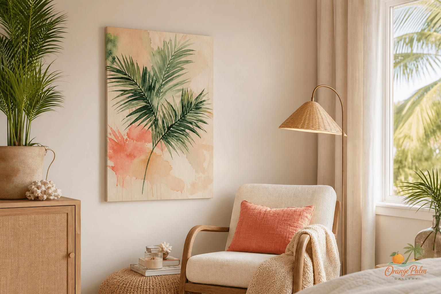
A reading corner is one of the easiest places to over-style.
People see a blank wall beside a chair and immediately start thinking in terms of filling it. Bigger art. More art. A stack of small frames. A little shelf. Maybe a plant. Then the corner starts acting less like a place to sit and more like a display zone.
That is usually not what the room needs.
A good reading corner has a small amount of visual gravity. Enough to make the chair feel intentional. Not so much that the wall starts competing with the book, the lamp, the window, or the quiet reason the corner exists in the first place.
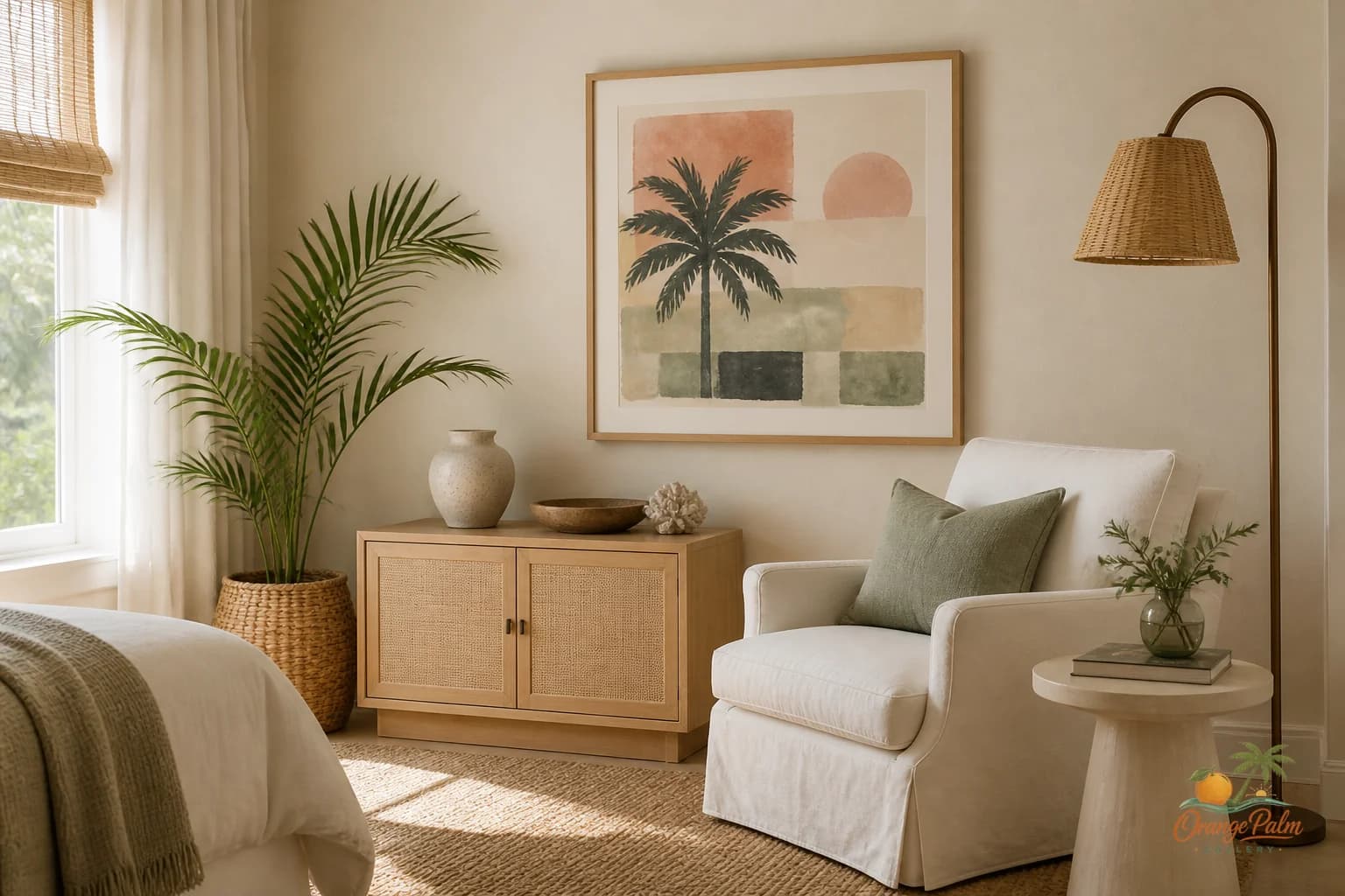
For a Florida-inspired room, I like this kind of corner best with one 2D wall art piece. Something warm, graphic, and calm. A piece that carries a little palm green, sand, coral, ink, or warm white without turning the wall into a beach theme.
Center the art on the sitting moment, not the wall
This is where people get the placement wrong.
They center the art on the wall because the wall is the thing they are looking at while standing. But a reading corner is not experienced from the center of the room. It is experienced from the chair.
The better move is to let the art belong to the chair.
If the chair sits slightly off-center, the art can sit slightly off-center too. If there is a floor lamp on one side and a small drink table on the other, the art should help tie that group together. Think of the chair, lamp, table, and artwork as one small composition.
The wall is just the background.
A single print hung above and a little to the side of the chair often feels more natural than a perfectly centered piece floating in the middle of open drywall. The goal is not symmetry. The goal is relationship.
Hang it lower than you probably think
Reading corners are seated spaces, so the art can come down.
A common mistake is hanging one small or medium piece at standing eye level, especially when the chair has a low back. The result is a strange gap: chair below, art above, nothing connecting them.
Try bringing the piece down until it feels visually connected to the top line of the chair. If there is a side table, let the bottom of the art feel close enough to the tabletop that the two objects acknowledge each other.
Not crowded. Just related.
This is especially useful in warm coastal rooms where the furniture tends to be light, woven, linen-covered, or low-profile. A little lower placement gives the corner weight without adding more furniture.
Let the color do less work
A reading corner should not shout from across the room.
For Orange Palm Gallery’s kind of Florida-inspired palette, I would rather see one strong but softened note than five competing references. A palm green shape. A sand-colored field. A thin ink line. A coral accent that appears once and then stops.
That restraint matters because reading corners already collect detail: book spines, woven texture, lamp glow, cushion seams, shadows from the window. The wall art should bring the corner into focus, not add another layer of noise.
If the room is mostly warm white and natural wood, a piece with ink and palm green can give the corner structure. If the chair is darker or more saturated, a sand and warm white piece may be enough. Coral works best as a small lift, not the whole personality of the wall.
Florida color is better when it feels sun-washed, not souvenir-shop bright.
Use the lamp as part of the composition
The lamp matters more than people think.
A floor lamp can make a piece of art feel anchored, especially at night. During the day, Florida light may come in sideways and create soft shifts across the wall. In the evening, the lamp gives the artwork a second mood.
That means the art should not be placed without considering the lamp shade, the lamp height, and the direction of the glow.
If the lamp is tall and arched, the art can sit inside that visual curve. If the lamp is a simple vertical line, the print can sit opposite it and balance the corner. If the lamp shade is wide, avoid hanging the art so high that the two feel disconnected.
Small interiors are built from these tiny alignments.
One piece is often the cleaner answer
A gallery wall can be beautiful, but a reading corner does not always want that much activity.
One piece gives the eye somewhere to land. It also leaves room for texture elsewhere: a rattan chair, a linen pillow, a ceramic cup, a pale wood table, a stack of paperbacks. In a coastal modern home, the empty space around the art is part of the styling.
That space is what keeps the corner breathable.
If you are collecting ideas for calm, Florida-inspired wall art and home styling, you can explore more at Orange Palm Gallery. I keep coming back to the same rule in these small rooms: the art should make the corner feel considered, not decorated to death.
A reading chair does not need a wall full of proof.
It needs one good visual pause.
For another small, quiet seating moment, read Guest Room Wall Art Should Not Feel Like Leftovers.