Wall Art Styling
The Long Hallway Wall Needs Rhythm, Not Wallpaper Energy
Wall art styling advice for long hallway walls, with practical guidance on spacing, scale, color, and calm Florida inspired rhythm.
November 6, 2026 / 4 min read / Orange Palm Gallery Studio
Source note: this guide is written and maintained by Orange Palm Gallery Studio. Last updated November 6, 2026.
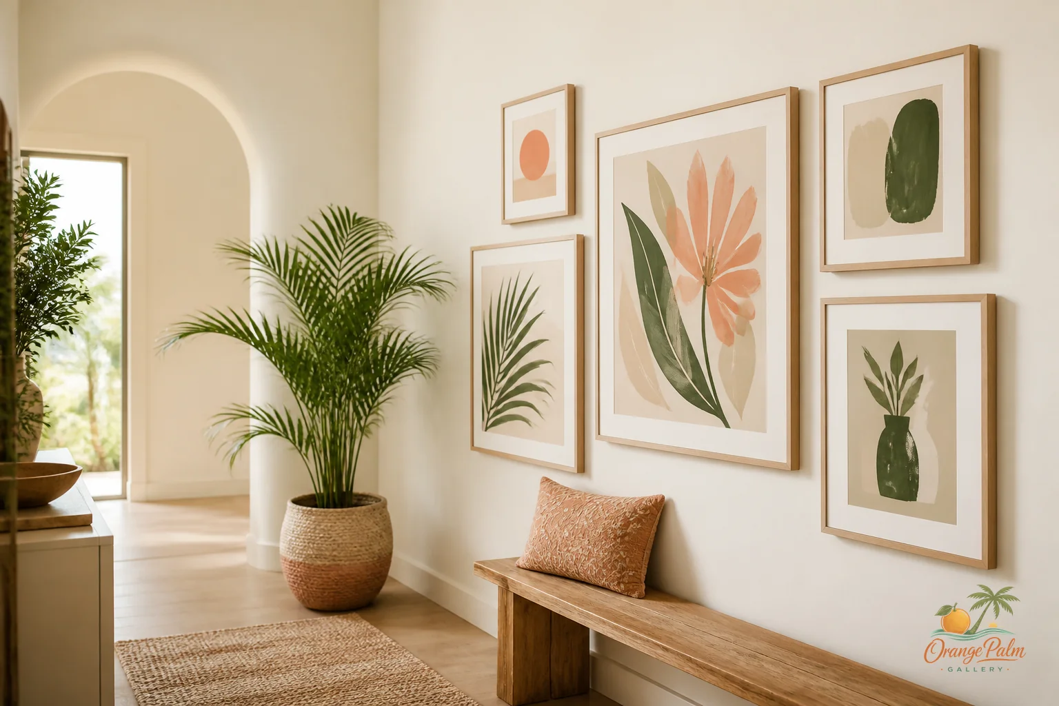
A long hallway is one of the easiest places to over decorate.
It looks empty, so the instinct is to keep adding. A frame here, a print there, maybe a full gallery wall because the wall is long and the house has art to place. But a hallway is not a storage unit for leftover pieces. It is a moving space. You do not sit in it. You pass through it, usually with a bag, a laundry basket, a dog, a coffee, or a child trying to narrate their whole morning.
So the wall art has a different job here. It should create rhythm, not noise.
Treat the hallway like a sentence
A good hallway wall has punctuation. Not every inch needs a word.
Think in pauses: one piece near the beginning, a pair farther down, one larger moment near the end. The eye should be able to move, rest, move again. If every frame is the same size and every gap is the same, the hallway can start to feel like hotel corridor decor. If every piece is different and crammed too close, it turns into visual static.
The sweet spot is a little irregular, but still intentional.
For a narrow hallway, I like a quieter composition: two or three pieces with generous breathing room. For a wider hallway, you can use a longer run, but the spacing still matters. Leave enough open wall so the art feels chosen, not accumulated.
Scale matters more than people think
Small art can work in a hallway, but too many tiny pieces will make the wall feel busy. You end up looking at frames instead of the feeling of the room.
One medium piece often does more than five little ones. A pair of vertical prints can lengthen the wall without making it frantic. A horizontal piece can slow the walk down, especially near the end of the hallway where the eye naturally lands.
If the hallway has doors, vents, switches, or trim interruptions, do not fight them. Use them as natural breaks. A doorway can act like a comma. A wall section between two door frames might only need one quiet piece, not a mini exhibition.
Keep the color temperature calm
Hallways often borrow light from other rooms, which means the art can look different throughout the day. Bright white paper, high contrast black frames, and saturated color can feel sharper here than they do in a living room.
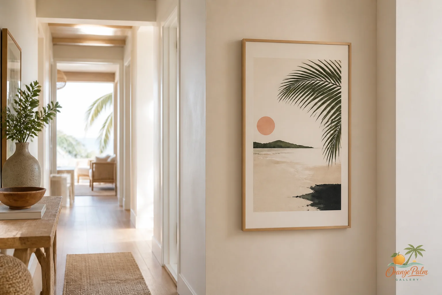
For a warm modern coastal feeling, softer color usually wins. Sand, warm white, palm green, muted coral, sun faded peach, and inky olive can give the hallway shape without making it shout. The goal is not to theme the house into a beach rental. The goal is to bring in a little Florida light, a little air, and a sense of ease.
What people get wrong is thinking coastal decor has to announce itself. It does not need rope, shells, or turquoise overload. In a hallway, coastal can be as simple as a loose palm shape, a sun washed palette, or a composition that leaves room around the edges.
Hang for the walk, not the photo
A hallway wall should be judged in motion. Stand at one end and walk through at a normal pace. Do the pieces pull you forward? Does anything feel too high, too low, too clustered, too eager?
Most hallway art looks better when the center of the piece sits around eye level, but the real test is how it feels with the architecture around it. If there is a console, bench, or runner involved, let those elements help set the height and spacing. If the hallway is bare, resist the urge to compensate with too much art.
A bare strip of wall is not a failure. It can be the thing that makes the art work.
A simple hallway formula
Try this:
1. Choose one main visual moment, not six. 2. Add one supporting piece or pair farther down the wall. 3. Keep at least one larger section of open wall untouched. 4. Repeat one color across the art so the hallway feels connected. 5. Avoid filling every awkward gap just because it exists.
That last one is the hardest. Empty space can feel unfinished when you are standing still. But in a hallway, empty space is movement. It gives your eye somewhere to go.
For Orange Palm Gallery, this is the kind of wall I like best: warm, edited, a little sunlit, and not trying to prove how decorated it is. The art does not have to dominate the passage. It can simply make the walk through the house feel considered.
Explore Orange Palm Gallery pieces for calm, modern Florida inspired homes at orangepalmgallery.com.