Wall Art Styling
The TV Wall Can Take a Little Art, If It Knows Its Place
How to style art near a TV wall with better scale, calmer color, and enough breathing room for a modern Florida inspired living room.
October 30, 2026 / 4 min read / Orange Palm Gallery Studio
Source note: this guide is written and maintained by Orange Palm Gallery Studio. Last updated October 30, 2026.
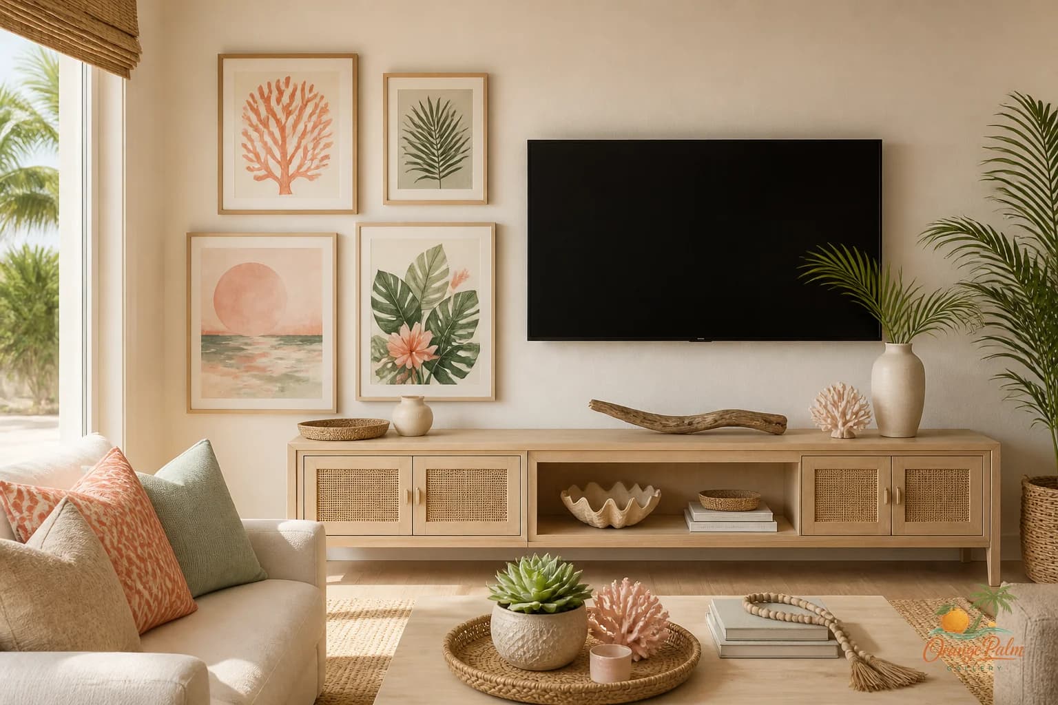
The TV wall is one of the hardest walls to style because it already has a bossy object in the middle of it. That black rectangle pulls the eye whether it is on or off. Pretending it is not there is usually how the wall gets weird.
People either leave the whole wall blank, which can make the TV feel even harsher, or they surround it with so much decor that the room starts to feel like a sports bar with better pillows. Neither option is great.
Art can belong on a TV wall. It just has to know its job.
Do not try to disguise the TV
The most common mistake is treating art like camouflage. A gallery wall gets packed around the screen, with tiny frames marching up the sides and over the top. The hope is that the TV will disappear into the arrangement.
It rarely does.
Instead, the TV becomes the biggest, darkest piece in a busy gallery wall. Everything else starts looking like it is orbiting the screen. That can work in a maximal room with strong pattern, layered bookshelves, and a lot of visual confidence. In a calm coastal room, it usually feels restless.
A better move is honesty. Let the TV be the TV. Then use art to soften the wall, not hide the equipment.
Keep the art slightly quieter than the screen
On a TV wall, art should usually sit one notch quieter than it would on a sofa wall or dining room wall. That does not mean boring. It means fewer sharp contrasts, fewer tiny details, and less visual chatter.
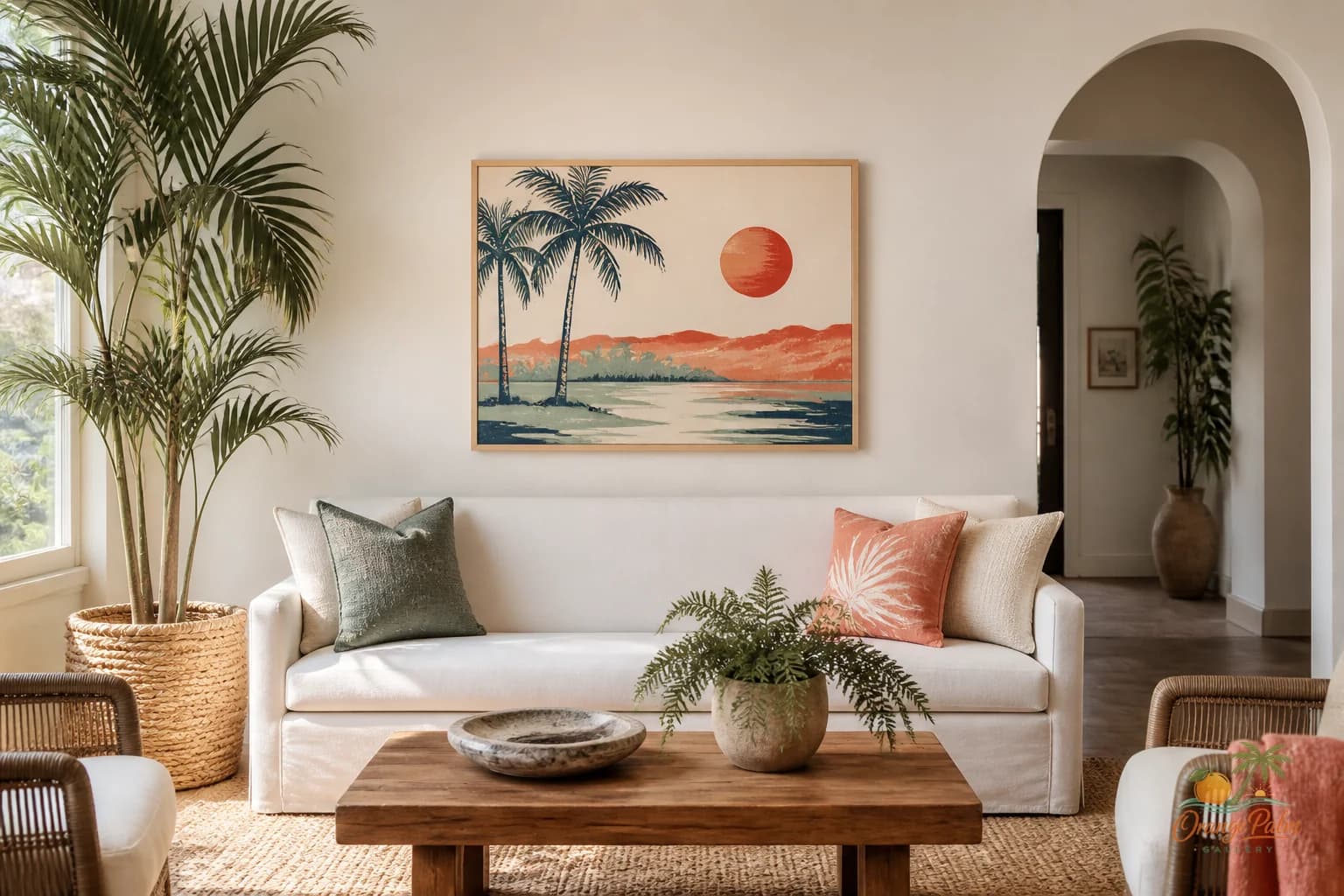
Look for broad shapes, washed color, botanical silhouettes, abstract coastal lines, or simple compositions with warm negative space. Coral, sand, palm green, ink, and warm white can all work beautifully here, especially if the rest of the room already carries natural texture.
The art should give the eye somewhere soft to land when the screen is off. It should not ask the eye to choose sides.
Use one side, not every side
A TV does not need to be framed like a certificate. One of the easiest ways to make the wall feel more natural is to style art on only one side.
Try a vertical pair to the left of the TV, a single larger piece to the right, or a small stacked arrangement near a media cabinet edge. The asymmetry helps the wall feel collected instead of installed by committee.
This is especially useful in Florida homes where living rooms often deal with sliding doors, open kitchens, bright windows, and tile floors. The room already has light moving through it. A little imbalance can feel more human than a perfect grid.
Respect the console line
If there is a media console, use it as the visual ground. The art should relate to that piece of furniture, not float independently above the TV.
A good test: step back and squint. Do the TV, console, and art feel like one loose composition, or three separate things that happen to be sharing a wall?
Most TV walls improve when the art sits closer to the console zone than to the ceiling. Keep the top of nearby art from climbing too high. Once the arrangement gets tall, the whole wall starts feeling like a display wall instead of part of a living room.
Leave actual breathing room
A TV wall needs air around the screen. Not a huge empty moat, just enough space so the art does not feel like it is crowding the device.
If the TV is wall mounted, give the art a bit of side clearance. If the TV sits on a console, avoid placing small art pieces directly behind the screen like background noise. Let the black shape have a clean edge.
Negative space is not wasted space. In a room with sunlight, plants, woven texture, books, remotes, lamps, and everyday life, empty wall space is doing real work.
Match the room, not the algorithm
A TV wall is not the place to copy a dramatic gallery wall just because it looked good in a cropped photo. Think about what the room feels like at 8 pm, when the lamps are on and someone has left a glass on the coffee table.
Does the wall calm down with the room, or does it keep performing?
For Orange Palm Gallery, the better answer usually leans warm, modern, and a little sun faded. Not beach themed in the obvious way. More like afternoon light on plaster, palm shadows, soft mineral color, and shapes that feel handmade without getting fussy.
If you want more quiet wall art and styling notes from the studio, you can explore Orange Palm Gallery here: https://orangepalmgallery.com/?utm_source=mdx
The short version
Treat the TV as part of the composition, not an enemy to cover. Use fewer pieces. Keep the palette soft. Let one side carry the art instead of boxing in the screen. Stay low enough to connect with the console. Leave breathing room.
The TV wall can take art. It just cannot take art that is trying too hard.