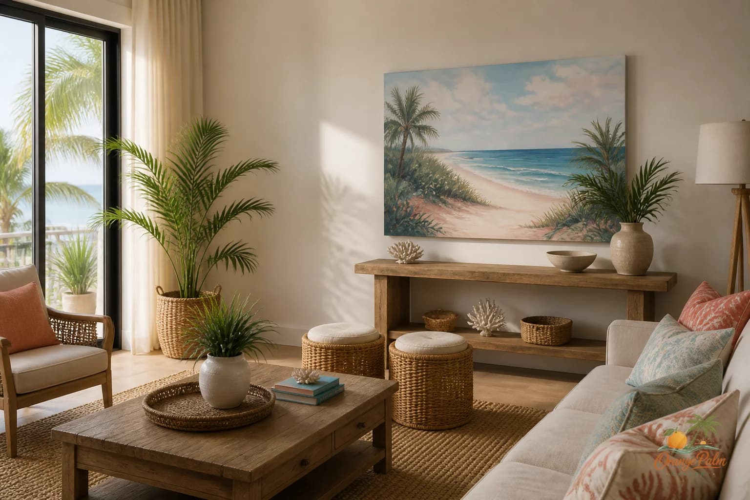
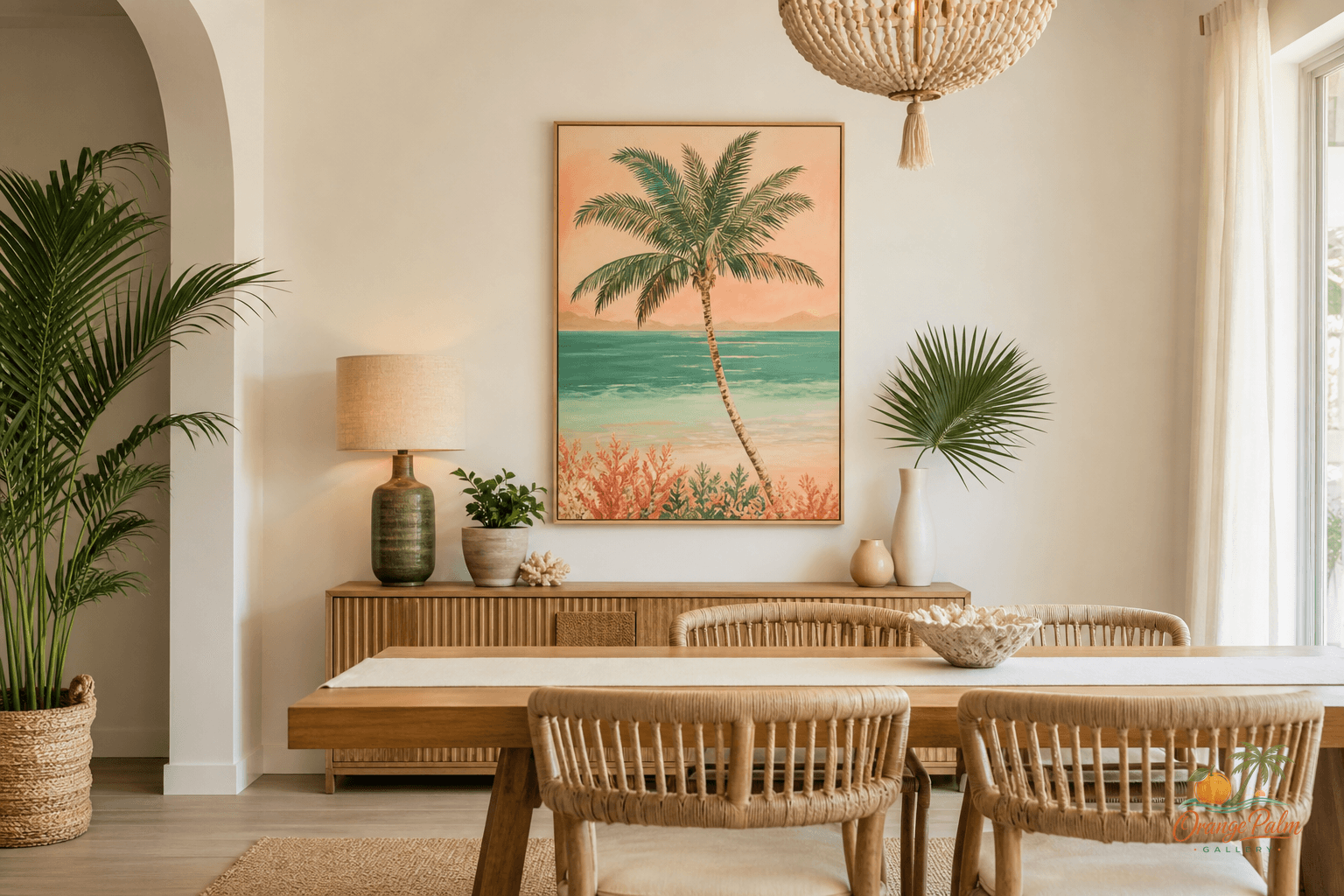
Wall Art Styling
The Mantel Wall Does Not Need a Prop Pile
A practical Orange Palm Gallery journal note on styling mantel wall art with restraint, warm Florida color, and better scale.
August 10, 2026 / 4 min read / Orange Palm Gallery Studio
Source note: this guide is written and maintained by Orange Palm Gallery Studio. Last updated August 10, 2026.
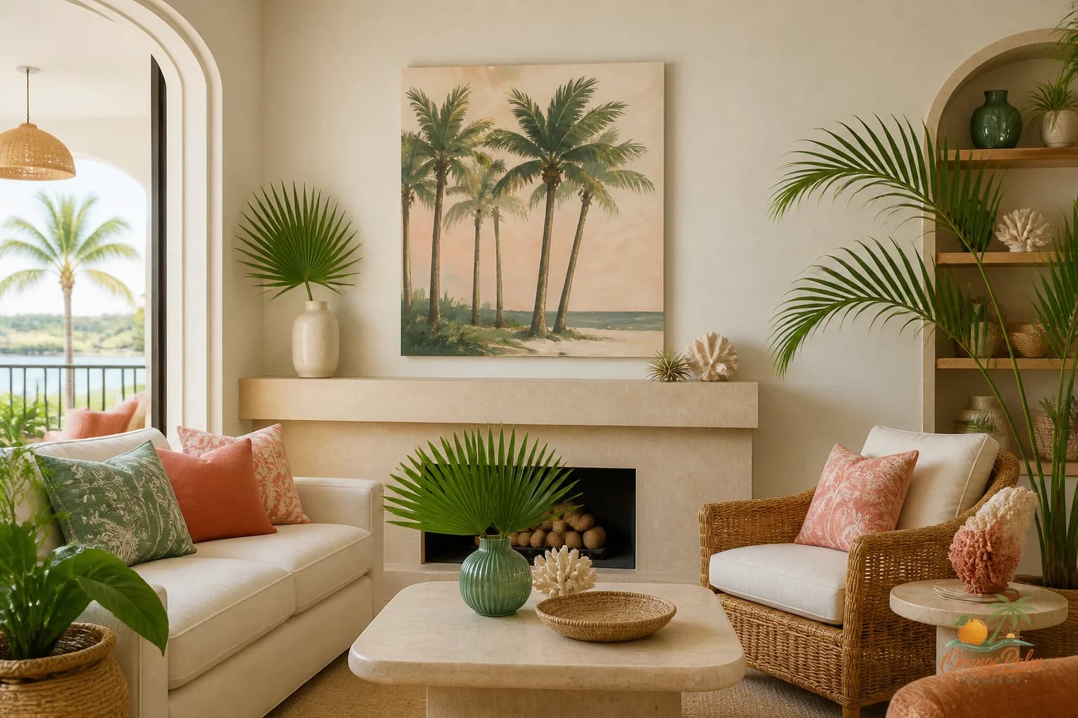
The mantel wall does not need a prop pile
A mantel is not a little stage for every vase, candle, bead strand, tiny frame, and seasonal object that has nowhere else to go.
That sounds harsher than it is. A mantel can absolutely hold a few beautiful things. But the wall above it has a job too, and most living rooms get awkward when the mantel ledge tries to do all the visual work by itself.
The common mistake is treating the mantel like a shelf first and the wall like leftover space. So the ledge fills up with small objects, then the art above it gets chosen too small, then everything starts to look nervous. Nothing is technically wrong, but the room never settles.
For a calm Florida inspired living room, I would usually start the other way around: choose the wall art first.
Let the art carry the mood
The mantel is already a strong horizontal line. The firebox, shelf, surround, or even a simple architectural bump out gives the room structure before you add anything. That means the art above it does not need to shout. It needs to hold the wall with enough scale that the mantel can relax.
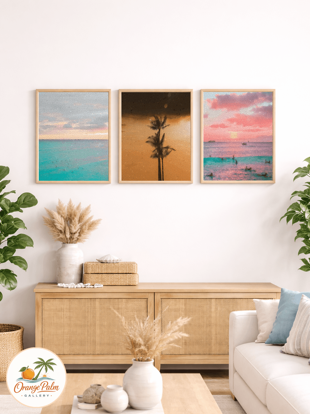
One generous 2D piece often works better than a scatter of small frames. Not because gallery walls are bad, but because mantel walls already have a lot of edges: shelf line, vertical sides, hearth line, nearby windows, sometimes a television or built ins. Add too many little rectangles and the eye starts counting instead of resting.
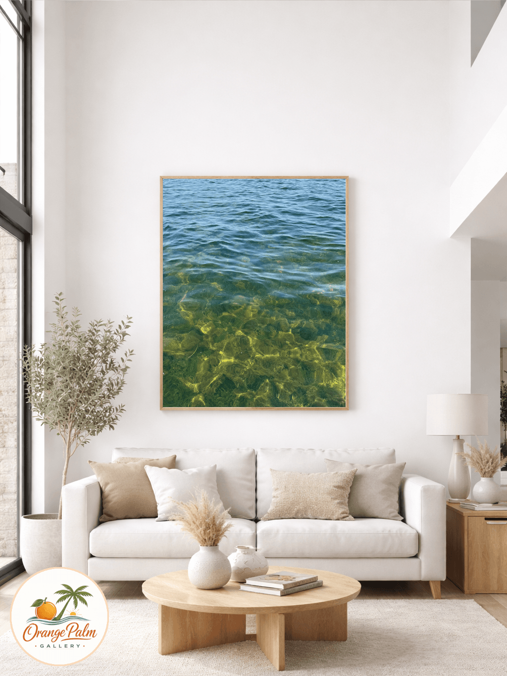
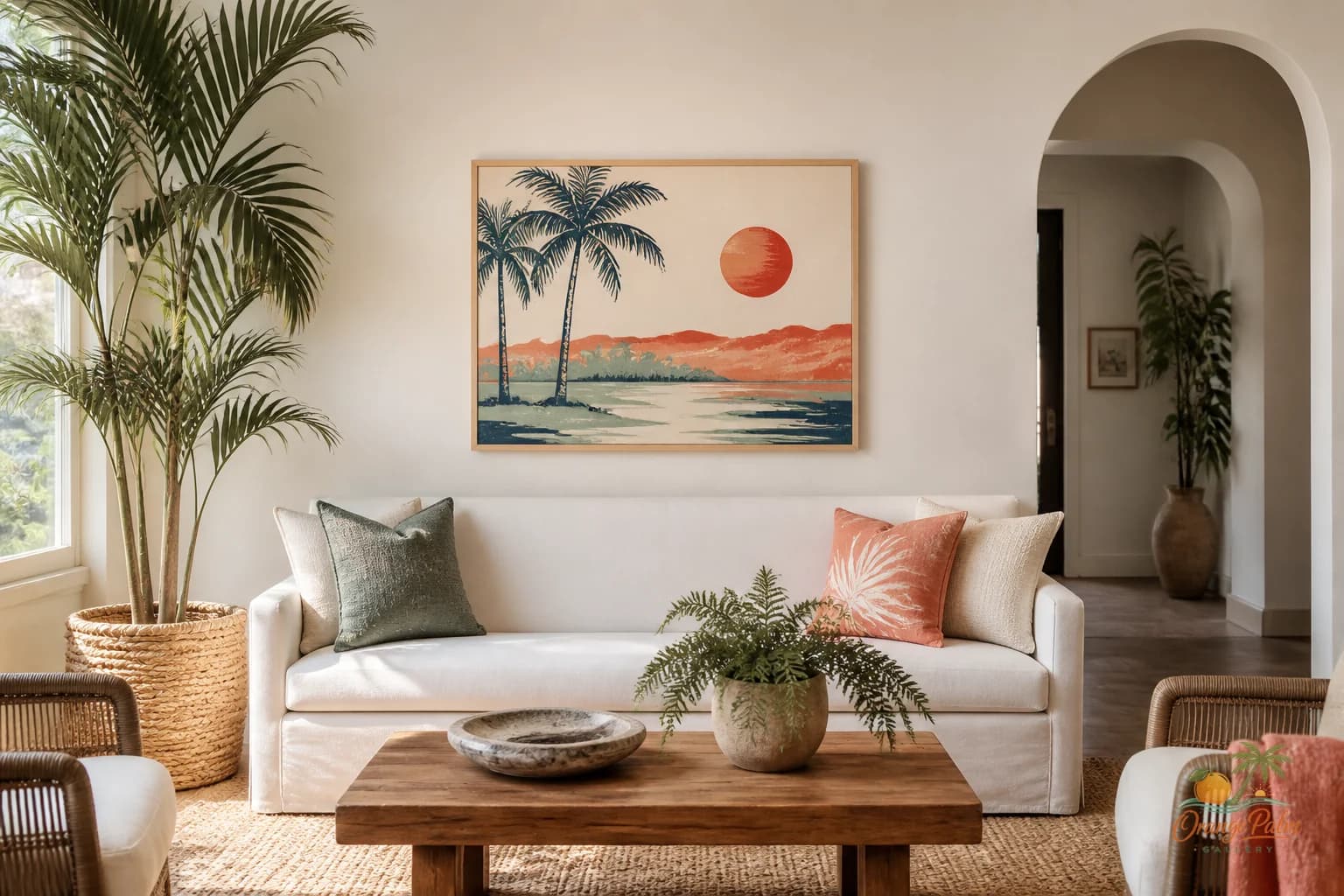
A single piece with warm white, sand, palm green, coral, or ink tones can give the wall a clear center. It can echo Florida light without turning the room into a beach souvenir shop. That is the tradeoff: less stuff, more intention.
Scale is where mantel styling usually falls apart
Tiny art above a mantel makes the shelf look heavier than it is. The wall feels top empty, bottom crowded. Then people try to fix the imbalance by adding taller objects on the mantel, and the whole thing becomes a prop pile.
A better starting point: let the artwork feel visually related to the mantel width. It does not need to match edge to edge. In fact, a little breathing room on both sides usually looks more relaxed. But the piece should be wide enough that it does not look like it wandered in from a side table.
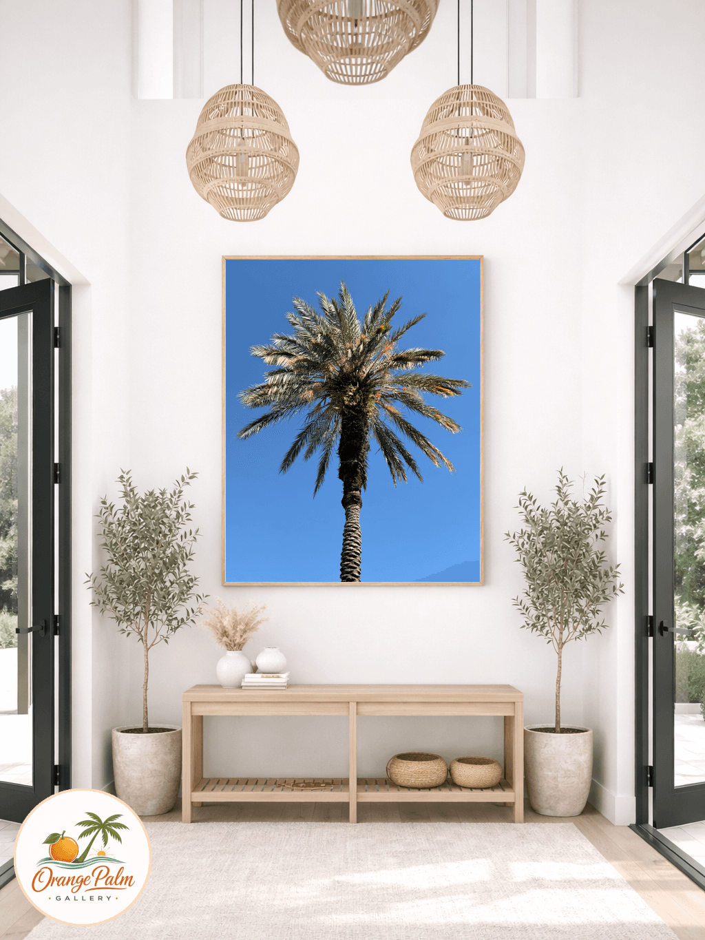
If the mantel is wide, go wider with the art or use a restrained pair. If the mantel is narrow, one vertical piece can work, especially when the ceiling is high. The point is not a formula. The point is relationship. The art should look like it belongs to the mantel, not like it is floating above it waiting for instructions.
Hang it lower than your instinct
Mantel art often gets hung too high. People leave a big gap because they are afraid of the heat, the shelf objects, or simply because the wall looks tall. The result is a strange visual split: mantel down here, art way up there, empty air in between.
If the space allows, bring the art low enough that the composition reads as one unit. The mantel and the artwork should have a conversation. A smaller gap usually feels more designed than a large one, especially in a room where people are seated.
Of course, use common sense around working fireplaces and heat. If the surface gets hot, do not pretend styling rules matter more than the material. But in many homes, especially where the mantel is decorative or the fireplace is rarely used, the visual issue is simply that the art has been placed too far away from the architectural feature it is supposed to anchor.
Keep the ledge quiet
Once the art is strong enough, the mantel does not need much.
Try one low object on one side, maybe a ceramic shape or a small stack of books. Add one organic element if it suits the room. Then stop before symmetry turns stiff. The better mantel often has a little imbalance, but not clutter.
What people get wrong is thinking restraint means emptiness. It does not. Restraint means every object has enough space to be seen. A coral note in the artwork can connect to a clay vessel. A palm green shape can speak to a plant across the room. A sand colored field can soften a white wall without making it beige and sleepy.
That is the quiet pleasure of wall art in a living room. It can pull the room together without adding more things to dust.
A simple mantel test
Step back to the main seat in the room. Look at the mantel wall for five seconds.
If your eye lands on the art first, then moves gently across the mantel, you are close. If your eye bounces between six small objects and never knows where to settle, edit. If the art disappears, scale up. If the mantel feels heavy, remove objects before buying new ones.
The mantel is already architecture. Let the wall art bring the atmosphere.
For more warm, modern Florida inspired wall art and styling notes, explore Orange Palm Gallery at orangepalmgallery.com.