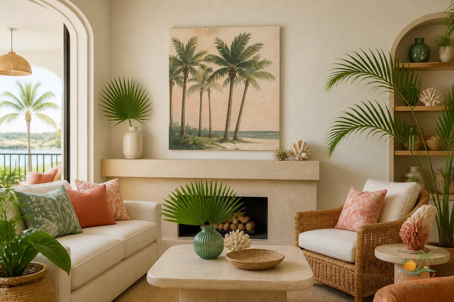
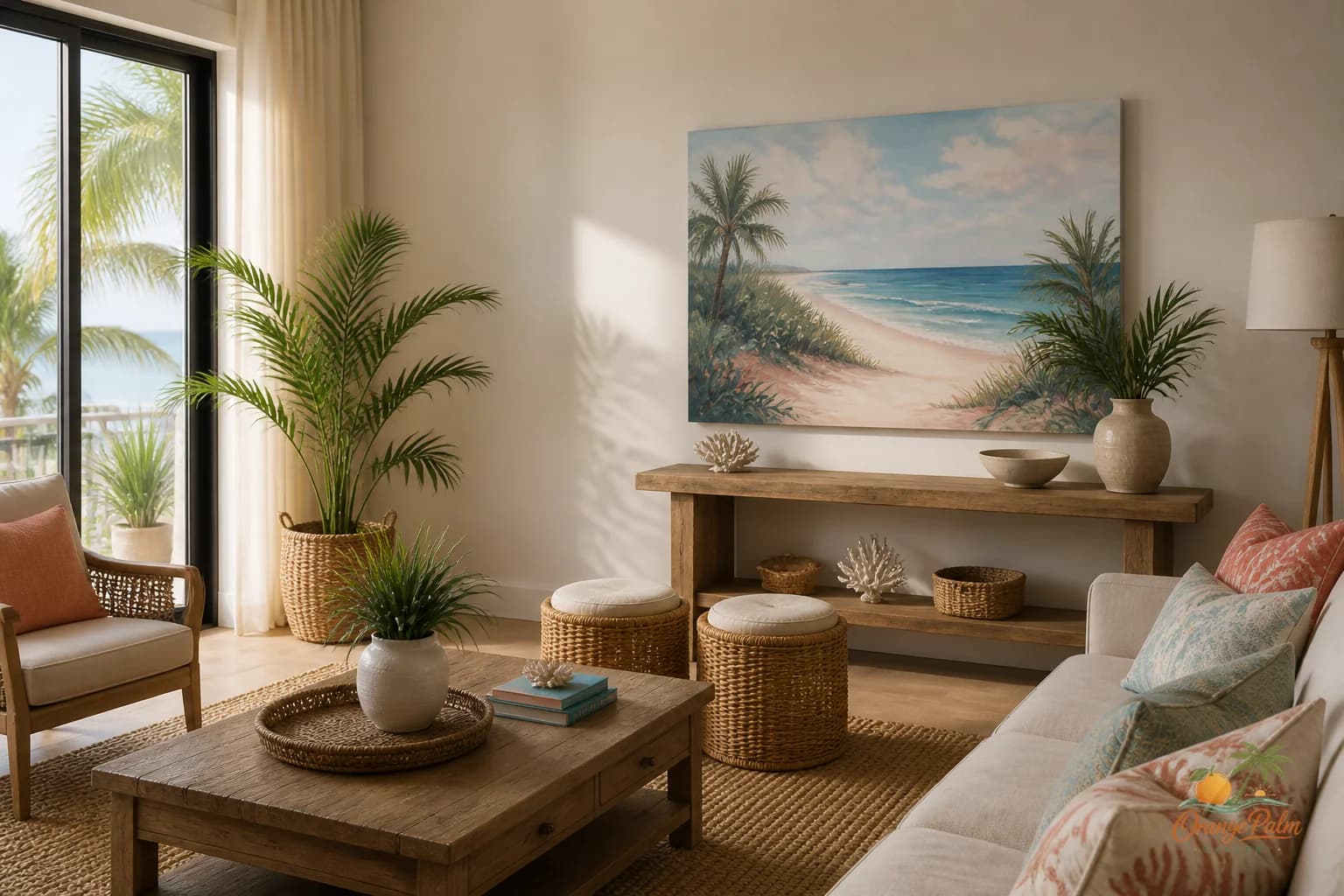
Wall Art Styling
The TV Wall Does Not Need More Noise
How to style wall art near a TV with calm coastal color, breathing room, and a more intentional living room composition.
July 24, 2026 / 4 min read / Orange Palm Gallery Studio
Source note: this guide is written and maintained by Orange Palm Gallery Studio. Last updated August 4, 2026.
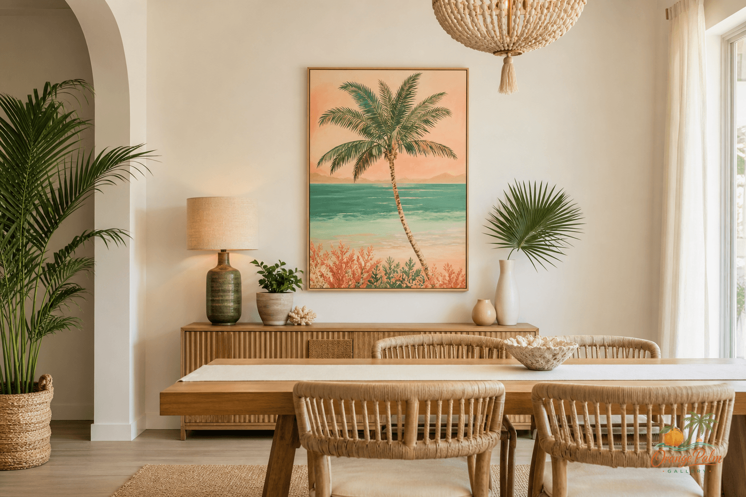
The TV wall does not need more noise
A TV already has a lot of visual weight. Even when it is off, it sits there as a flat black rectangle, pulling the eye toward it. That is not a moral failure of the room. It is just what screens do.
Where people get into trouble is trying to decorate the TV wall into submission. They add a pair of prints, then a shelf, then a plant, then a tiny framed quote, then something woven, then another print because the first two looked lonely. Suddenly the wall has five competing jobs and none of them are being done well.
For a calm Florida-inspired living room, I would rather see one good piece of wall art near the TV than a small committee of decor trying to distract from it.
Quick answer
The best TV wall art setup is usually one calm piece placed beside the television, not a cluster of small decor around it. Choose artwork with enough scale to balance the screen, leave clear breathing room, and use quiet coastal colors like warm white, sand, palm green, ink, and a small coral note.
Give the art its own job
The art does not need to hide the TV. It does not need to match the screen. It definitely does not need to become part of a symmetrical media wall unless the room is formal enough to support that.
A better move is to let the art soften the edge of the TV zone.
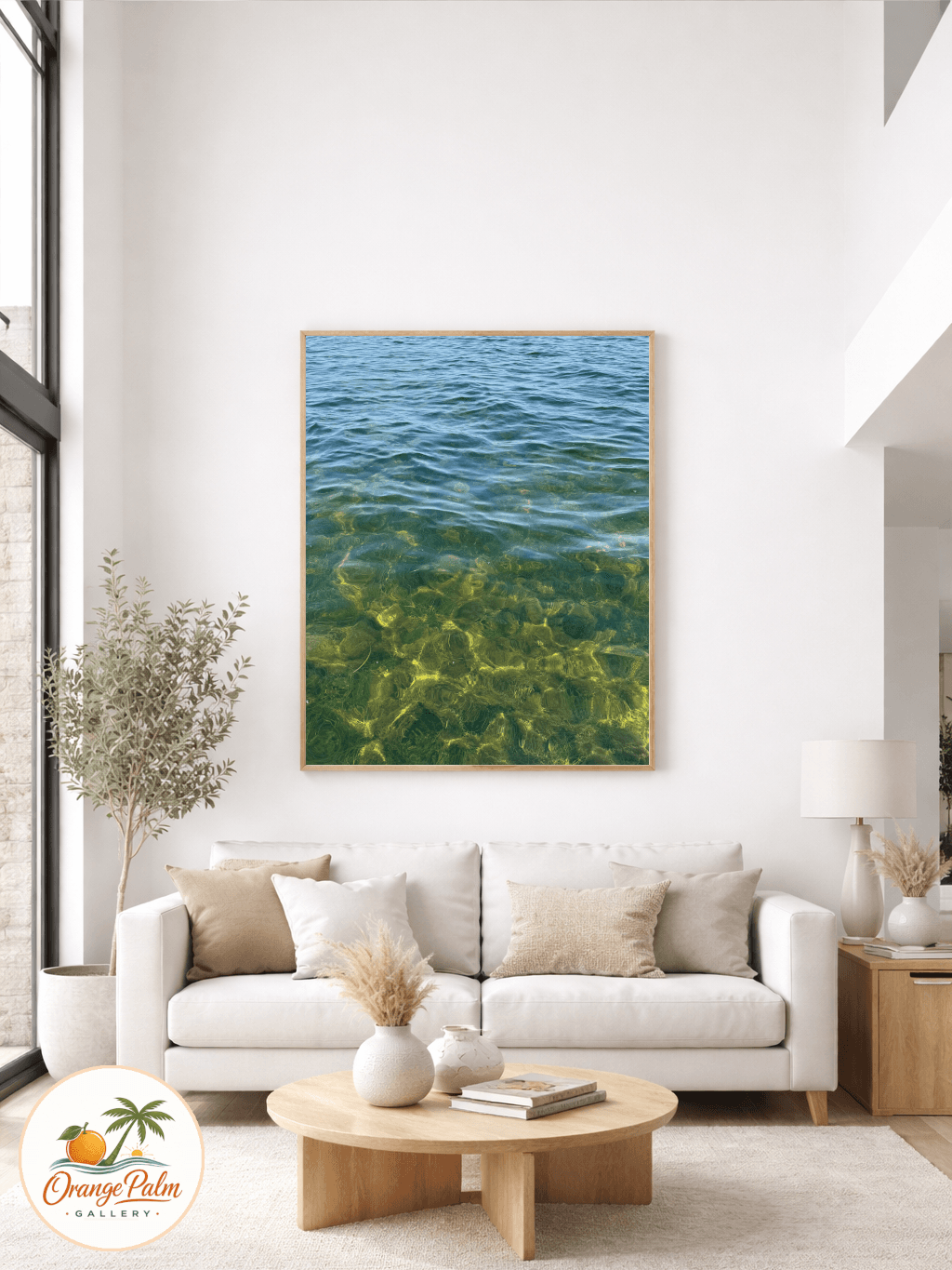
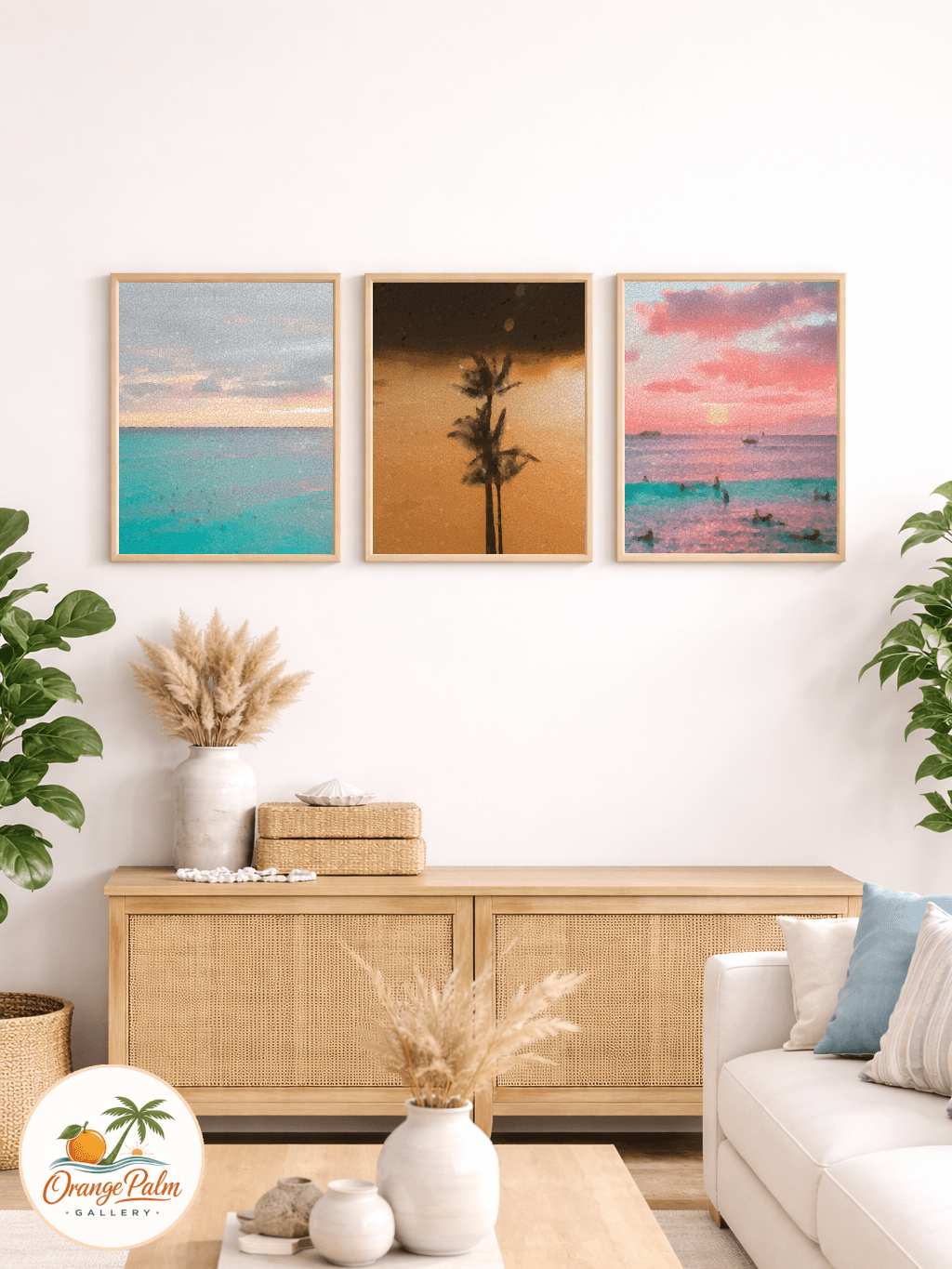
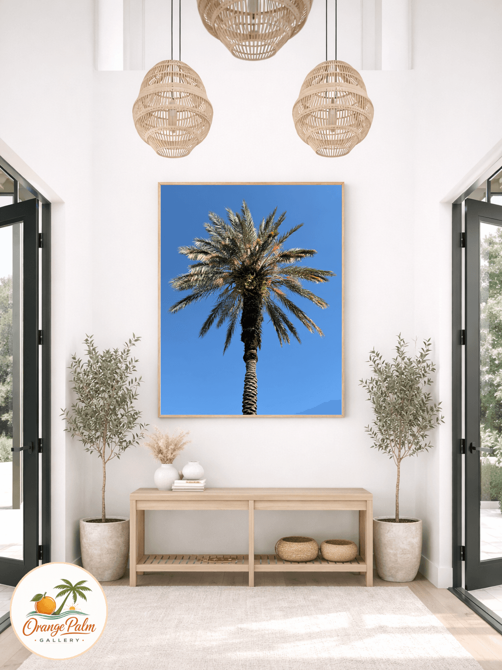
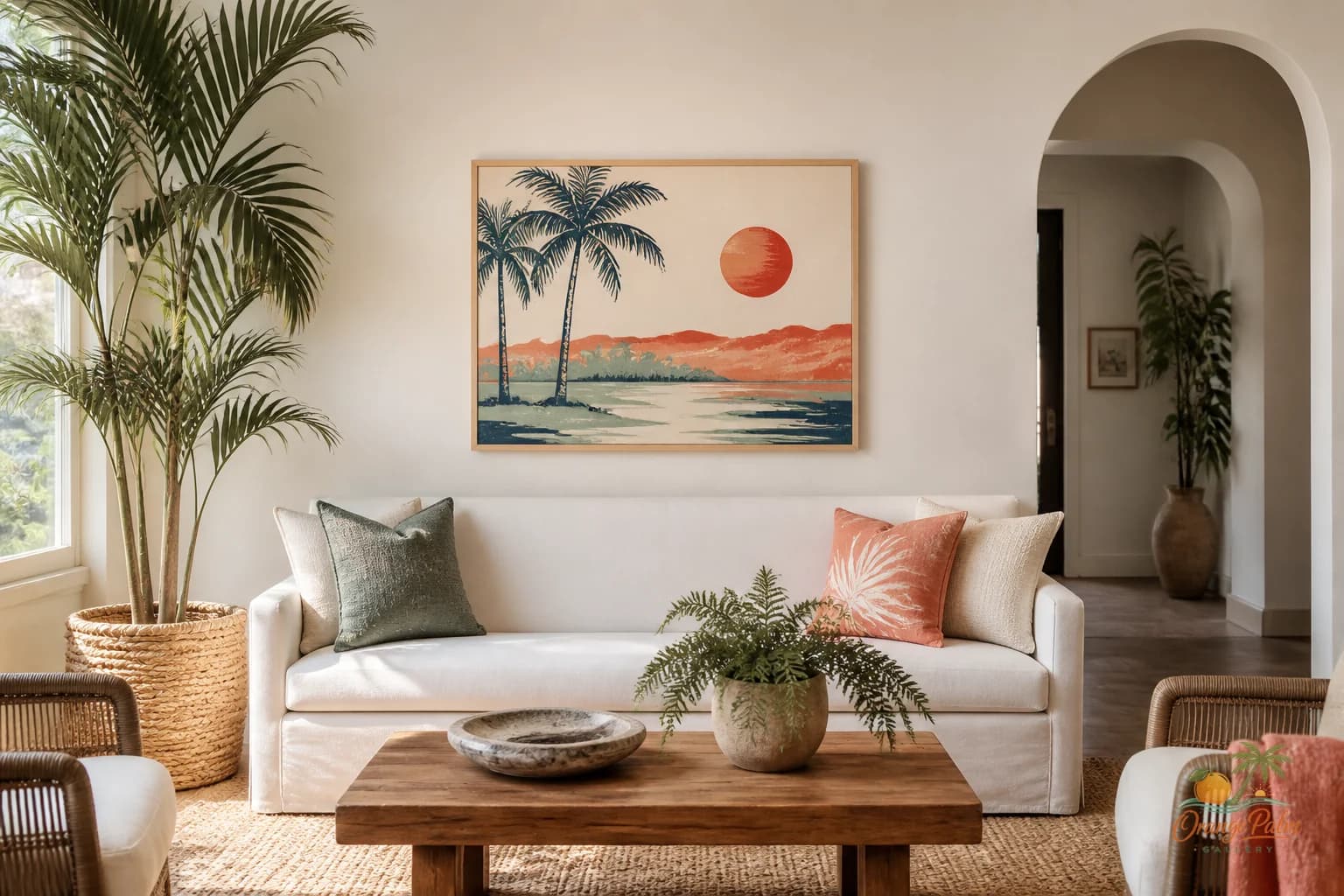
That might mean one vertical 2D piece on the wall to the left or right of the television, with enough breathing room that it reads as intentional rather than squeezed in. Think palm green, sand, warm white, a little coral, or a dark ink line to echo the screen without copying its heaviness.
The tradeoff is simple: if the art is too busy, it competes with the screen. If it is too small, it looks like an apology. The sweet spot is calm but present.
Stop centering everything on the TV
A lot of living rooms get stiff because every object is arranged around the television like it is the fireplace, the host, and the altar. Sometimes that is honest. Most people do watch the TV. But the wall can still have more rhythm than a black rectangle floating above a console.
Try shifting the visual balance instead of forcing perfect symmetry.
If the TV is centered over a media console, place one larger piece of art on the open side of the wall. If there is a window on one side, let the art sit on the opposite side to balance the light. If the console is long, do not automatically fill the entire width above it. Leave some quiet wall showing.
Empty wall is not unfinished. It is what lets the art and furniture breathe.
Use coastal color without making it themed
Florida-inspired decor gets strange when every choice tries to announce the coast. A palm shape, a sandy palette, a washed coral accent, or a soft green field can be enough. You do not need shells, slogans, driftwood, and a blue stripe all in the same corner.
Near a TV, restraint matters even more. The screen already brings contrast. A wall art piece with warm white space and a few grounded colors can keep the room from feeling like two different moods fighting each other.
I like this kind of palette for a TV wall:
- Warm white for air and calm
- Sand for softness against wood furniture
- Palm green for a natural Florida note
- Ink for structure, especially near a black screen
- Coral only as a small lift, not the whole event
That mix feels coastal without tipping into souvenir shop decor.
Hang it with the furniture, not the ceiling
The most common TV wall mistake is hanging art too high because the wall above the console looks tall. Wall art should relate to the furniture and the seated eye line, not the ceiling.
If the piece sits beside the TV, align it loosely with the screen or the media console. It does not have to be mathematically perfect, but it should look like it belongs to the same composition. If the art is much higher than the TV, it starts to drift. If it is much lower, it can feel accidental.
A small gap can look sharp. A cramped gap looks nervous.
Let one piece do enough
This is where I get a little firm: not every blank patch needs a frame. A TV wall often improves when you remove two small things and keep one stronger one.
One calm 2D artwork can give the room a handmade note, a bit of coastal warmth, and a break from the screen. That is enough. The goal is not to win the wall. The goal is to make the room feel like someone with taste made a decision.
If you are shaping a quieter living room mood, you can explore Orange Palm Gallery pieces for calm, modern Florida-inspired homes at orangepalmgallery.com.