Wall Art Styling
The Wall Between Windows Is Not a Leftover
How to style wall art between two windows with quiet scale, warm coastal color, and enough breathing room for the light to stay in charge.
November 4, 2026 / 5 min read / Orange Palm Gallery Studio
Source note: this guide is written and maintained by Orange Palm Gallery Studio. Last updated November 4, 2026.
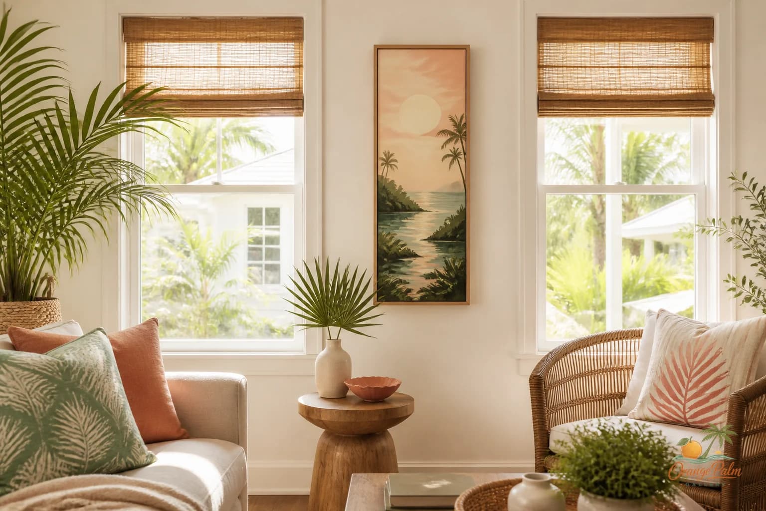
The strip of wall between two windows gets treated badly.
People either ignore it completely, as if the windows already did all the decorating, or they try to jam a tiny gallery wall into a space that never asked for one. Both choices can make the room feel accidental. One leaves a visual gap. The other turns the wall into a nervous little bulletin board.
A narrow wall between windows has a better role: it can be the quiet center note in the room.
Let the windows stay important
Windows are not blank wall interruptions. They are active parts of the composition. They bring in light, frame the outside, and create strong vertical edges. Any art placed between them has to respect that.
That usually means going simpler, not smaller.
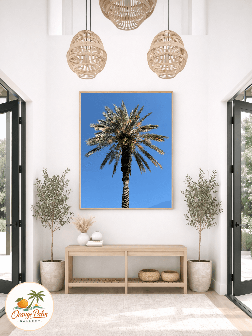
A single vertical piece often works better than a cluster of small pieces. Small art can look like it is apologizing for being there. A taller piece gives the strip of wall a clear spine, especially if the windows are similar in size and height.
The mistake is thinking narrow wall equals tiny art. It does not. It means controlled art.
Look at the width first. If the space between windows is tight, the art should leave clear breathing room on both sides. Not a huge border, just enough that the piece does not feel wedged between the trim. The wall should still feel like wall.
Match the mood of the light
This is where Florida inspired interiors can get really good. Window walls already shift during the day. Morning light can make warm white walls go creamy. Afternoon light can sharpen greens, coral tones, and sandy neutrals. Art between windows should not fight that movement.
For a calm coastal room, I would look for:
- warm white or sand as the resting color
- palm green or softened ink for structure
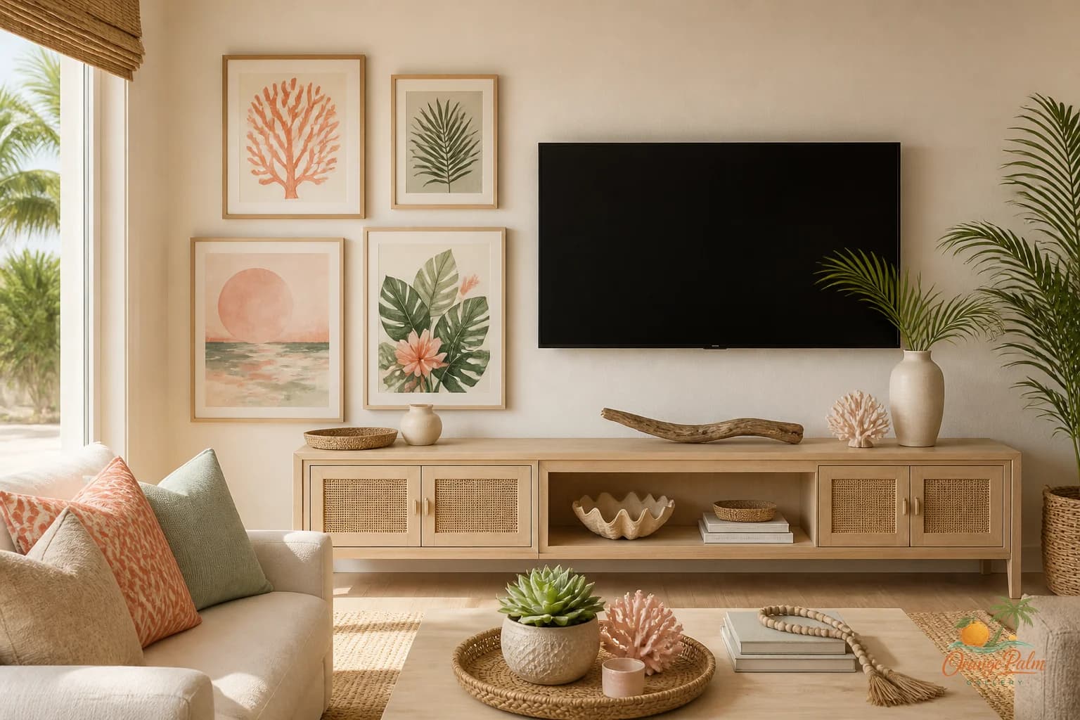
- coral used carefully, more like a sun warmed accent than a shout
- loose organic shapes instead of busy detail
- enough empty space inside the artwork to echo the glass around it
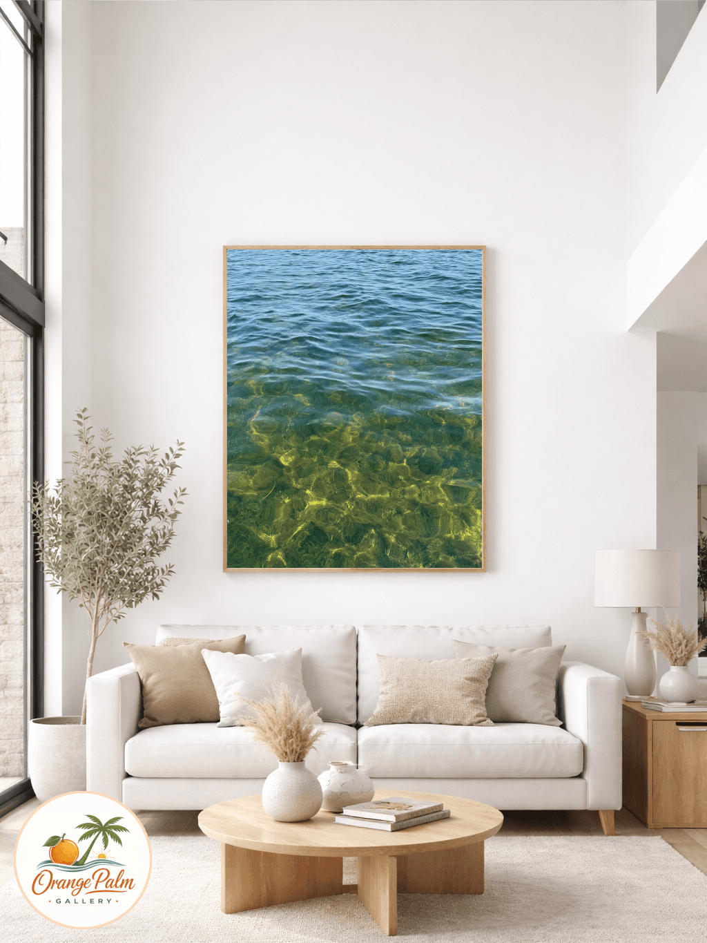
The art does not need to show a beach, a palm tree, or a shell to feel coastal. In fact, the more literal it gets, the faster the wall can turn into a theme corner. A narrow abstract piece with the right palette can feel more Florida than a postcard scene.
Center it by the architecture, not the furniture
This wall is one of the few places where the architecture usually wins.
If the art sits between two windows, center it between the window frames first. Do not chase the sofa arm, the side table, or the plant stand unless the whole room is visually lopsided. The windows create the frame. The art belongs to that frame.
Height is the second decision. A good starting point is to place the center of the artwork around eye level, then adjust for the window proportions. If the windows are tall, the piece can sit a little higher so it does not sag visually. If there is a sill line nearby, avoid lining up every edge too perfectly. A slight offset can keep the wall from feeling stiff.
What people get wrong is trying to make every line behave. Rooms do not need that much obedience.
Do not force a gallery wall into a skinny space
A gallery wall between windows can work, but it has to earn its place. Most of the time, it looks cramped because every little frame creates another edge, another shadow, another demand for attention.
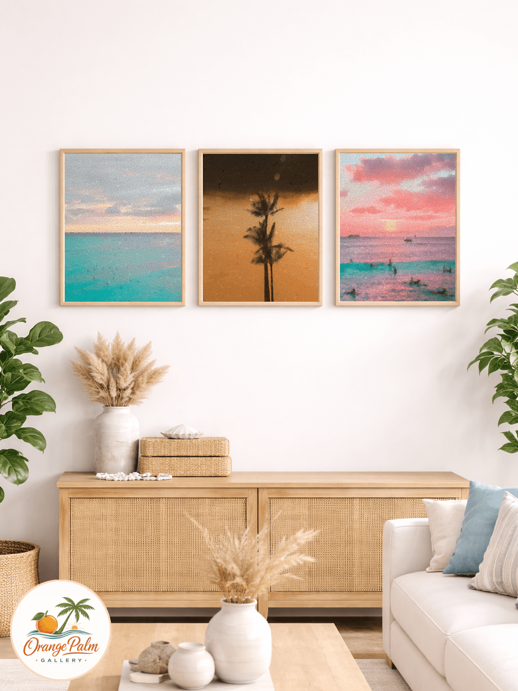
If you want more than one piece, try two stacked works with generous spacing. Keep the palette close. Keep the shapes related. Let the pair read as one vertical gesture instead of two separate decorations fighting for room.
Three or more pieces in a narrow strip can start to feel like a ladder. That may be fine in a stairwell, but between windows it often looks fussy.
A window wall already has rhythm: frame, glass, wall, glass, frame. The art should add one clear beat, not drum over the whole thing.
Give the room a reason to look there
The best art between windows does not scream for attention. It gives the eye somewhere soft to land after all that daylight.
In a living room, that might mean a vertical coastal abstract that repeats the green of a plant, the sand tone of a rug, or the ink line of a lamp base. In a bedroom, it could be quieter still: pale warmth, a loose shape, a little texture, nothing too awake. In a dining nook, it might hold a small dose of coral so the wall feels alive without stealing the meal.
The point is not to fill a blank. The point is to finish the rhythm.
If you are building a calmer home around wall art, Orange Palm Gallery keeps that kind of placement in mind: warm color, modern coastal restraint, and pieces that know when to leave air around them. Explore more at https://orangepalmgallery.com/?utm_source=mdx.
A simple check before you hang
Stand across the room and squint.
If the windows disappear and the art takes over, it is too loud. If the art disappears completely, it is too timid. If the wall suddenly feels settled, like the windows and the room are finally speaking to each other, you are close.
That narrow strip was never leftover space. It was just waiting for one confident decision.