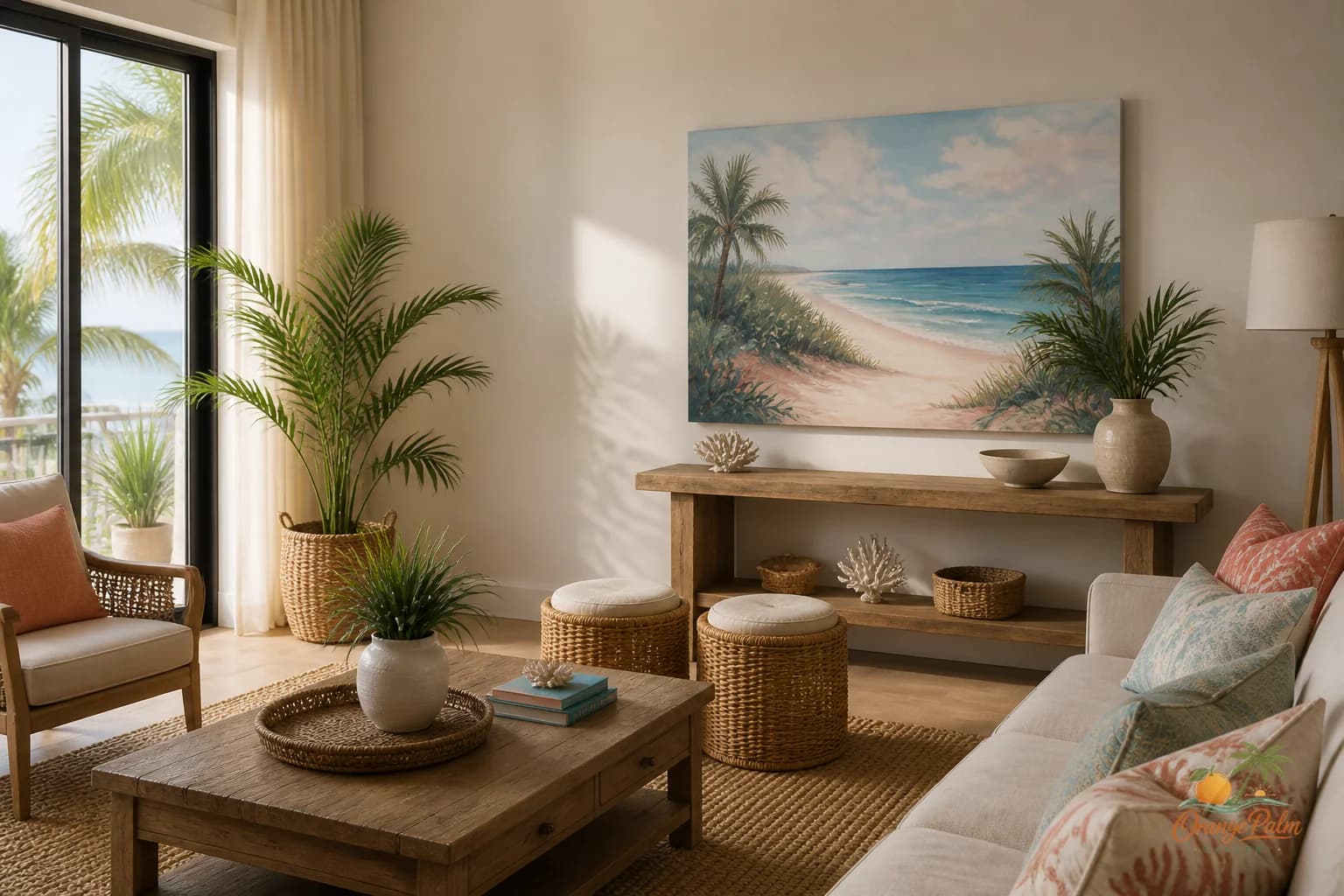
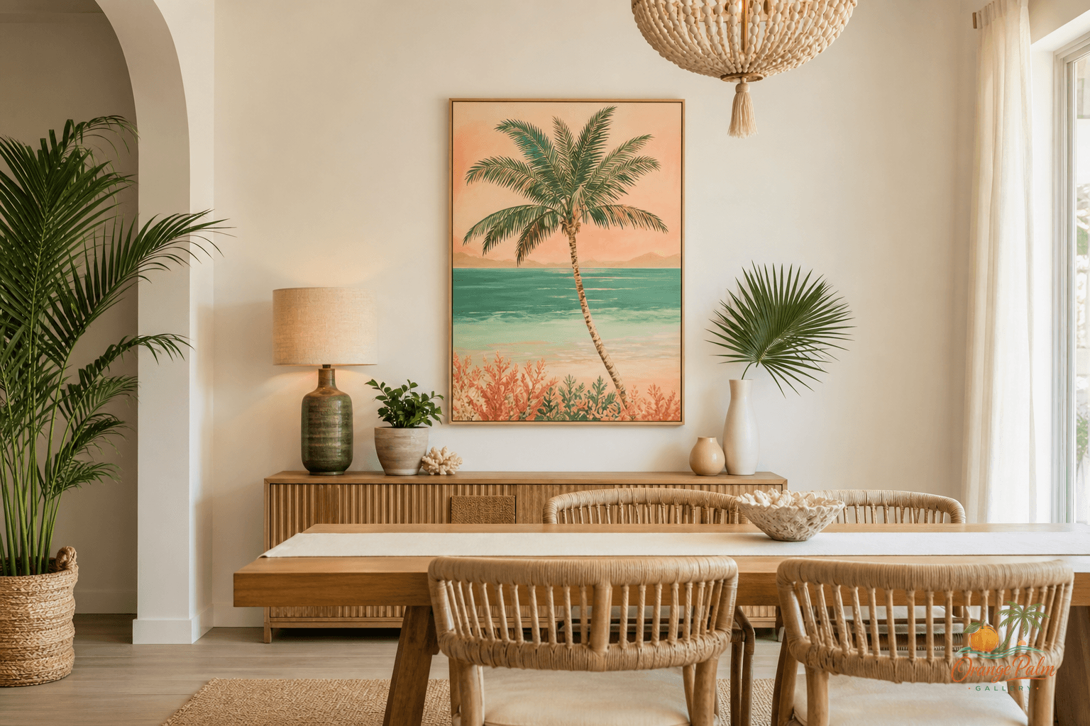
Wall Art Styling
The Sofa Wall Should Not Float Away
How to choose size, height, spacing, and color for wall art above a sofa in a calm modern coastal living room.
September 16, 2026 / 4 min read / Orange Palm Gallery Studio
Source note: this guide is written and maintained by Orange Palm Gallery Studio. Last updated September 16, 2026.
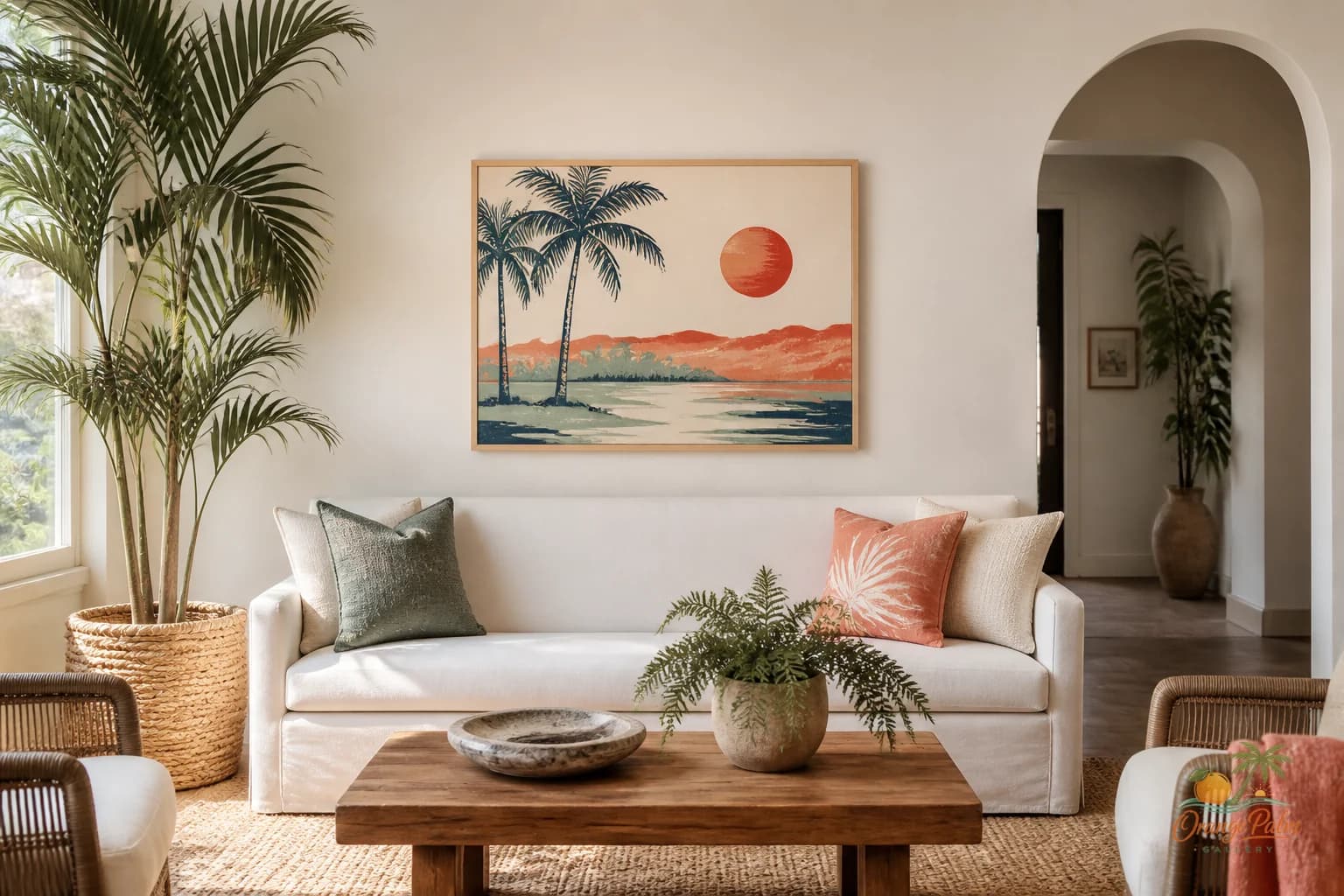
The sofa wall is one of those places where good art gets made to look nervous.
Not because the piece is wrong. Usually the problem is placement. The art is too high, too small, too scattered, or trying to decorate the entire wall instead of relating to the sofa underneath it. The result is a room with two separate conversations: furniture down low, art drifting somewhere above it.
A living room does not need that much distance.
Hang for the sofa, not the ceiling
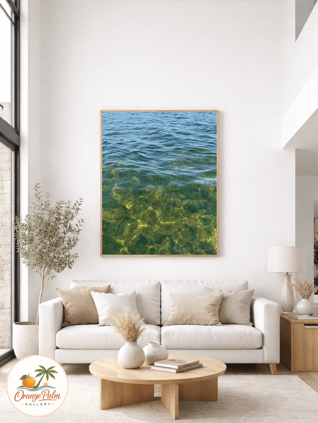
The most common mistake is hanging art at standing eye level when the main experience of the room is seated. Above a sofa, the artwork should feel tied to the furniture. A good starting point is to leave about 8 to 12 inches between the top of the sofa back and the bottom of the artwork.
That small gap matters. Too tight, and the wall feels cramped. Too wide, and the piece looks like it belongs to another room.
If your sofa has very low arms or a low back, you can give the art a little more breathing room. If the sofa is tall or deep, keep the art closer. The goal is not a perfect rule. The goal is visual gravity.
Size is not a personality test
People often choose art that is too small because they are afraid of overwhelming the room. Fair. Oversized art can get loud fast. But tiny art above a full sofa has its own problem: it makes the wall feel accidental.
For one piece, aim for artwork that is roughly two thirds the width of the sofa. It does not need to stretch edge to edge. In fact, it usually should not. A little side space keeps the arrangement relaxed.
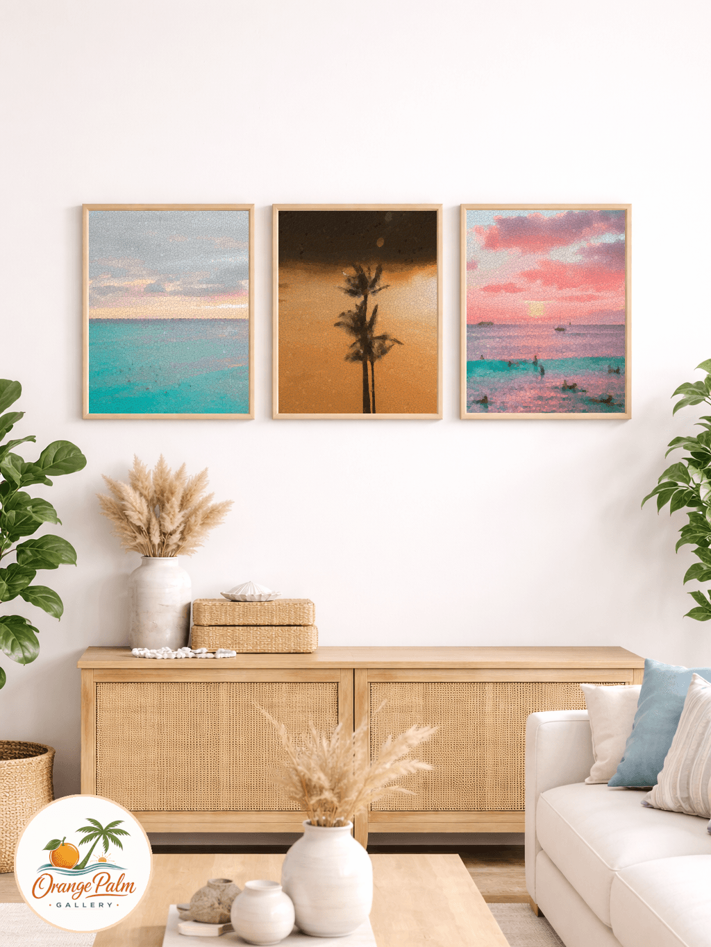
For a pair or trio, think of the group as one shape. The total width matters more than each individual piece. Three modest prints with tight spacing can hold the wall better than one small print floating alone.
Gallery walls need even more discipline. They should not become a scrapbook cloud. Keep the outer shape clean, keep spacing consistent, and let one or two pieces carry more visual weight. A gallery wall above a sofa still has to read as a single decision from across the room.
Florida light changes the math
In bright coastal rooms, pale art can disappear if the wall, sofa, and rug are all sitting in the same warm neutral range. Sand, cream, and soft beige are beautiful, but they need contrast somewhere.
That contrast does not have to be black and dramatic. A line of ink green, a deeper palm shade, a terracotta coral note, or a denser shape can be enough. The point is to give the eye something to land on when sunlight washes across the room.
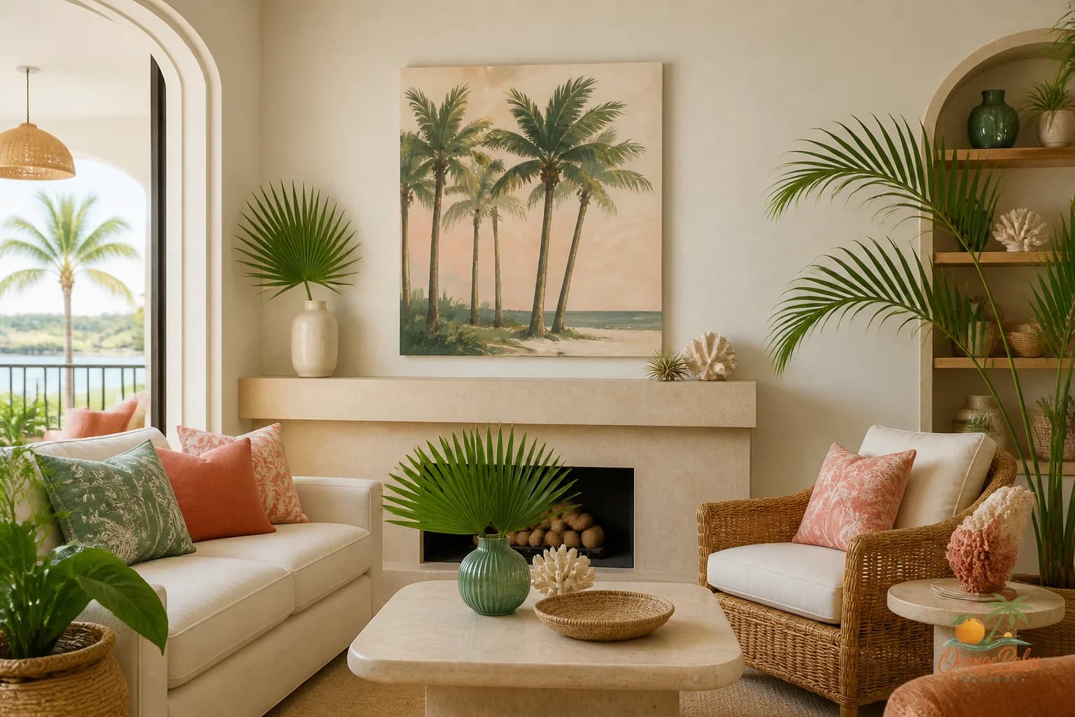
This is where Florida inspired wall art can be calm without going blank. Think warm white, sand, palm green, muted coral, and a little ink. Not a beach theme. More like the feeling of late afternoon light after the glare has softened.
Stop matching the pillows exactly
Matching art to pillows is one of those ideas that sounds safe and often looks stiff. The room starts to feel like a set.
A better move is repetition without copying. If the sofa has a warm linen tone, let the art pick up a warmer ground or a soft sand color. If there is green in a plant nearby, echo it lightly in the artwork. If the rug has a small rust or coral thread, one small warm note on the wall can be enough.
The art should belong to the room, not obey it.
One large piece or several smaller ones
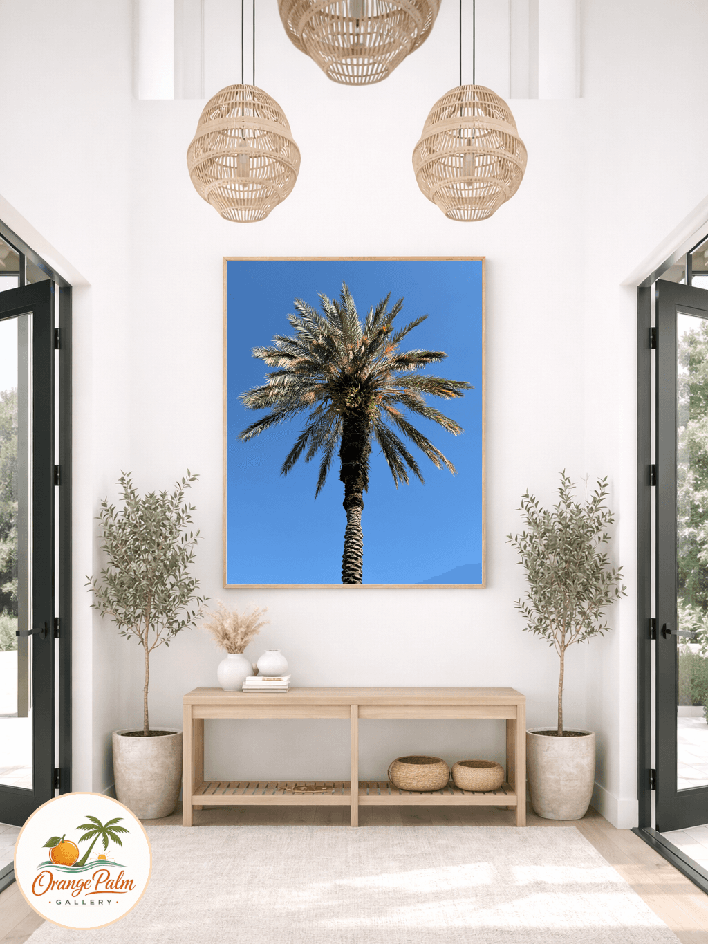
One large piece gives the sofa wall calm authority. It is best when the room already has texture from woven shades, natural wood, books, plants, or layered textiles. The art can stay simple because the room is doing some of the talking.
A pair works well when the sofa is long and the room wants rhythm. Keep the gap narrow enough that the two pieces feel connected. If they drift too far apart, they start acting like separate windows.
A gallery wall is strongest when the sofa is simple and the room needs a little movement. It should still have a clear boundary. The mistake is adding one more frame every time the wall feels off. Usually the fix is not more art. It is better spacing, better scale, or removing the weakest piece.
The quick studio check
Stand at the main entrance to the living room and squint. Does the sofa and art read as one zone, or does the wall art hover above everything like it missed the meeting?
Then sit where people actually sit. If the piece feels comfortable from the sofa, you are closer than most rooms ever get.
The sofa wall does not need drama. It needs enough scale to hold the furniture, enough contrast to survive daylight, and enough closeness to feel intentional. That is the quiet work of good wall art.
Explore Orange Palm Gallery pieces for calm, modern Florida inspired homes at https://orangepalmgallery.com/?utm_source=mdx.