Wall Art Styling
The Wall Beside the Slider Needs Restraint
How to style wall art beside a sliding glass door with scale, spacing, color, and restraint for a calm Florida living room.
August 5, 2026 / 4 min read / Orange Palm Gallery Studio
Source note: this guide is written and maintained by Orange Palm Gallery Studio. Last updated August 5, 2026.
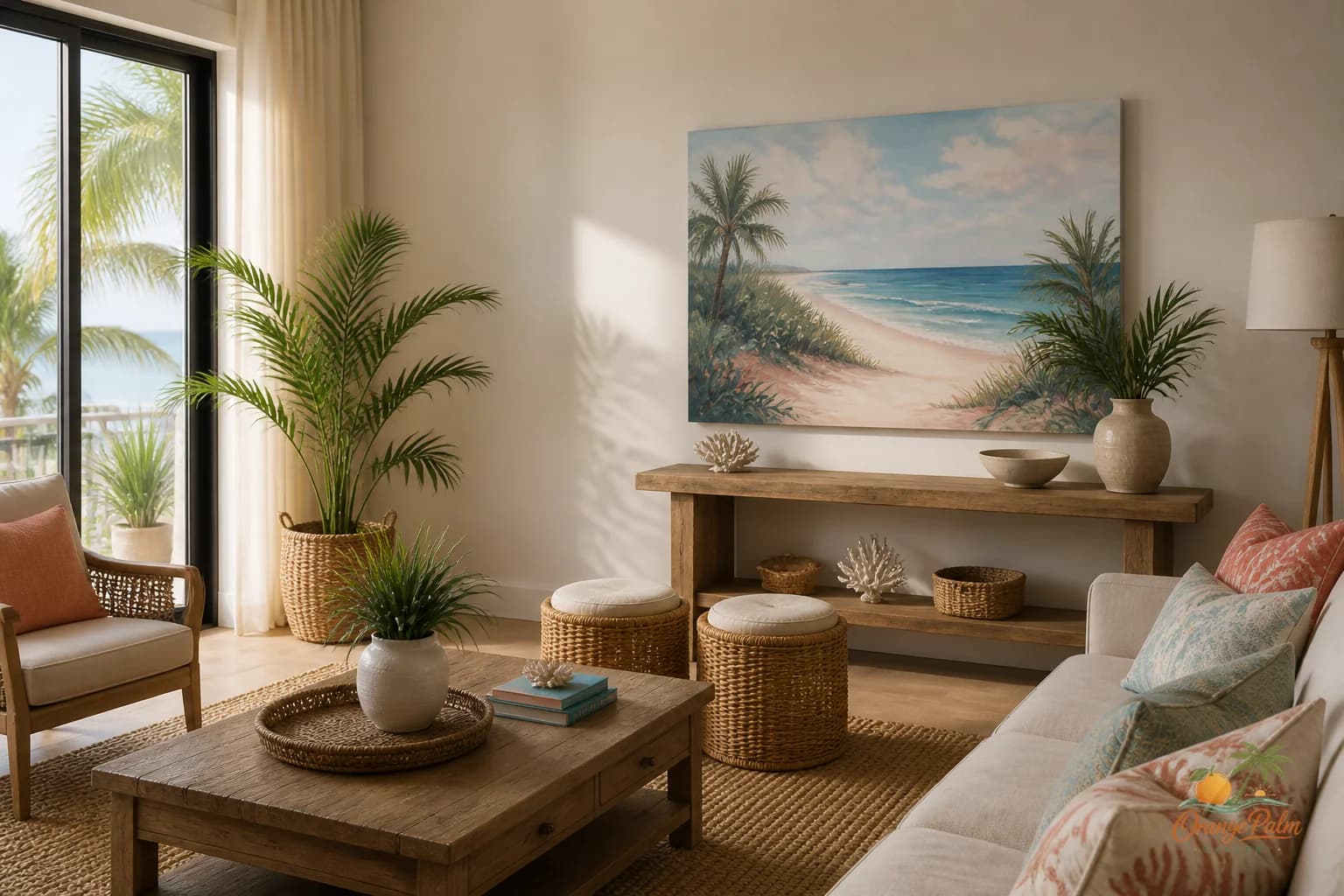
Florida rooms often have one wall that does not behave like a normal wall: the skinny stretch beside a sliding glass door.
It catches glare. It sits next to curtains or vertical blinds. It borrows attention from the patio, the palms, the pool light, or whatever patch of sky is doing the most that afternoon. And because it looks unfinished, people are tempted to overcorrect.
That is usually where the wall gets worse.
The wall beside the slider is not empty space begging for decoration. It is a visual hinge between the room and the outside light. Treat it that way and one piece of 2D wall art can make the whole corner feel calmer. Treat it like a leftover gallery wall zone and it starts looking like the room could not decide where to stop.
Start by respecting the door
A sliding glass door already has a strong shape: tall, vertical, reflective, bright. The art beside it should not try to compete with that. A loud cluster of small pieces can look fussy because the door is already making lines, reflections, and movement.
One calm piece usually works better here than a busy arrangement. Not because minimalism is automatically better, but because this wall has less visual privacy than most walls. It is seen against daylight, moving curtains, outdoor color, and often the traffic path in and out of the room.
The tradeoff is simple: you get less decoration, but more composure.
Use the curtain stack as a boundary
Before choosing placement, look at where the curtain or blind actually rests when open. That edge matters more than the architectural edge of the glass.
If the curtain stack eats into the wall, do not squeeze art into the remaining sliver. That usually makes the piece feel apologetic. Leave breathing room between the textile and the art, even if that means choosing a smaller piece or moving the art slightly farther into the room.
A good rule: the art should feel placed beside the slider, not trapped by it.
If the wall is wide enough, a vertical piece can echo the height of the door without copying it. If the wall is short, a modest horizontal piece can work, but keep it low enough to connect to the furniture nearby. Floating art high beside a tall door can make the entire wall feel jumpy.
Let the outdoor color inform the palette
This is one of those places where Florida inspiration can be subtle and still carry the room.
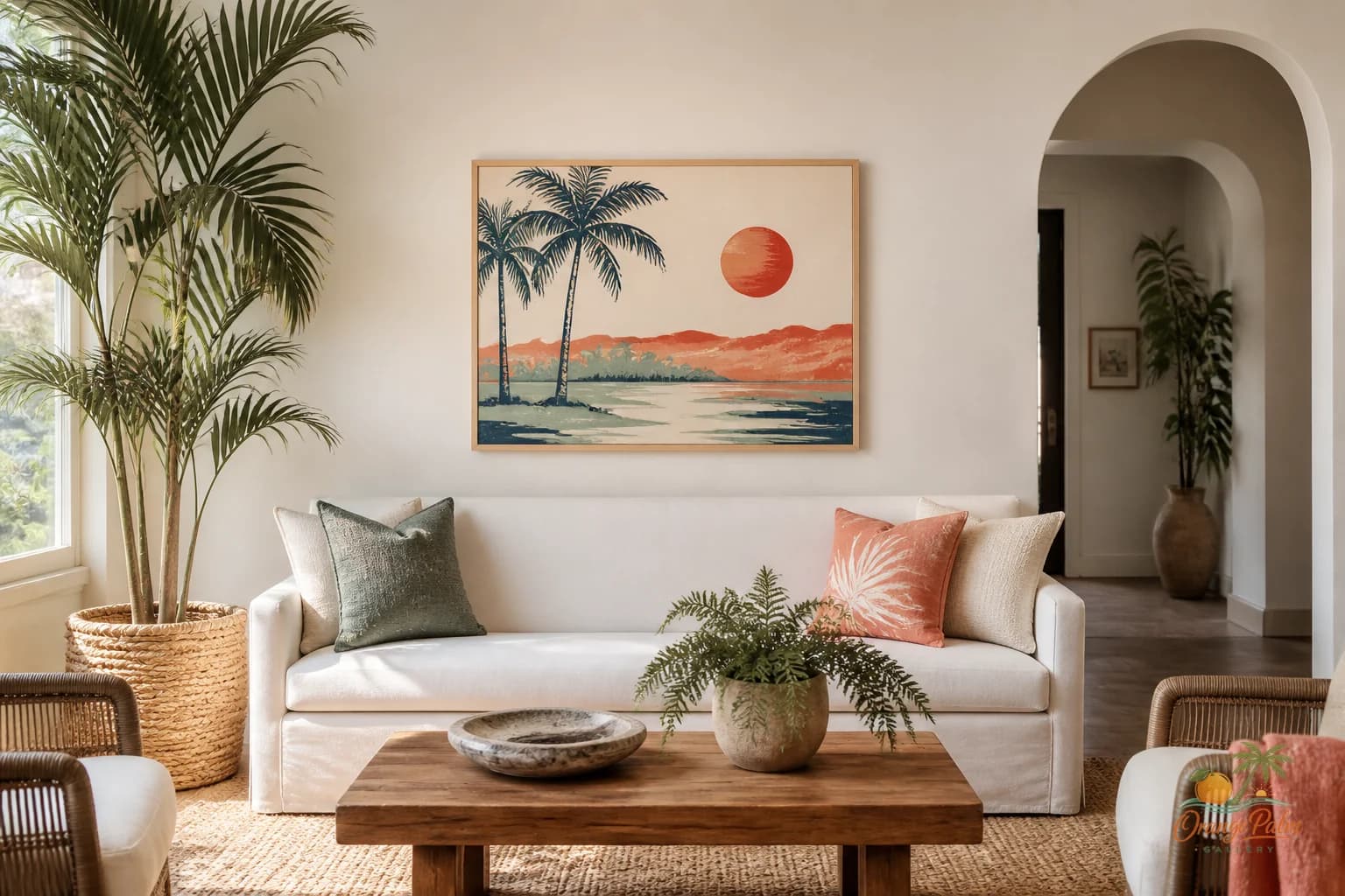
If the view outside is heavy with green, try art with warm white, sand, soft coral, muted peach, or a quieter palm green. If the room already has rattan, linen, oak, or warm tile, a sandy palette keeps the wall connected without shouting coastal theme at everyone.
What people get wrong is thinking the art has to repeat the view exactly. It does not. A palm outside the door does not require a palm on the wall. Sometimes the better move is a piece that catches the feeling of Florida light instead: warm, flat, calm, a little sun washed.
That is where 2D wall art earns its place. It can soften the hard rectangle of glass without turning the corner into a beach souvenir shelf.
Watch the glare
The prettiest placement at noon may be the worst placement at five.
Sliding doors throw light sideways, especially in late afternoon. Before committing, stand in the room at the time you actually use it. If the wall gets blasted with reflection, avoid anything too dark, glossy, or visually dense. A softer composition will survive glare better than a piece that depends on tiny details.
This is also why the wall beside a slider is not ideal for a crowded gallery arrangement. Multiple small surfaces mean multiple little glare problems. One confident piece is easier on the eye.
Tie it to nearby furniture, not the glass alone
The door is the loud neighbor, but the art still belongs to the room.
If there is a sofa near the slider, relate the art to the sofa height. If there is a console, plant stand, woven basket, or floor lamp, let the art complete that small zone. The piece should help the furniture feel intentional, not act like a label for the door.
A simple pairing can be enough: one art piece, one lamp, one plant with a good shape. Stop there. The corner does not need a tray, a stack of books, a shell bowl, and a sign telling everyone to relax.
Too much styling near a sliding door quickly becomes visual static because the outside is already part of the room.
The quiet win
A well placed piece beside the slider does not announce itself from across the house. It steadies the edge of the room. It gives the eye somewhere warm to land before the bright view takes over.
That is the job.
Not every wall needs to become a feature wall. Some walls need to behave like a pause.
For more calm, Florida-inspired wall art and styling notes, explore Orange Palm Gallery here: https://orangepalmgallery.com/?utm_source=mdx