Wall Art Styling
Hallway Wall Art Should Slow the Eye, Not Block the Walk
A practical studio note on choosing and placing hallway wall art so a narrow passage feels calm, intentional, and easier to move through.
August 7, 2026 / 5 min read / Orange Palm Gallery Studio
Source note: this guide is written and maintained by Orange Palm Gallery Studio. Last updated August 7, 2026.
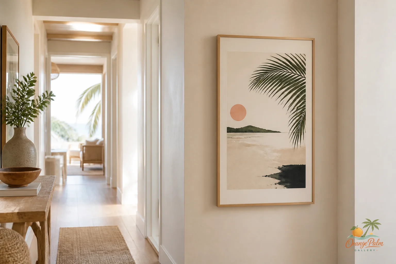
A hallway is not a storage tunnel, but it is also not the place to prove how much art you own.
That is where people usually go wrong. They treat the hallway like bonus wall space, then fill every blank stretch until the whole thing feels like a corridor in a busy rental house. Too many tiny frames, too many competing colors, too much visual chatter at shoulder height.
A hallway has a job before it has a style. It moves people from one room to another. Good hallway wall art respects that movement. It gives the eye one or two calm places to land without making the passage feel narrower.
For Orange Palm Gallery, I like thinking about hallway art almost like a breeze line. It should move with you, not stop you cold.
Quick answer
The strongest hallway wall art ideas use one calm landing point, generous spacing, and color that connects nearby rooms without crowding the walkway. In a narrow hallway, art should slow the eye just enough to make the passage feel cared for.
Start with the walk, not the wall
Before choosing art, walk the hallway at a normal pace. Notice where your eye naturally goes.
Maybe it lands at the end wall. Maybe it catches a patch of afternoon light. Maybe there is one long side wall that feels bare but not important enough for a full gallery arrangement.
That is your answer. The art should belong to the path your eye already takes.
The mistake is centering art on the largest empty wall just because it is empty. Empty is not always a problem. In a narrow hallway, blank space can be the thing that keeps the room breathing.
If the hallway is short, one confident piece is usually better than a row of small ones. If the hallway is long, two or three related pieces can work, but they need enough spacing to feel like rhythm, not inventory.
Keep the profile quiet
A hallway is a close viewing space. You are not standing back from the art the way you might in a living room. You pass beside it, often within arm’s reach.
That means the composition can be simple and still feel rich.
Look for soft contrast, clean shapes, and color that does not fight the flooring, trim, or doorways. Warm white, sand, palm green, coral, and deep ink tones can work beautifully in a Florida inspired home because they bring warmth without shouting.
A hallway does not need beach signs or a literal vacation mood. A small coastal reference can do more: a curved palm shape, a sun washed palette, a loose botanical line, a warm coral accent against quiet neutral space.
The goal is not to decorate the hallway. The goal is to make the transition between rooms feel cared for.
Hang for moving eyes
Standard eye level is a decent starting point, but hallways need a little more judgment.
If the ceiling is low, hanging art too high makes the corridor feel squeezed. If the hallway is narrow, oversized vertical art can feel like it is leaning into the walkway. If there are multiple door frames, a piece that ignores those lines can look jumpy.
I usually like hallway art with its center around eye level, then adjusted slightly based on nearby trim, light switches, and door casing. The art should feel aligned with the architecture, not pasted over it.
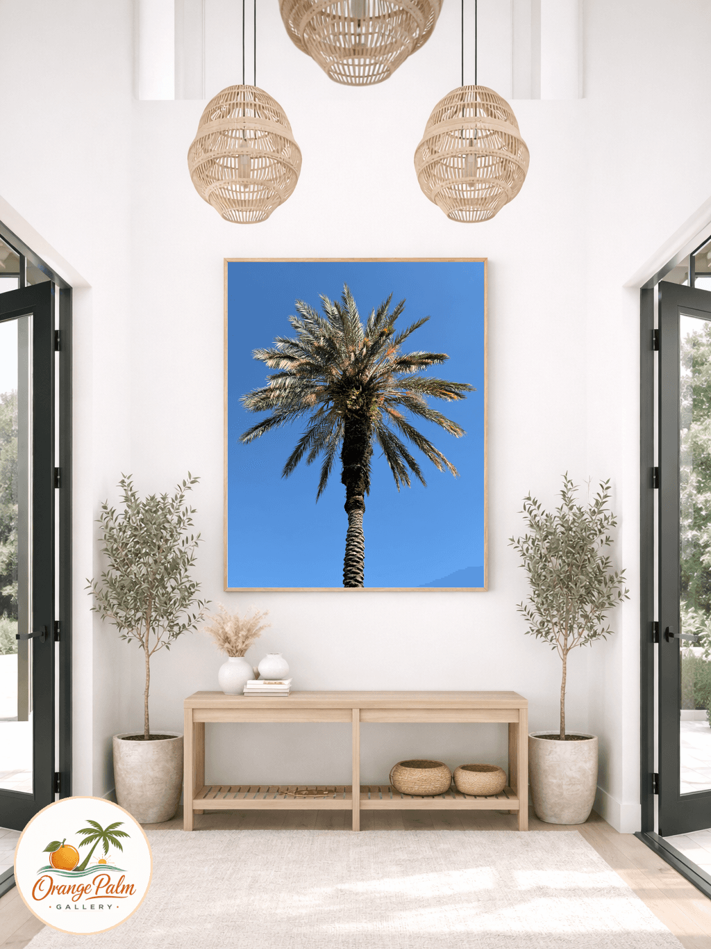
For a long side wall, a horizontal piece can help the hallway feel calmer and less chopped up. For an end wall, a single vertical or square piece can act like a soft landing point. That end wall is powerful because you see it from a distance. It does not need much.
Leave room for the wall to be a wall
This is the tradeoff: restraint can feel unfinished at first.
Especially if you are used to filling space, one piece on a hallway wall may look too quiet for a day or two. Let it sit. Hallways change as light moves through them. Morning shadow, afternoon brightness, and evening lamps all affect how the art reads.
A calm piece with enough blank wall around it often gets better once your eye stops asking for more.
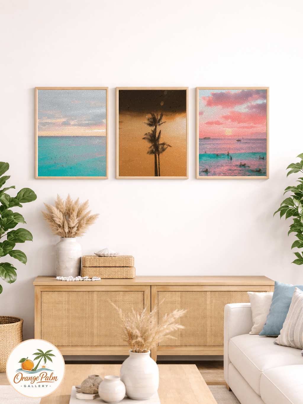
If you want a small grouping, keep the spacing consistent and the palette tight. Three pieces with shared tones will usually feel better than five unrelated pieces fighting for attention. Repetition helps in a hallway because movement is already part of the experience.
Think of color as a thread
Hallway wall art is a good place to connect rooms without matching them exactly.
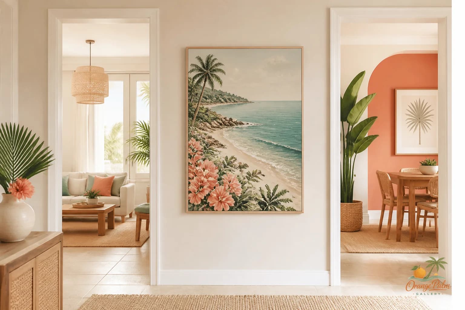
If the living room has palm green accents and the bedroom has warm white bedding, a hallway piece with both tones can make the home feel more intentional. It becomes a visual thread, not a statement wall.
That is where Florida inspired styling works especially well. You can use sun warmed neutrals, soft coastal color, and botanical shapes without turning the hallway into a theme.
The art should feel like it belongs to the house on a normal Tuesday, not only when guests come over.
A simple hallway formula
If the hallway feels narrow, choose one calm piece and give it generous breathing room.
If the hallway feels long, use two or three pieces with related color and similar visual weight.
If the hallway ends in a blank wall, treat that spot as the main moment and keep the side walls quieter.
If the hallway has strong natural light, let the art catch it rather than compete with it.
Most of all, do not punish the hallway for being useful. It does not need a dramatic reveal. It needs proportion, warmth, and a little visual pause between rooms.
That is enough.
Explore more warm, modern Florida inspired wall art and styling notes at Orange Palm Gallery.