Wall Art Styling
Guest Room Wall Art Should Not Feel Like Leftovers
A practical journal note on styling guest room wall art above a dresser with warm coastal color, generous spacing, and a quieter Florida mood.
July 22, 2026 / 4 min read / Orange Palm Gallery Studio
Source note: this guide is written and maintained by Orange Palm Gallery Studio. Last updated July 22, 2026.
Guest rooms get punished by good intentions.
They become the place for the extra lamp, the almost-right bedding, the old chair that does not fit anywhere else, and the framed print that survived three moves because nobody disliked it enough to donate it. None of that is a crime. A guest room does not need to behave like a boutique hotel. But wall art is usually where the room gives itself away.
If the art feels like an afterthought, the whole room starts to feel temporary.
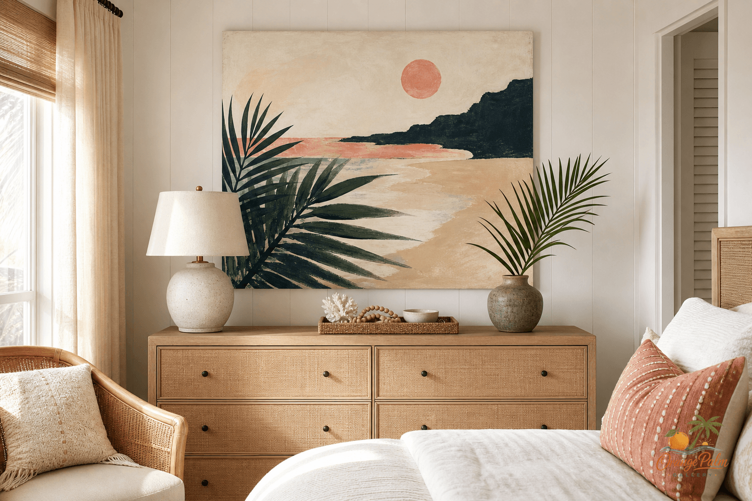
The easiest fix is not a gallery wall. It is not a theme. It is one calm piece placed where the guest will actually notice it: above the dresser.
Quick answer
The best guest room wall art ideas start with one intentional piece, enough space around the frame, and a clear relationship to the dresser, bed, or chair below it. In a calm coastal guest room, wall art should make the space feel considered without turning it into a full decorating scheme.
Why the dresser wall works
A bed wall can be tricky. If the headboard is tall, the art can float too high. If the room is small, the wall above the bed can start to feel heavy. A dresser wall is different. It already has a natural base, which means the art has something to relate to.
That relationship is what most people miss. They center art on the blank wall instead of centering it over the furniture. The result is a print that looks technically placed but visually disconnected.
Above a dresser, the art should belong to the dresser first and the wall second. Let the furniture set the width. A single horizontal piece can stretch the wall quietly. A vertical piece can work if the dresser is narrow or if a lamp, tray, or small stack of books balances the other side.
The goal is not symmetry for its own sake. The goal is a little visual confidence.
Keep the Florida mood quiet
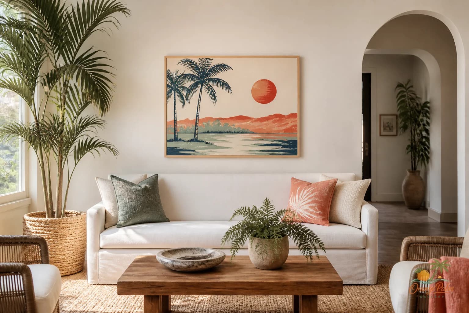
Florida-inspired decor does not have to announce itself with beach words, shell clusters, or aggressive turquoise. A guest room usually benefits from a softer read: warm white, sand, palm green, a touch of coral, and enough ink or deep green to keep the palette from going sugary.
Think of the kind of color you see when late afternoon light hits a stucco wall or when palm shadows move across tile. That is more interesting than a literal vacation poster.
For Orange Palm Gallery, that quieter Florida feeling is usually the better lane: modern, warm, lightly coastal, and handmade in spirit. If you want to explore the studio’s visual direction, you can visit Orange Palm Gallery without turning the room into a sales floor.
The scale test
A common guest room mistake is choosing art that is too small because the room is small. Small room does not mean tiny art. Tiny art often makes a room feel more nervous.
Over a dresser, the art can usually be about two thirds to three quarters of the dresser width. It does not have to hit that exactly, but it should feel connected. If the piece is much smaller, give it help: a taller lamp, a vase with one branch, or a shallow tray below it can create a fuller composition.
Hang it low enough to talk to the dresser. If there is a huge gap between the dresser top and the frame, the art starts drifting away. A modest gap feels more intentional and more relaxed.
This is especially useful in a guest room, where the dresser often doubles as a landing zone for keys, sunglasses, a book, or a folded sweater. The art above it gives that small daily mess a composed backdrop.
What people get wrong
They decorate for the imaginary guest instead of the actual room.
That is how guest rooms end up with cheerful signs, generic coastal prints, and too many matching pieces. The room does not need to perform hospitality. It needs to feel considered.
One good wall art choice can do more than five small decorative objects. It sets the color temperature. It gives the eye somewhere to rest. It makes the dresser feel like part of the room instead of a storage object pushed against a wall.
A guest room also does not need to be bland to be restful. A coral accent can be beautiful if it is handled with restraint. Palm green can feel grown up when paired with warm white and sand. Ink lines can add structure so the room does not dissolve into beige.
The tradeoff is simple: fewer pieces, better placement.
A small styling recipe
Start with the dresser.
Clear the top except for what belongs there. Add one useful lamp if the room needs softer evening light. Keep one low object nearby, maybe a small bowl or book stack, so the surface does not feel staged flat.
Then place one piece of wall art above it. Let the color in the artwork repeat once in the room, maybe in a pillow, a throw, or the spine of a book. Do not repeat every color. That is how a room starts looking packaged.
If the artwork has palm green, let it echo in a plant or textile. If it has coral, let that coral stay small. If it has sand tones, let the bedding and wood finish carry the warmth.
The guest room should exhale when the door opens.
Not because everything matches. Because one wall made a decision.
For a related bedroom surface, read The Dresser Wall Is Not a Mini Gallery.