Wall Art Styling
The Dresser Wall Is Not a Mini Gallery
A practical Orange Palm Gallery journal on choosing and placing wall art above a bedroom dresser without turning the wall into visual clutter.
July 31, 2026 / 4 min read / Orange Palm Gallery Studio
Source note: this guide is written and maintained by Orange Palm Gallery Studio. Last updated July 31, 2026.
The dresser wall gets treated badly because it looks useful. There is a flat surface, a blank wall, maybe a lamp, maybe a mirror, maybe a small stack of books that keeps moving from one side to the other. So the instinct is to keep adding. A framed print. A tray. A candle. Another small print. Something leaning. Something hanging. A plant that is somehow both too tall and too small.
That is how a bedroom starts to feel busy even when every object is technically pretty.
A dresser wall does not need to become a mini gallery. Most of the time, it needs one calm 2D piece with enough scale to hold the wall and enough quiet to let the bedroom stay a bedroom.
Quick answer
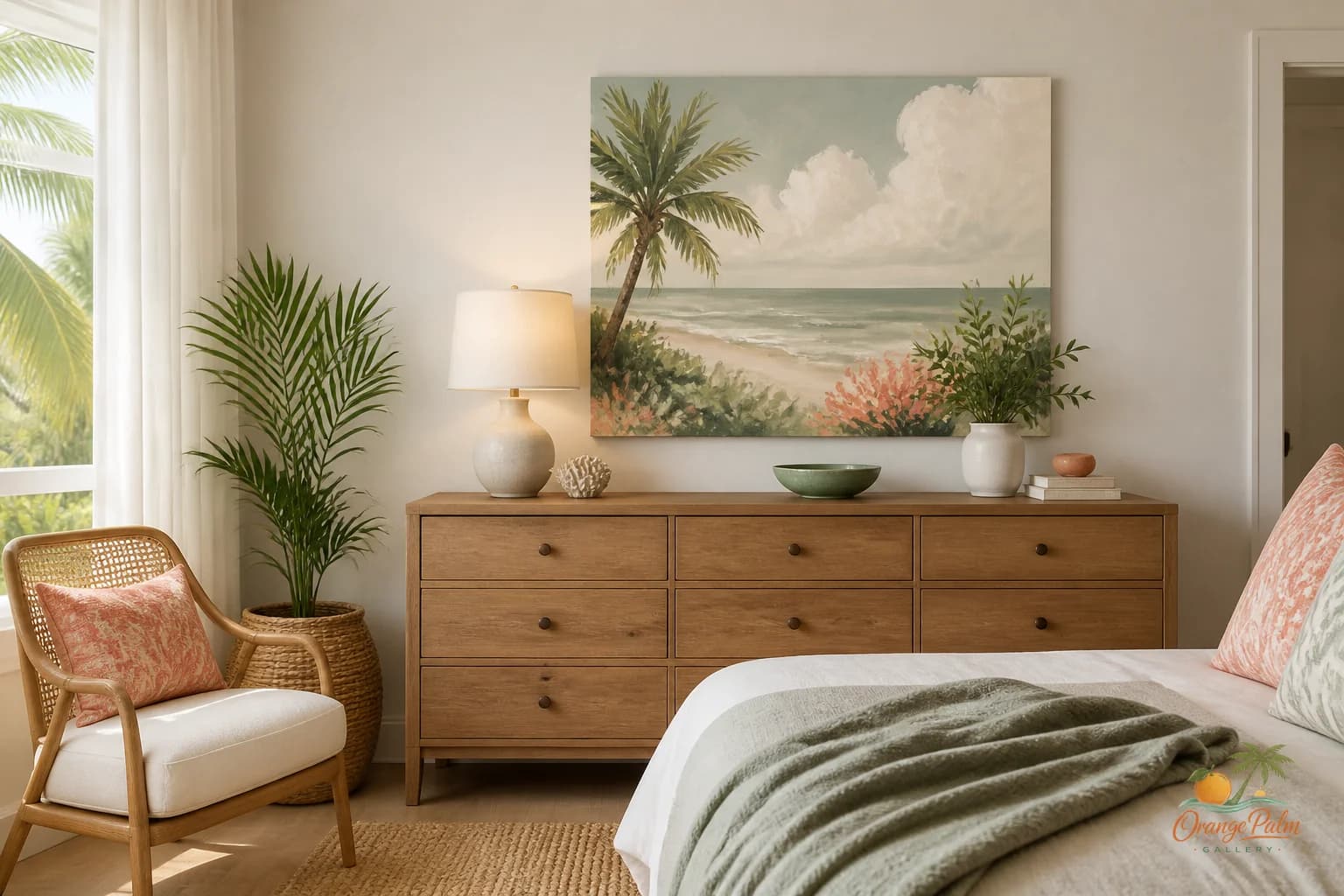
The best bedroom dresser wall art ideas start with one calm piece sized to the dresser, a lower hanging height, and enough open surface space below it. Treat the dresser as the anchor, then let the wall art set the mood without turning the bedroom into a mini gallery.
Start with the dresser, not the wall
The biggest mistake is centering art on the blank wall instead of relating it to the dresser. The dresser is the visual anchor. The art should belong to that piece of furniture first.
If the dresser is wide and low, a horizontal artwork often feels more settled. If the dresser is narrow or tall, a vertical piece can work, but it still needs width in the composition around it. That width can come from a lamp, a bowl, a folded textile, or simply open surface space.
What looks wrong is a tiny print floating high above a heavy dresser. The furniture feels grounded. The art feels nervous.
A better move: hang the artwork low enough that it reads as part of the dresser arrangement. Not touching. Not cramped. Just close enough that your eye connects the two.
Give the top of the dresser a job
The surface below the art should not compete with it. It should support it.
Think in three layers:
1. The wall art gives the area its mood. 2. The dresser surface gives it rhythm. 3. The negative space keeps it from feeling styled to death.
A single lamp on one side, a shallow dish or small stack on the other, and open space in the middle can be enough. The art does not need five decorative objects below it to prove it belongs there.
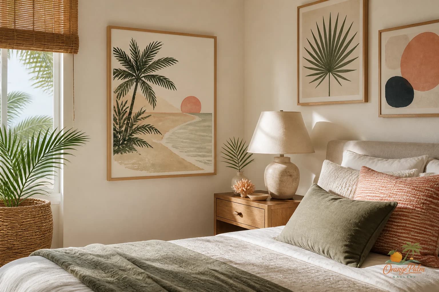
This is especially true in a Florida inspired bedroom, where light does a lot of the decorating for you. Warm white walls, sand colored wood, a palm green accent, a coral note, and a little ink linework can make the space feel finished without filling every inch.
Be careful with mirrors
A mirror above a dresser is common, and sometimes it is the right call. But a mirror is not automatically calmer than art. It reflects movement, doorways, ceiling fans, laundry piles, and whatever is happening across the room.
If the dresser faces a closet, a bathroom, or a busy corner, wall art may actually be quieter.
A calm print gives you a fixed view. It can soften the wall without reflecting the unfinished parts of the room back at you. That is a tradeoff worth naming. Mirrors add light and utility. Art adds mood and stillness. Pick the one your room actually needs.
Let Florida color stay restrained
Coastal bedroom decor can go wrong when every cue becomes literal. Shells, waves, rope, bright turquoise, and beach signs all fighting for attention is not rest. It is a souvenir shop with pillows.
For a dresser wall, the better Florida reference is usually quieter: a warm sand field, a soft coral shape, a palm green curve, an ink detail, a washed warm white ground. Enough to bring in the climate. Not so much that the room turns thematic.
That restraint is part of what makes modern coastal decor feel grown up. It suggests the place instead of announcing it.
Leave more wall than you think
A dresser wall can handle breathing room. In fact, it often needs it. Bedrooms collect visual noise quickly: bedding, nightstands, clothing, curtains, doorways, hardware, lamps, chargers. The wall above the dresser should not add to the static.
One piece, well placed, can make the whole corner feel intentional. The space around it is not empty. It is doing work.
A useful check: step into the bedroom from the doorway and look at the dresser for three seconds. If your eye jumps between five small things, simplify. If your eye lands on the artwork, then settles into the dresser and the room, you are close.
A calmer way to style it
Try this arrangement:
- one medium to large 2D artwork above the dresser
- the bottom edge hung close enough to relate to the furniture
- one taller object on one side, like a lamp or vase
- one low object on the other side
- clear space across at least a third of the dresser top
- a palette pulled from warm white, sand, palm green, coral, and ink
That is not a formula. It is a way to stop the dresser from becoming a storage surface with frames attached.
The dresser wall is often the last wall people think about, but it affects the mood of the whole bedroom. It is what you see while getting dressed, folding laundry, opening drawers, passing through the room. It should feel steady.
Orange Palm Gallery is built around that kind of quiet visual work: warm Florida references, modern wall art, and pieces that help a room settle rather than shout. Explore more at Orange Palm Gallery.