Wall Art Styling
The Bed Wall Does Not Need a Crown
How to style wall art above a bed with calm proportion, warm coastal color, and enough quiet space for the room to breathe.
October 5, 2026 / 4 min read / Orange Palm Gallery Studio
Source note: this guide is written and maintained by Orange Palm Gallery Studio. Last updated October 5, 2026.

The wall above the bed gets overtreated because it looks important. It is centered. It is symmetrical. It is the first wall people notice in listing photos and bedroom reveal videos. So the instinct is to crown it.
Big arch. Big quote. Big triptych. Big drama.
Most bedrooms do not need that. They need the opposite: a visual exhale.
The bed is already the largest object in the room. It has volume, fabric, pillows, seams, shadows, and usually a headboard. When the art above it tries to become another piece of furniture, the whole wall starts shouting. A bedroom should not feel like it is presenting itself.
Keep the art close enough to belong
The most common mistake is hanging the art too high. A lonely piece floating near the ceiling makes the bed feel disconnected, like the room has two separate conversations happening at once.
Above a headboard, the art usually feels better when it sits close enough to relate to the bed. Not touching. Not crammed. Just close enough that the headboard, pillows, and art read as one quiet zone.
Think of the artwork as the last soft layer of the bed, not a sign hanging over it.
If the headboard is low, you have more room to play. If the headboard is tall, the art needs more restraint. A tall headboard with oversized art above it can turn the entire wall into a monument. That may work in a hotel. At home, it can feel weirdly formal when all you want is clean sheets and a slower morning.
Choose a shape that calms the wall
A low horizontal piece is often the easiest choice above a bed. It follows the line of the mattress and headboard, which makes the wall feel settled. It does not compete with the vertical height of the room.
A pair can work too, especially over a queen or king bed, but the spacing matters. Too much gap between two pieces creates a little visual crack right where the room should feel composed. Keep the pair close enough that it reads as a set, not two unrelated thoughts.
A single vertical piece can be beautiful, but it asks for more care. It brings energy upward. That can be useful in a small room with low ceilings, but it can also make the bed feel narrow or overly staged. If you use a vertical piece, keep the color quieter and let the scale breathe.
Let the color come from the room, not the trend
For a Florida inspired bedroom, the easy trap is going too beachy. Blue everywhere. Palm leaves everywhere. Sand dollars if nobody stops you.
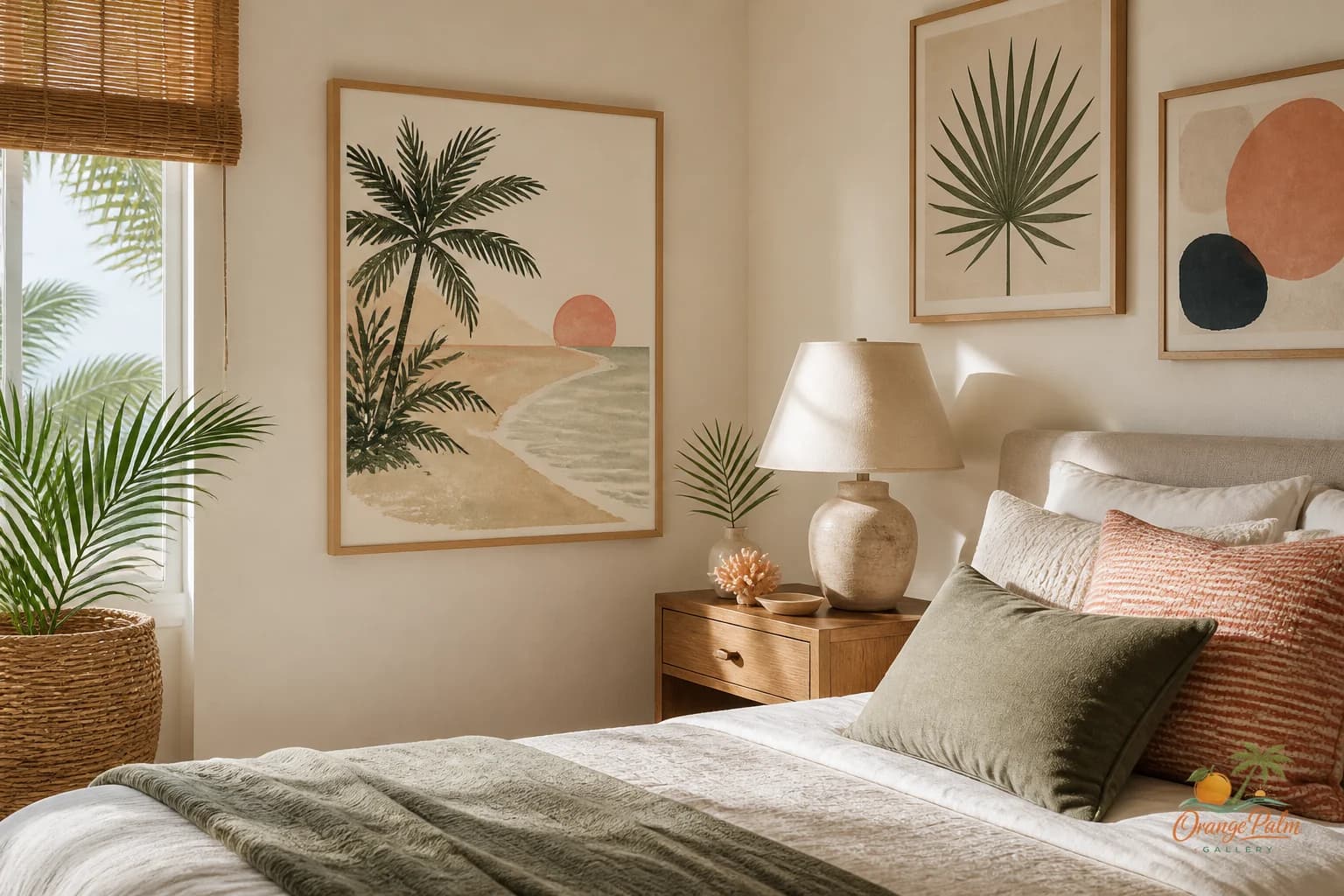
A coastal bedroom does not need to announce the coast. It can borrow the temperature instead: warm white, pale sand, muted coral, washed palm green, a little ink for structure. Those colors feel close to Florida without turning the room into a vacation rental.
The art above the bed is a good place to repeat one color that already exists in the room. A green pulled from a plant. A coral note from a pillow edge. A tan that matches the woven shade. Repetition makes the room feel intentional without making it match too hard.
What people get wrong is thinking the art has to introduce the theme. Usually, the art should edit the theme down.
Match the weight of the bed, not the wall
Scale is not only about wall size. It is about the visual weight of the furniture below it.
A bed with a heavy wood headboard can handle art with stronger contrast or a larger format. A bed with a slim upholstered headboard may need something lighter, with more negative space. White bedding can support softer art because the whole area already feels open. Dark bedding can ask for a paler piece above it so the bed wall does not become a block.
Before choosing size, look at the bed as a mass. Then choose art that balances that mass instead of simply filling the empty drywall.
A good rule: the piece should feel connected to the width of the bed, but not as wide as the bed itself. If it stretches too far, the wall starts to feel like a headboard extension. If it is too small, it looks accidental.
Leave some air above the art
Bedrooms need air. Not every inch above the bed has to be solved.
Leaving space above the artwork lets the ceiling stay quiet. It also keeps the art from feeling trapped between the headboard and crown molding. In a warm modern coastal room, that breathing room is part of the mood. It is the same reason linen looks better slightly relaxed than aggressively pressed.
The best above bed art does not finish the room with a punchline. It lowers the noise. It gives the wall a center without making the bed feel decorated for inspection.
If you are working through a bedroom wall and want pieces with that calmer coastal temperature, you can explore Orange Palm Gallery at orangepalmgallery.com.
The tradeoff is simple: dramatic art makes the bed wall memorable. Quiet art makes the bedroom usable. For a room built around sleep, I know which side I would rather live with.