Wall Art Styling
The Nightstand Wall Needs Softer Art
How to style the nightstand wall with calm, modern, Florida inspired wall art that feels restful instead of fussy.
August 21, 2026 / 5 min read / Orange Palm Gallery Studio
Source note: this guide is written and maintained by Orange Palm Gallery Studio. Last updated August 21, 2026.
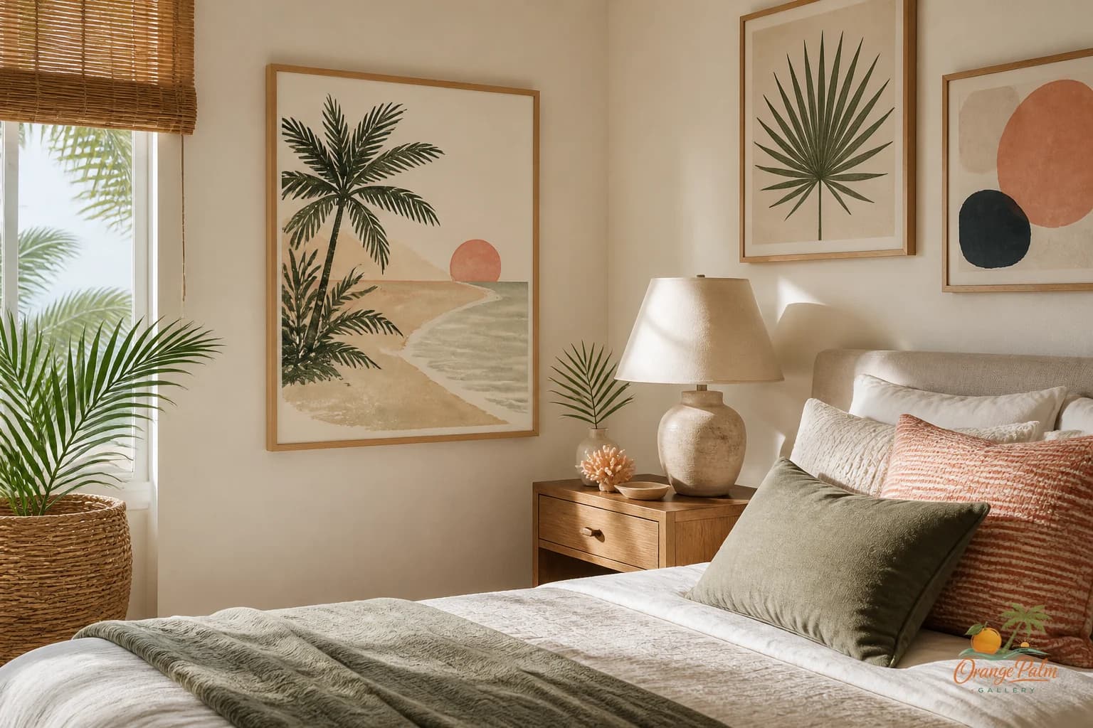
The wall by a nightstand gets treated like leftover space. A tiny print over the lamp. A pair of frames squeezed beside the headboard. Something cute because the room felt unfinished.
That corner is small, but it is not minor.
The nightstand wall sits right where the bedroom shifts from furniture to rest. It is close to the pillow, close to the lamp, close to the first thing you see when you turn into the room. If the art is too loud, too high, or too busy, the whole bedside zone starts to feel nervous. Not dramatic. Just slightly wrong.
For a calm bedroom, the art near the nightstand should do less than most people expect.
Quick answer
The best bedroom nightstand wall art ideas use softer color, generous but not oversized scale, and placement that relates to the lamp, headboard, and bedside table. Let the art make the corner restful instead of fussy.
Start with the lamp, not the wall
A common mistake is choosing art based on the empty rectangle above the nightstand. That makes sense on paper, but the lamp is already doing a lot of visual work. It has height, shade shape, glow, shadow, and sometimes a cord line. Add art without accounting for that, and the corner gets crowded fast.
Look at the nightstand as a stack:
- the surface
- the lamp
- the headboard edge
- the wall art
- the space above it
The art should sit inside that stack, not float like a separate decision.
If the lamp is tall or sculptural, choose quieter art with open space, softer contrast, and a shape that does not compete. If the lamp is low and simple, the art can carry a little more presence. The tradeoff is simple: either the lamp leads, or the art leads. When both try to lead, the bedroom loses its restfulness.
Keep the scale generous, not oversized
Small bedroom art often looks timid near a bed. Oversized art can feel like it is pressing down on the nightstand. The sweet spot is usually a piece that feels connected to the bedside furniture without swallowing it.
For a single piece above a nightstand, aim for art that feels slightly narrower than the nightstand or roughly aligned with the lamp and table together. It does not need to fill every inch. A little breathing room around the art is what makes the corner feel intentional.
If the wall beside the bed is narrow, a vertical piece can work beautifully. It echoes the lamp, pulls the eye upward, and gives the bed a sense of height. If the room already has a tall headboard, a horizontal or softly square piece may feel calmer.
What people get wrong is thinking bedroom art has to be symmetrical to feel finished. It does not. It has to feel balanced. Those are not the same thing.
Color should lower the volume
Bedroom wall art near the nightstand is not the place for every color in the room to show up at once. It is too close to the bed for that kind of visual chatter.
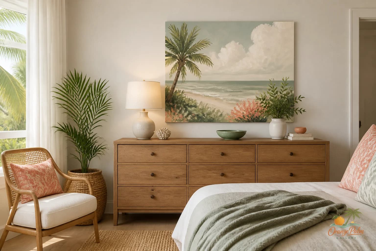
For a Florida inspired bedroom, I like colors that feel sun warmed rather than beach themed. Sand, warm white, palm green, muted coral, soft ink, pale shell tones. The point is not to shout coastal. The point is to make the room feel as if light has moved through it.
If your bedding is white or cream, a little warmth in the art keeps the corner from feeling sterile. If your bedding has pattern, go simpler on the wall. If the room already has woven texture, wood, cane, linen, or a rattan lamp, the art can stay clean and graphic.
A bedroom can handle contrast, but it needs quiet contrast. Think palm shadow on stucco, not billboard color.
One piece is often better than a tiny pair
A pair of small prints above two nightstands can work, especially in a very ordered room. But in many bedrooms, the pair starts to feel like punctuation marks. Dot, dot. Lamp, lamp. Frame, frame. The result is tidy but stiff.
One stronger piece on one side can be more interesting, especially if the other side has a taller lamp, a plant, stacked books, or a window nearby. You can also use related art on both sides without making them identical. Similar palette, different composition. That gives the room rhythm without making it feel staged.
The goal is not to make the nightstands match for a photograph. The goal is to make the bed feel held.
Hang it lower than you think
Art near a nightstand often gets hung too high because people center it on the wall instead of relating it to the furniture. Bedside art should have a relationship with the lamp, headboard, and table.
A good test: when you are standing at the doorway, does the art feel like part of the bed zone, or does it hover above it? If it hovers, lower it.
The bottom edge does not need to sit dangerously close to the lamp shade, but it should feel visually connected. A bedroom corner gets calmer when the objects speak to each other.
Let the art be the slowest thing in the corner
Nightstands collect life. A water glass, a book, hand cream, a charging cable, a pair of earrings. That is normal. Wall art can either add more busyness or give that small mess a calmer backdrop.
For this spot, I would rather use art with negative space, soft movement, imperfect line work, or a restrained coastal palette than something packed with detail. Handmade feeling matters here because the bedroom is intimate. Too slick can feel cold. Too decorative can feel noisy.
The nightstand wall is not asking for a statement. It is asking for a softer landing.
If you are rethinking a bedroom corner, start with the lamp, then the scale, then the color. The right art should make the room feel more settled before you can explain why.
Explore Orange Palm Gallery pieces for calm, modern Florida inspired homes at https://orangepalmgallery.com/?utm_source=mdx.