Wall Art Styling
The Home Office Wall Should Not Look Like a Lobby
How to style home office wall art with softer contrast, Florida inspired color, and enough visual quiet for video calls and real work.
September 30, 2026 / 5 min read / Orange Palm Gallery Studio
Source note: this guide is written and maintained by Orange Palm Gallery Studio. Last updated September 30, 2026.
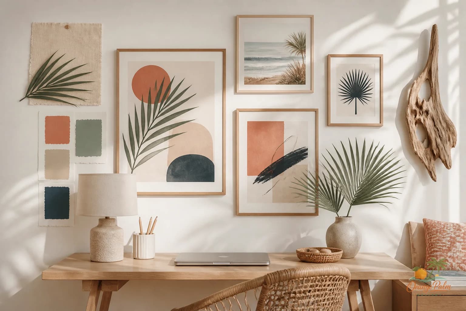
The home office wall has a strange job now. It has to look considered in real life and stay quiet through a camera lens. That is a narrow lane. Too much art and the wall starts acting like a restaurant bathroom. Too little and the room looks temporary, like the desk landed there during a move and never left.
The mistake is treating the wall behind a desk like a personal billboard. Big slogan prints, high contrast grids, tiny gallery clusters, anything with too much text. It might be fun in a hallway. On a video call, it becomes visual noise that sits right behind your head for forty minutes.
A better home office wall does not need to perform. It needs to hold the room together.
Start with the camera, then style the room
Before choosing art, look at the wall from the angle your laptop or monitor actually sees. Not the styled corner. Not the wide shot you would post. The real rectangle behind your shoulders.
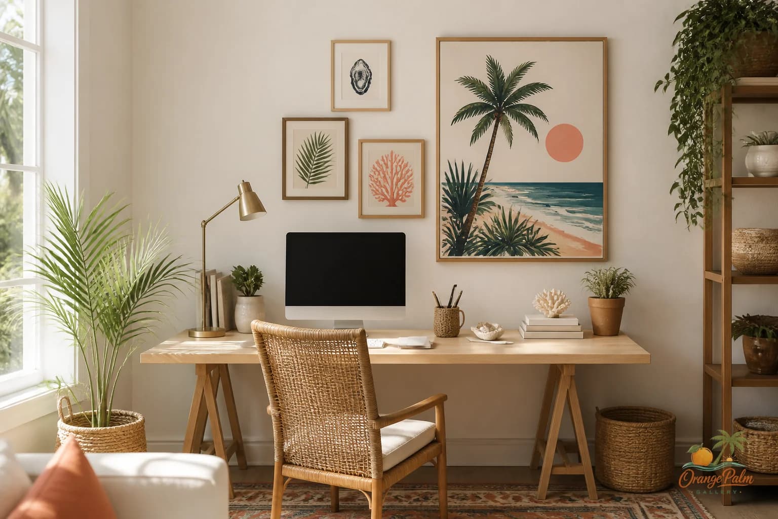
That view usually wants fewer pieces than the full wall can technically fit. One generous horizontal piece, two balanced verticals, or a loose pair with breathing room will often look more grown up than a packed grid. The camera flattens everything. Small spacing mistakes become louder. Busy edges get twitchy. Fine detail disappears, then somehow still feels cluttered.
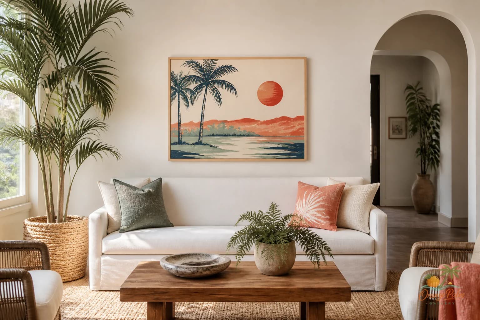
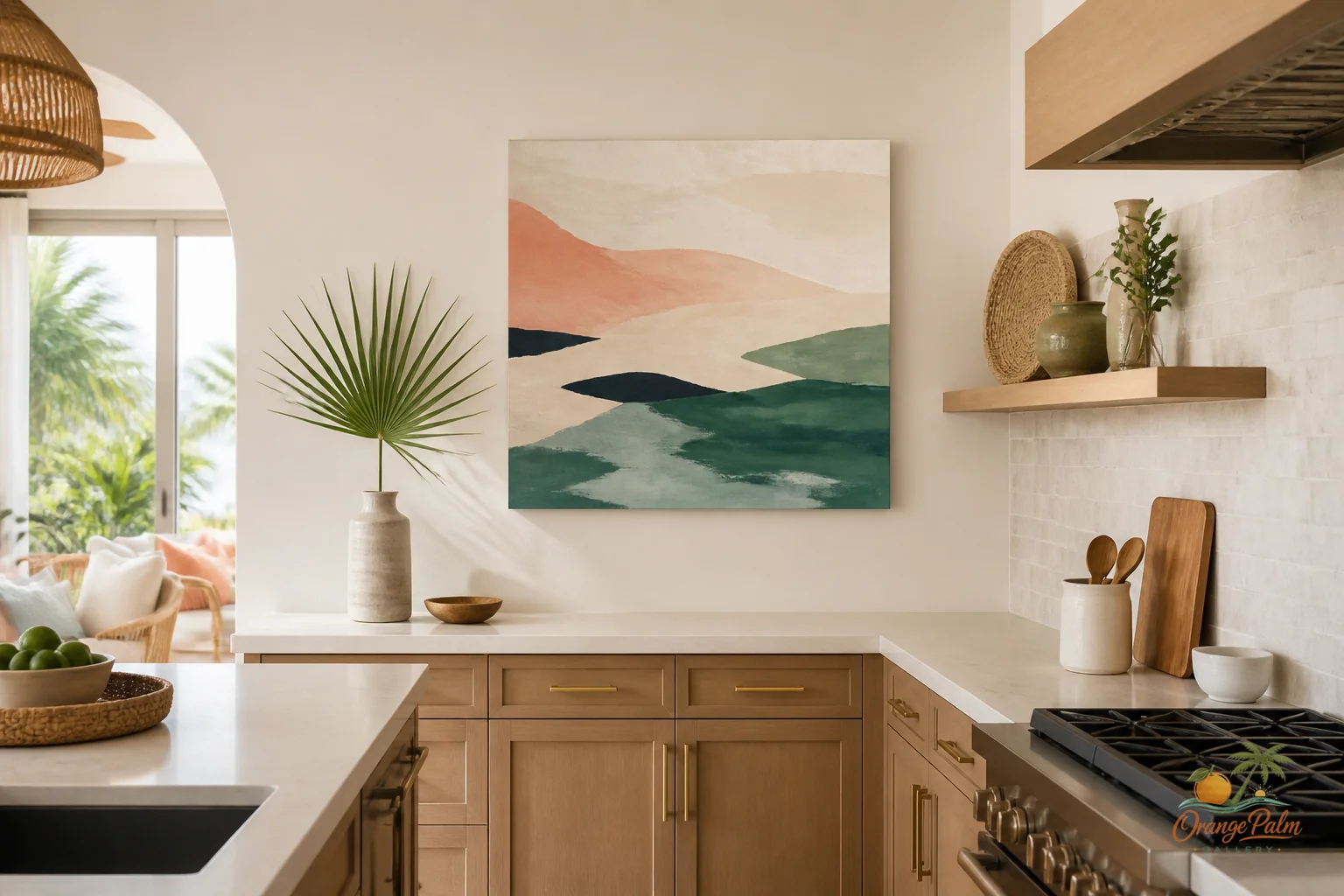
For a warm modern coastal room, I like art that carries shape more than information. Palm shadows, washed coral, sand, ink green, a soft coastal line, a little texture. Not seashell theme park decor. Not a navy anchor situation. Just enough Florida in the color and air.
Pick a quieter contrast
Home office art has to compete with screens, task lighting, notebooks, cords, books, coffee, and whatever else work leaves behind. High contrast black and white art can look sharp, but behind a desk it often hardens the whole room. If the rest of the space is already full of dark monitor rectangles, the wall does not need another one.
Try mid contrast instead. Warm white against sand. Palm green against cream. Coral that has been softened a little, not shouted. Ink used as a thin line rather than a block. These choices still read clearly, but they do not bully the space.
The tradeoff is obvious. Softer art will not give you that instant dramatic before and after. Good. A home office is not a hotel lobby. It should have enough style to feel intentional and enough restraint to let you think.
Hang for the seated body
Most wall art advice assumes people are standing. A home office is different. You live in that room seated. The art should relate to the desk, chair, lamp, and your eye line when you are actually working.
If the piece is behind the desk, hang it a little lower than you might in a living room. Let it connect to the furniture rather than float above the workstation like a disconnected announcement. If the art is on the side wall, place it where your eye catches it during a pause. That side wall can handle something calmer and more atmospheric because it is not doing camera duty all day.
A useful rule: the wall behind the desk should be composed. The wall beside the desk can be more personal.
Leave some blank wall on purpose
People get blank space wrong. They treat it as unfinished. In a work room, blank space is part of the design. It gives your eye somewhere to rest between tabs, calls, and lists.
If you are building a small gallery wall, resist filling every gap. Use one dominant piece, one smaller companion, and maybe a third quiet shape if the wall needs it. Keep the palette tight. Repeat one color from the art somewhere else in the room, like a notebook, a ceramic cup, a woven shade, or a chair cushion. That tiny repeat does more than adding another print.
The goal is not to prove that you own art. The goal is to make the room feel edited.
What works for a Florida inspired office
A Florida inspired home office does not have to mean beach signs or loud tropical pattern. The better version is more restrained: limestone warmth, pale sky, old stucco, palm shade, grapefruit coral, deep green leaves, and the chalky white of afternoon light.
That palette is useful because it brings warmth without making the office sleepy. Sand and cream keep it grounded. Green adds a living note. Coral gives the wall a pulse. Ink keeps the whole thing from becoming too sweet.
If the room gets strong sun, avoid art that depends on tiny pale details. Glare will erase them. Choose larger shapes, clearer edges, and color that can survive bright light. If the room is dim, use warmer whites and lighter grounds so the wall does not sink behind the desk.
The wall should feel like you work there
The best home office wall is not empty, but it is not trying to entertain every visitor either. It says someone chose the room on purpose. Someone cared about color, proportion, and the feeling of sitting there every day.
That is the part worth getting right. Not the perfect backdrop. Not the most impressive gallery wall. Just a room that makes work feel a little less brittle.
For more calm, modern Florida inspired wall art and styling notes, explore Orange Palm Gallery pieces for home walls that need warmth without clutter: https://orangepalmgallery.com/?utm_source=mdx