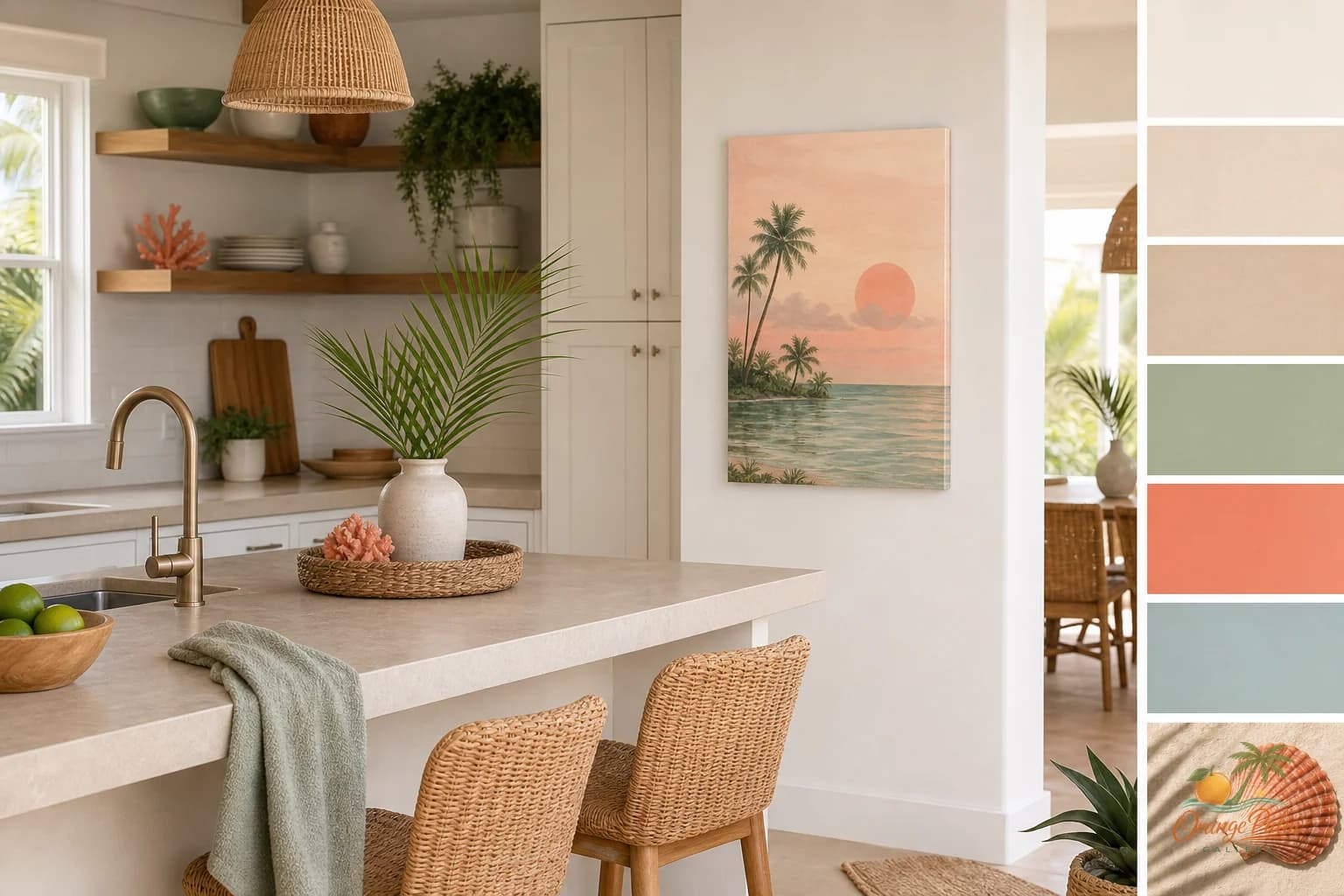
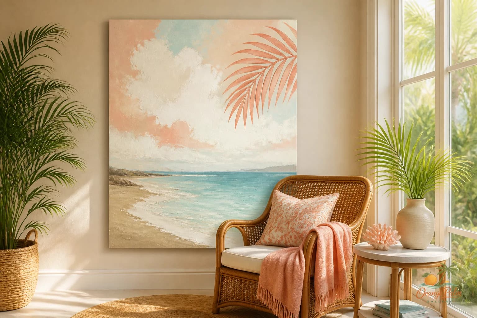
Wall Art Styling
The Kitchen Counter Wall Is Not a Menu Board
A practical Orange Palm Gallery journal note on styling kitchen counter wall art with restraint, warm coastal color, and enough breathing room for real life.
September 9, 2026 / 5 min read / Orange Palm Gallery Studio
Source note: this guide is written and maintained by Orange Palm Gallery Studio. Last updated September 9, 2026.
A kitchen wall has a bad habit of attracting signs. Coffee signs. Recipe signs. Little jokes about wine. Cute typography that looked harmless online and somehow turns bossy once it is hanging above the toaster.
The counter wall does not need more instructions.
It already has enough going on. There is stone, tile, stainless steel, glass, cabinet hardware, a fruit bowl, a cutting board, a kettle, mail you meant to move, and probably one small appliance with a cord that refuses to disappear. This is not a blank gallery wall. It is a working edge.
That changes the job of the art.
Kitchen wall art near a counter should make the room feel edited, not decorated to death. It should give the eye one soft place to land before the cabinets, backsplash, and counter objects start talking again.
Quick answer
The best kitchen counter wall art ideas use one calm piece near a quiet stretch of counter, away from steam, splatter, and visual clutter. Let the artwork soften the kitchen instead of labeling the coffee zone or turning the wall into a menu board.
Start with the counter, not the wall
Most people choose kitchen art by staring at the empty wall. That is backwards.
Look at the counter first. If the counter is busy, the art needs to be quiet. If the counter is mostly clear, the art can carry a little more shape or color. If the backsplash has movement, like veining, handmade tile variation, or glossy texture, keep the print simple enough that it does not argue with the surface below it.
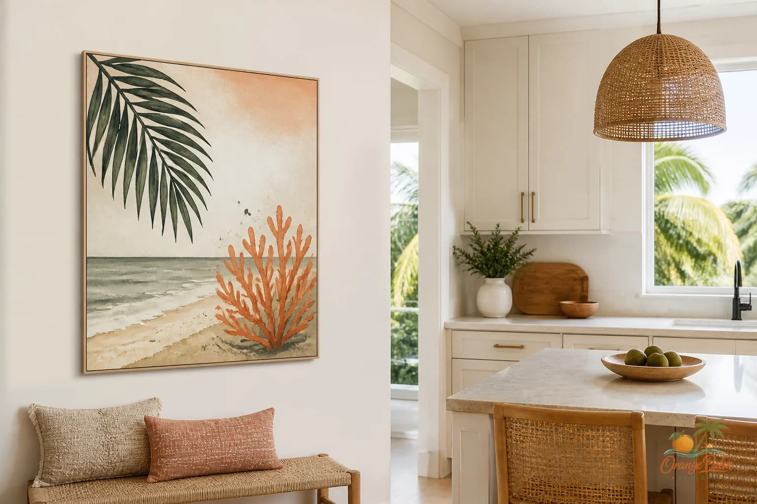
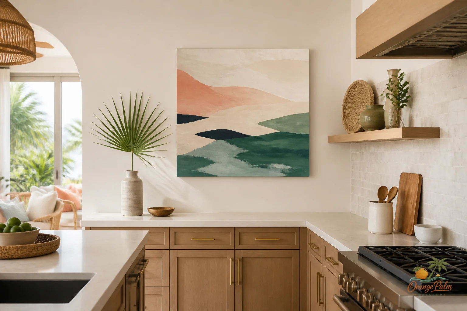
A warm abstract coastal piece can work beautifully here because it does not ask the kitchen to become a theme. Think sand, palm green, coral, ink, and warm white in shapes that feel sun washed rather than literal. A palm reference can be a curve, not a tree. A coastal mood can be a color temperature, not a shell collection.
The mistake is treating the wall above the counter like a mini command center. Once art, shelves, hooks, canisters, and signage all pile into the same sightline, the kitchen starts to feel visually noisy even when it is clean.
Keep the scale honest
Tiny art above a long counter can look nervous. Oversized art squeezed between cabinets can look like it is holding its breath.
For a narrow wall section, one vertical piece is usually cleaner than two small pieces stacked. For a wider stretch of wall with no upper cabinets, a horizontal piece can settle the room nicely, especially if the counter below is long and uninterrupted.
Leave space around the work. In a kitchen, breathing room is not fancy. It is practical. Steam, splatter, cabinet doors, and daily motion all make tight placement feel fussy.
If the art sits near a coffee area or prep zone, resist the urge to label that zone with text. You already know where the coffee is. Let the art bring tone instead of narration.
Color should lower the volume
Kitchen materials can be loud without meaning to be. White cabinets can glare. Black hardware can punch hard. Stainless steel can feel cold. Stone can introduce more pattern than expected.
Wall art can soften all of that if the palette is doing real work.
In a warm modern Florida inspired kitchen, I like art that pulls from natural light rather than beach props. Sand and warm white can calm white cabinets. Palm green can connect the room to plants outside the window. Coral can warm up a gray counter if used with restraint. Ink gives the composition a little structure so the whole thing does not float away.
The point is not to match the dish towels. The point is to tune the room.
A kitchen can feel coastal without announcing itself. That is usually the better version.
One piece is often enough
The kitchen is one of the few rooms where restraint reads as confidence immediately. One good piece on the right wall can do more than a collection of small things scattered around the room.
A single print near the counter can frame a quiet ritual: pouring coffee, cutting citrus, rinsing greens, leaning there while someone talks from the other side of the island. It does not have to dominate the room. It just has to make that spot feel considered.
This is where handmade feeling matters. Not rough for the sake of roughness, but a little human warmth in the shape, color, and spacing. The kitchen is already full of manufactured finishes. Art can be the part that feels touched by a hand.
Where it tends to work
Good kitchen counter wall art usually belongs in one of these places:
- the short wall at the end of a counter run
- the space above a low backsplash with no upper cabinets
- a small wall near a coffee setup, if the surface stays edited
- the side wall beside a pantry or fridge zone
- an open stretch between windows where the light does not wash everything out
Bad places are usually bad because they are too active: directly above heavy prep areas, too close to the sink splash zone, or wedged between competing storage pieces.
The art should survive the room, not need protection from it every time dinner happens.
Let the kitchen stay useful
There is a reason kitchen art goes wrong so quickly. People try to make the practical room feel charming by adding more stuff. But charm in a kitchen often comes from subtraction: one clean line, one warm color, one quiet shape, one wall that does not try to explain itself.
If the counter is the working surface, the wall above it should be the pause.
That is the balance I keep coming back to at Orange Palm Gallery: Florida warmth, modern restraint, and art that knows what room it is in.
Explore Orange Palm Gallery pieces for calm, modern Florida inspired homes: https://orangepalmgallery.com/?utm_source=mdx