Wall Art Styling
The Kitchen Wall Wants Appetite, Not a Menu
How to style kitchen wall art with color, scale, and breathing room for a calm modern Florida-inspired home.
October 26, 2026 / 4 min read / Orange Palm Gallery Studio
Source note: this guide is written and maintained by Orange Palm Gallery Studio. Last updated October 26, 2026.
Kitchen wall art has a bad habit of becoming a label.
Coffee signs. Lemon prints. Wine jokes. Forks, spoons, scripted words, cute little commands. The room already tells people what it is. You do not need the wall to introduce itself.
A kitchen needs something better from art. It needs appetite, warmth, and a little visual pause between hard surfaces. Cabinets, tile, stone, appliances, and metal finishes can make the room feel efficient but cold. The right piece of wall art softens that without getting in the way.
The tradeoff is simple: too little art and the kitchen feels like a work zone. Too much theme and it starts to feel like a café set built for someone else’s breakfast.
Start with the wall that is not doing a job
The best kitchen wall for art is usually the one that is not already loaded with function. Not the backsplash behind the stove. Not the strip where oil and steam land. Not the narrow bit competing with a magnetic knife rack, a calendar, and three tote bags.
Look for the quiet patch: beside a pantry door, above a small counter run, near a breakfast perch, or on the wall you see when you walk in from the living room. If the kitchen opens into another space, that view matters. Art can help the kitchen feel connected to the rest of the home instead of looking like a separate utility zone.
A good kitchen wall piece should hold its own from across the room. It should not require someone to walk up and read it. That is where many kitchen prints go wrong. If the whole idea depends on tiny words or a punchline, it often dies once dishes, groceries, and real life enter the frame.
Choose food friendly color, not food illustrations
You can make a kitchen feel appetizing without hanging fruit on the wall.
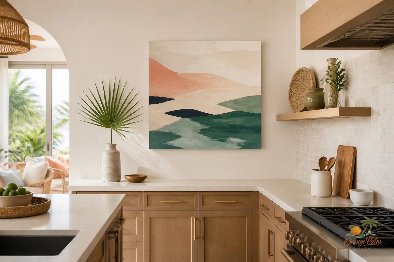
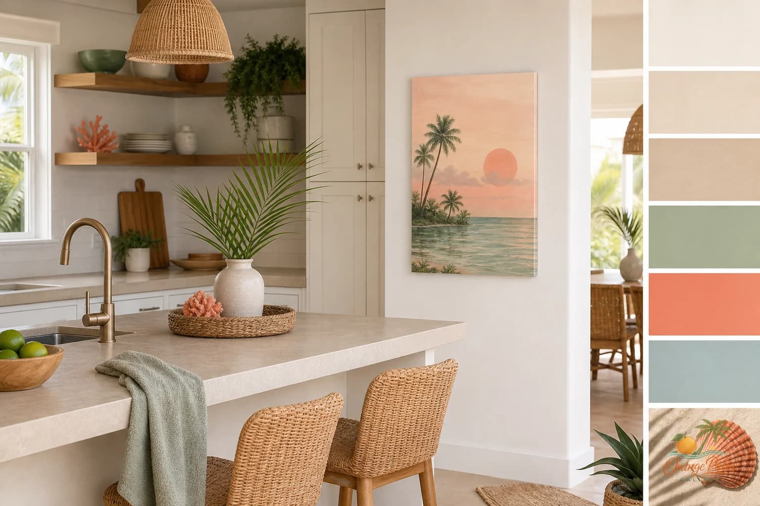
Warm white, sand, coral, palm green, and deep ink tones all work because they sit close to the natural materials that already belong in a kitchen: salt, citrus peel, herbs, ceramic, wood, evening shadows. That palette feels coastal without waving a beach flag.
Coral is especially useful in a kitchen because it brings life to white cabinets and pale counters. Palm green can steady a space with brass, wood, or cream tones. Sand gives the eye somewhere soft to land. Ink adds enough contrast to keep the room from becoming washed out.
The mistake is trying to match every finish exactly. Art does not need to be a sample chip. It should relate, not disappear. If your kitchen is mostly white and oak, a print with warm white and sand may be too polite on its own. Add a stronger line, darker shape, or small coral note so the wall has a pulse.
Scale should respect the cabinets
Kitchen walls are chopped up by doors, uppers, shelves, vents, and switches. That does not mean art has to be tiny. In fact, tiny art often looks nervous in a kitchen.
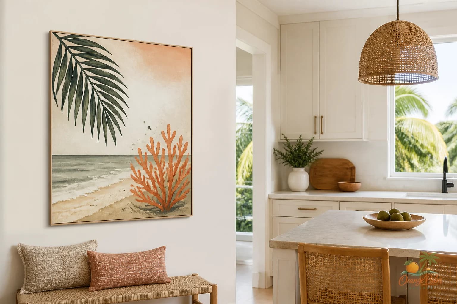
If you have one open vertical space, try one confident piece rather than three small ones stacked like afterthoughts. The piece can be modest, but it should feel intentional. Leave air around it. Let the edges breathe.
If the wall is wide and low, one horizontal piece can calm the room better than a busy cluster. This is especially true above a counter where appliances already create visual noise. A toaster, kettle, fruit bowl, and cutting board count as composition whether you planned them or not.
Gallery walls can work in a kitchen, but they need discipline. Keep the spacing clean. Limit the color range. Mix sizes with care. A kitchen gallery wall should feel like rhythm, not a bulletin board.
Let the art soften the practical stuff
The kitchen is not a precious room. It gets splashes, crumbs, steam, fingerprints, and bags dropped where bags should not be dropped. Wall art in this room should not pretend life is not happening.
That does not mean the art has to be loud or wipe clean in spirit. It means the placement should be honest. Keep art away from direct grease, heavy steam, and sink spray. Give it a spot where it can add atmosphere instead of fighting the room’s daily mess.
The nicest kitchen art often has a handmade feeling: a softened edge, a calm shape, a slight irregularity, a color that looks mixed rather than manufactured. That kind of visual texture balances the shine of appliances and the straight lines of cabinetry.
The Florida note should be felt, not performed
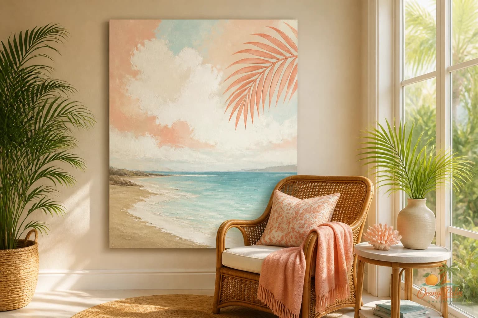
Florida-inspired kitchen art does not need flamingos, shells, or palm leaves pasted into every corner. Sometimes the Florida note is the light. Sometimes it is coral against warm white. Sometimes it is a green shape that feels like something seen through a window rather than something printed for tourists.
That restraint is what keeps coastal decor modern. The room gets warmth and place without turning into a theme.
A kitchen wall should make you want to stay in the room a little longer. Not because it shouts, and not because it explains itself. Because the color feels good near morning light. Because the shape breaks up all the cabinet rectangles. Because the wall finally has a reason to be there.
For more calm, Florida-inspired wall art and styling notes, visit Orange Palm Gallery.