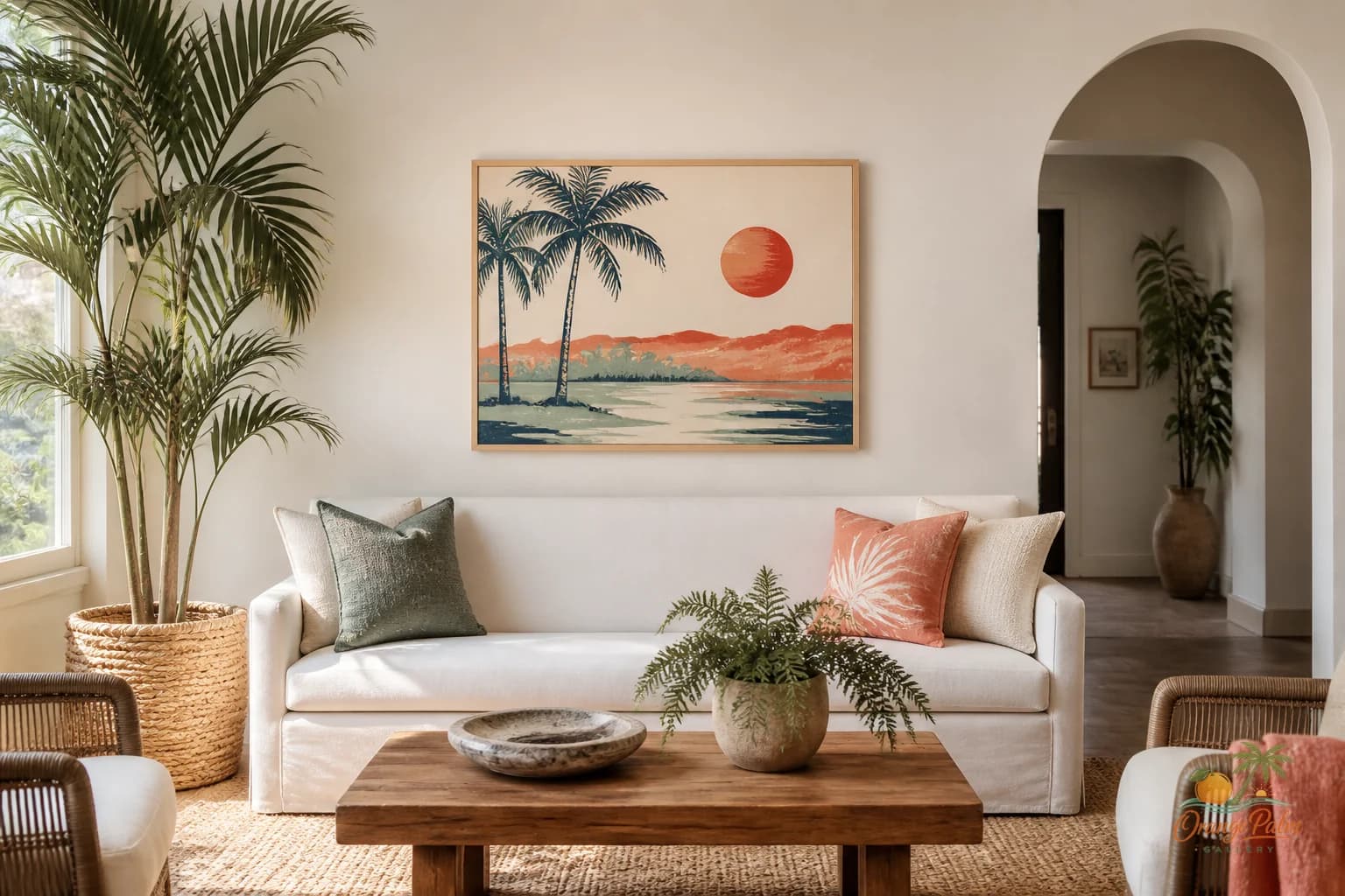
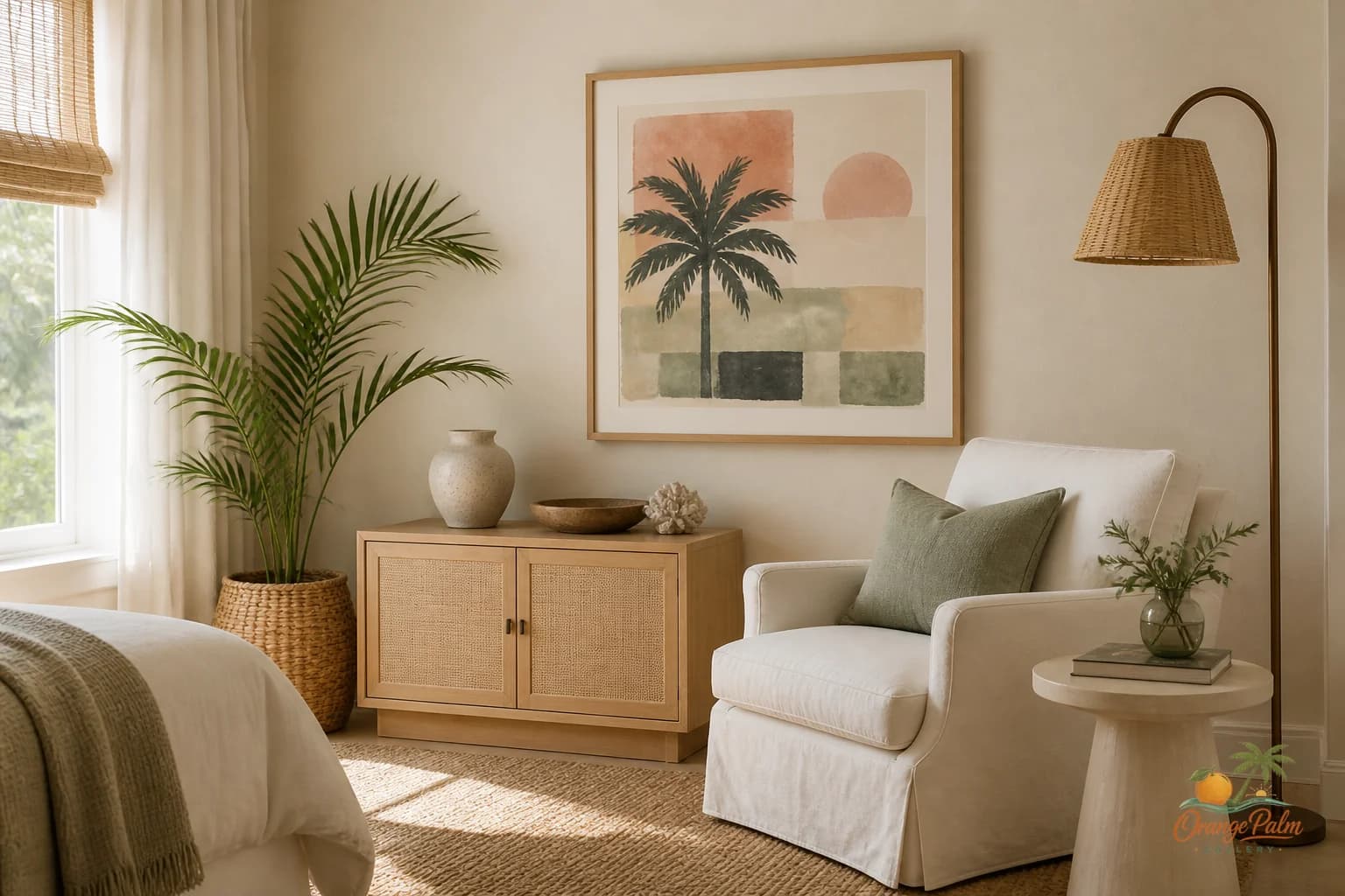
Wall Art Styling
Kitchen Wall Art Should Not Compete With the Cabinets
Kitchen wall art works best when it softens the room, not when it tries to outshout cabinets, tile, and appliances.
July 27, 2026 / 5 min read / Orange Palm Gallery Studio
Source note: this guide is written and maintained by Orange Palm Gallery Studio. Last updated August 4, 2026.
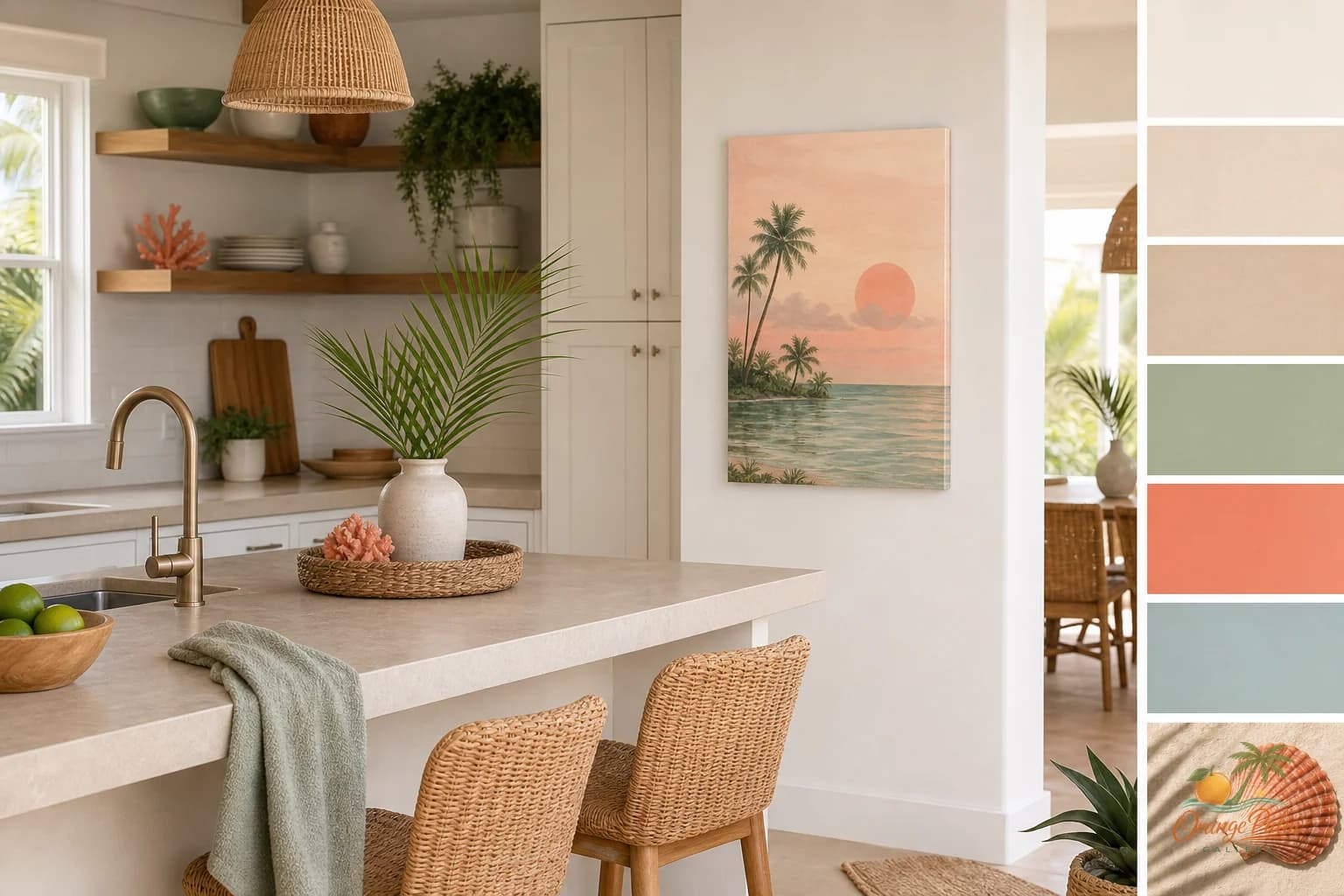
Kitchens are rarely short on visual information. Cabinet doors, hardware, tile grout, stone movement, small appliances, jars, bowls, coffee gear, the one cutting board that somehow became decor. Then people try to add wall art and wonder why the room suddenly feels busier instead of warmer.
The mistake is treating kitchen wall art like it needs to perform. A loud print, a packed gallery wall, or a tiny framed thing wedged into leftover space can make the kitchen feel like it is wearing too many accessories.
A kitchen does not need art that competes with the cabinets. It needs art that gives the hard surfaces a softer note.
Quick answer
The best kitchen wall art ideas are usually restrained: choose one calm piece, place it on a quiet wall away from steam and grease, and size it to nearby architecture rather than leftover blank space. In warm modern coastal kitchens, soft Florida color can connect cabinets, counters, shelves, and everyday objects without adding clutter.
Look for the quiet wall, not the biggest wall
The best kitchen wall for art is usually not the largest blank area. It is the wall that naturally catches your eye while you are moving through the room.
That might be:
- The short wall beside open shelves
- The end of a cabinet run
- The space above a small prep table
- A narrow wall near a pantry door
- The area beside a breakfast counter, if it is not already doing too much
A calm 2D piece works especially well in these spots because it can act like a pause. Not a centerpiece. Not a sign. A pause.
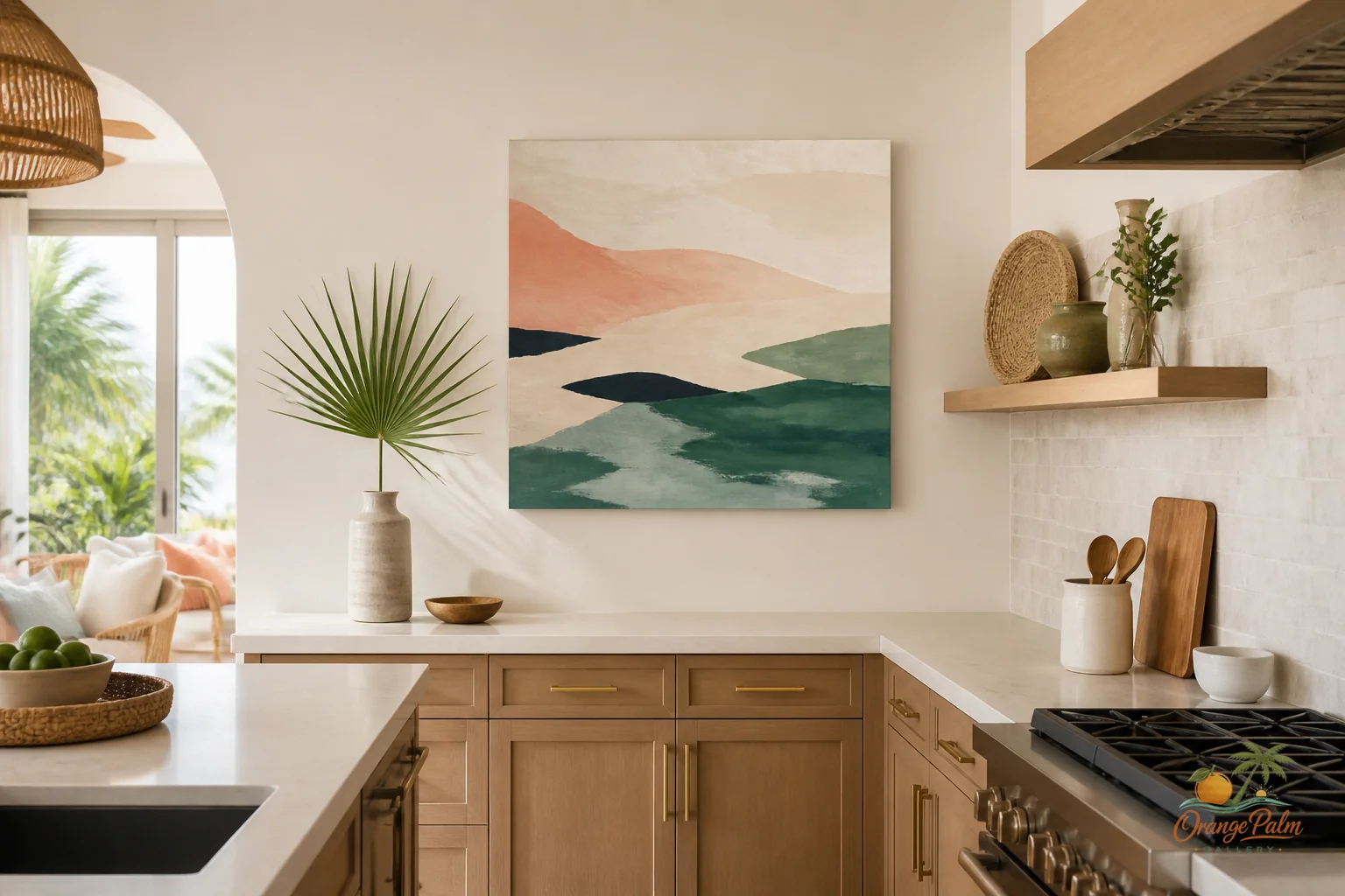
If the kitchen has strong cabinetry, heavy veining, patterned tile, or mixed metals, the art should not add another argument. Choose something with breathing room in the composition. A little palm green, a warm sand tone, a coral detail, or an inky shape can be enough.
Scale it to the architecture, not the countertop clutter
People often size kitchen art based on whatever empty patch remains after everything else is installed. That usually produces a print that feels timid. Too small, too high, too apologetic.
Instead, size the art to the architectural feature near it.
If the piece is beside open shelving, let it relate to the shelf width or the vertical space between shelf and counter. If it is at the end of a cabinet run, let it hold enough visual weight to finish that run cleanly. If it is above a slim console or prep surface, keep the edges comfortably inside the furniture line rather than stretching wall to wall.
The goal is not to fill every inch. The goal is to make the placement feel intentional.
A useful rule: if the piece looks like it was added because the wall felt empty, it is probably too small or too decorative. If it makes the cabinet, shelf, or counter feel more complete, it is doing its job.
Keep it away from the wet and greasy zones
Kitchen art can be beautiful, but it does not need to live in the splash zone to prove a point.
Avoid hanging 2D wall art directly above a sink, beside a stovetop, or anywhere steam and oil are going to make the piece feel like a maintenance problem. There are better places. The end wall. The side of a pantry. A dining-adjacent kitchen corner. A wall near open shelving where the art can be seen but not punished.
This is one of those tradeoffs that makes the room better. You give up the dramatic “art over the range” moment, and you get a piece that actually belongs to daily life.
Use color like seasoning
Florida-inspired decor can go cartoon quickly when every element is trying to say coastal. The kitchen is a good place to be more restrained.
Warm white and sand tones are easy partners for painted cabinets and natural wood. Palm green can cool down a room with too much beige. Coral works best as a small lift, not a full takeover. Ink gives the whole arrangement a little structure, especially if the kitchen is pale and airy.
Think of the art as the color note that connects the room, not the object that explains the theme.
For a warm modern coastal kitchen, I like art that feels sunlit but not sugary. Simple shapes. Natural rhythm. A handmade edge. Something that could sit near a bowl of citrus, a linen towel, and a quiet counter without turning the whole room into a vacation rental mood board.
Let the negative space do some work
Kitchens are full of useful things. That is part of their charm. But when every surface is full and every wall is styled, the room loses its generosity.
One piece of wall art with some clean space around it can make the entire kitchen feel calmer. Leave room between the art and shelves. Do not crowd it with a hanging plant, a clock, three boards, and a ceramic fish. Let the piece have enough air to be seen.
That little bit of restraint is what makes the art feel modern instead of themed.
A simple kitchen wall art setup
Try this:
Choose one wall that is visible from the main entry into the kitchen. Pick a calm 2D piece with two or three colors already present in the room. Hang it at eye level, or slightly lower if it relates to a counter or shelf. Keep the nearby objects practical and quiet: a small bowl, a glass jar, a wooden board, maybe nothing at all.
Then stop.
The kitchen does not need a full gallery wall to feel designed. Sometimes one good piece, placed with confidence, does more than a dozen small decorations trying to prove the room has personality.
Orange Palm Gallery is built around that kind of quieter visual decision: warm, modern Florida-inspired art for homes that want color without clutter. You can explore more at orangepalmgallery.com.