Wall Art Styling
The Sunroom Wall Does Not Need a Vacation Costume
A studio note on choosing sunroom wall art with restraint: one visual anchor, warm Florida color, breathing room, and less coastal clutter.
October 23, 2026 / 5 min read / Orange Palm Gallery Studio
Source note: this guide is written and maintained by Orange Palm Gallery Studio. Last updated October 23, 2026.
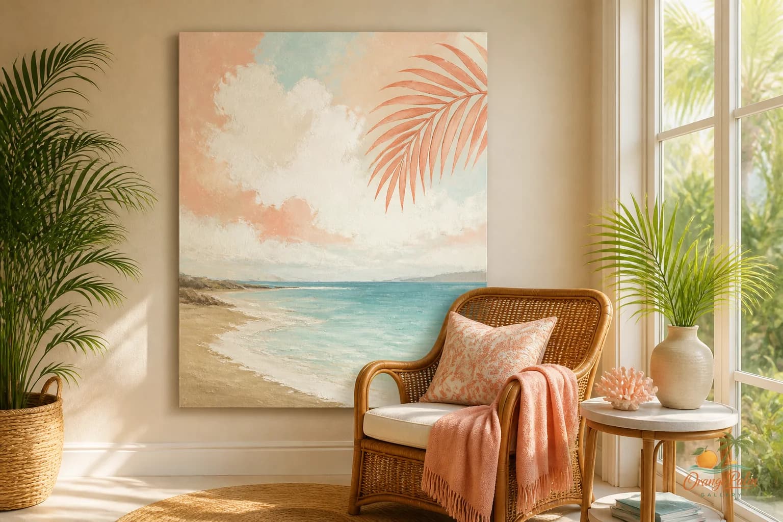
A sunroom is already doing a lot before you hang a single thing. It has glare. It has plants leaning toward the glass. It has outdoor color changing every hour. It has wicker, wood, tile, leaves, shadows, and probably one chair that everyone likes more than the rest.
So the wall art does not need to arrive wearing a straw hat.
That is where many coastal rooms go sideways. The instinct is understandable: the room gets good light, so people add shells, blue signs, beach words, rope, driftwood, palm prints, and three different versions of turquoise. Suddenly the sunroom stops feeling breezy and starts feeling like it is auditioning for a souvenir shop.
A better move is quieter. Pick one wall art anchor and let it do the atmospheric work.
Start with the light, not the theme
Florida light is not neutral. Morning light can feel peachy and soft. Afternoon light can flatten pale colors and make whites go sharp. Evening light warms everything, especially sand, coral, clay, rattan, and palm green.
Before choosing art for a sunroom wall, stand in the room at the time you actually use it. Coffee light and late day light are not the same room. If the space gets a hard blast of sun, delicate pale art can disappear. If the room is shaded by palms or porch overhangs, darker ink lines and warmer grounds can feel grounded instead of heavy.
The mistake is choosing art as if the wall lives in a catalog. It lives in weather.
For a calm Florida sunroom, I like a piece that holds one of three moods:
- warm white and sand for a dry, quiet room
- palm green and ink for a leafy room
- coral and clay for a room that needs a little pulse
Not all three at full volume. The sunroom already has movement. The art should give the eye a place to land.
One anchor beats five small apologies
Small walls make people nervous. They start adding little things because one piece feels too decisive. A tiny print, a mini shelf, a hanging basket, a small mirror, another little print. None of it is wrong by itself, but together it often looks apologetic.
One confident art piece usually looks calmer than five small pieces trying to create importance.
For a narrow sunroom wall, use a vertical piece with enough negative space around the main shape. For a low wall above a bench or chair, use a horizontal piece that echoes the seat line without stretching wider than the furniture. If the room has a lot of plant shapes, choose art with simpler forms. If the furniture is plain, the art can carry more texture or pattern.
The tradeoff is simple: a single piece asks you to commit. The reward is that the room feels designed instead of decorated by accumulation.
Leave room for the plants to be plants
Plants are visual objects too. A large palm, fiddle leaf, fern, or trailing pothos can read like sculpture against a wall. If the art competes with every leaf, both lose.
A good sunroom wall gives plants and art different jobs. The plant can be irregular, living, slightly wild. The art can be flatter, calmer, more composed. That contrast is what makes the corner feel intentional.
Try this arrangement: one chair, one plant with height, one art piece, one small table if needed. That is enough. The room does not need a tray of shells to explain itself.
Color can nod to the coast without spelling it out
Coastal color does not have to mean blue. In many Florida rooms, the more interesting palette is the one just off the obvious path: sand, warm white, sun faded coral, palm green, deep ink, a little clay.
Those colors feel coastal because they behave like the place. They are not shouting beach. They are picking up stucco, shade, citrus skin, old tile, sun on concrete, and palms outside the window.
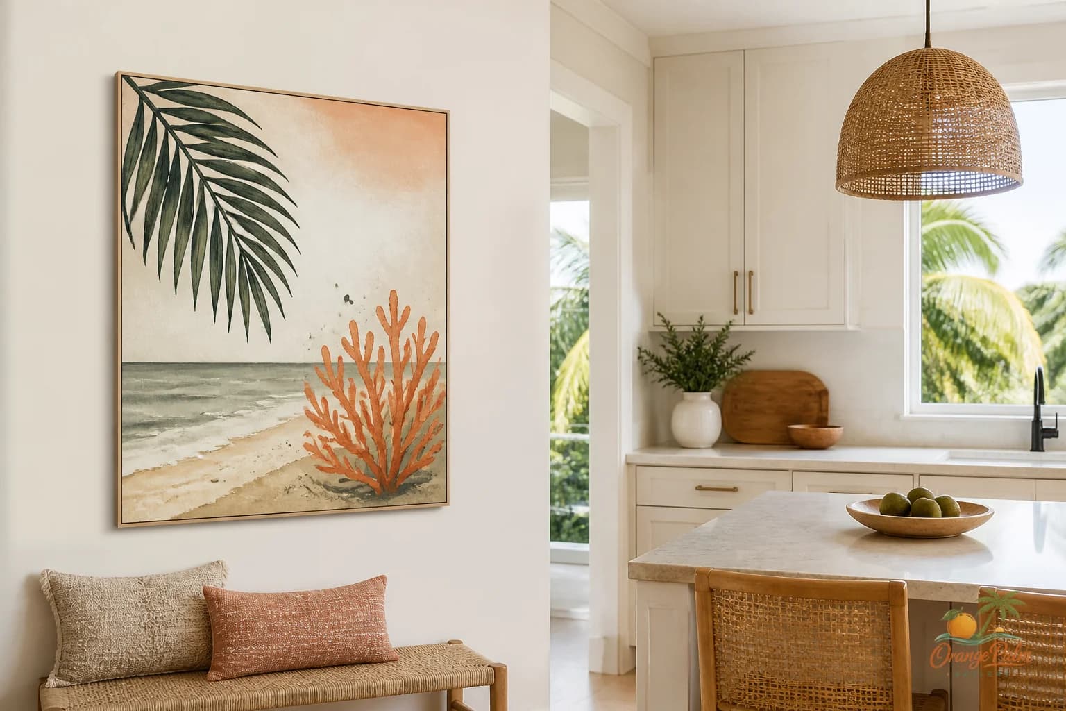
This is where wall art can do a lot of quiet work. It can bring in coastal atmosphere without adding objects. A coral shape on a warm white ground can lift a dark rattan chair. A palm green piece can settle a bright room. An ink line can keep soft neutrals from turning mushy.
The goal is not to match everything. Matching too closely makes a room feel airless. Let the art relate to one or two colors already present, then give it a little independence.
Hang it lower than you think
Sunrooms often have casual furniture: lounge chairs, benches, small breakfast tables, plant stands. If the art is hung at formal hallway height, it can float above the life of the room.
Hang for the seated view. If the piece is above a chair or bench, let it sit close enough to be part of that arrangement. Not jammed down onto the furniture, but connected. A good starting point is to keep the bottom edge closer to the furniture than to the ceiling. The wall should feel like one composition, not a chair downstairs and art upstairs.
If there is no furniture below it, give the art enough wall around it to feel intentional. A lonely piece centered on a bare wall can look stranded. Move it toward the zone where people actually sit, read, water plants, or set down a glass.
The quiet sunroom test
When the room is finished, look away from the wall and then look back. What do you notice first?
If you notice the art, the plant, the chair, the light, and the floor all at once, the room is probably too busy. If your eye lands on the art and then relaxes into the rest of the room, you are close.
A sunroom does not need to prove it is coastal. The light already made that argument. The better wall art choice is the one that keeps the room loose, warm, and breathable.
Orange Palm Gallery keeps that kind of restraint in mind: modern Florida feeling, handmade texture, and enough quiet space for a room to stay livable. Explore more studio notes and wall art ideas at orangepalmgallery.com.