Wall Art Styling
Laundry Room Art Should Feel Like Fresh Air, Not a Chore Chart
How to style laundry room wall art with simple composition, coastal color, and enough breathing room for a hardworking space.
October 19, 2026 / 4 min read / Orange Palm Gallery Studio
Source note: this guide is written and maintained by Orange Palm Gallery Studio. Last updated October 19, 2026.
The laundry room is one of the easiest places to overdecorate badly.
Not because the room is unimportant. Because it is already visually loud. Detergent bottles, baskets, hooks, cabinet pulls, tile grout, appliance doors, warning labels, switches, cords, hampers, towels, lint rollers. Even a tidy laundry room has a lot of small visual noise.
That is why laundry room wall art has a different job than living room art. It should not announce the obvious. It should not say wash, dry, fold as if the machines forgot. It should not turn a practical room into a joke wall.
It should give the eye a clean place to land.
Start with the mess you actually see
A laundry room is rarely styled like the photos we save. In real life, there is a half folded towel on the counter, one sock with no partner, a basket waiting by the door, and a bottle someone put down sideways for no reason.
So the wall art needs to handle interruption.
Small busy prints can get swallowed by the room. Tiny typography can start competing with every label on the shelf. A high contrast gallery wall can make the space feel more frantic than finished.
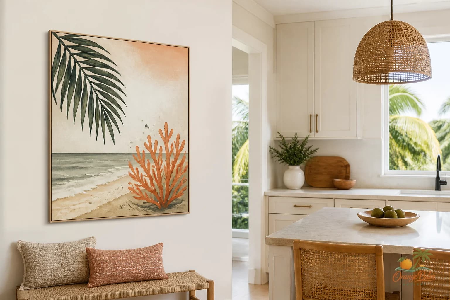
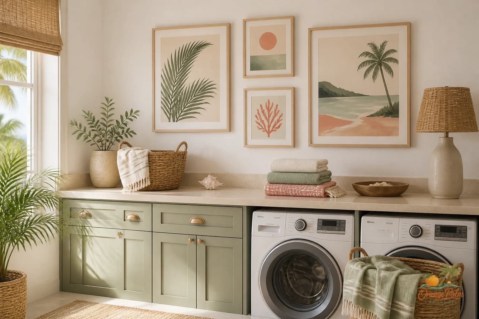
A better move is one quiet piece with a clear shape. Think broad palm shadow, soft coastal line, warm sand field, pale coral wash, or a simple botanical form. Something with enough presence to hold its spot, but not so much drama that it argues with the washer.
Choose clean color, not themed color
Laundry room decor often gets pushed into two predictable lanes: bright white farmhouse or blue nautical. Both can work, but both can also get stiff fast.
For a Florida inspired room, the palette can be softer and warmer.
Try warm white instead of cold white. Sand instead of beige. Palm green instead of mint. Muted coral instead of pink. Ink instead of black. These colors feel coastal without dragging the room into seashell territory.
The art can be the one place where the room breathes. If the cabinets are white and the machines are white, a piece with a sand background and a dark green gesture can keep the wall from feeling sterile. If the room has wood shelving or woven baskets, a coral or terracotta note can pick up that warmth without adding another object to the counter.
Hang it where your hands are not working
The worst place for laundry room art is wherever your elbows, baskets, or cabinet doors constantly hit it.
Look for the passive wall. The strip above a folding counter. The narrow wall near the doorway. The space above a bench or hamper zone. The wall you see when you walk in, not the wall you fight while sorting socks.
If the room is narrow, keep the art flatter in feeling. A vertical piece can lift the room without crowding it. If the room has a long counter, a horizontal piece can calm the line and make the space feel more intentional.
Do not hang art too high just because the room is small. Laundry rooms already have a lot happening at eye level and below. Art that floats near the ceiling feels forgotten. Let it relate to the counter, shelf, or cabinet line beneath it.
One piece is usually enough
People love the idea of a tiny gallery wall in a utility space. The tradeoff is maintenance. More frames or prints mean more edges, more dust lines, more little decisions, more chances for the wall to look cluttered once the room is being used.
A single piece is often stronger.
If you do want a pair, make the pair quiet. Two related shapes. Similar spacing. Similar color weight. No tiny mix of quotes, illustrations, and signs. The laundry room is not asking for a personality test.
It is asking for order.
Let the art soften the machines
Appliances are blunt. Big rectangles, hard gloss, circular doors, metal edges. Wall art can soften that geometry without pretending the room is something else.
Rounded botanical forms are useful here. So are loose coastal shapes, pale washes, and simple abstract pieces with visible hand movement. The handmade feeling matters because utility rooms are full of manufactured surfaces. A little irregularity makes the space feel human again.
That does not mean rustic. It means touched. A soft edge. A palm inspired curve. A color field that feels like morning light on plaster instead of a printed warning label.
The quiet test
Before choosing laundry room art, picture the room on an ordinary Tuesday. Not staged. Not cleared. Basket on the floor. Cabinet slightly open. A towel over the machine.
Now ask whether the art lowers the visual volume or adds to it.
If it adds another command, another joke, another tiny detail, skip it. If it gives the wall a little air, a little warmth, and a place for the eye to rest, it belongs.
Laundry room art does not need to be precious. It does need to be calm enough to survive the room.
For more quiet, Florida inspired wall art and styling notes, visit Orange Palm Gallery.