Wall Art Styling
Guest Room Art Should Feel Like a Good Host
How to style guest room wall art with a warm modern coastal mood, enough personality, and enough breathing room for real guests.
October 21, 2026 / 4 min read / Orange Palm Gallery Studio
Source note: this guide is written and maintained by Orange Palm Gallery Studio. Last updated October 21, 2026.
A guest room is where a lot of wall art gets weird.
People either ignore it completely, leaving one blank wall and a bed that looks temporary, or they overcorrect and make the room feel like a staged rental. Too many matching signs, too much theme, too much proof that someone decorated very hard.
The better aim is quieter: make the room feel like a good host.
Not fancy. Not anonymous. Just settled enough that a person can put down a bag, breathe for a minute, and understand the mood of the house.
Start with the wall the guest sees first
In most guest rooms, the first read is either the wall above the bed or the wall directly opposite the door. That first wall sets the temperature.
If the art above the bed is tiny, the room feels unfinished. If it is too loud, the bed stops feeling restful. This is the tradeoff: guest room art needs presence, but it cannot demand attention all night.
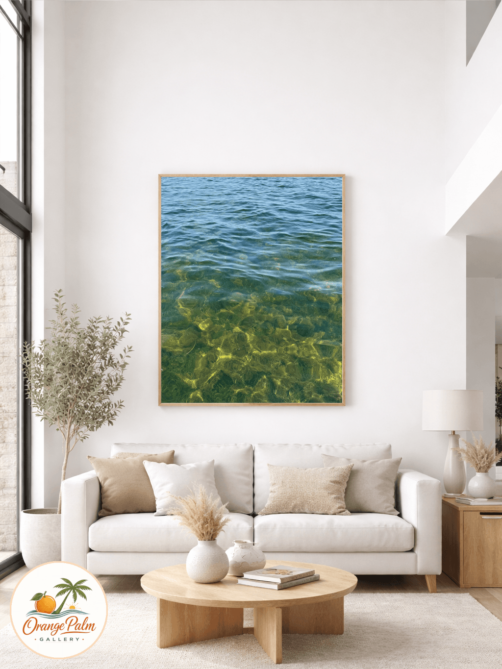
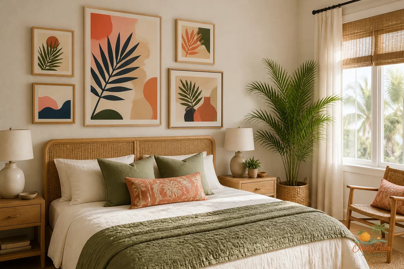
A single medium to large piece usually works better than a fussy grid here. The guest room already has interruptions: luggage, folded blankets, a nightstand, a lamp, maybe a chair that becomes a clothing station by morning. The art should give the eye one clean place to land.
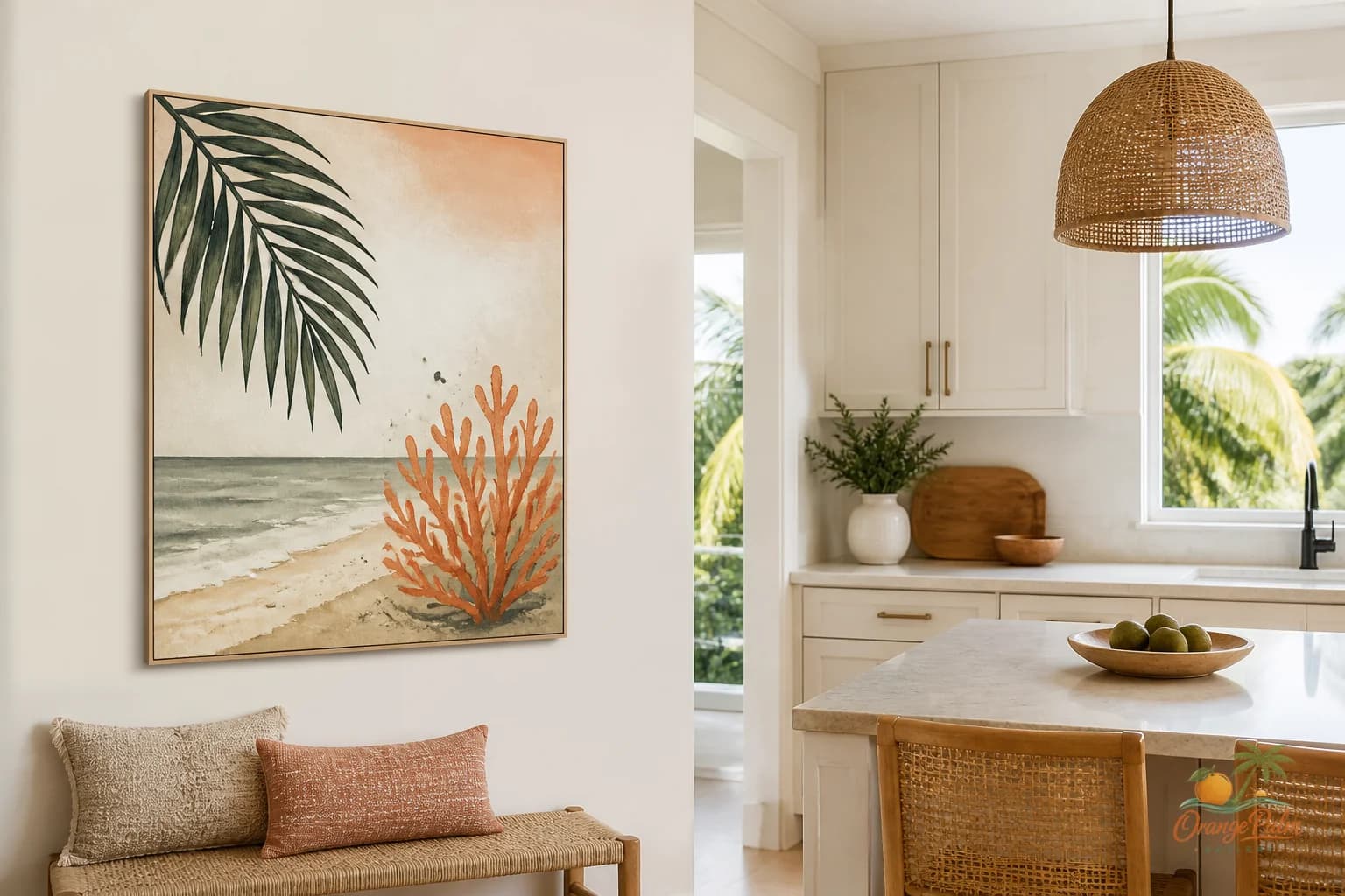
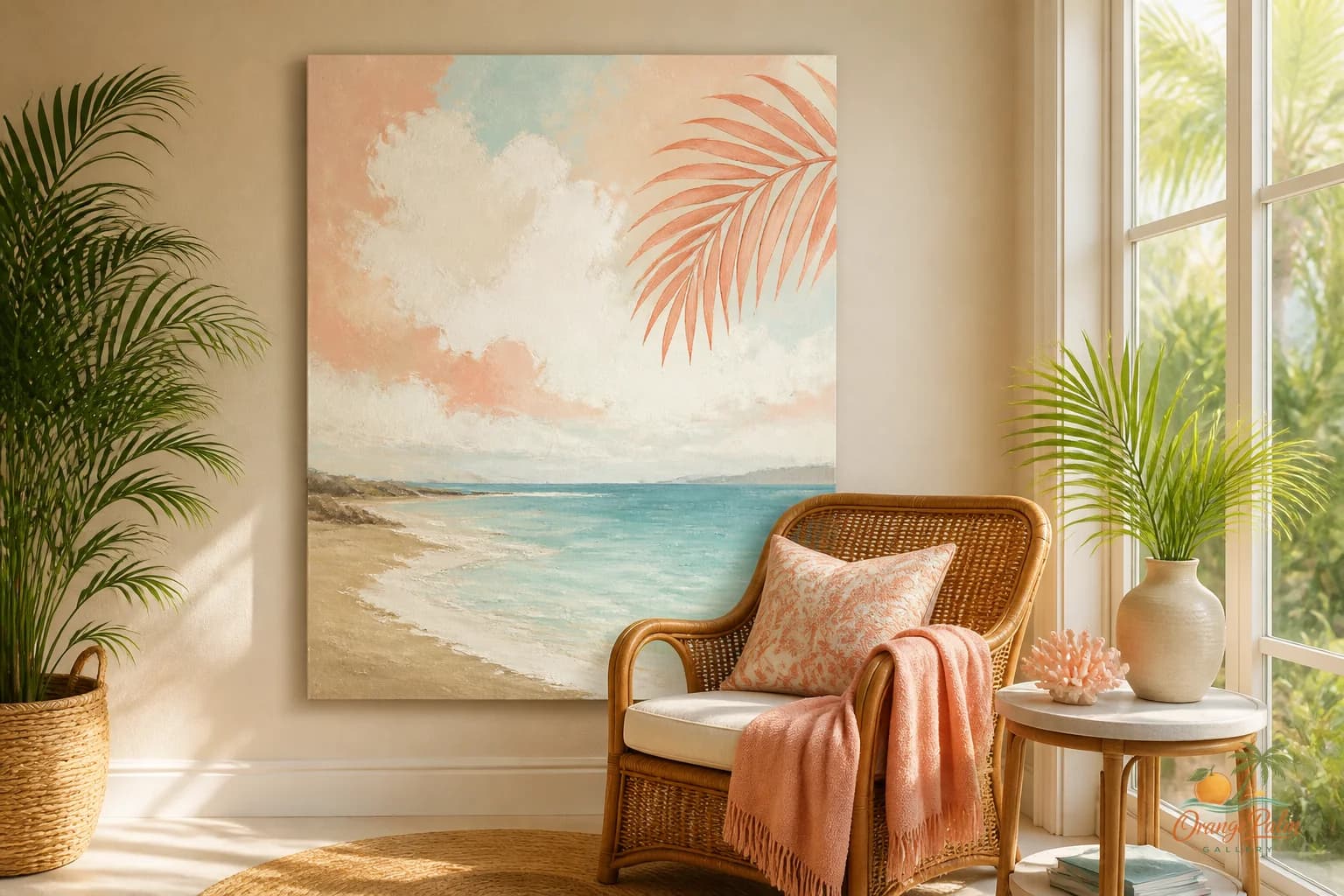
For a warm coastal room, I like shapes and colors that feel sun softened instead of nautical. Sand, palm green, warm white, a little coral, a little ink. The point is not to announce beach house. The point is to bring in light, air, and a hint of place.
Avoid the hotel problem
Hotel art is usually chosen to offend no one. That sounds safe until the room starts feeling like no one lives there.
Guest rooms do need restraint, but restraint is not the same as blandness. A piece can have a handmade edge, an uneven line, a palm shape, a washed coastal color, or a composition that feels drawn rather than manufactured. Those details give the room a pulse without making it personal in the wrong way.
What people get wrong is thinking the guest room has to be neutral because guests are temporary. Temporary does not mean flavorless. It means the room should be easy to enter.
Skip inside jokes, family photo walls, and anything too emotionally pointed. Use art to offer atmosphere, not biography.
Let the bed do some work
Wall art does not have to carry the whole room. In a guest bedroom, the bed is already the largest visual object, so the art should coordinate with it, not compete with it.
If the bedding is white or cream, the art can bring the color. A coral shape, a muted green curve, or an inky abstract line can keep the room from drifting into flatness.
If the bedding has pattern, go simpler on the wall. Let the art provide quiet structure: fewer colors, bigger shapes, more open space.
A good test is to stand in the doorway and squint. If the bed and art blur into one calm composition, you are close. If the wall looks like a separate argument, simplify.
Give luggage a visual break
This is the unglamorous part that matters. Guest rooms get messy fast because visitors live out of bags. A suitcase on the floor, a tote on a chair, a phone cord across the nightstand. That is normal.
So the wall art should not add more visual noise to a room that is about to collect temporary clutter.
Open space in the artwork helps. So does a limited palette. So does placing the piece high enough to clear pillows, lamps, and the inevitable stack of books or folded clothes.
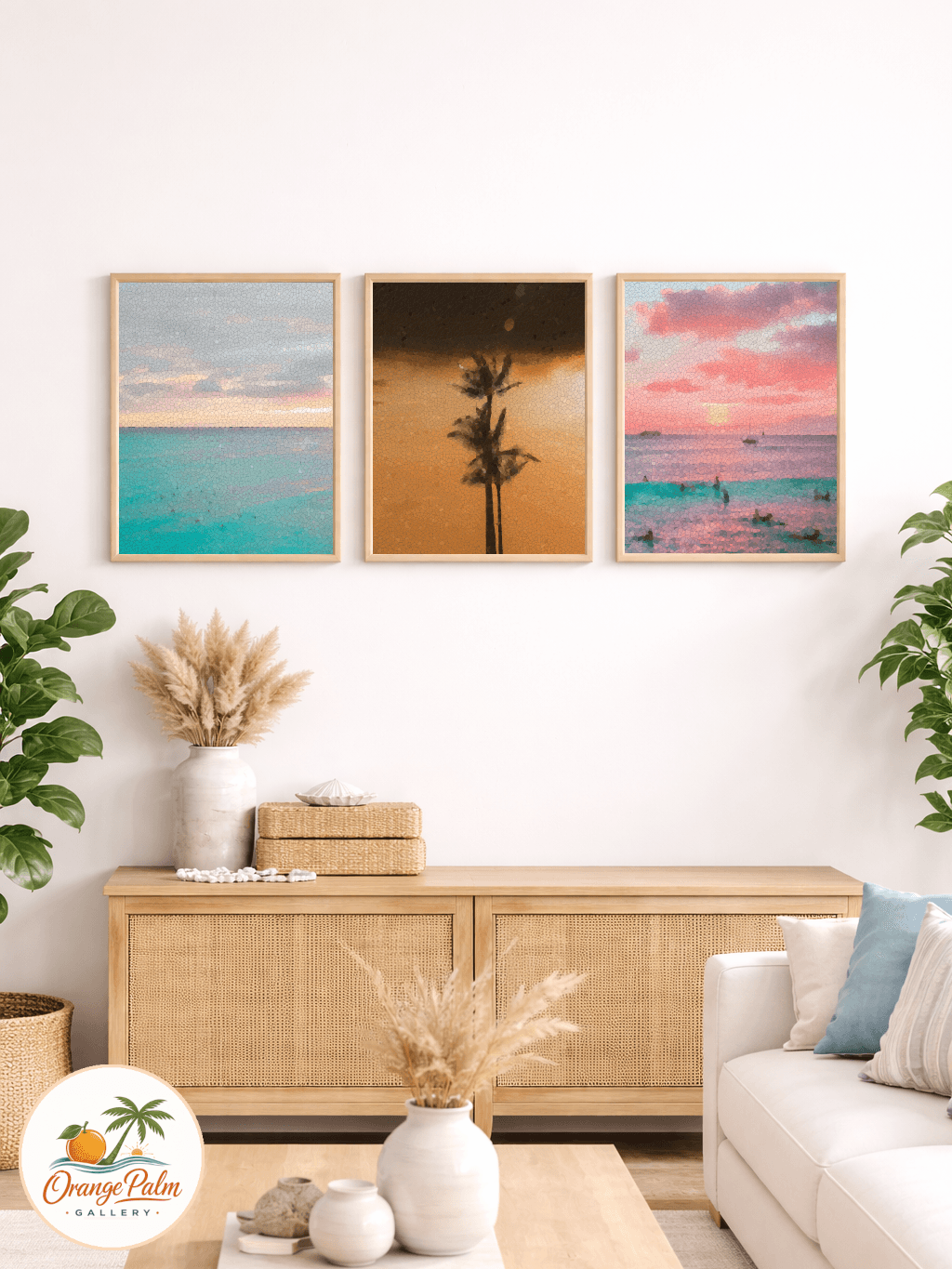
I would rather see one calm piece with breathing room than five small frames trying to make the room feel decorated. Small frames can be lovely, but in a guest room they often read as chores for the eye.
Use coastal references lightly
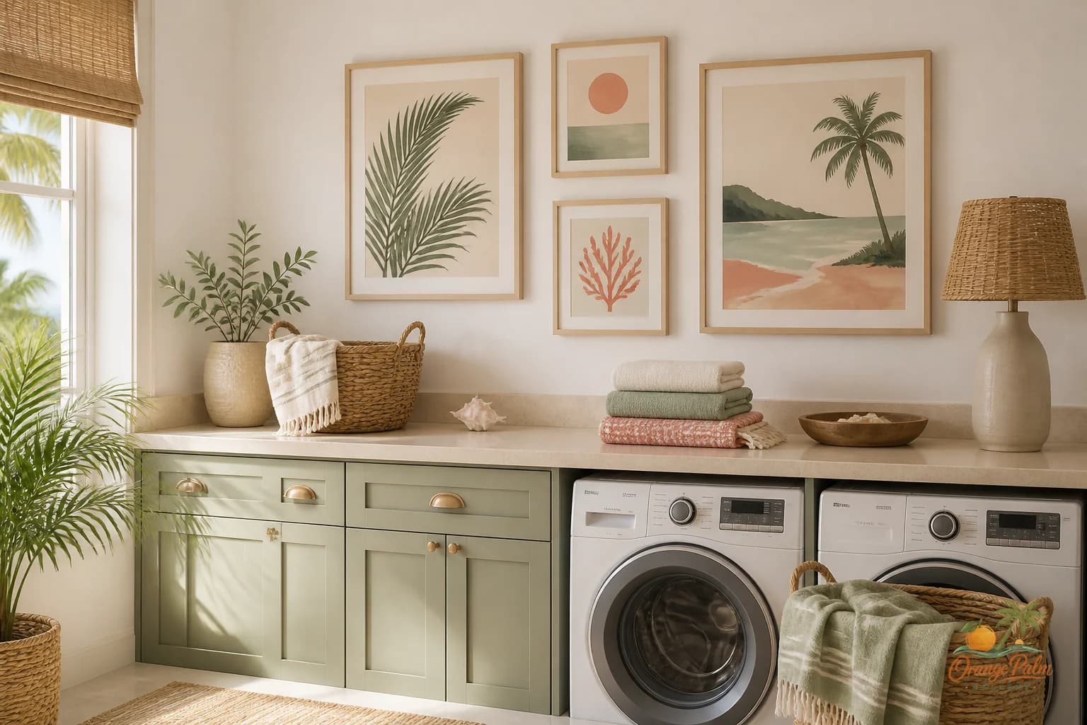
Florida inspired does not have to mean shells, anchors, or turquoise overload. A room can feel coastal through warmth, light, negative space, and organic shape.
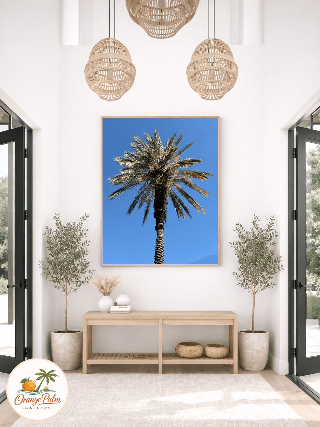
Think of a late afternoon wall after the sun moves across it. Think of palm shadows. Think of sand that is not beige so much as warm. That is a better starting point than a theme.
This is the lane Orange Palm Gallery keeps returning to: modern wall art that feels connected to place without turning the home into a souvenir shelf. If you want to keep looking through that lens, you can explore the studio here: https://orangepalmgallery.com/?utm_source=mdx
The room should not try too hard
The nicest guest rooms have a little restraint and a little nerve.
They do not apologize for being simple. They also do not hide behind beige. The art gives the room a point of view, then steps back.
That is what a good host does too.