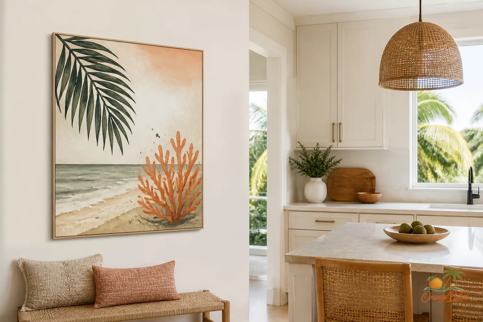
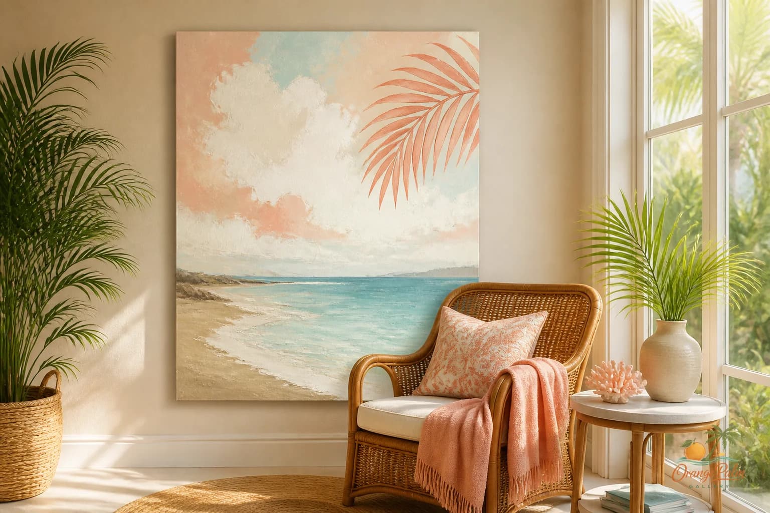
Wall Art Styling
The Reading Corner Wall Should Stay Quiet
Orange Palm Gallery notes on choosing and placing quiet wall art for a reading corner, with Florida inspired color, scale, and spacing advice.
August 28, 2026 / 4 min read / Orange Palm Gallery Studio
Source note: this guide is written and maintained by Orange Palm Gallery Studio. Last updated August 28, 2026.
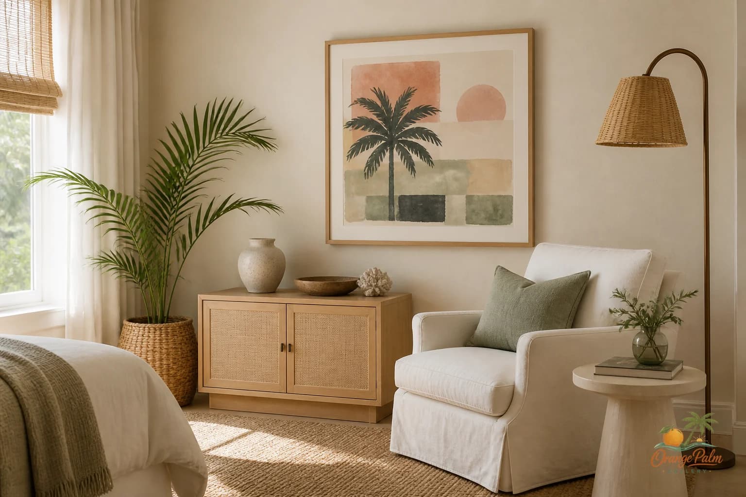
A reading corner is one of the easiest places to overdecorate.
It looks harmless at first. A chair. A lamp. Maybe a small table. Then the wall above it starts looking empty, and suddenly the corner is carrying three little prints, a shelf, a leaning frame, a plant hook, and something with words on it.
Now the quiet seat has become a bulletin board.
That is usually the wrong tradeoff. A reading corner is not asking for proof that someone styled it. It is asking for enough visual weight to feel intentional, then enough blank wall to let the room breathe.
Quick answer
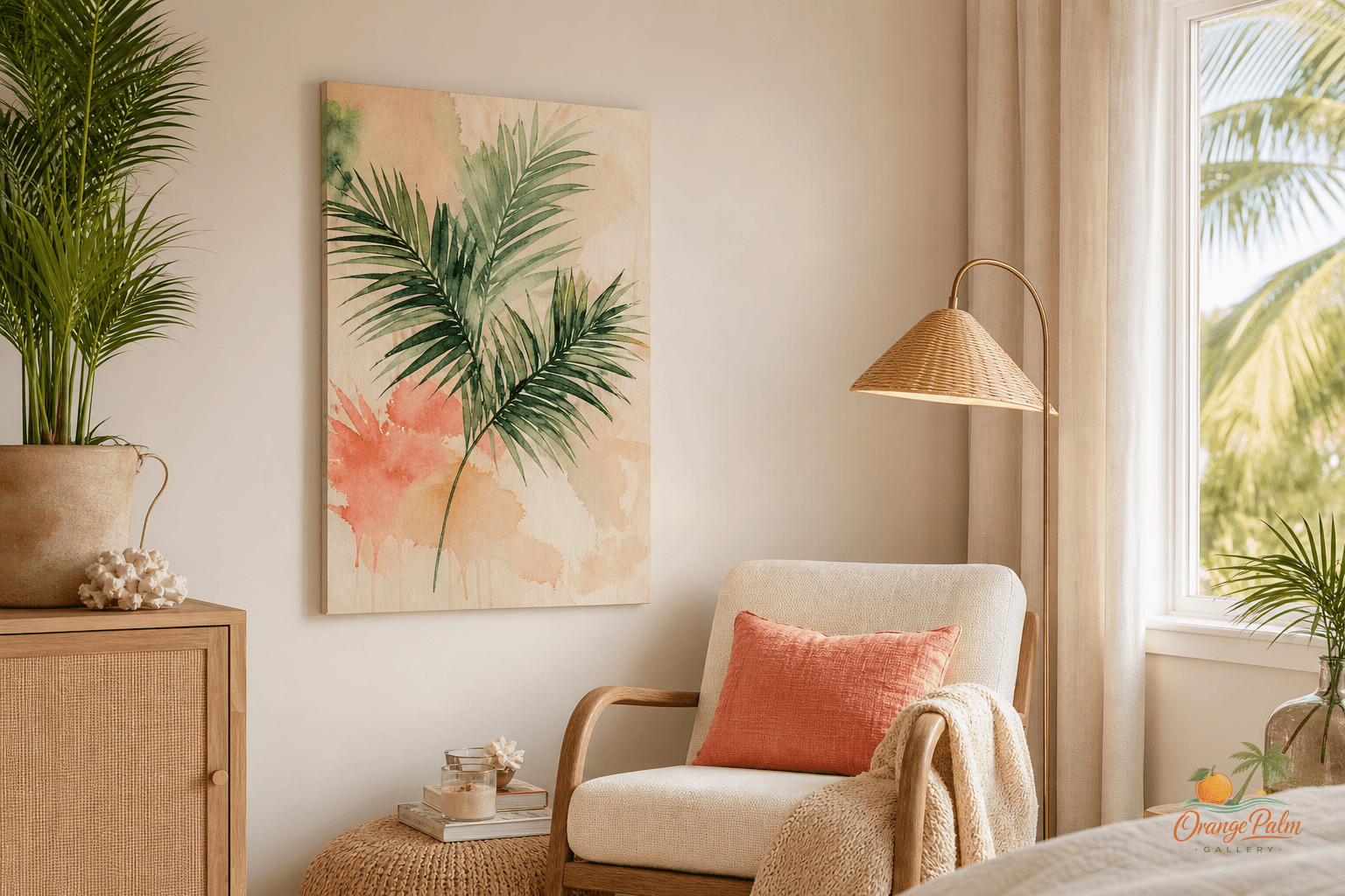
The best reading corner wall art ideas for a calm coastal home start with the chair, lamp, and side table as one small composition. Choose art that feels quiet at home, hangs low enough to belong to the chair, and leaves enough blank wall for reading.
Start with the chair, not the wall
The chair is the anchor. Not the art.
That sounds backward because wall art is the thing being chosen, but the chair decides the mood. A deep linen chair wants softer art than a sharp black reading chair. A woven accent chair can handle warmer, earthier color. A small slipper chair needs restraint because too much art above it can make the seat feel flimsy.
Before hanging anything, stand across the room and look at the whole corner as one shape: chair, lamp, side table, art, open wall. The art should complete that shape. It should not float above the chair like a separate thought.
For most reading corners, one vertical piece or one quiet horizontal piece is enough. A pair can work if the chair is wide or the wall is broad, but the pair needs to behave like one calm gesture. If the eye has to count the pieces, the corner is already getting louder.
Hang lower than you think
People often hang reading corner art too high because they are thinking about the wall as an empty rectangle. But this is a seated space. The art should relate to a person sitting down, not just to someone walking past.
A useful starting point: let the bottom edge sit close enough to the chair that the two feel connected, while still leaving breathing room. If the art is small, it can sit slightly lower. If it is large, give it more space so it does not press down on the chair.
The mistake is hanging a small piece high above the chair and hoping the lamp will bridge the gap. It rarely does. The result feels like a lonely sticker on drywall.
If you are using a floor lamp, think of the lamp as part of the composition. The art does not need to be centered perfectly over the chair if the lamp is visually strong. Sometimes the better placement is slightly off center, balancing the lamp on one side and the open wall on the other.
Symmetry is not the goal. Ease is.
Let the palette do less
Reading corners get better when the color palette narrows.
For a Florida inspired room, I like warm white, sand, palm green, soft ink, and maybe a small hit of coral if the rest of the space can handle it. The color should feel like filtered afternoon light, not a souvenir shop.
If the chair is patterned, choose quieter art. If the rug has movement, choose a simpler composition. If the corner already has books, plants, woven texture, or a ceramic lamp, the wall art can afford to be still.
What people get wrong is treating wall art as the only source of personality. In a reading corner, personality is already coming from the stack of books, the fabric, the lamp glow, the cup on the table, the way the chair sits near a window. The art should sharpen the mood, not compete for authorship.
Avoid the miniature gallery wall
Tiny gallery walls can be charming in the right place. A reading corner is rarely that place.
Small clustered art above a single chair often makes the wall feel nervous. The corner starts to look like it is auditioning for attention. Worse, the scale can make the chair look smaller, especially in rooms with high ceilings or broad blank walls.
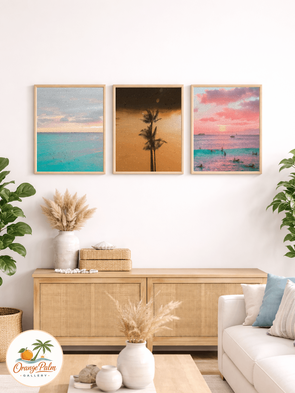
If you want more than one piece, keep the arrangement simple. Two stacked pieces. Two side by side pieces. A restrained trio with generous spacing. But skip the scattered salon look unless the whole room already has that collected, layered rhythm.
The reading corner should be the exhale in the room. Not the wall that starts talking first.
Give the blank wall a job
Blank space is not unfinished. In a reading corner, blank space is what makes the chair feel usable.
A little open wall around the art lets the eye slow down before it lands on the seat. It also keeps the corner from feeling staged, which is important. The best reading corners look like someone could actually sit there for twenty minutes, not like every object was placed for a photo.
That is the quiet standard I keep coming back to at Orange Palm Gallery: wall art should change the weather of a room without taking over the room. If you want more calm, modern Florida inspired notes and pieces, you can explore the studio here: https://orangepalmgallery.com/?utm_source=mdx
The corner does not need a theme. It does not need a quote. It does not need five frames to justify itself.
It needs one good visual pause, placed with care.