Wall Art Styling
The Wall Opposite the Bed Should Not Stare Back
Wall art styling advice for the bedroom wall opposite the bed, with calm Florida-inspired color, softer contrast, and better scale.
October 16, 2026 / 5 min read / Orange Palm Gallery Studio
Source note: this guide is written and maintained by Orange Palm Gallery Studio. Last updated October 16, 2026.
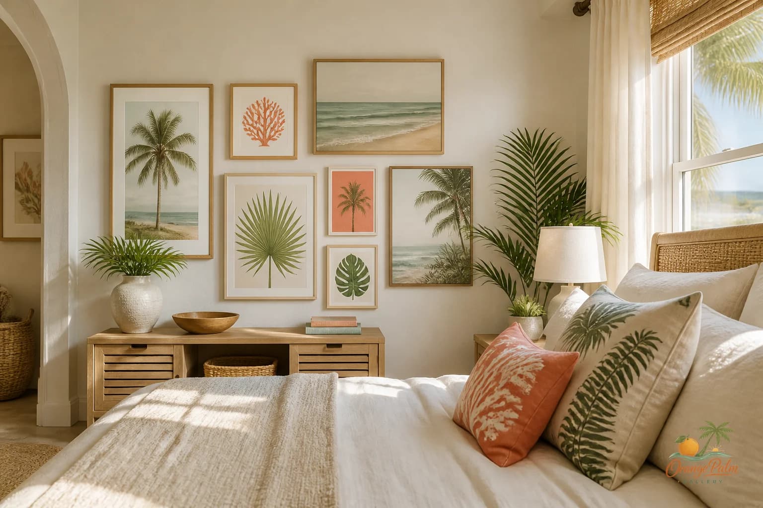
The wall opposite the bed has a strange job. It has to be visible without becoming theatrical. It is the wall you see before coffee, before shoes, before the day gets loud. If it acts like a hotel lobby feature wall, the whole bedroom starts performing instead of resting.
People often treat this wall like leftover real estate. The bed gets the headboard, the nightstands get lamps, the dresser gets a mirror, and the opposite wall gets whatever still needs a place. That is how a bedroom ends up with art that technically fits but emotionally argues with the room.
A better goal: give the wall a clear, quiet note.
Start with the viewing distance
Art across from the bed is usually seen from farther away than bedside art. That means tiny pieces can look nervous. One small print floating on a large wall asks the eye to work too hard, especially in the soft light of morning.
But the fix is not always one huge piece. Scale can come from width, repetition, or negative space. A medium piece with generous blank wall around it can feel more restful than a large piece packed with detail. The tradeoff is simple: big enough to register from bed, quiet enough not to dominate the room.
For a queen or king bedroom, think in broad shapes first. A horizontal piece can echo the bed line and make the room feel settled. A vertical piece can work if the wall is narrow or if there is a dresser below it, but it should not feel like a command center. If the room already has a lot of vertical lines from doors, windows, or tall furniture, a lower, wider art moment usually calms things down.
Keep contrast softer than you think
High contrast art can look crisp in a hallway or over a console. Across from the bed, it can feel a little too alert. Sharp black and white, heavy outlines, or busy pattern may photograph well, but bedrooms are not only for photographs.
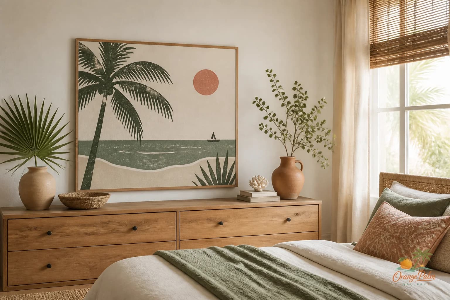
Orange Palm Gallery’s warm coastal language is useful here: warm white, sand, palm green, a little coral, and ink used with restraint. The palette can still have shape and personality. It just does not need to shout from the opposite wall.
A good bedroom piece can carry one darker note, maybe ink or deep palm green, but it should have breathing room around it. Let sand and warm white do some of the work. Coral is best as a pulse, not a siren. A small coral mark can warm the whole composition without turning the wall into a sunrise alarm.
Avoid the fake vacation wall
Coastal bedrooms go wrong when every surface tries to prove it lives near water. The wall opposite the bed does not need a literal beach scene, shell joke, or blue wash over everything. Florida inspiration can be more interesting than that.
Think about the quieter details: late afternoon warmth on stucco, palm shadows, sandy neutrals, weathered green, citrus pink, the flat calm of a horizon. Wall art can borrow from those things without illustrating them too neatly.
That is the difference between a room with coastal taste and a room with coastal props.
Hang it lower than your panic says
A common mistake is hanging art too high on the wall opposite the bed. People stand in the room, measure from their standing eye line, and forget the art will mostly be seen while sitting or lying down.
If there is furniture below it, let the art relate to that piece. If the wall is empty, resist pushing the art toward the ceiling just because the blank space feels large. A slightly lower placement often feels more human in a bedroom. It keeps the composition connected to the bed instead of drifting into the upper wall.
The piece should feel like part of the room’s resting zone, not a sign installed above it.
Give the wall one job
This wall is not the place for every framed memory, every quote, and every small object that lost the battle elsewhere. If you want a gallery arrangement, keep the rhythm slow. Fewer pieces, wider spacing, related tones. The bedroom can handle asymmetry, but it has to feel intentional.
A single piece is often stronger here because it lets the room exhale. A pair can work if the shapes are calm and the spacing is generous. A grid can work too, but only if the art itself is quiet enough to survive repetition.
What you want to avoid is visual chatter. Bedrooms already collect texture: bedding, curtains, rugs, lamps, books, laundry, chargers, shoes. The wall art should edit the room, not add another pile.
Use the morning test
Before choosing art for this wall, imagine seeing it at 7 a.m. with no overhead lights on. Does it feel kind? Does it give the room a little structure without demanding a reaction? Does the color still make sense when the room is dim?
That test is more useful than asking whether the art matches the pillows. Pillows change. Morning light tells the truth.
A calm wall opposite the bed gives the bedroom a quiet center. Not blank, not bland, not decorated into submission. Just enough shape, warmth, and coastal restraint to help the room start and end softly.
Explore more calm, modern Florida-inspired wall art and room styling ideas at Orange Palm Gallery.