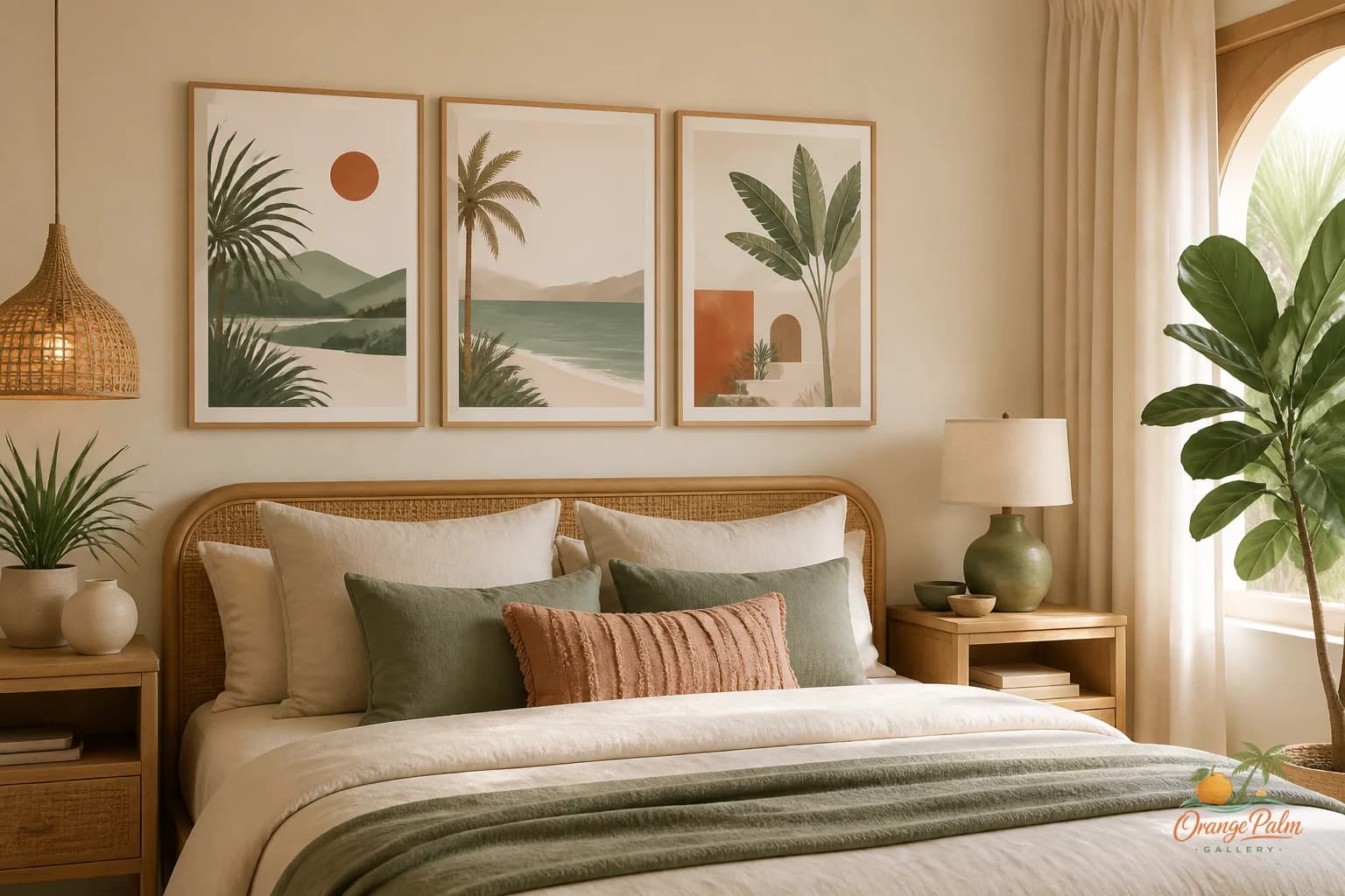
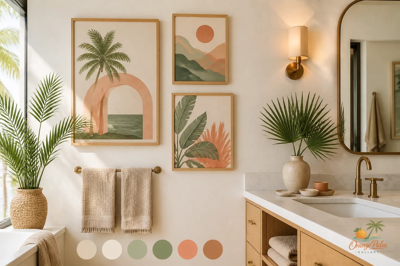
Wall Art Styling
The Dresser Wall Wants a Low Horizon
Bedroom dresser wall art placement advice for calm modern rooms, with notes on scale, spacing, color, and coastal Florida inspired mood.
September 18, 2026 / 4 min read / Orange Palm Gallery Studio
Source note: this guide is written and maintained by Orange Palm Gallery Studio. Last updated September 18, 2026.
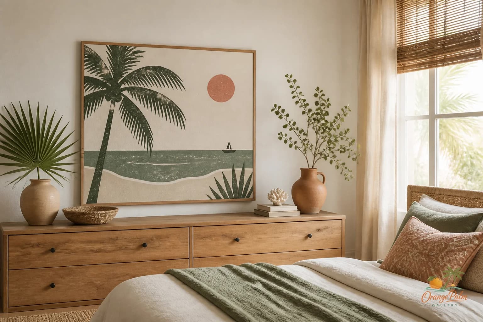
A dresser wall can go wrong in a very quiet way. Nothing crashes. Nothing looks obviously terrible. The art is just too high, too scattered, too eager to become a feature wall when the room wanted a place to exhale.
The dresser is already doing visual work. It is a long horizontal block with handles, wood grain, shadows, folded clothing, perfume bottles, a lamp, maybe a dish for small things. When art goes above it, the job is not to perform. The job is to make the whole area feel intentional.
Most people hang dresser art as if the dresser is not there. They center a piece on the wall, step back, and wonder why the room feels slightly off. The wall measurement won. The furniture lost.
Start with the dresser instead.
Keep the art close enough to belong
The best dresser walls usually have a low horizon. That means the art sits visually connected to the top of the dresser, not stranded halfway to the ceiling.
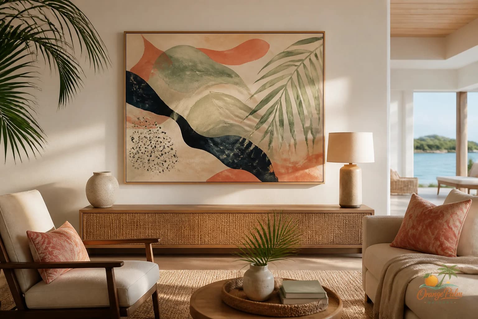
A good starting range is about 6 to 10 inches above the dresser top, adjusted for the height of the piece and anything sitting on the surface. If the dresser has a lamp or taller object, let that object overlap the art zone visually. The room will feel more layered and less like a showroom checklist.
The tradeoff is simple: higher art can make the wall feel taller, but it can also make the dresser look abandoned. Lower art makes the furniture and wall read as one composition. In a bedroom, I usually want the second outcome.
Choose width before you choose mood
Mood is tempting. Everyone wants the right coastal note, the right soft color, the right quiet print. But scale is less forgiving than color.
For one larger piece, aim for art that is roughly two thirds to three quarters the width of the dresser. It does not need to be exact, but it should feel like it has enough shoulder. A tiny piece above a wide dresser looks nervous. A piece that is wider than the dresser can work, but it starts to feel architectural, not intimate.
For two pieces, keep the gap modest. The mistake is treating each piece as its own little island. A pair should read almost like one wider breath. Think palm shade and pale sand, not two separate announcements.
For three pieces, keep the rhythm calm. Equal spacing helps, but equal visual weight matters more. If one piece is much darker or busier, it will pull the whole dresser to one side.
Let the dresser top edit the wall
A dresser top is not just storage. It is the foreground of the wall art.
If the surface is busy, the art should be simpler. If the dresser top is spare, the art can carry more texture or contrast. This is where Florida inspired rooms can get beautiful without getting themed. A warm white ground, a palm green shape, a muted coral edge, a sandy beige field. Those colors can suggest heat, shade, and coast without putting a beach sign in the bedroom.
The room does not need proof that it lives near sunshine. It needs the feeling of light landing well.
Try this: remove half the objects from the dresser before judging the art. Then put back only what changes the composition for the better. A lamp can anchor one side. A low tray can settle the other. A small ceramic piece can break the straight line. But too many small objects make the art work harder than it should.
Avoid the mirror default
A mirror above a dresser can be useful, but it is not always the best visual answer. Mirrors reflect whatever is opposite them, including closet doors, ceiling fans, laundry baskets, and the restless parts of real life.
Wall art gives you more control. It lets that part of the bedroom hold a mood instead of reflecting whatever happened five feet away.
If the room already has strong practical elements, art may be the softer choice. Something with a broad shape, a quiet coastal palette, or a hand touched texture can make the dresser feel finished without adding more visual noise.
Build a bedroom corner that lowers the volume
The dresser wall is usually seen at the beginning and end of the day. That changes the rules. This is not the spot for art that demands too much attention. It should reward a glance, not grab the room by the collar.
Look for calm contrast. Ink against warm white. Palm green against sand. A coral note used like seasoning, not frosting. If the bedroom already has patterned bedding, pull the art back. If the bedding is plain, the wall can take a little more movement.
The nicest dresser walls feel settled. The art is low enough to belong to the furniture, wide enough to hold the wall, and quiet enough to let the bedroom stay a bedroom.
That is the whole point. Not every wall needs to become a moment. Some walls just need to lower the room into place.
Explore Orange Palm Gallery pieces for calm, modern Florida inspired homes at https://orangepalmgallery.com/?utm_source=mdx.