Wall Art Styling
The Sofa Wall Should Answer the Seating, Not the Drywall
How to choose size, height, spacing, and color for wall art above a sofa without letting the empty wall bully the room.
November 2, 2026 / 5 min read / Orange Palm Gallery Studio
Source note: this guide is written and maintained by Orange Palm Gallery Studio. Last updated November 2, 2026.
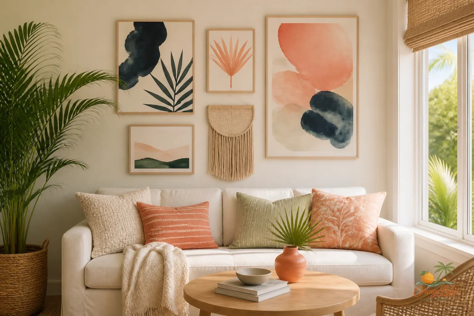
A sofa wall can make a living room feel finished in one move. It can also make the room look like somebody panicked at a giant blank rectangle and bought art by square footage.
That is usually where the trouble starts. People center the art on the wall, not on the sofa. They hang it too high because the ceiling feels tall. They choose one piece so small it looks stranded, or one piece so loud it turns the couch into a waiting room bench.
The wall is not the boss. The seating is.
Start with the width of the sofa
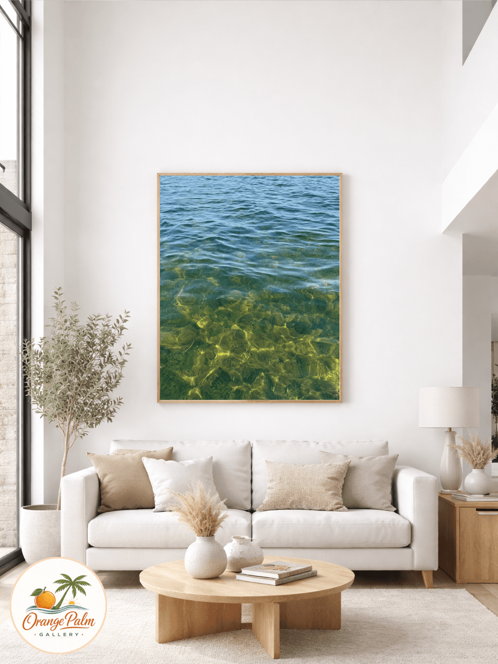
For most living rooms, art above a sofa wants to feel connected to the furniture below it. A good visual range is about two thirds to three quarters of the sofa width. Not a law, just a useful guardrail.
If the sofa is 84 inches wide, a single large piece around 56 to 64 inches wide can feel grounded. If you are working with two or three pieces, think of the full group as one shape. The outside edges matter more than the individual frames.
What looks wrong is usually not the art itself. It is the lonely gap between the art and the furniture. A small print floating above a long sofa has the same energy as a postage stamp on a garage door.
Hang it lower than your instinct says
The biggest sofa wall mistake is height. Art gets pushed upward because people imagine the center of the wall matters. In a room where people sit, the eye line drops.
A comfortable starting point is to place the bottom edge of the art or gallery grouping about 6 to 10 inches above the sofa back. If the sofa has very loose pillows, give it a little more breathing room. If the back is low and clean, you can sit closer to the 6 inch side.
The goal is not to avoid all empty wall. The goal is to make the art feel like it belongs to the seating zone. Too much blank space between the sofa and the art makes the two feel unrelated, like they were installed by different committees.
Let the art follow the furniture, not the architecture
A room can have an off center window, an odd vent, a wall that runs too long, or a sofa that is shifted to make space for a walkway. Do not let the drywall trick you into solving the wrong problem.
Center the art over the sofa or over the seating composition. If there is a floor lamp on one side and a side table on the other, include their visual weight in the decision. Sometimes the art should shift slightly to balance the whole sitting area, not line up with the exact sofa seam.
This is where a room starts to look designed instead of decorated. The art is not just filling wall space. It is answering the arrangement below it.
Choose quiet color with one clear opinion
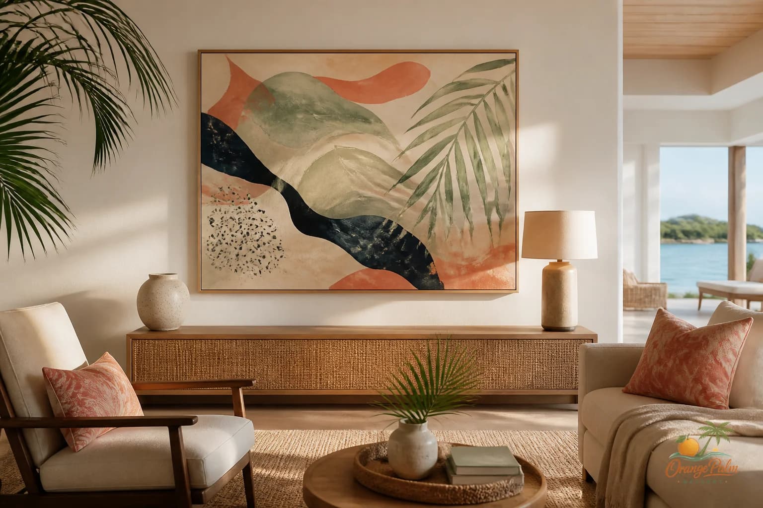
For a warm modern coastal room, the sofa wall does not need to shout beach. It needs a little temperature, a little movement, and enough contrast to hold its place.
A palette of warm white, sand, palm green, coral, and deep ink can do more than a literal shell or sign ever will. The Florida reference can be in the light, the softness of the edge, the washed warmth, or the way a green shape cuts through a pale ground.
If the sofa is neutral, art can bring the room its point of view. If the sofa is already colorful, the art may need to calm down and carry texture instead. Both choices can work. The tradeoff is simple: either the art becomes the color note, or it becomes the resting place.
Trying to make it do both often creates a room that feels busy but not alive.
Think in one large shape
A gallery wall above a sofa can be beautiful, but it needs discipline. The collection should read as one large shape from across the room. That means consistent spacing, a clear outer boundary, and enough shared color language to keep the eye from bouncing everywhere.
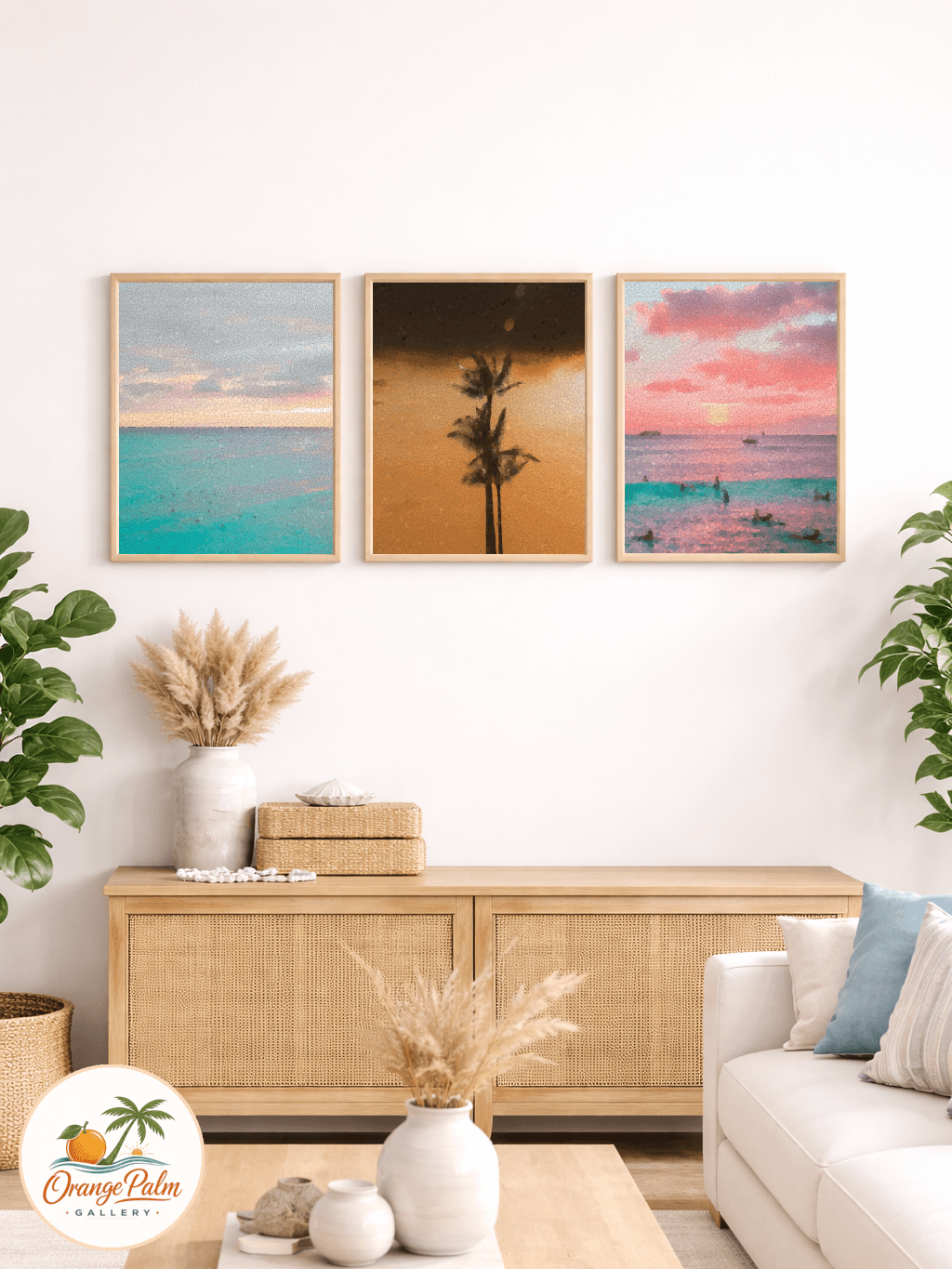
For a calmer look, try three pieces in a row with the same frame size or two larger vertical pieces with generous space between them. For a looser studio feel, mix sizes but keep the outside edges tidy. A wild center can work if the perimeter behaves.
Before hanging anything, lay the arrangement on the floor. Better yet, tape the outer shape on the wall. You will see the problem immediately. The eye understands proportion faster than the measuring tape does.
Leave room for the room
A sofa wall is not a product display. It has to live with cushions, throws, side tables, lamps, plants, books, and the ordinary mess of a living room. Art that looks perfect in isolation can feel stiff once real life enters the frame.
The best sofa wall has enough presence to anchor the seating, but enough restraint to let people relax near it. That is the line worth protecting.
At Orange Palm Gallery, I keep coming back to that balance: warm color, clean composition, and a little Florida light without turning the room into a theme. If you want more calm, modern wall art and styling notes, you can explore the studio here: Orange Palm Gallery.
The sofa wall does not need to impress the whole house. It needs to make the place where people sit feel considered.