Wall Art Styling
The Console Wall Wants Weight, Not Clutter
How to style wall art above a console table with enough visual weight, breathing room, and warm Florida restraint.
September 14, 2026 / 4 min read / Orange Palm Gallery Studio
Source note: this guide is written and maintained by Orange Palm Gallery Studio. Last updated September 14, 2026.
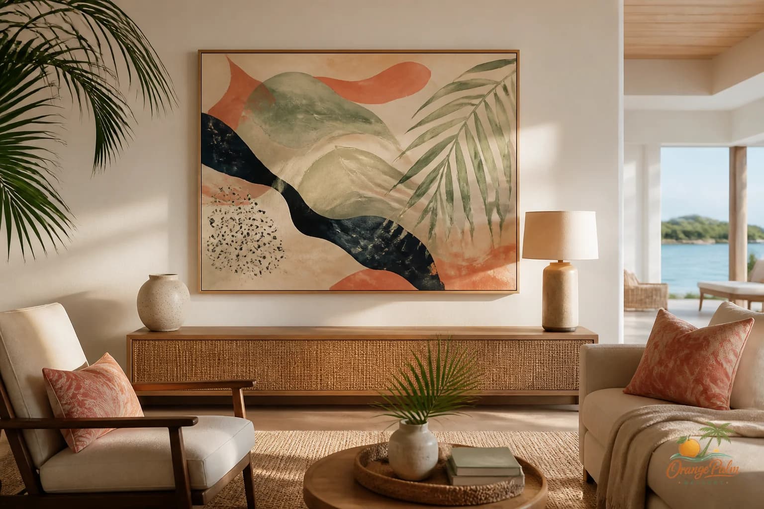
A console table is one of those pieces that quietly causes trouble.
It looks simple. Low surface, skinny legs, maybe a lamp, maybe a bowl for keys, maybe a stack of books that no one is reading. Then the wall above it gets treated like leftover space. A mirror goes up because mirrors feel safe. Three tiny prints get lined up because symmetry feels productive. A vase joins in. A tray joins in. Suddenly the whole thing looks like a mantel that lost its fireplace.
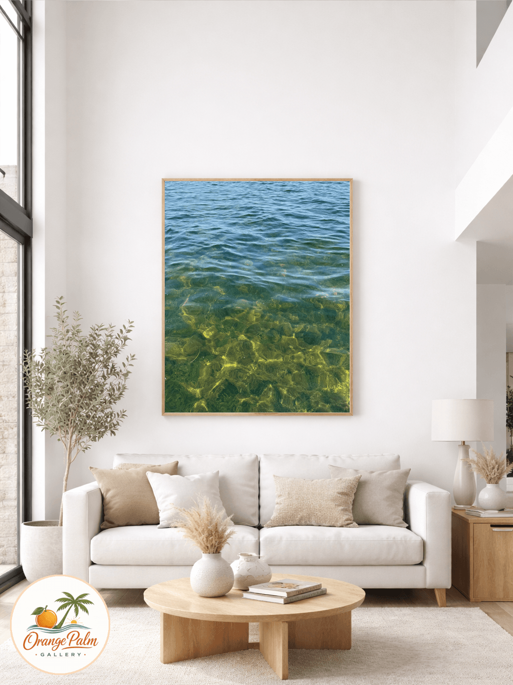
The better move is usually less decorative and more architectural: give the wall one clear piece of visual weight.
Start with the line the console already makes
A console creates a horizontal line across the room. That line is stronger than people think. If the art above it is too small, the furniture looks heavy and the wall looks nervous. If the art is too busy, the whole zone starts chattering.
I like console wall art that feels broad, calm, and slightly grounded. Not necessarily huge, but substantial enough to hold the space above the table without asking a pile of accessories to help.
In a Florida inspired room, that might mean a soft palm shape, a sand colored abstract, a quiet coastal curve, or a piece with enough warm white space to let the room breathe. The point is not to shout beach. The point is to catch the same kind of light the room already has.
The mistake is treating the console like a stage
A console does not need a cast of twelve objects.
One lamp can be useful. One vessel can be beautiful. A low stack of books can add a human note. But when every inch of the top gets styled, the wall art has to fight through clutter before it can do its job.
That is the tradeoff: more objects can make a surface feel collected, but they also steal clarity from the artwork. If the wall art is the mood setter, keep the surface quieter. If the objects are the story, choose simpler art. Trying to make both the hero usually makes the whole wall feel undecided.
Choose art with enough body
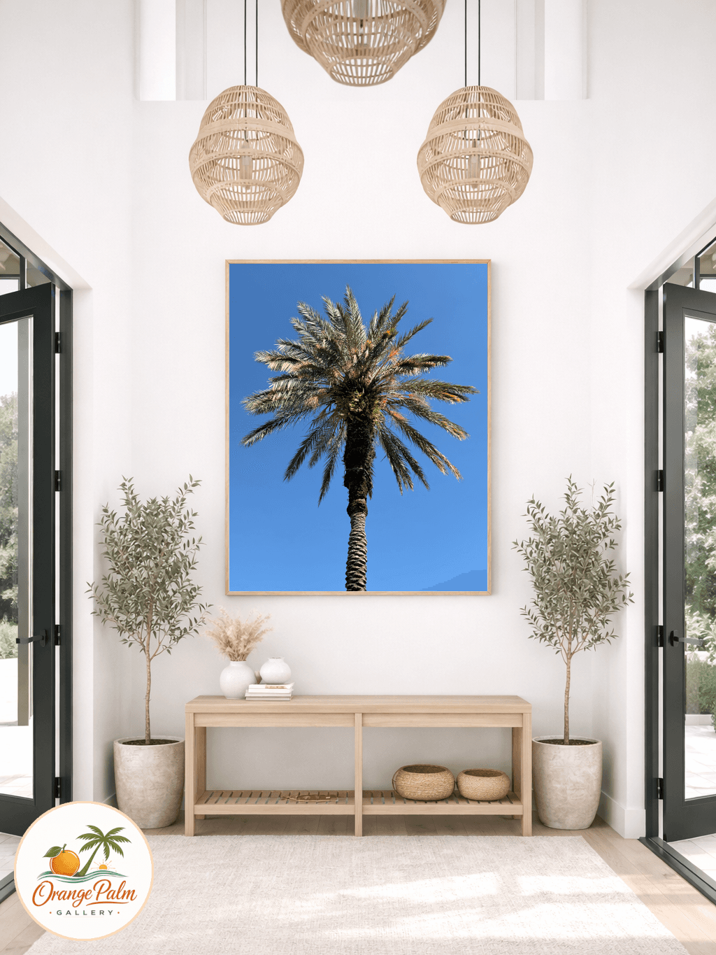
For most console walls, a single larger piece works better than several small ones. Small art above a long, low table often looks apologetic. It leaves too much empty air around it, then people try to fix that empty air with more stuff.
A good proportion is art that takes up a meaningful portion of the console width without matching it exactly. Exact matching can feel stiff. Too narrow can feel temporary. Somewhere in the middle is usually where the wall starts to relax.
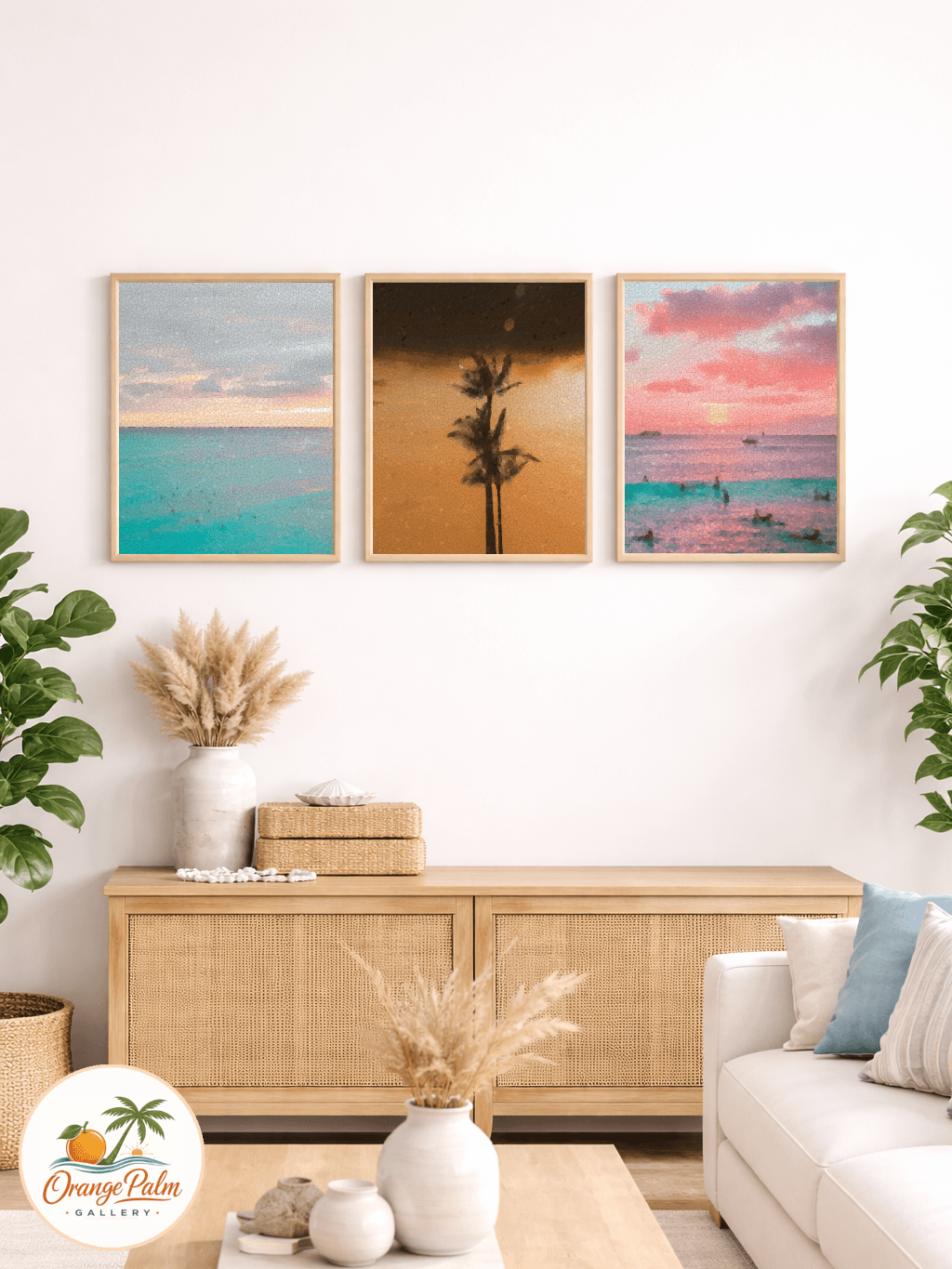
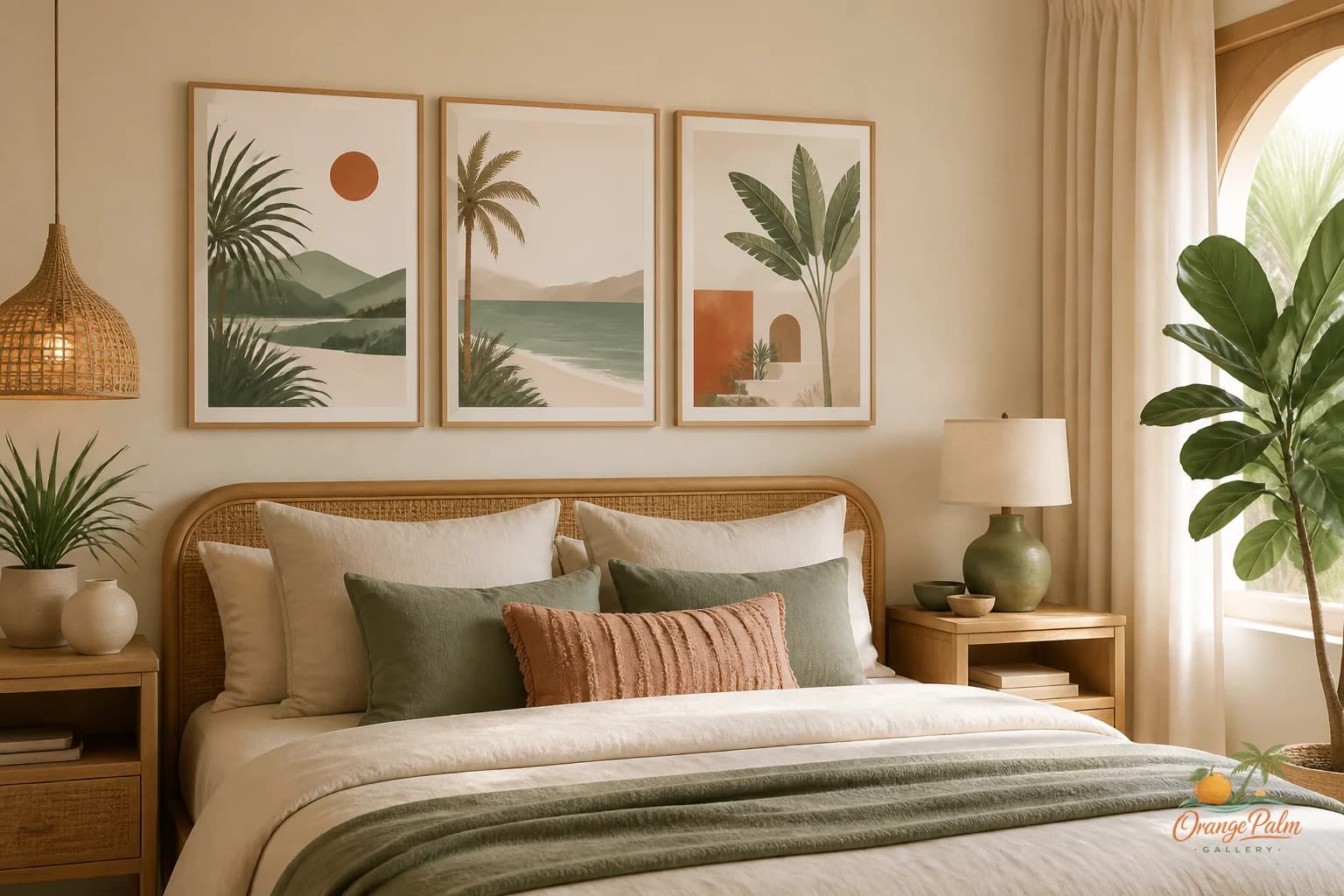
If you prefer a pair, keep the pair calm. Two pieces with shared color, shared spacing, and a similar visual rhythm can work beautifully. Four tiny pieces, each with a different personality, will make the console feel like a hallway bulletin board.
Leave a little air between table and art
The space between the console and the artwork matters. Too high, and the art floats away from the furniture. Too low, and everything feels cramped.
A modest gap usually feels best. Enough room for the table surface to exist, not so much that the art disconnects from the vignette. Think of the console and the art as one composition, not two separate decisions.
This is where coastal restraint helps. Warm white wall, pale sand, palm green, coral in a small dose, ink for structure. You do not need every Florida color at once. One or two notes are enough.
Let texture do some of the work
Console zones often sit in transition spaces: behind a sofa, along a living room wall, near a dining pass through, close to a door. They need polish, but they also need to survive real life.
That is why handmade feeling art works well here. Soft edges, imperfect shapes, visible brush like texture, or quiet paper grain can make a modern room feel less showroom stiff. The room gets warmth without needing a dozen little props.
The console wall should feel intentional from across the room and pleasant up close. That is a narrow brief, but it is a good one.
A simple composition that usually works
Try this:
- one substantial artwork centered above the console
- one lamp or vertical object on one side
- one low object on the other side
- plenty of visible surface between them
- colors that repeat something already in the room
That last part is important. The art should not look imported from a different house. Pull from the room: a linen shade, a palm outside the window, terracotta tile, pale oak, a dark green cushion, the color of late afternoon light on the wall.
A console wall is not empty space to solve. It is a chance to set the room’s pace. The best version has weight, air, and a little quiet confidence.
Explore more calm, modern Florida inspired wall art and styling notes at Orange Palm Gallery.