Wall Art Styling
Bedside Wall Art Should Not Wake the Room
How to style bedside wall art with quieter scale, warmer color, and better spacing for a calm modern coastal bedroom.
October 7, 2026 / 4 min read / Orange Palm Gallery Studio
Source note: this guide is written and maintained by Orange Palm Gallery Studio. Last updated October 7, 2026.
The bedside wall is where a lot of otherwise calm bedrooms start acting jumpy.
People treat the space above a nightstand like a miniature gallery wall, then wonder why the room feels busy at the exact spot where it should slow down. A stack of books, a lamp, a water glass, a charging cord, maybe one small dish for jewelry. The nightstand is already doing plenty. Wall art beside the bed should not add another round of visual errands.
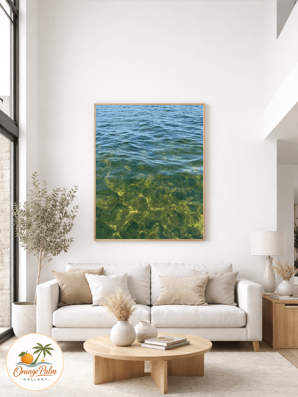
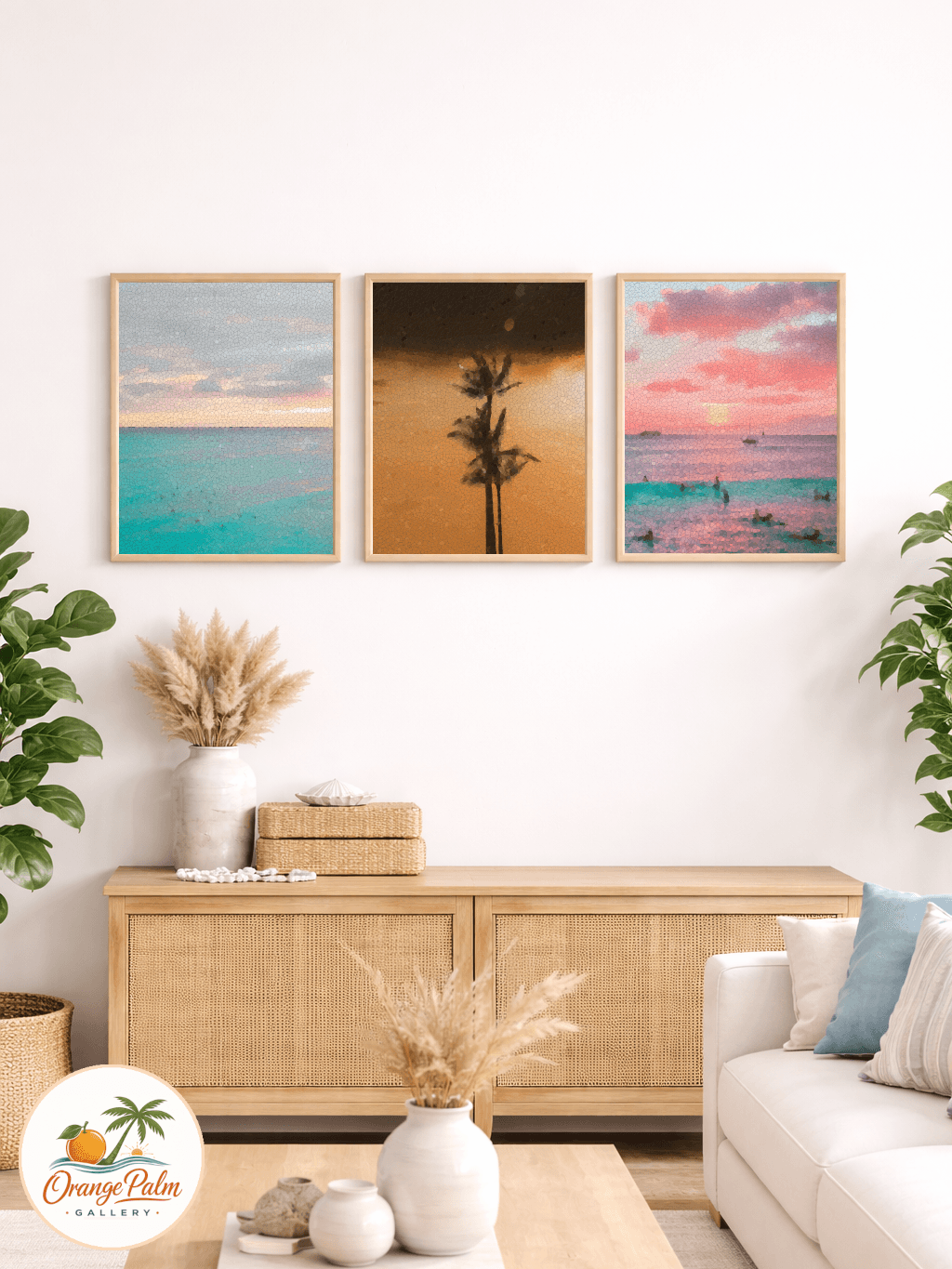
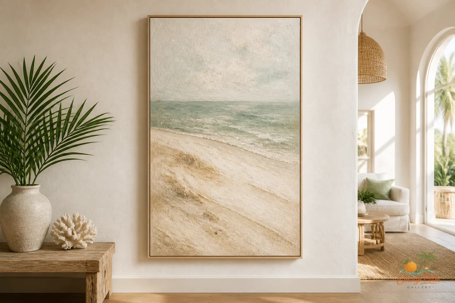
I like bedside art best when it feels almost overheard. A small coastal shape. A soft block of sand color. A palm green mark that does not try to become a whole vacation. Something with enough presence to finish the wall, but not so much drama that it competes with sleep.
Start with the lamp, not the wall
The common mistake is measuring the blank wall first. That usually leads to art that is too large, too high, or too centered on the wrong thing.
Start with the lamp instead.
If the lamp has a wide shade, the art can be narrower and quieter. If the lamp is slim, the art can carry a little more width. The goal is not symmetry for its own sake. The goal is a bedside stack that reads as one calm composition: table, lamp, art, negative space.
A good rule is to let the art sit a few inches above the visual top of the lamp shade, not floating halfway to the ceiling. When art climbs too high, the nightstand looks abandoned underneath it. When it sits too low, the wall feels cramped. That small band of breathing room is where the bedroom starts to feel considered.
Smaller is usually better here
A bedside wall does not need the biggest print that will physically fit. That is the trap.
Large art can work over a bed because the bed has enough mass to answer it. A nightstand does not. It is a small piece of furniture with small daily objects on it. Oversized art above it can make the whole corner feel top heavy, like the wall is leaning into the room.
For a calmer bedroom, choose a piece that leaves visible air on at least two sides. Not a postage stamp, but not a proclamation either. The most elegant bedside art often feels slightly modest. It knows the bed is the main object in the room.
That modesty is not boring. It is discipline.
Color should lower the temperature
In a Florida inspired room, coastal color can go wrong fast. Too much blue and white can feel like a rental hallway. Too much coral can feel awake in the wrong way. Too much green can turn botanical into themed.
For bedside art, I would rather see color behave like morning light through a shade.
Warm white keeps the wall open. Sand softens hard furniture edges. Palm green gives the room a living note without shouting plant corner. Coral works best as a small warmth, not the whole conversation. Ink is useful when the room needs one fine line or darker shape to keep everything from dissolving.
The tradeoff is simple: quieter color asks more from texture, shape, and spacing. That is a good tradeoff in a bedroom. A room meant for rest should not need loud color to prove it has taste.
Do not force a pair
Two nightstands do not automatically need matching art.
Matched pieces can be beautiful if the room is already visually loose. But if the bed, lamps, pillows, and nightstands are all paired, identical art can push the room into hotel behavior. Clean, yes. Personal, not always.
Try related instead of identical. Same palette, different shape. Same scale, different composition. One side can carry a small abstract piece while the other uses a quieter coastal form. The room will still feel balanced if the visual weight is similar.
Balance is not sameness. It is when both sides of the bed feel like they belong to the same sentence.
Leave one edge imperfect
A perfectly centered bedside piece can look stiff, especially if the nightstand is narrow or the lamp is already centered. A slight shift toward the bed often feels more natural. It pulls the composition inward and keeps the outside edge from looking like a display shelf.
This is one of those small placement choices that changes the mood without announcing itself. The wall feels styled, but not staged.
And that is the point. Bedside wall art should support the private rhythm of the room. It should sit near the lamp, soften the corner, hold a little color, and then get out of the way.
A bedroom does not need art that wakes the room. It needs art that lets the room exhale.
Explore more calm, modern Florida inspired wall art and styling notes at Orange Palm Gallery.