Wall Art Styling
The Dining Room Side Wall Can Handle a Little Tension
Warm, practical advice for choosing dining room side wall art with scale, color, and Florida inspired restraint.
September 28, 2026 / 5 min read / Orange Palm Gallery Studio
Source note: this guide is written and maintained by Orange Palm Gallery Studio. Last updated September 28, 2026.
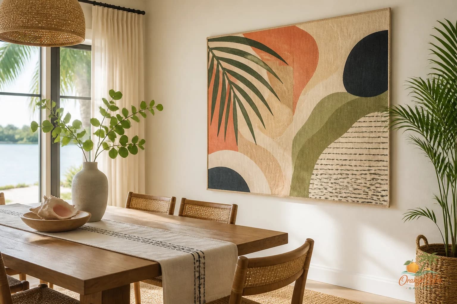
Dining room art gets treated too politely.
People look at the table, the chairs, the light fixture, the rug, then choose art that behaves like a napkin ring. Same tone, same mood, same safe little coastal whisper. The result is technically pretty and strangely dead.
The dining room side wall is not the head of the table. It does not have to announce the room. It also should not disappear. It is the wall you catch from an angle while someone is pouring water, passing a bowl, or leaning back after dinner. That means it can carry a different kind of mood: slower, saltier, a little more graphic.
For a Florida inspired room, that tension matters. Too much beach language and the dining room turns into a rental listing. Too much minimalism and the room starts to feel like nobody has ever spilled citrus dressing there. The better middle is art that feels sun warmed but not themed, composed but not stiff.
Start with the table, then argue with it a little
The table already sets the rhythm. A long rectangular table makes the eye move horizontally. A round table softens the room. A chunky wood table brings weight. A glass or pale table keeps things airy.
Do not automatically mirror that rhythm on the wall.
If the table is long and linear, one vertical piece on the side wall can be a smart interruption. It gives the room a spine instead of another stripe. If the table is round, a wider horizontal artwork can keep the room from becoming too soft and floaty. If the room is full of woven texture, a cleaner graphic piece can keep the whole thing from going fuzzy.
Matching is easy. Balance is better.
Give the wall one clear job
A dining room side wall usually needs one of three things from art.
It may need weight. This happens when the table and chairs sit in the middle of the room and the side wall feels bare, pale, and forgotten. Choose a piece with deeper ink, palm green, clay, rust, or shadow. Not dark for drama, dark for anchoring.
It may need movement. This works when the room has a lot of straight furniture lines. Look for curve, botanical gesture, waterlike shapes, or an abstract composition that feels hand placed rather than mechanically centered.
Or it may need quiet. If the dining room already has a patterned rug, open shelving, a dramatic pendant, or a busy view, the art should hold its ground without competing. This is where warm white space, sand tones, and one restrained mark can do more than a crowded print.
The mistake is asking one wall to do all three jobs. That is how rooms get nervous.
Hang it for seated people, not just standing people
Dining rooms are experienced sitting down. That changes the art height.
A piece that looks perfect while standing can feel oddly high once everyone is seated. On a side wall, the center of the artwork can usually sit a little lower than you might expect, especially if the wall is viewed from the table. The goal is not museum height. The goal is conversation height.
Leave enough breathing room above a console, sideboard, or chair rail if there is one. But do not shove the art up toward the ceiling just because the wall is tall. Tall blank space above art is usually less offensive than art that feels like it is trying to escape the meal.
If you are using two pieces, keep the gap intentional. A narrow gap feels like a pair. A wide gap feels like two separate thoughts. Both can work. The lazy middle looks accidental.
Color should season the room
Dining room color does not need to match the plates, the runner, or the chair cushions. It should season the room.
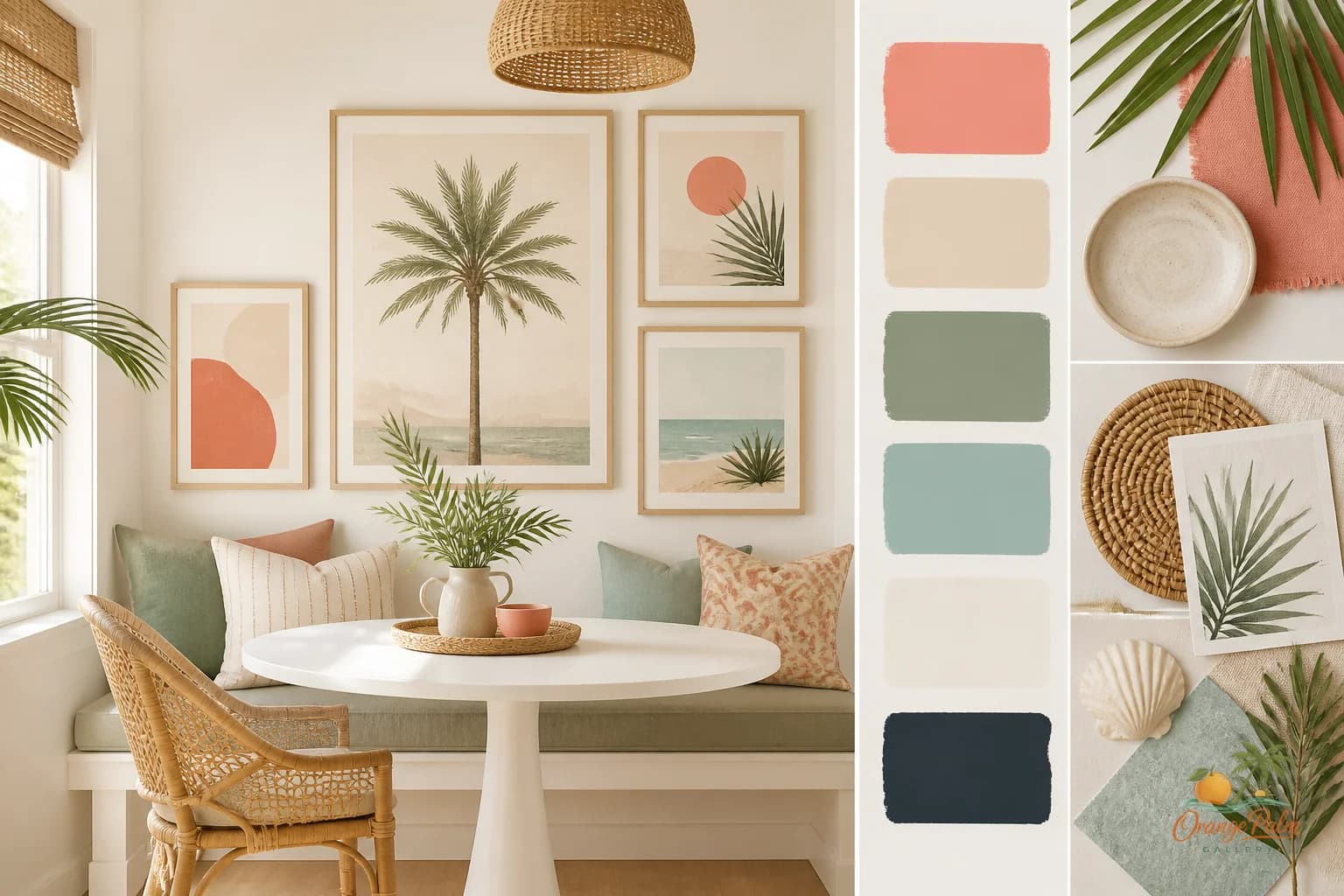
In a warm coastal space, I like art that borrows from the outside without turning literal: palm green that feels leafy but not jungle themed, coral that feels like late sun rather than candy, sand that has enough warmth to sit with wood, ink that gives the eye somewhere to land.
If your dining room is mostly white and beige, do not be afraid of a stronger note. One deep green or inky shape can make the pale tones look intentional instead of unfinished. If the room already has color, go quieter with the art, but keep some contrast in value. A low contrast print on a low contrast wall can look expensive up close and invisible from the doorway.
That tradeoff is worth naming. Subtle art rewards closeness. Dining rooms need both closeness and distance.
The side wall can be slightly less charming
Not every piece in a home has to be charming. A dining room side wall can handle something a little drier, flatter, stranger, or more architectural than the art you would put over a bed.
That does not mean harsh. It means less decorative reflex. A quiet abstract palm shape. A block of sun faded color. A coastal line that feels more like a memory than a postcard. Something with enough restraint to let food, people, and glassware stay alive in the room.
The best dining room art does not beg to be noticed during dinner. It changes the air around the table.
If you are building a calm, modern Florida inspired room, start with one side wall and make a decision there before filling every blank surface. One good piece with the right amount of tension will do more than a matched set trying to prove the theme.
Explore more Orange Palm Gallery notes and pieces for calm, modern Florida inspired homes at https://orangepalmgallery.com/?utm_source=mdx.