Wall Art Styling
The Hallway Wall Should Breathe Between Doors
How to choose and place wall art in a narrow hallway so the space feels calm, intentional, and visually breathable.
September 21, 2026 / 4 min read / Orange Palm Gallery Studio
Source note: this guide is written and maintained by Orange Palm Gallery Studio. Last updated September 21, 2026.
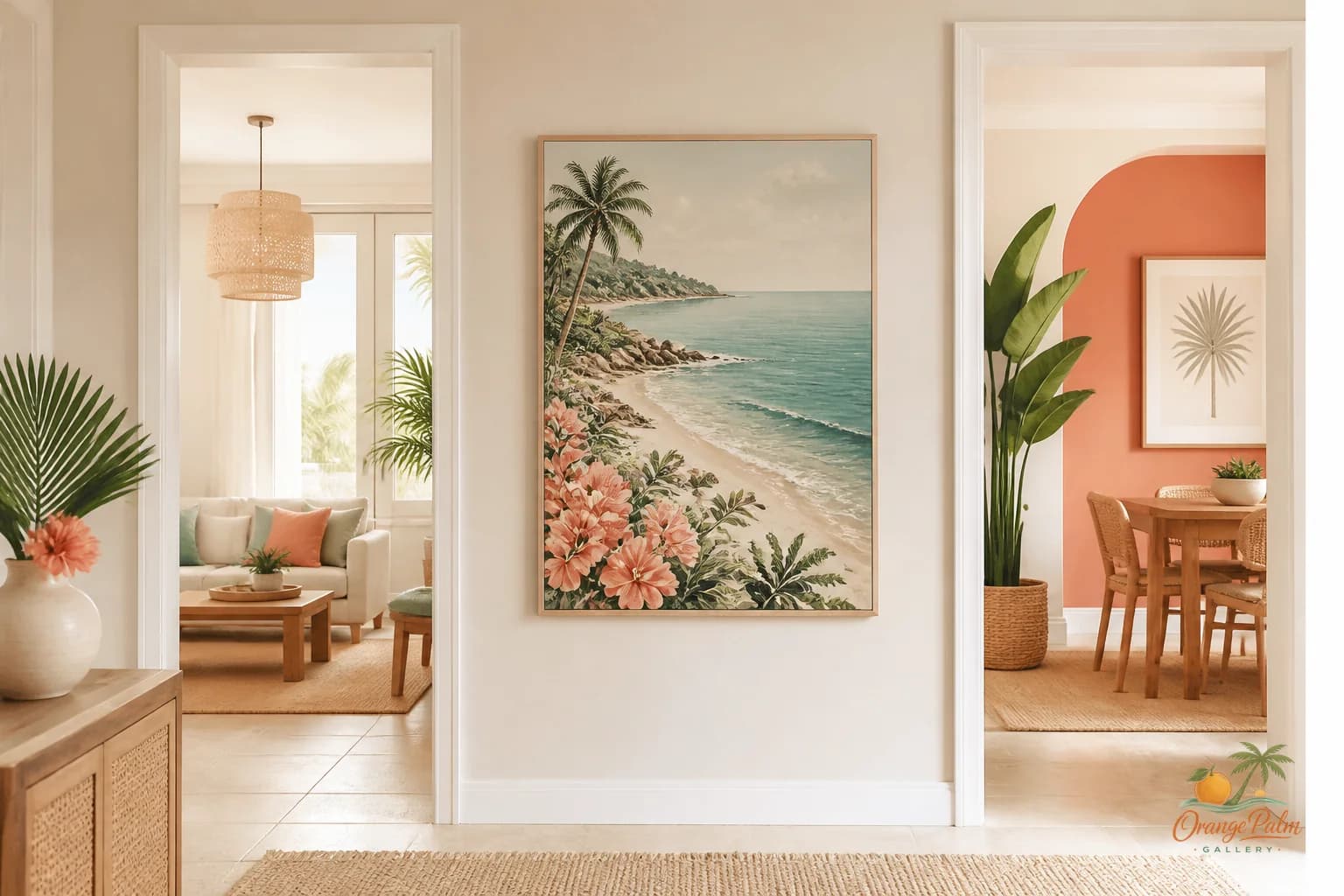
A hallway wall has a strange job. It is visible all day, but rarely looked at for long. You pass it with laundry, coffee, keys, a towel, a dog leash, a half remembered thought. It is not a place where people stand and admire composition for ten minutes.
That is exactly why hallway wall art gets overworked.
People see a narrow blank wall between two doors and treat it like unused inventory. A small print here, a framed quote there, maybe a vertical stack because the wall is skinny and something should fill it. Then the hallway starts to feel busy before anyone has even entered a room.
The better move is usually one piece with enough air around it.
Start with the doors, not the art
In a hallway, the wall is never alone. Door trim, baseboards, light switches, vents, and shadows are already part of the composition. If you ignore those lines, even beautiful art can look like it was squeezed into the only available patch of drywall.
Stand at the end of the hallway and look at the full run. Notice where your eye lands first. Is there a clean rectangle of wall between two door frames? Is the switch plate cutting into the best spot? Does one door stay open most of the day and cover part of the wall?
The art should work with the hallway as it actually lives, not as it looks for five seconds after tidying.
For a wall between doors, I like a single piece that leaves visible breathing room on all sides. Not a tiny piece floating apologetically, and not something so large it fights the trim. The sweet spot is often a piece that feels centered within the open wall area, not necessarily centered between the architectural edges of the entire hallway.
That distinction matters. Houses are rarely perfect grids.
Pick art that can handle motion
Hallway art is seen in motion. That changes the kind of image that works.
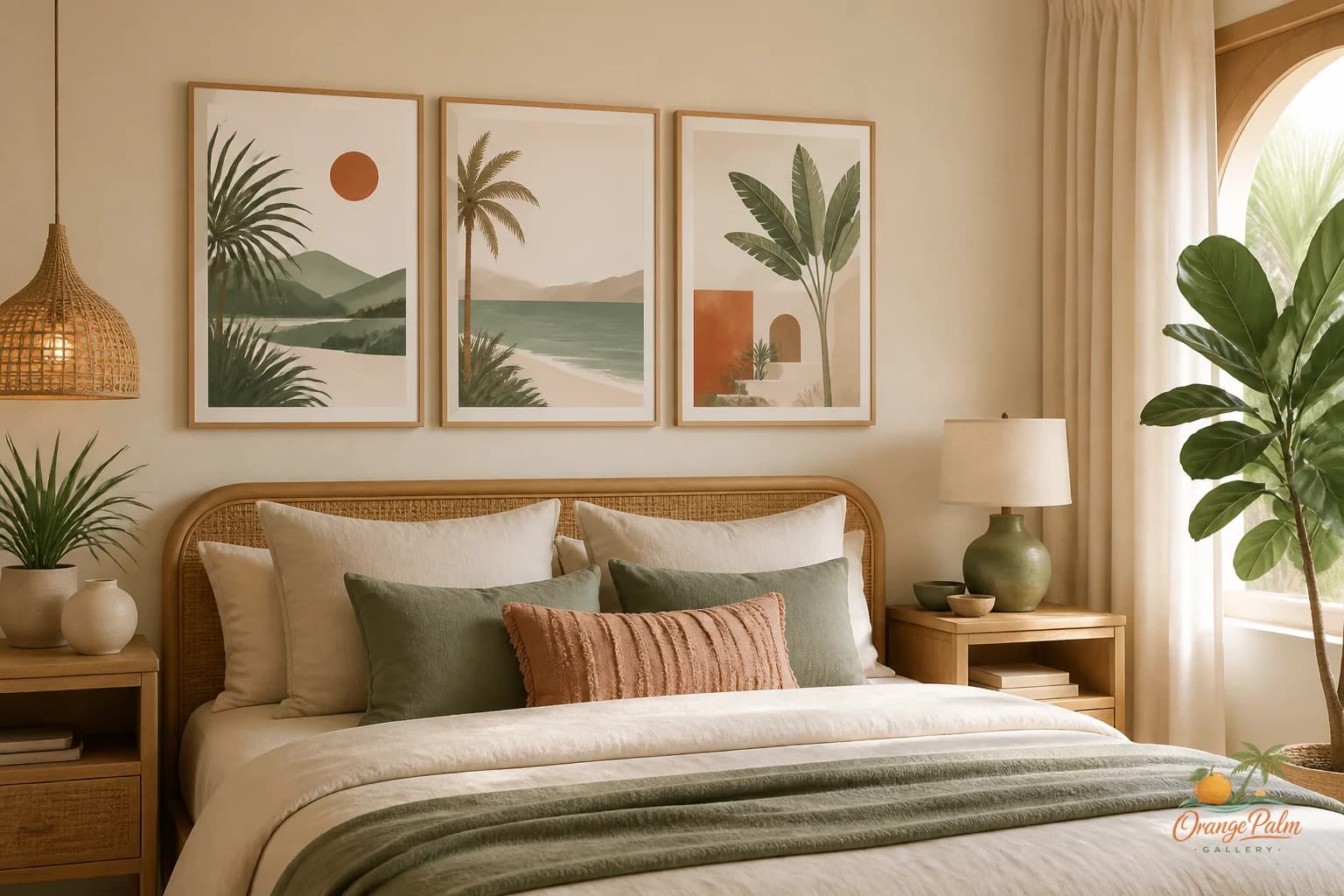
Tiny detail can disappear. High contrast can flash too loudly. A busy gallery wall can turn into visual static as you walk past it. In a narrow passage, the best piece often has a strong simple shape, a calm palette, and enough texture to reward a second glance without demanding one.
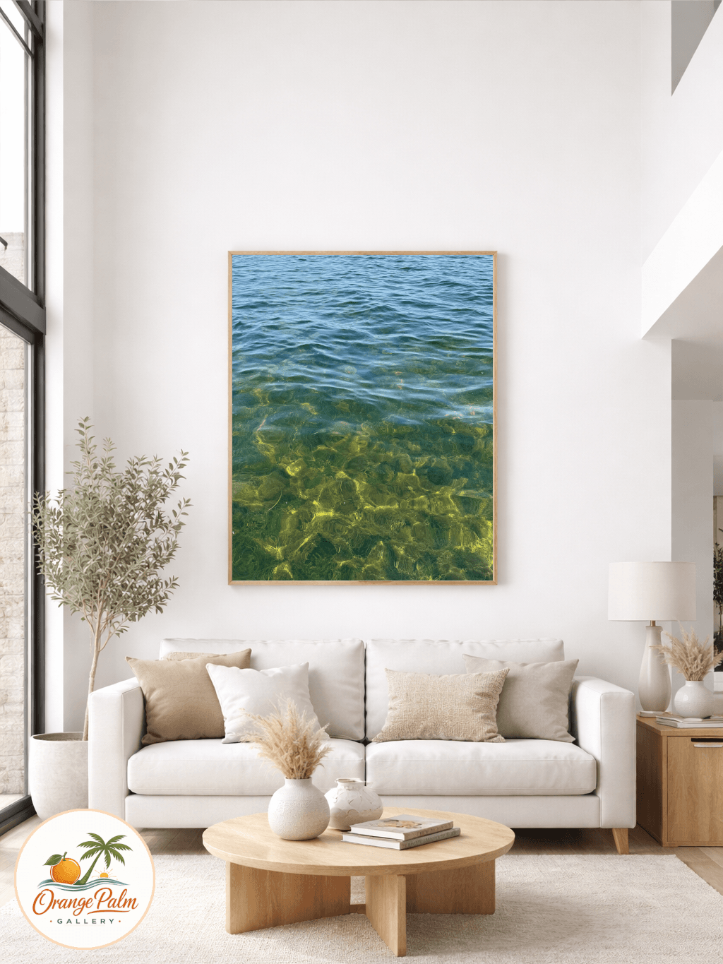
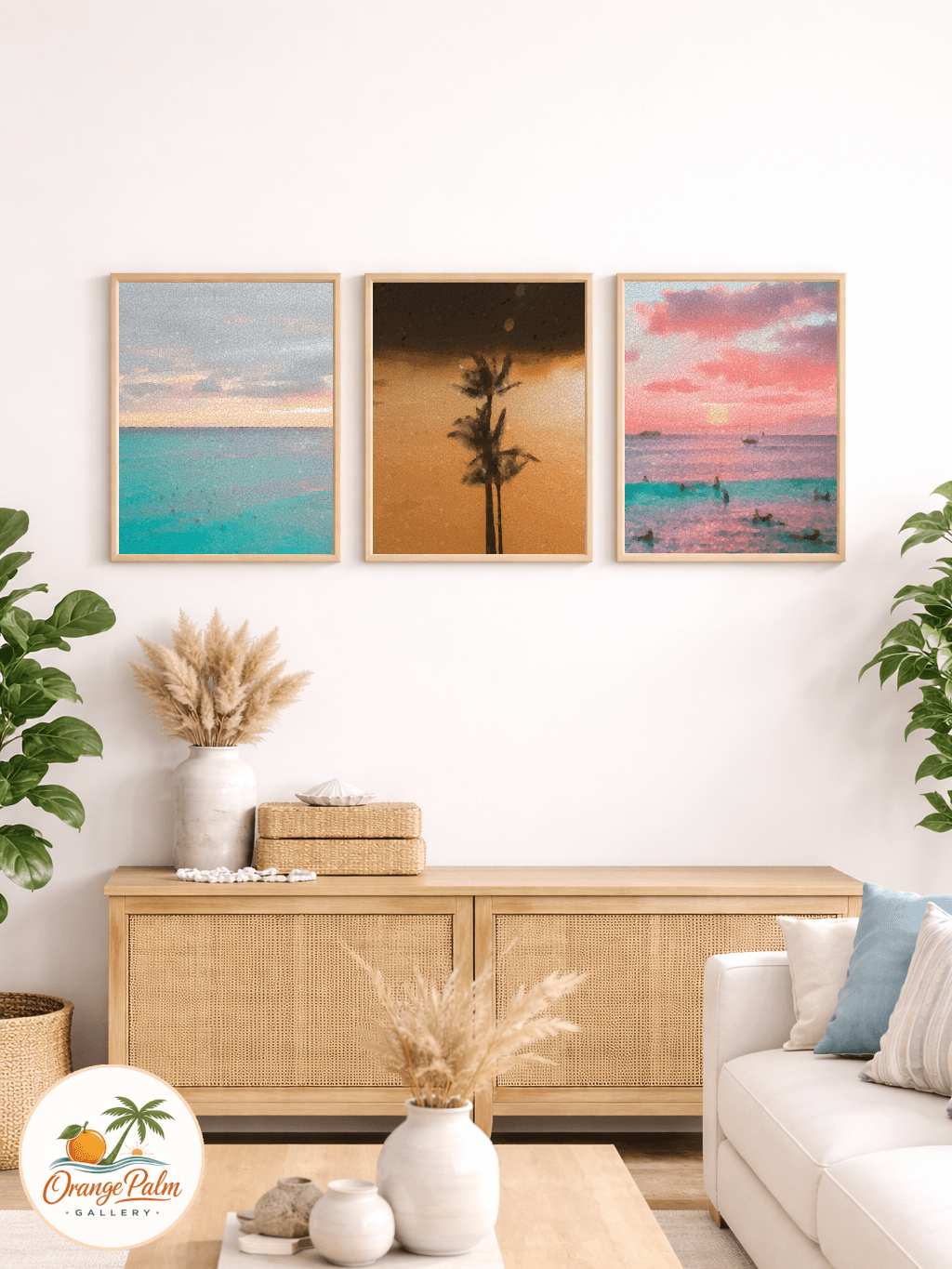
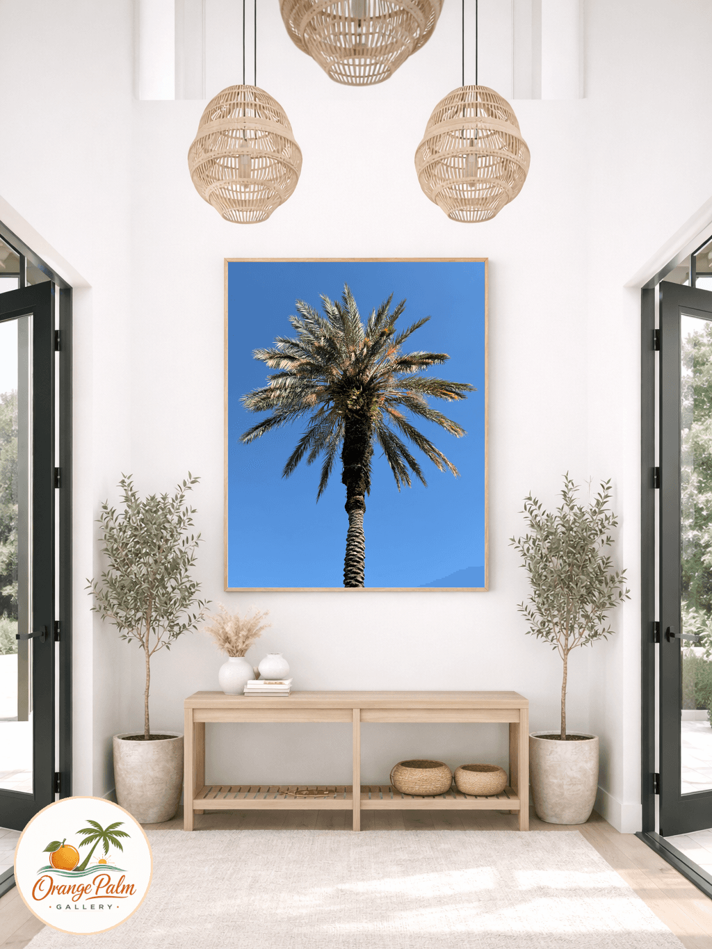
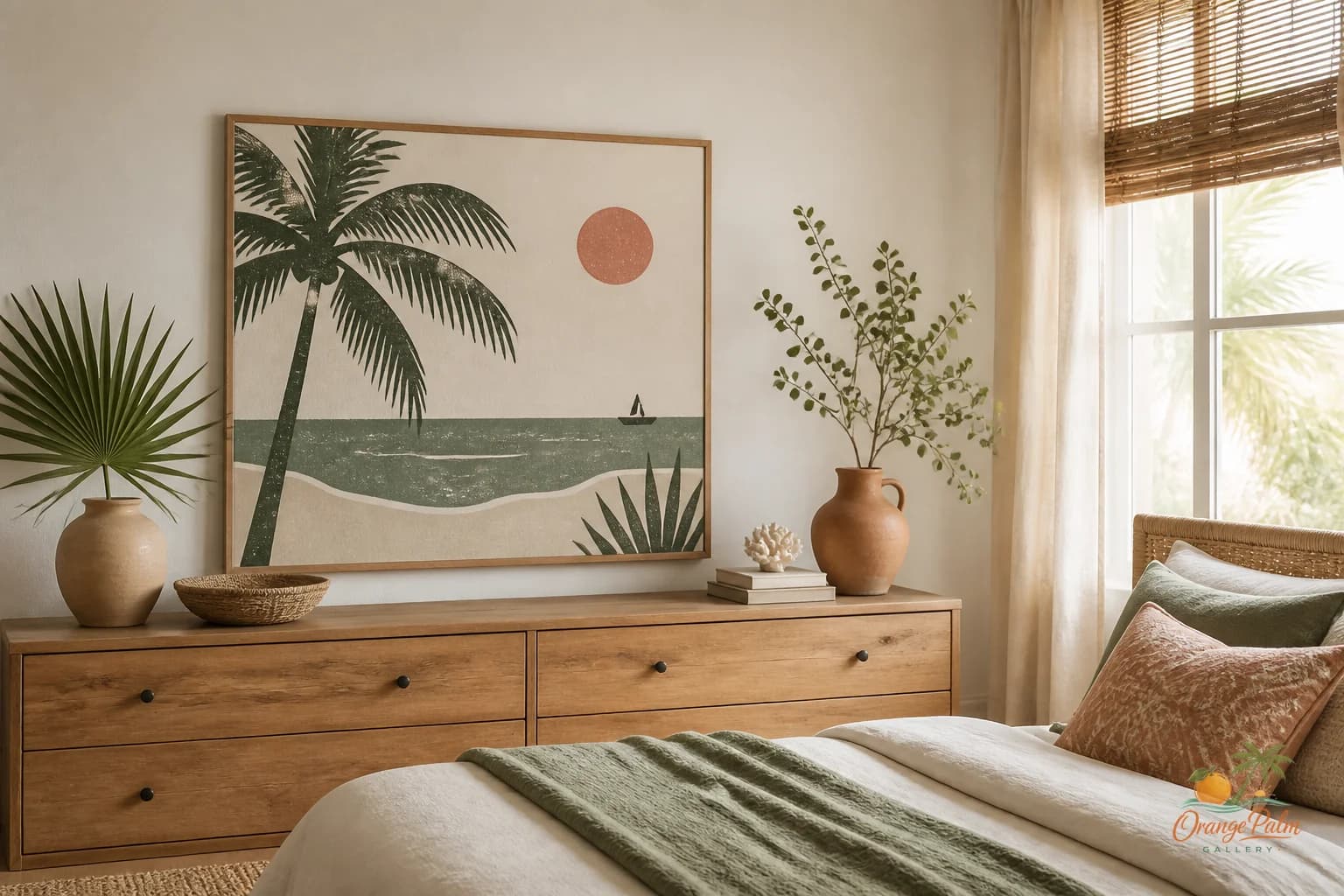
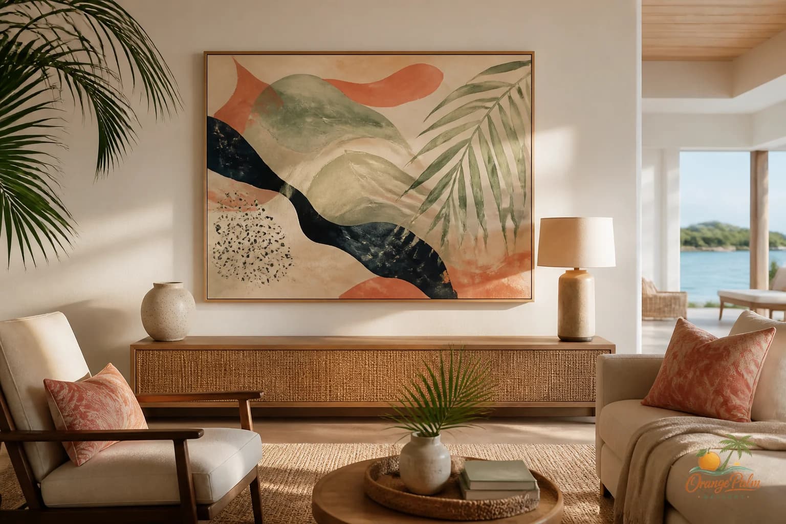
For a Florida inspired home, that might mean washed coral, palm green, warm white, sand, or inky botanical shapes. Not beach theme overload. Not a wall trying to prove it lives near water. Just a note of warmth and air.
Think of the art as a pause, not a performance.
A hallway already has rhythm: door, wall, door, trim, shadow, light. The artwork should sit inside that rhythm. A soft abstract coastal piece, a quiet palm influenced form, or a simple modern print can give the eye somewhere to rest between harder architectural lines.
Height is where most hallway art goes wrong
The common mistake is hanging hallway art too high because the wall feels narrow and vertical. That usually makes the piece feel disconnected from the body moving through the space.
Use eye level as a starting point, then adjust for the hallway. If the ceiling is low, do not chase height. If the wall is interrupted by a light switch, do not pretend the switch is invisible. If the piece sits between two doors, let the top and bottom margins feel calm rather than mathematically perfect.
A hallway is not a museum corridor. It is part of the daily route through the home. The art should feel naturally encountered.
If you are hanging one vertical piece, give it enough width to hold the wall. If you are using a horizontal piece, make sure it does not crowd the door casings. When in doubt, tape the outline first. Live with the tape for a day. Walk past it in morning light and evening light. The wall will usually tell you if the scale is nervous.
Leave some wall alone
Blank space in a hallway is not failure. It is relief.
A home needs a few walls that do not announce anything. Especially in compact rooms and pass through spaces, restraint can make the whole house feel more intentional. One good piece between doors can do more than a series of small frames trying to justify every inch.
The tradeoff is obvious: less decoration means each choice has to be better. The color, scale, and placement have less room to hide. But that is also what makes the result feel considered instead of accumulated.
Orange Palm Gallery looks at wall art from that angle: calm modern pieces, Florida warmth, and enough handmade feeling to soften a room without crowding it. If you are thinking through a hallway, a small wall, or a pass through space, you can explore the studio here: https://orangepalmgallery.com/?utm_source=mdx
The hallway does not need a full story. It needs one good sentence.
Let the doors do their job. Let the trim draw its lines. Let the wall breathe. Then choose art that knows how to stay quiet and still be seen.