Wall Art Styling
The Breakfast Nook Wall Should Not Steal Breakfast
How to choose and place breakfast nook wall art with softer color, breathing room, and enough visual weight for a small dining corner.
September 25, 2026 / 5 min read / Orange Palm Gallery Studio
Source note: this guide is written and maintained by Orange Palm Gallery Studio. Last updated September 25, 2026.
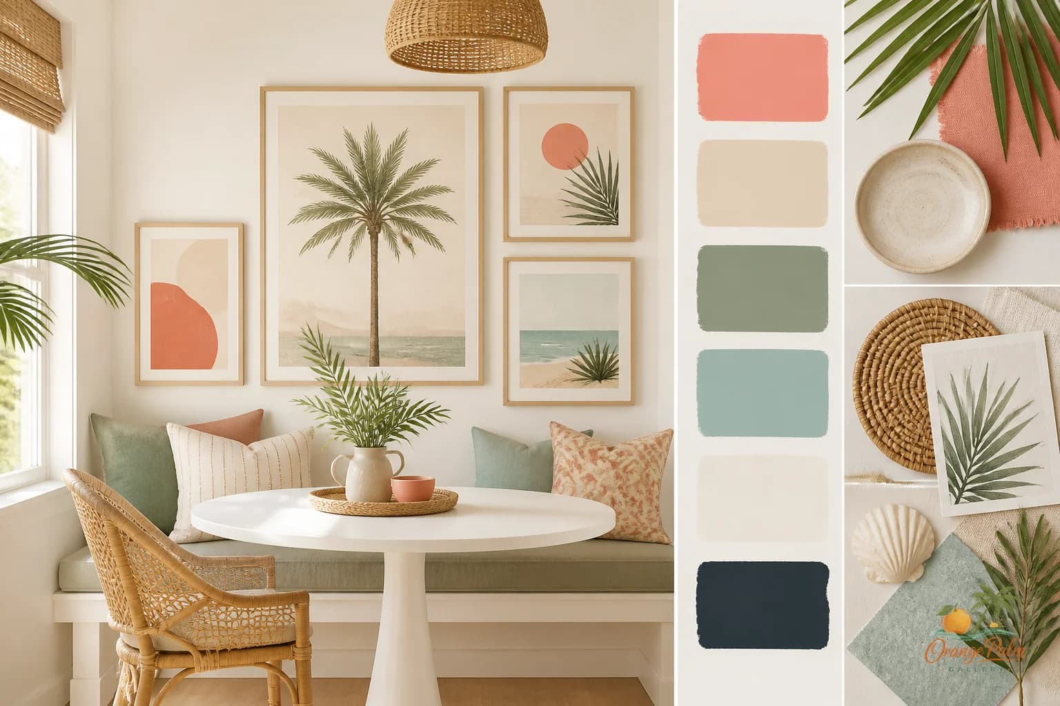
The breakfast nook is not a miniature dining room. Treating it like one is where people usually get into trouble.
A dining room can handle ceremony. Big table, wider sight lines, maybe a chandelier doing something dramatic overhead. A breakfast nook is tighter and more ordinary in the best way. It has coffee rings, chair legs tucked close, morning sun, a bowl of oranges that may or may not be decorative, and somebody's keys landing where they should not.
The wall art has to live with all of that. It should not try to make the corner feel important. It should make the corner feel settled.
Start with the table, not the wall
The mistake is choosing art because the wall looks blank when the nook is empty. But the nook is almost never visually empty. Once the table, chairs, pendant light, seat cushions, fruit, mugs, and small daily mess show up, the wall has less responsibility than you think.
A breakfast nook usually wants one clear piece or a very small pair. Not a full gallery wall. Not a row of tiny frames trying to create personality by quantity. Small spaces get noisy fast, especially where eating happens.
If the table is round, a single piece with a calm vertical or square shape can give the corner a center. If the table is rectangular or built into a banquette, a horizontal piece can echo the line of the seating without making the wall feel chopped up.
The art should feel related to the table, but not glued to it. Leave enough air between the tabletop and the bottom of the artwork so plates, flowers, and everyday objects do not visually crash into the piece. If your eye reads the art and the breakfast clutter as one pile, the art is too low or too busy.
Keep the color edible
Breakfast nook color should feel good in morning light. That does not mean everything has to be beige. It means the palette should not fight the food, the daylight, or the cabinetry nearby.
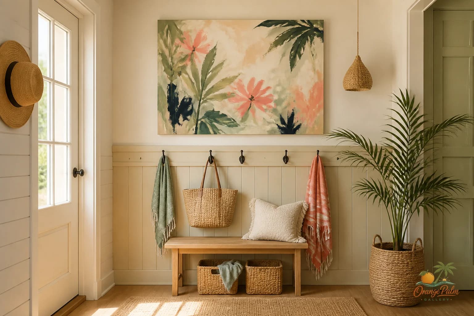
Soft coral, sand, palm green, warm white, and a little ink work beautifully here because they have a lived in Florida ease without turning the wall into a beach sign. A small amount of contrast helps the piece hold its place. Too much contrast makes the nook feel like a poster wall.
What people get wrong with coastal art in eating corners is going too literal. Shells, waves, palms, boats, all at once. The breakfast nook is not a vacation rental brochure. A better move is a quieter coastal cue: a sun washed shape, a palm influenced curve, a warm horizon line, a block of sandy color, a bit of green that feels like something outside the window.
Let the room do some of the talking. If the nook already has woven chairs, pale wood, tile, plants, or bright windows, the art can be simpler.
Scale matters more than theme
A tiny print on a generous wall makes the corner feel accidental. Oversized art in a cramped nook can feel like it is leaning over your coffee. The right scale usually sits somewhere in the middle: large enough to anchor the wall, quiet enough to let people sit under it comfortably.
For a small two chair nook, think of the artwork as a visual pause above the table. For a banquette, the art can be wider, but it still needs breathing room at the sides. Do not fill every inch just because the wall allows it.
If there is a window close by, respect it. Art squeezed between a window trim and a corner can look nervous. In that case, choose one strong piece with a clean shape, or skip the narrow spot and place art on the wall that has the clearest view from the kitchen.
The best breakfast nook art is often noticed from another room. You catch it while pouring coffee or walking past the counter. It should read quickly, then soften when you sit down.
Let texture come from the room
A breakfast nook already has texture: chair caning, table grain, napkins, ceramics, sunlight, shadows from blinds or palm leaves outside. Wall art does not have to fake all of that. In fact, a cleaner 2D piece can make the real materials around it feel better.
This is where handmade feeling matters. Not messy. Not overworked. Just enough irregularity, warmth, and human touch so the art does not feel like office decor.
If the nook is mostly white, choose art with a little warmth so the wall does not go cold. If the nook is already colorful, pick up one color and let the rest stay restrained. If the chairs or cushions have pattern, avoid art that competes at the same scale. Pattern against pattern in a tiny breakfast corner gets old quickly.
The quiet test
Stand where you actually enter the room. Look at the nook for three seconds. Does the art make the corner feel ready for the day, or does it ask for attention before the room has earned it?
That is the tradeoff. A breakfast nook can take charm, but not performance. It can take color, but not visual shouting. It can take coastal references, but not a whole theme stacked onto a small wall.
Choose art that gives the nook a clean mood: warm, awake, unfussy. Something with enough presence to make the wall intentional and enough restraint to let breakfast still be breakfast.
Explore Orange Palm Gallery pieces for calm, modern Florida inspired homes at orangepalmgallery.com.