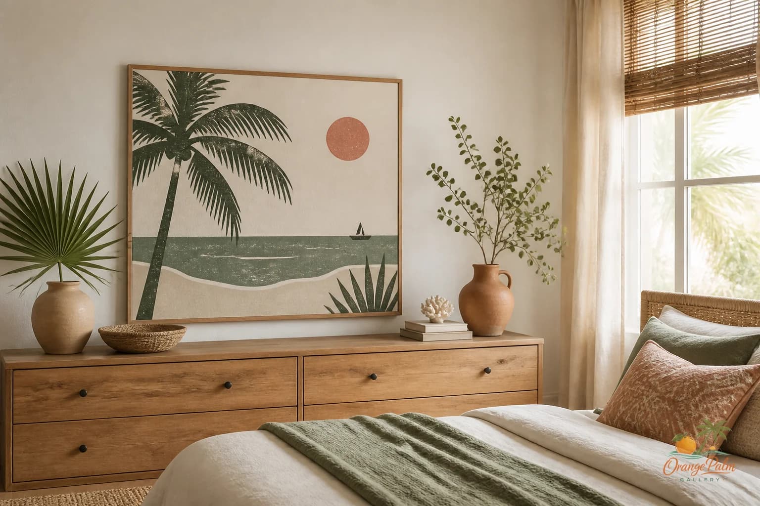
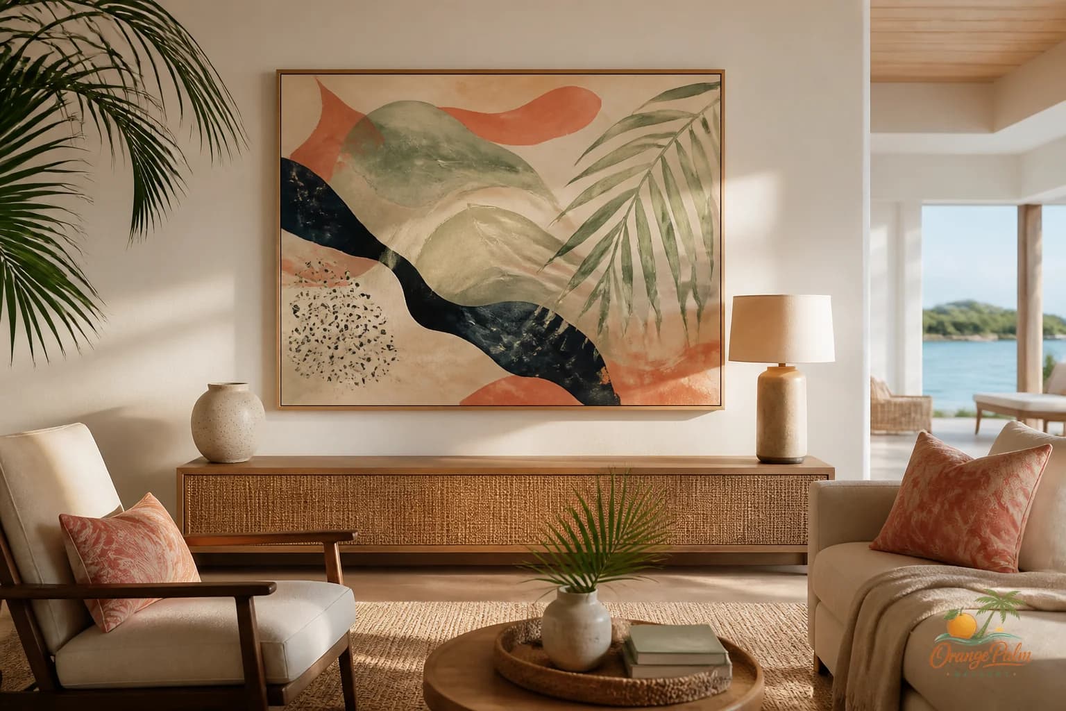
Wall Art Styling
The Back Door Wall Has to Live With the Mess
How to style wall art in a back door drop zone with warm coastal color, simple composition, and enough visual weight to survive daily clutter.
September 23, 2026 / 4 min read / Orange Palm Gallery Studio
Source note: this guide is written and maintained by Orange Palm Gallery Studio. Last updated September 23, 2026.
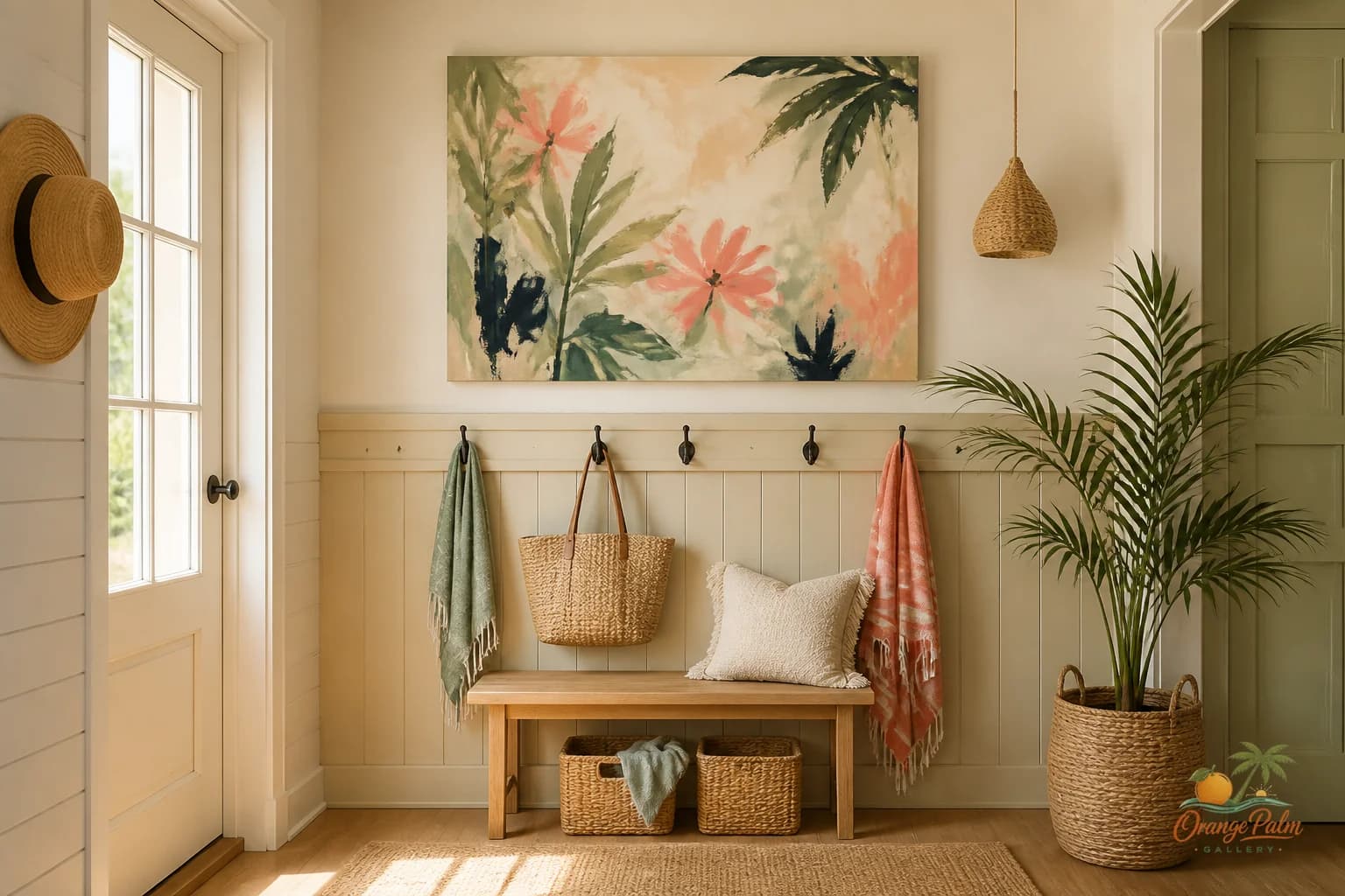
The back door wall is where good decorating advice often falls apart.
A styled photo can make a mudroom look like a linen closet with better lighting. Real life is not that polite. The back door catches sandy shoes, grocery bags, dog leashes, wet towels, hats, sunscreen, school stuff, half remembered errands, and keys that never land in the same place twice.
So the art on that wall cannot be precious. It also cannot be invisible.
The mistake is treating the drop zone like a miniature gallery wall. Five little prints, a sign, a mirror, two baskets, three hooks, a bench cushion, and suddenly the wall is making more noise than the backpacks. The other mistake is giving up and leaving it blank, as if a practical wall does not deserve a visual decision.
It does. It just needs a quieter one.
Use one piece with enough backbone
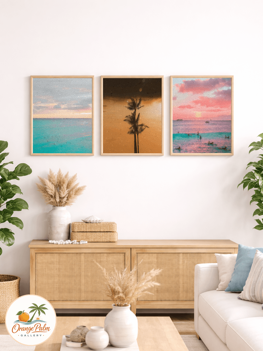
For a back door wall, one stronger piece usually works better than a cluster. The room already has plenty of small shapes: hooks, handles, straps, shoes, mail, sunglasses, tote bags. Tiny art has to compete with all of that, and it usually loses.
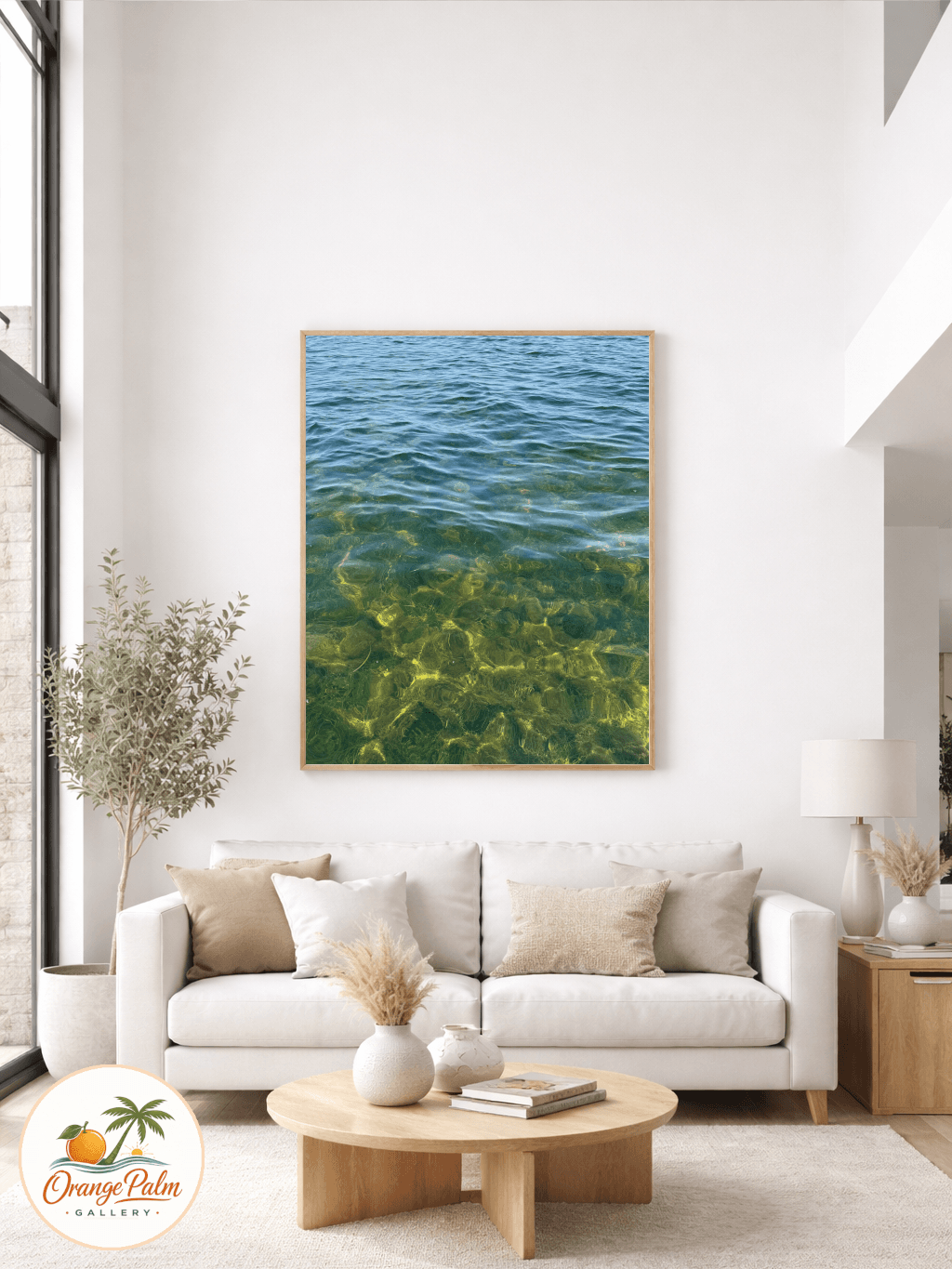
A single medium sized print gives the eye a place to land. It can sit above a bench, beside a hook rail, or over a narrow console where the keys go. The point is not to decorate every inch. The point is to put one calm note into a wall that is already doing practical work.
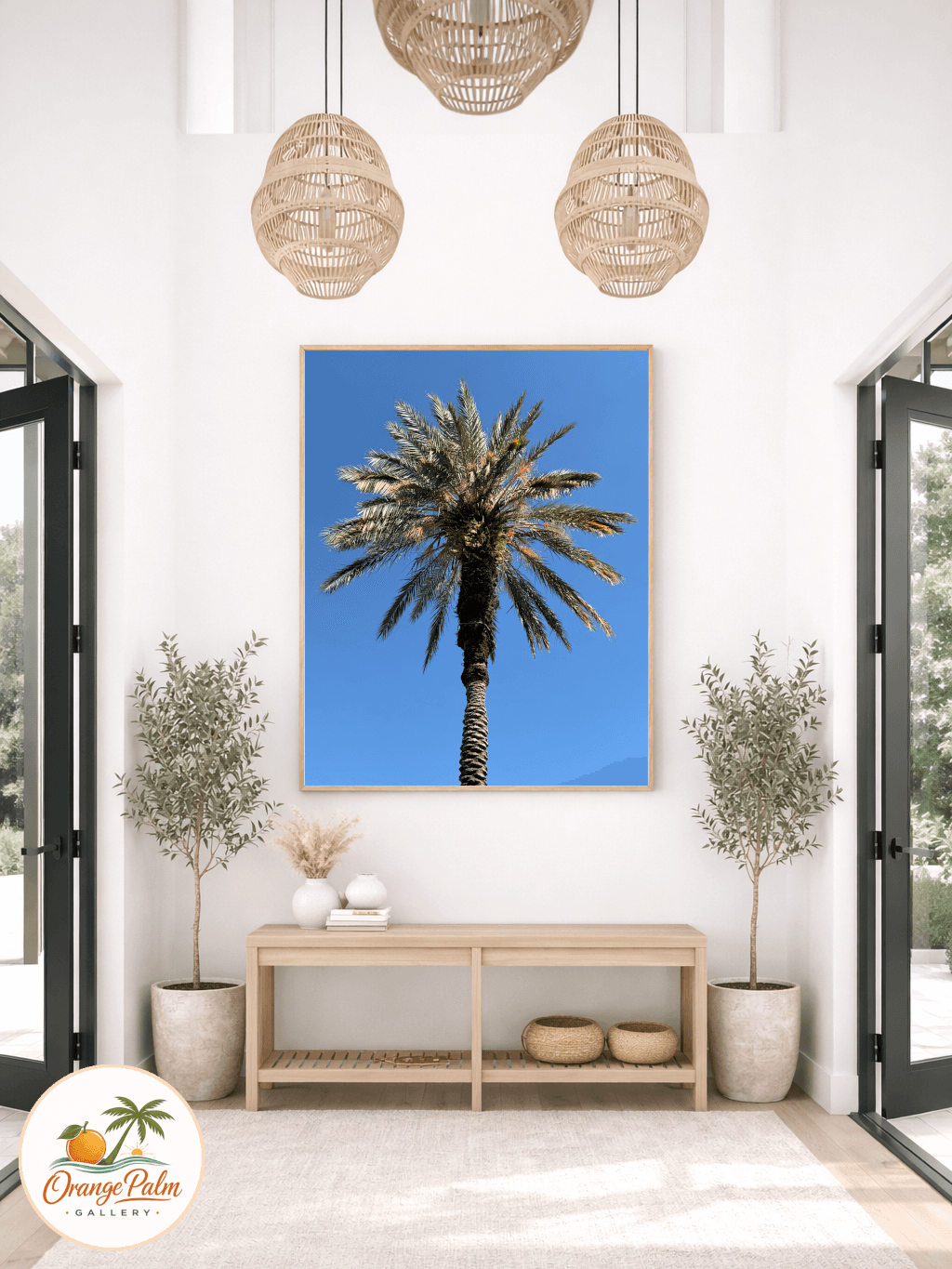
Choose art with a clear shape from across the room. A palm form, a loose coastal horizon, a block of warm sand color, a simple botanical silhouette. Nothing too fussy. If the piece needs you to stand six inches away to understand it, the drop zone is probably the wrong wall.
Keep the palette a little sun faded
Back door areas often get sharp light, especially in Florida homes where the outside is always trying to come inside. Bright white walls, tile floors, woven baskets, and glass doors can make color feel louder than expected.
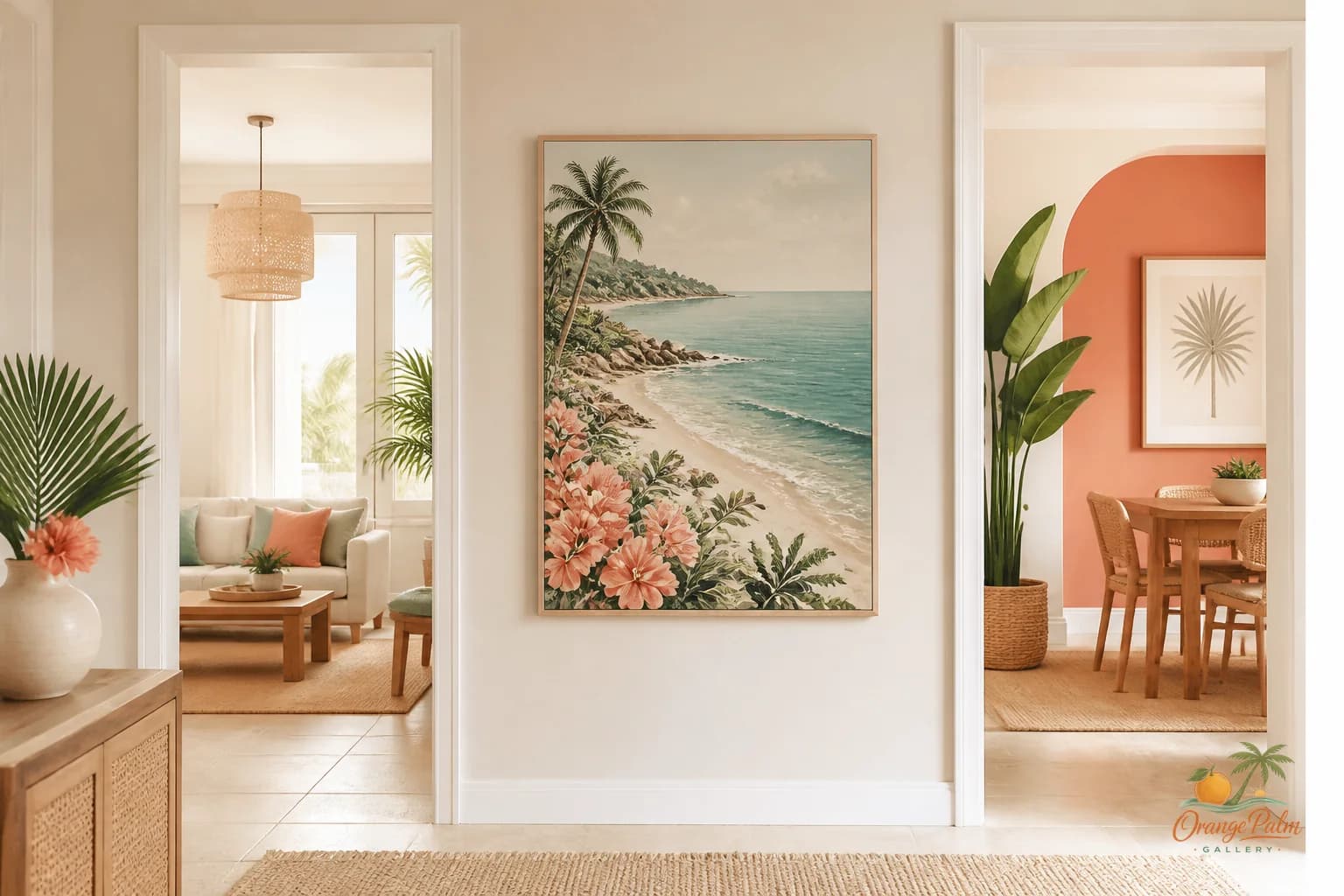
A good palette here is warm but restrained: sand, palm green, soft coral, warm white, a little ink. Not beach shop turquoise. Not a dozen coastal colors fighting for attention. The art should feel like it belongs near a towel, a straw hat, and a pair of shoes that still have the day on them.
If the room has dark hooks or black door hardware, a little ink in the artwork helps it sit with the architecture. If the room is mostly pale, let the art carry one deeper shape so it does not wash away in the daylight.
Give the wall some air
Drop zones get crowded fast, so spacing matters more here than almost anywhere else.
Do not hang art so low that bags knock into it. Do not cram it tight above a hook rail. Do not use the only clear patch of wall as an excuse to wedge in a tiny frame. The art needs a little breathing room around it, or it becomes one more object in the pile.
A simple rule: leave enough space below the piece for motion. Arms reaching for hooks, bags swinging, towels hanging unevenly, all of it. The wall art should hover above the traffic, not sit inside it.
If there is a bench, the art can align with the bench rather than the door. If there is a hook rail, let the art sit above or beside it, not tangled with it. The cleanest drop zones usually have one dominant horizontal line and one visual anchor. More than that starts to feel like storage pretending to be styling.
Avoid words unless they earn the wall
The back door is a tempting place for lettered signs. Drop your keys. Stay awhile. Beach this way. It can get cute quickly, and not in a good way.
Text art adds another instruction to a wall that already tells people what to do. Hang the coat. Take off the shoes. Grab the leash. Find the sunscreen. A quiet image often works better because it changes the mood without barking at the room.
A soft abstract, a coastal shape, or a botanical piece gives the space a pause. That is more useful than another command.
Let practical rooms have beauty
The back door wall is not glamorous. That is the charm of it. It is a working edge of the house, the place where outside and inside overlap.
Wall art here should respect that. It should not pretend the room is serene all day. It should not demand perfect baskets and color coded shoes. It should simply bring a little order to the visual mess.
That is the tradeoff: less decoration, more intention.
One piece. Clear shape. Warm color. Enough space around it. Let the rest of the wall keep doing its job.
For more calm, Florida inspired wall art and styling notes, visit Orange Palm Gallery.