Wall Art Styling
The Stair Landing Wants a Pause, Not a Parade
How to choose stair landing wall art with warm coastal color, breathing room, and enough presence without crowding the turn.
October 2, 2026 / 4 min read / Orange Palm Gallery Studio
Source note: this guide is written and maintained by Orange Palm Gallery Studio. Last updated October 2, 2026.
A stair landing is easy to overdecorate because it feels like found space. It is not quite a room, not quite a hallway, not quite a destination. So people treat it like a spare wall and start filling it with leftovers.
That is usually where the trouble starts.
The landing is one of the few places in a home where your eye is already doing work. You are turning a corner, watching a step, catching light from another floor, seeing a railing cut across the wall. Add too many small pieces and the wall starts to chatter right when the body wants a pause.
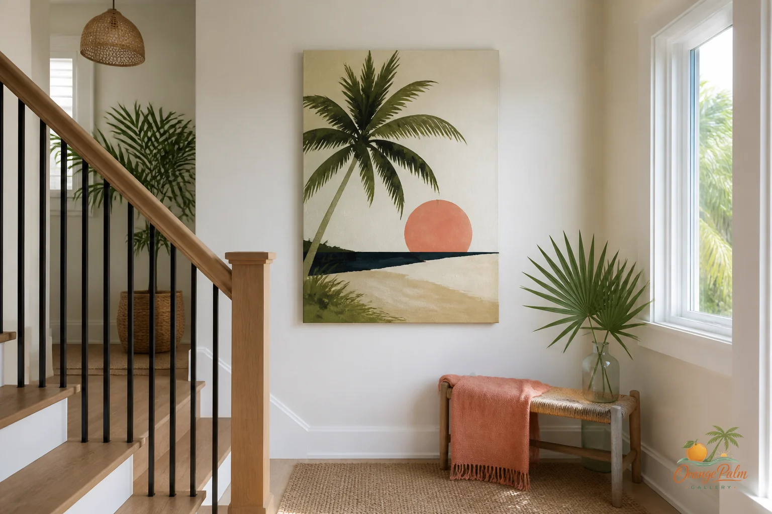
For a warm coastal home, especially one with Florida light, the better move is often simpler: one piece with enough presence to hold the turn.
Think of the landing as a comma
A landing should slow the house down for half a second. Not stop it. Not announce itself. Just make the transition feel intentional.
That means the art can be quieter than you think. A soft palm shape, a loose coastal wash, a block of sand and warm white, a small hit of coral, a darker ink line to give the wall a little backbone. The art does not need to explain the ocean. It only needs to carry some air.
What people get wrong is scale. They hang a tiny piece because the wall is narrow, then the whole landing feels apologetic. Or they build a busy stack of frames because the vertical space feels tall, then the landing starts acting like a bulletin board.
The better question is not, “How much can I fit here?”
It is, “What can hold this turn without making it noisy?”
One strong piece usually beats five polite ones
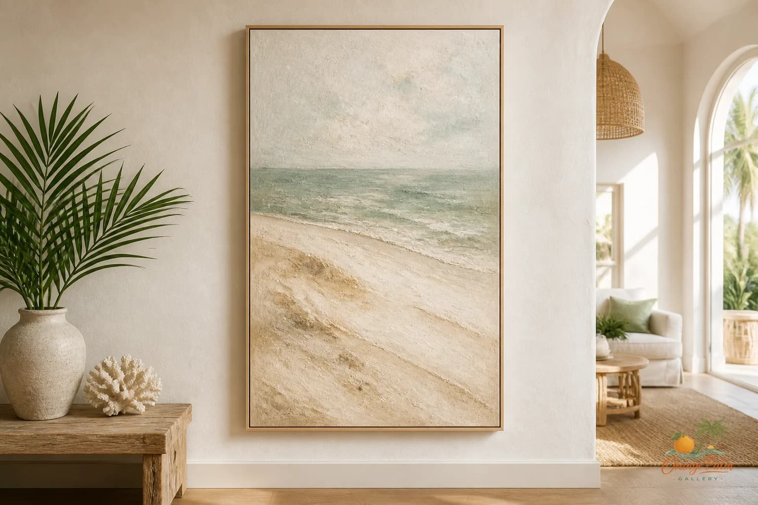
On a stair landing, a single vertical piece can do a lot. It follows the lift of the stairs, respects the height of the wall, and gives the eye one clean place to land. If the wall is wider, a horizontal piece can work too, especially if the landing opens into a small flat stretch before the next run of stairs.
But the piece needs breathing room. The edges matter. Leave enough wall around it so the art feels placed, not squeezed. If there is a railing nearby, do not let the frame fight the angle. Let the rail be architecture and the art be atmosphere.
A gallery wall can work on a stair run, but the landing is a different animal. A stair run has movement built in. A landing has a pause built in. Those are not the same design problem.
Use color like climate, not decoration
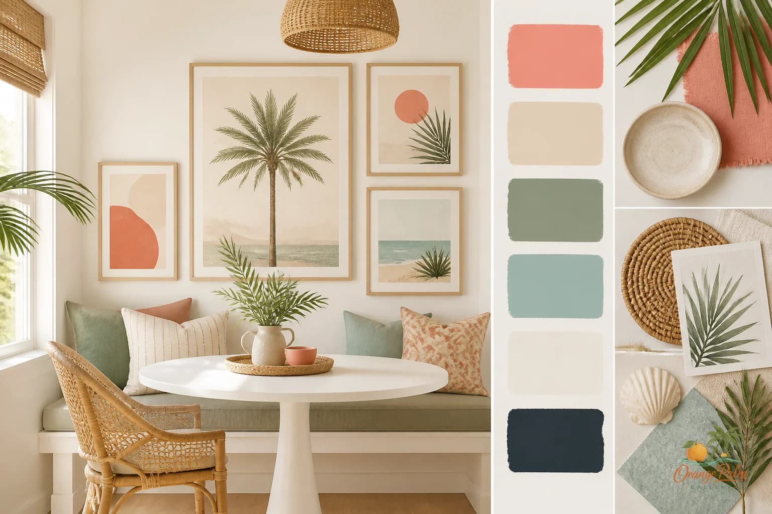
For Orange Palm Gallery rooms, I come back to a warm Florida palette because it behaves well in real houses: warm white, sand, palm green, coral, and a little ink. Those colors do not have to appear literally. They can show up as temperature.
Warm white keeps the wall from going cold.
Sand gives the piece a grounded, sun faded base.
Palm green adds life without turning the wall into a theme.
Coral is best in small doses here. A landing is not the place for a color to shout from three steps away.
Ink is the useful one people skip. A bit of dark line or depth keeps coastal art from becoming too soft. Without it, a stair landing can look washed out, especially in bright afternoon light.
The tradeoff is simple: pale art feels calm, but it can disappear. High contrast art has presence, but it can feel abrupt on a small landing. The sweet spot is a piece with quiet color and one firm note.
Hang for the turn, not the photograph
A landing wall is often judged from the wrong spot. People stand directly in front of it, center the art, and call it done. But most of the time, you experience that wall while moving toward it or away from it.
Before hanging anything, walk the stairs. Notice when the wall first appears. Notice where your eye naturally lands as you turn. That is your real center, not always the mathematical center of the wall.
If the landing has a window, let the light have a vote. Florida light can flatten pale pieces in the middle of the day and make warm tones glow late in the afternoon. Matte surfaces, softer contrast, and artwork with a bit of texture in the composition tend to feel more forgiving than glossy, high glare choices.
Keep the story short
A stair landing should not carry the whole personality of the house. It should repeat one note from the rooms around it.
If the lower floor has sandy neutrals, bring that warmth upward. If the upstairs has green plants or darker wood, echo that with palm green or ink. If the house has a coastal mood but you are tired of obvious beach references, choose shape and atmosphere over shells, signs, or literal blue water.
The landing is a connector. Let it connect.
One calm piece. Good air around it. A color that belongs to the rest of the house. That is usually enough.
For more quiet, modern Florida-inspired wall art notes, you can explore the studio at Orange Palm Gallery.