Wall Art Styling
The Stair Landing Is a Pause, Not a Billboard
How to choose calm, Florida-inspired wall art for a stair landing, with advice on scale, sightlines, color, and spacing.
August 19, 2026 / 5 min read / Orange Palm Gallery Studio
Source note: this guide is written and maintained by Orange Palm Gallery Studio. Last updated August 19, 2026.
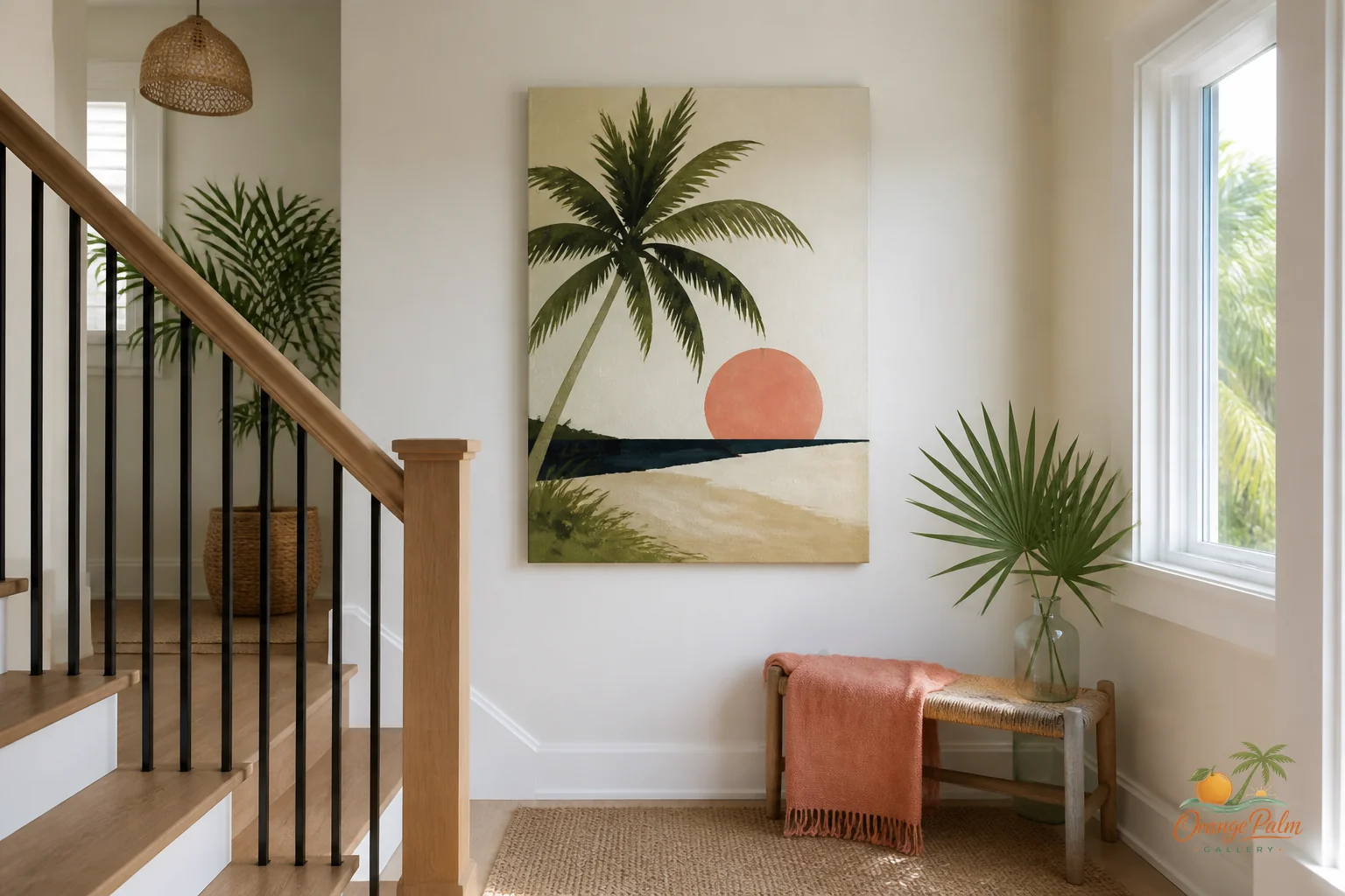
A stair landing is easy to overdecorate because it feels like found wall space. There it is, empty and visible, asking for something. The mistake is treating it like a tiny gallery or a spare hallway. It is neither.
A landing is a pause in motion. You are turning, climbing, carrying laundry, following a kid, avoiding a dog, or glancing up from the first floor. The wall art has to work inside that movement. It should register quickly, soften the transition, and then let you keep going.
That is a different job from the sofa wall or dining room wall. Those walls can hold a longer look. A stair landing gets a passing look. The art needs enough presence to feel intentional, but not so much detail that it asks people to stop in a place where no one really stands.
Quick answer
The best stair landing wall art ideas use one calm piece, clear sightlines, and enough breathing room around rails, turns, and shadows. Treat the landing as a quiet pause in a coastal home, not as a billboard or miniature gallery.
Start with the sightline, not the blank wall
Before choosing size or color, stand at the bottom of the stairs and look up. Then stand at the top and look down. The best placement is usually the spot your eye naturally meets as you turn, not the geometric center of the wall.
People often hang art too high on landings because the ceiling height tricks the eye. The wall feels tall, so the art floats upward. Then it belongs to the architecture instead of the person walking through the space.
Use the turn of the stairs as your anchor. If the landing has a short flat wall, one medium piece can feel better than a scattered group. If the wall rises with the stairs, a vertical piece or two aligned works more cleanly than a busy grid. The goal is not to fill every inch. The goal is to give the eye a place to land.
One piece is often stronger than a mini gallery
A stair landing already has angles, rails, shadows, and changes in height. Add too many small prints and the wall starts to chatter. That can make the stairwell feel tighter than it is.
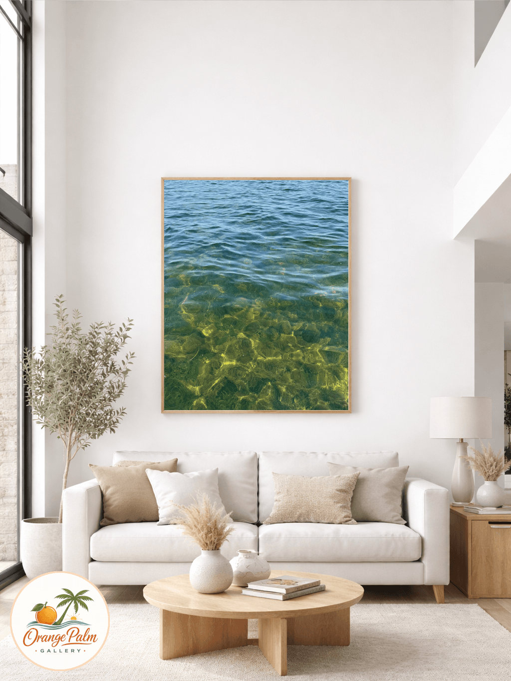
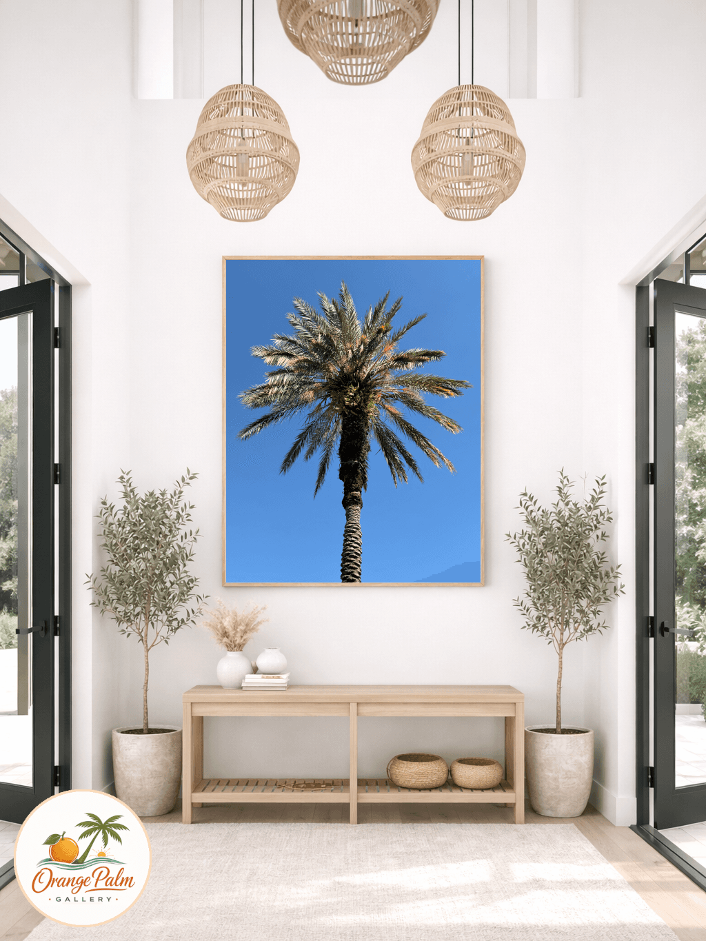
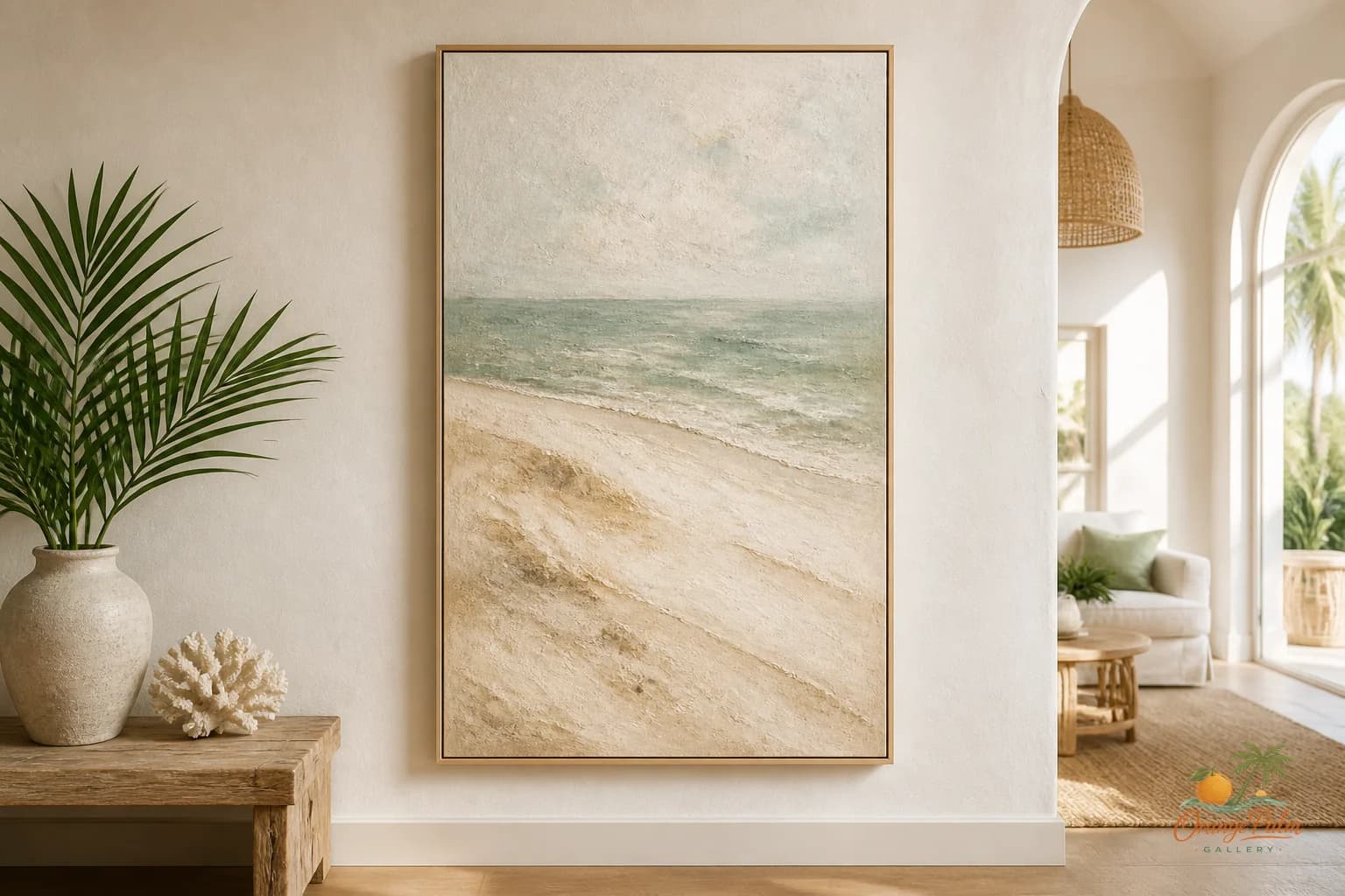
One calm piece of 2D wall art can do more. Think soft coastal shape, warm sand color, palm green, a little coral, or an ink line that has movement without fuss. Florida-inspired does not have to mean seashells everywhere. It can be the color of late afternoon stucco, the green edge of a palm frond, the quiet warmth of sun on a wall.
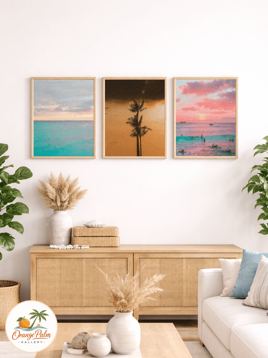
If you do use a pair, keep the spacing honest. Tight enough that the two pieces read as one thought, not two unrelated leftovers. A landing is a poor place for art that feels like it was placed there because no other room wanted it.
Keep the palette steady
The stair landing usually connects multiple spaces, so the color should bridge rooms rather than start an argument. Pull from what is already nearby: the floor tone, stair runner, railing finish, wall color, or the room visible at either end.
For a warm modern coastal home, a restrained palette works well. Sand, warm white, palm green, soft coral, and a grounding ink tone can give the landing a Florida feeling without making it themed. The tradeoff is restraint. You give up the instant punch of a loud statement piece, but you gain a wall that still feels good after the tenth time you pass it in a day.
That matters in transition spaces. Loud art can be exciting in a room where you sit and choose to look at it. On a stair landing, loud art can feel like it is interrupting you.
Leave breathing room around the rail
Stair railings are visual lines. They cut across the wall, cast shadows, and create their own rhythm. Wall art should not fight them.
If the railing is strong or dark, let the art sit in a clear pocket of wall. Avoid placing the bottom edge too close to the rail line, especially if the piece has a heavy lower section. It can make the whole wall feel compressed.
If the railing is light and simple, the art can carry a little more weight. Still, keep the edges clean. A landing wall should feel composed from a distance, not assembled from whatever fit.
Choose art with motion, not clutter
The nicest landing art has a small sense of movement. A curve, a vertical stem, a wash of color, a soft horizon, a palm inspired shape. Something that echoes the act of moving through the space.
Tiny detail is usually wasted here. You will not read it while walking. Big contrast can work, but only if the rest of the stairwell is quiet. Texture, imperfect edges, and handmade feeling are better than visual noise. They give the wall warmth without turning the landing into a performance.
At Orange Palm Gallery, we think about wall art as part of the room, not a decoration pasted on after the fact. If you are shaping a calm, modern Florida-inspired home, you can explore the studio at orangepalmgallery.com.
The landing only needs one clear job
Ask the landing wall to do one thing. Soften the climb. Connect two floors. Bring warmth to a white stairwell. Add a small coastal note. Make the turn feel intentional.
Do not ask it to become a family archive, vacation shrine, color experiment, and gallery wall all at once. That is how a useful pause becomes a billboard.
A good stair landing is quiet on purpose. It catches the eye, steadies the house for a second, and lets the rest of the home continue.