Wall Art Styling
The TV Wall Needs Art That Can Lose
A practical Orange Palm Gallery journal on choosing quiet, grounded wall art for the TV wall so the room feels warm, finished, and not visually loud.
September 7, 2026 / 5 min read / Orange Palm Gallery Studio
Source note: this guide is written and maintained by Orange Palm Gallery Studio. Last updated September 7, 2026.
The TV already wins the wall
A TV wall is one of the easiest places to overdecorate, mostly because the screen feels like a problem people want to hide. So they add shelves, stacks of objects, tiny frames, tall branches, matching sconces, and then wonder why the room feels restless.
The screen is not subtle. It is a black rectangle with its own glow, its own sound, and its own reason for being there. Wall art cannot beat that. It should not try.
The better move is to choose art that can lose gracefully.
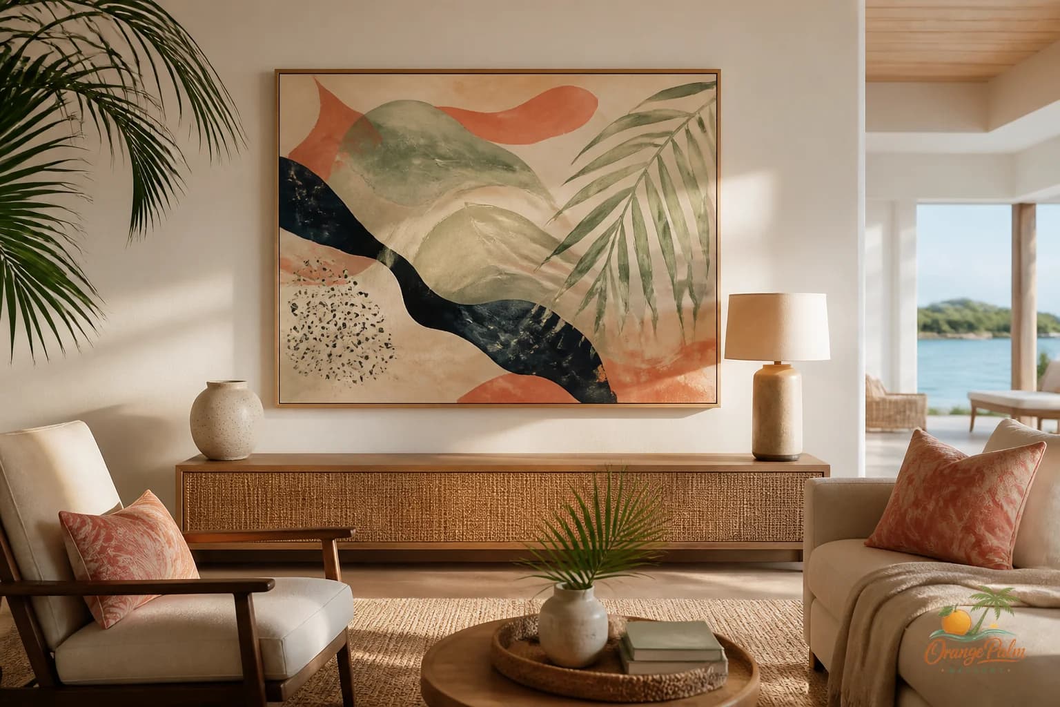
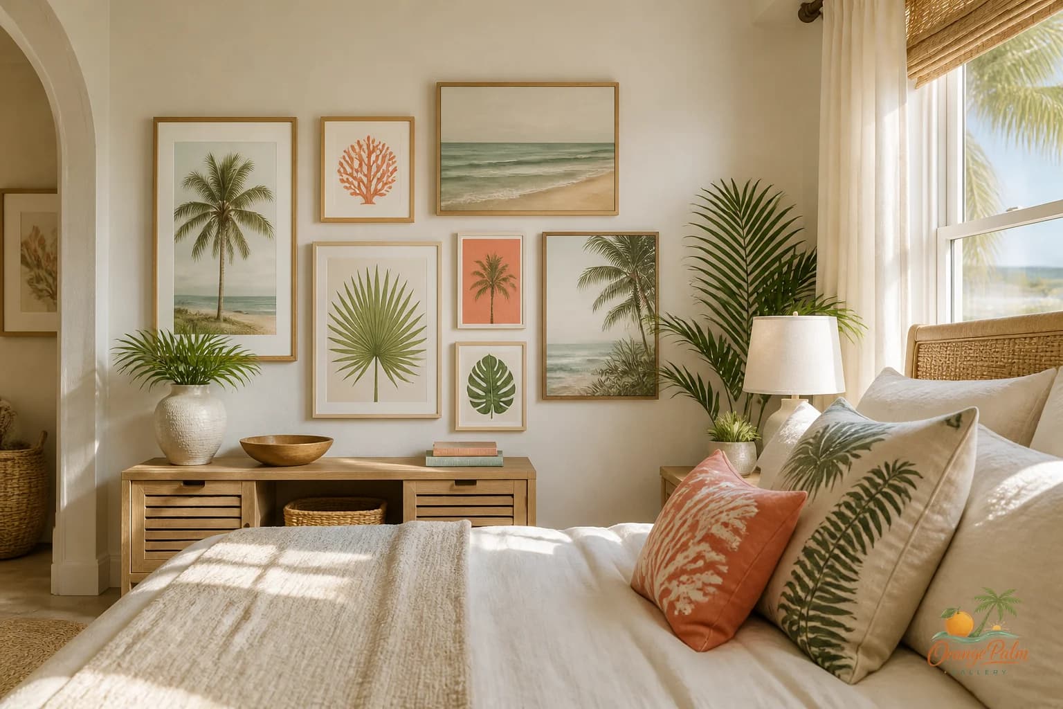
That does not mean boring art. It means art with enough softness, scale, and breathing room to make the TV wall feel finished without turning it into a competition. In a warm Florida inspired room, the best pieces often feel like a deep exhale: sand toned shapes, palm green undertones, coral warmth used with restraint, and enough open space to let the wall settle.
Quick answer
The best TV wall art ideas choose pieces that can support the screen without trying to outshine it. Use quiet scale, softer color, and generous spacing so the living room feels finished without adding visual noise around the TV.
Stop treating the TV like a hole to patch
A common mistake is trying to camouflage the TV with too many small pieces. Tiny art around a screen usually makes the screen look even heavier. The TV becomes the largest, darkest object in a cluster of nervous little rectangles.
Instead, give the wall a clear hierarchy.
The TV is the anchor. The art is the atmosphere.
That tradeoff helps. Once you stop asking art to disguise the screen, you can ask it to do something more useful: soften the edges, warm up the color, and connect the black rectangle to the rest of the room.
One larger piece nearby can work better than four small ones. A pair of quiet prints can work if they have enough size and space. A horizontal piece above a low console can bring the wall back down to human scale. The point is not symmetry for its own sake. The point is reducing visual chatter.
Use color like a dimmer switch
The TV wall does not need the brightest art in the room. Save the most expressive piece for a reading corner, entry, dining wall, or bedroom moment where it can hold attention without fighting moving images.
Around a TV, color should feel like a dimmer switch.
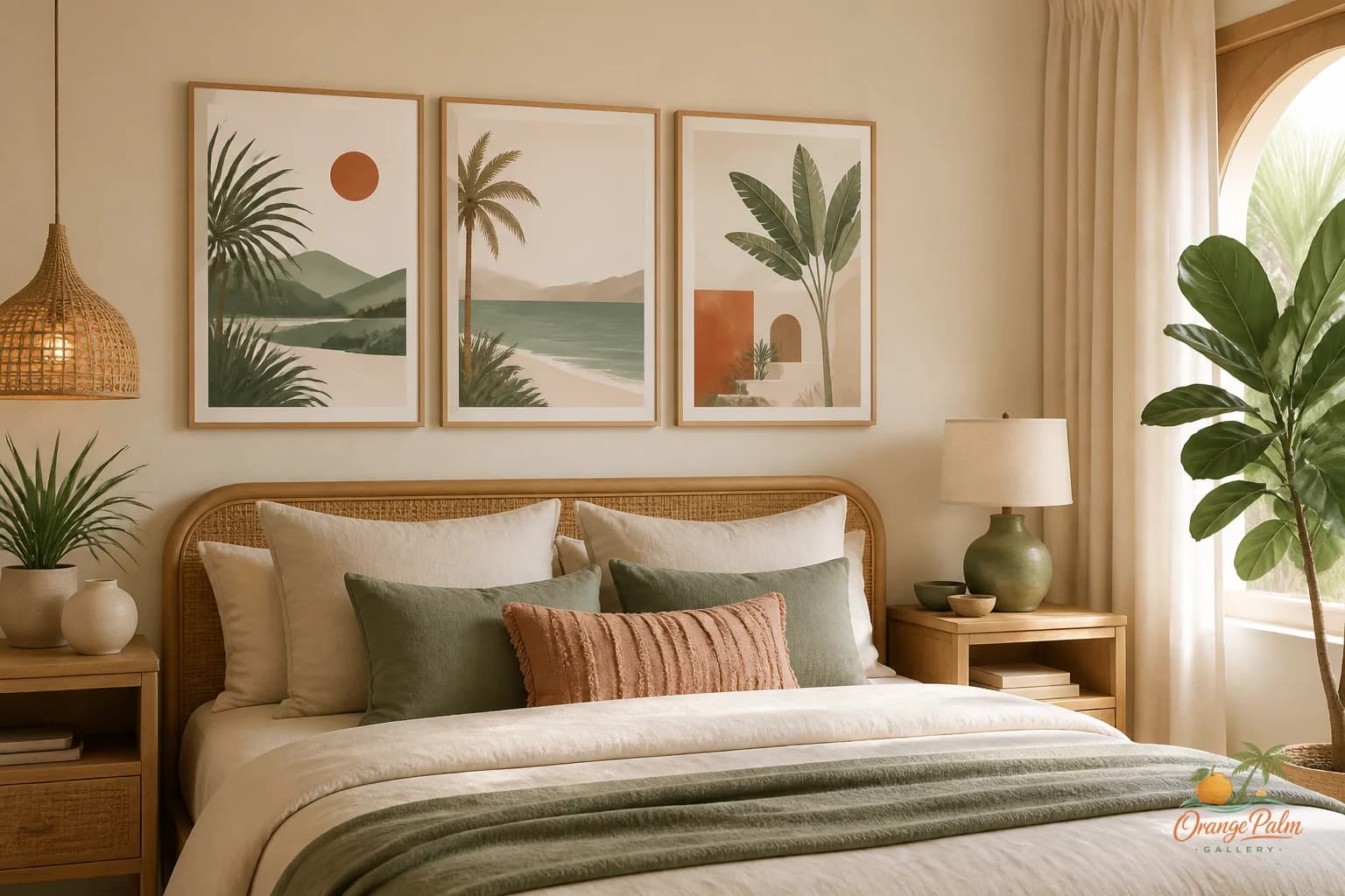
Warm white keeps the wall from feeling stark. Sand and clay tones help the black screen feel less severe. Palm green can add depth without shouting. Coral is beautiful here, but it needs discipline. A small coral note can wake up the wall. Too much coral near the TV can make the whole surface feel hot.
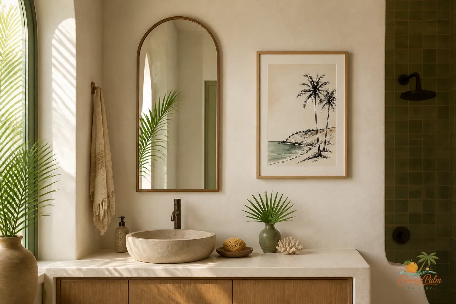
This is where coastal decor can go wrong. People hear coastal and jump straight to blue, shells, and beach signs. A Florida room does not need to announce itself that loudly. It can suggest heat, shade, water, stucco, citrus, palm shadow, and late afternoon light through shape and color alone.
Quiet art can still carry place.
Watch the edges, not just the center
When styling a TV wall, look at the edges of the screen. That is where the tension usually lives.
If the art sits too close, everything feels squeezed. If the art is too small, the wall feels scattered. If the frame or shape is too contrasty, the eye keeps bouncing between the screen and the art. Leave more space than you think you need, especially on a wall that already has a console, speakers, lamps, or plants.
A useful studio test: squint at the whole wall. If the screen, art, console, and objects all break into separate competing spots, simplify. If the wall reads as one calm composition with a few clear notes, you are closer.
The negative space is not empty. It is what lets the room breathe.
Pick art with texture, not noise
For a TV wall, I like artwork that has handmade feeling without a lot of fussy detail. Soft edges, imperfect shapes, quiet contrast, and layered color tend to hold up better than busy linework or tiny pattern.
This is especially true in living rooms, where the wall has to function in different light. Morning brightness, afternoon glare, and evening screen glow all change how the art behaves. A piece that already looks visually loud in daylight can feel even louder when the TV is on.
Texture gives the wall warmth. Noise gives it homework.
Look for pieces that feel grounded from across the room. If you have to walk up close to understand the art, it may not be the right neighbor for a TV. The best TV wall art often works in a quieter register: broad shape, warm color, simple movement, a little irregularity.
Let another wall carry the drama
Every room needs a decision. If the TV wall gets the biggest screen and the loudest art, the room has nowhere to rest.
Let the TV wall be composed. Let the sofa wall, entry wall, or hallway hold the piece with more personality. That does not make the TV wall less designed. It makes it more mature.
A calm TV wall can still feel warm, modern, and specific. It can still carry a coastal mood. It can still look considered. It just has to accept its role.
The art is not there to win.
It is there to make the black rectangle feel less blunt, the wall less accidental, and the room more like a place someone actually wants to sit.
Explore Orange Palm Gallery pieces for calm, modern Florida inspired homes at orangepalmgallery.com.