Printable Wall Art
A Tide Pool Print for Rooms That Need Less Noise
A studio note on designing a Florida-inspired tide pool printable for calm coastal rooms without leaning on beach clichés.
July 16, 2026 / 3 min read / Orange Palm Gallery Studio
Source note: this guide is written and maintained by Orange Palm Gallery Studio. Last updated August 4, 2026.
Some coastal art tries too hard to prove it lives near the water.
A shell in the corner. A blue wash over everything. A palm tree where a shape would have done the job better.
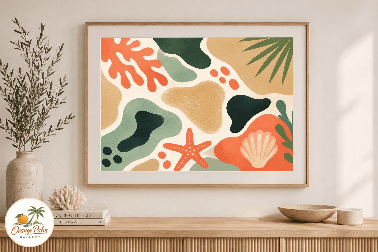
This tide pool printable wall art is meant to sit a little quieter than that. It borrows from Florida without turning the room into a souvenir wall. The reference is low tide: shallow pools, softened stone, wet sand, small green edges, and that warm white light that makes even flat color feel sun-touched.
Quick answer
This tide pool printable wall art is best for modern coastal rooms that need color, softness, and a Florida reference without shells, signs, or a literal beach scene. Use it near an entry bench, bedroom dresser, or small gallery wall where one quiet print can lower the visual noise.
Print it on matte warm white paper, pair it with simple furniture, and avoid surrounding it with too many other beach symbols. The tide pool shapes should be the coastal reference, while the rest of the room stays calm and usable.
The tide pool shape is the point
Tide pools are small compositions if you look at them long enough. They have edges, gaps, little islands of color, and dark spots where the water gets deeper. That is more interesting to me than another literal beach scene.
For this piece, the layout is built around soft organic blocks. Nothing is perfectly symmetrical. The shapes have a cut-paper feeling, but the overall print stays clean enough for a modern room. Coral and sand do most of the warmth. Palm green gives it a Florida note without relying on an actual palm. Ink keeps the piece from getting too sweet.
That balance matters. Coastal rooms can get pale very quickly. If every object is white, beige, and washed blue, the space may look calm, but it can also go flat. A small amount of grounded color gives the wall something to hold onto.
Where I would use it
This is the kind of print I would put near the front door, above a small bench, or beside a bedroom dresser. It does not need a large room to make sense. It is more of a pause than a statement.
In an entryway, it can soften all the hard little things that collect there: keys, shoes, bags, mail. In a bedroom, it works best when the bedding and furniture are simple. The print brings in color, but not visual noise.
For modern coastal homes, that quietness is useful: the artwork can carry a Florida reference without asking the whole space to become a theme.
I would avoid pairing it with too many other beach symbols. If the room already has rope, shells, driftwood, and striped pillows, this piece may lose its quieter edge. Let the print be the coastal reference. Then let the rest of the room breathe.
Printable art has to earn its simplicity
A printable file is not a shortcut around design. If anything, it has less room to hide. The composition has to work on its own, before framing, before styling, before the room does any favors.
That is why I like printable wall art for smaller studio studies. The file can stay direct: one flat artwork, clean edges, no frame mockup pretending to be the product. The final printed piece can be dressed up or down depending on the paper, mat, and frame, but the artwork itself should still feel finished.
For this tide pool study, I would print on a matte paper rather than glossy. A soft white or warm white stock keeps the palette natural. Gloss would make it feel more like a poster, and that is not the mood here.
A Florida reference without the usual costume
Florida is not only palms and citrus and bright beach umbrellas. It is also shallow water, limestone, sea grass, heat-softened color, and the strange quiet of the coast before a storm rolls in.
That is the side of Florida this piece is trying to hold. Not loud. Not themed. Just warm, shaped, and a little uneven in the right places.
A room does not need more decoration for the sake of it. Sometimes it needs one piece that lowers the volume.