Printable Wall Art
A Shell Grid for the Wall, Not the Souvenir Shelf
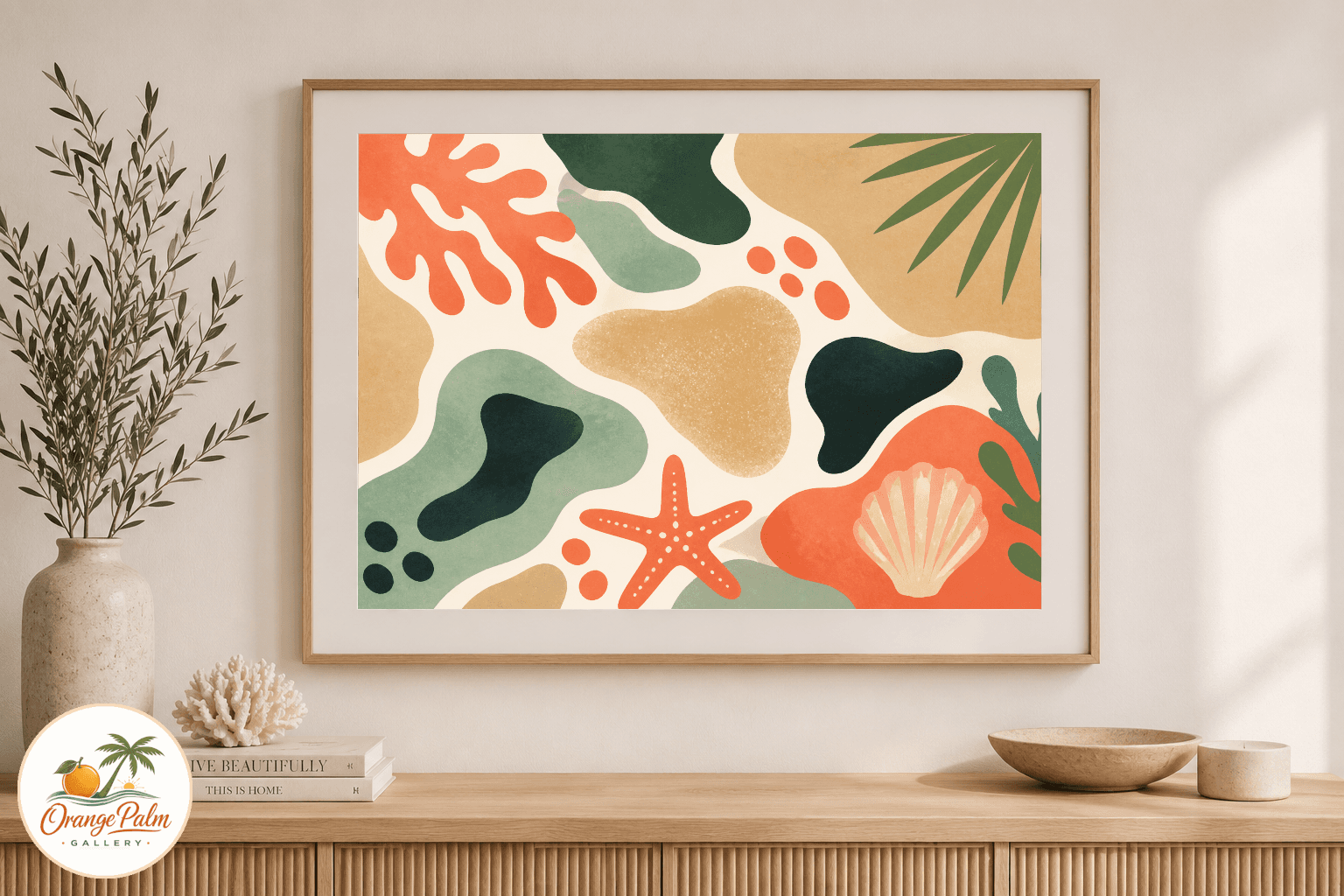
Studio journal note for a Florida inspired shell grid printable wall art concept with warm coastal color and a simple modern layout.
August 13, 2026 / 3 min read / Orange Palm Gallery Studio
Source note: this guide is written and maintained by Orange Palm Gallery Studio. Last updated August 13, 2026.
There is a version of coastal decor that tries too hard to prove it has been to the beach. Rope, anchors, giant blue typography, driftwood piled on driftwood. It can work in the right rental house, but it is a lot to ask of a small bathroom wall or a quiet hallway.
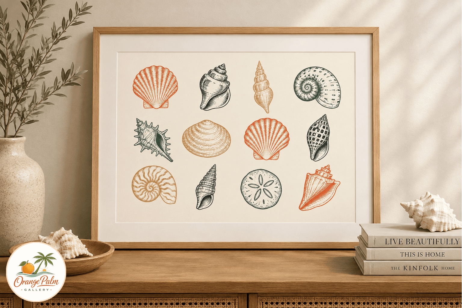
This printable concept started from the opposite direction: one clean sheet, a few shell shapes, warm Florida color, and enough blank space to keep the room from turning into a theme.
The shape language
The idea is a loose shell grid, not a scientific chart and not a pile of beach finds. Each form has a slightly drawn quality, like it came out of a studio notebook after a walk near low tide. The spacing does most of the work. When coastal art gets crowded, the eye starts reading it as clutter. A grid gives the shells a little discipline.
That tradeoff is intentional. The piece loses some of the wildness of a real shoreline, but it gains something useful indoors: calm. A bathroom, entryway, laundry corner, or guest room usually needs that more than it needs a full beach scene.
Color without the postcard blue
People often default to navy and bright turquoise for anything coastal. Those colors can be beautiful, but they can also make a room feel like it is wearing a costume. For this piece, the palette stays closer to warm white, sand, soft coral, palm green, and a dark ink line.
That gives the print a Florida note without shouting about it. The coral warms the page. The sand keeps it grounded. The green adds a little living color, closer to sea grape leaves and shaded palms than pool water.
Where it wants to live
This kind of printable works best where the wall is asking for a small, steady visual pause. Over a towel hook. Beside a powder room mirror. In a narrow entry with a shallow console. It could also sit in a gallery wall as the quieter piece between bolder blocks of color.
The mistake is sizing it like a poster when the room needs a breath. An 8 by 10 or 11 by 14 print can be enough, especially if the surrounding wall has tile, mirrors, baskets, or wood tones already doing some of the talking.
Printing notes from the studio side
For the final file set, I would prepare clean printable ratios for common home and local print shop sizes. Matte paper is the safer call here. Gloss can make shell shapes feel slick, and the whole point is to keep the surface soft.
A lightly textured fine art paper would suit it best if the room is simple. For a practical bathroom print, a good matte heavyweight paper still gives the artwork enough body without making it precious.
Why this one belongs in the Orange Palm line
Orange Palm Gallery pieces are usually at their best when the Florida reference is specific but not literal in a loud way. This shell grid fits that lane. It nods to low tide, shell paths, warm light, and quiet walls, but it still behaves like modern decor.
No fake weathered signs. No beach house slogan. Just a printable page with a little salt air in the spacing.