Wall Art Styling
Bathroom Wall Art Should Feel Clean, Not Clinical
A studio note on choosing bathroom wall art with softer color, better scale, and enough visual warmth for a clean but lived in room.
August 26, 2026 / 4 min read / Orange Palm Gallery Studio
Source note: this guide is written and maintained by Orange Palm Gallery Studio. Last updated August 26, 2026.
Bathrooms are full of hard edges. Tile, mirror, faucet, glass, stone, grout lines, cabinet pulls. Everything reflects light or repeats a line. Then people hang art that is either too tiny to matter or too themed to survive more than a week.
A bathroom does not need a sign telling you to relax. It needs one quiet visual decision that softens the room.
That is the tradeoff. Bathroom wall art has to bring warmth without adding clutter. It has to feel clean without turning the space into a dentist office. In a Florida inspired home, that usually means less beach language and more atmosphere: sand, palm green, warm white, a little coral, a little ink.
Quick answer
The best bathroom wall art ideas use one warm, clean piece that softens tile, mirrors, towels, and fixtures without adding clutter. Choose scale and color that make the bathroom feel lived in, not clinical.
Start with the surfaces already doing the talking
Before choosing art, look at what the bathroom is already saying.
Glossy white tile says crisp. Matte stone says grounded. A big mirror says bright. Black hardware says graphic. Brass hardware says warmer. Blue gray paint says cool. Cream towels say soft. Every one of those choices is already part of the composition.
The mistake is treating the wall art like a separate decoration. It is not separate. It sits inside a room with lots of small reflections and straight lines. If the art is too busy, the bathroom feels crowded fast. If the art is too pale, it disappears into tile and drywall.
A bathroom often needs art with a little weight. Not heavy color everywhere, but enough contrast to keep the wall from looking unfinished.
Use color like temperature, not theme
Coastal bathroom art gets goofy when every choice screams ocean. Shells, waves, anchors, sea glass, blue script. That can work in the right place, but it often makes the room feel more rented than personal.
A better approach is to use color as temperature.
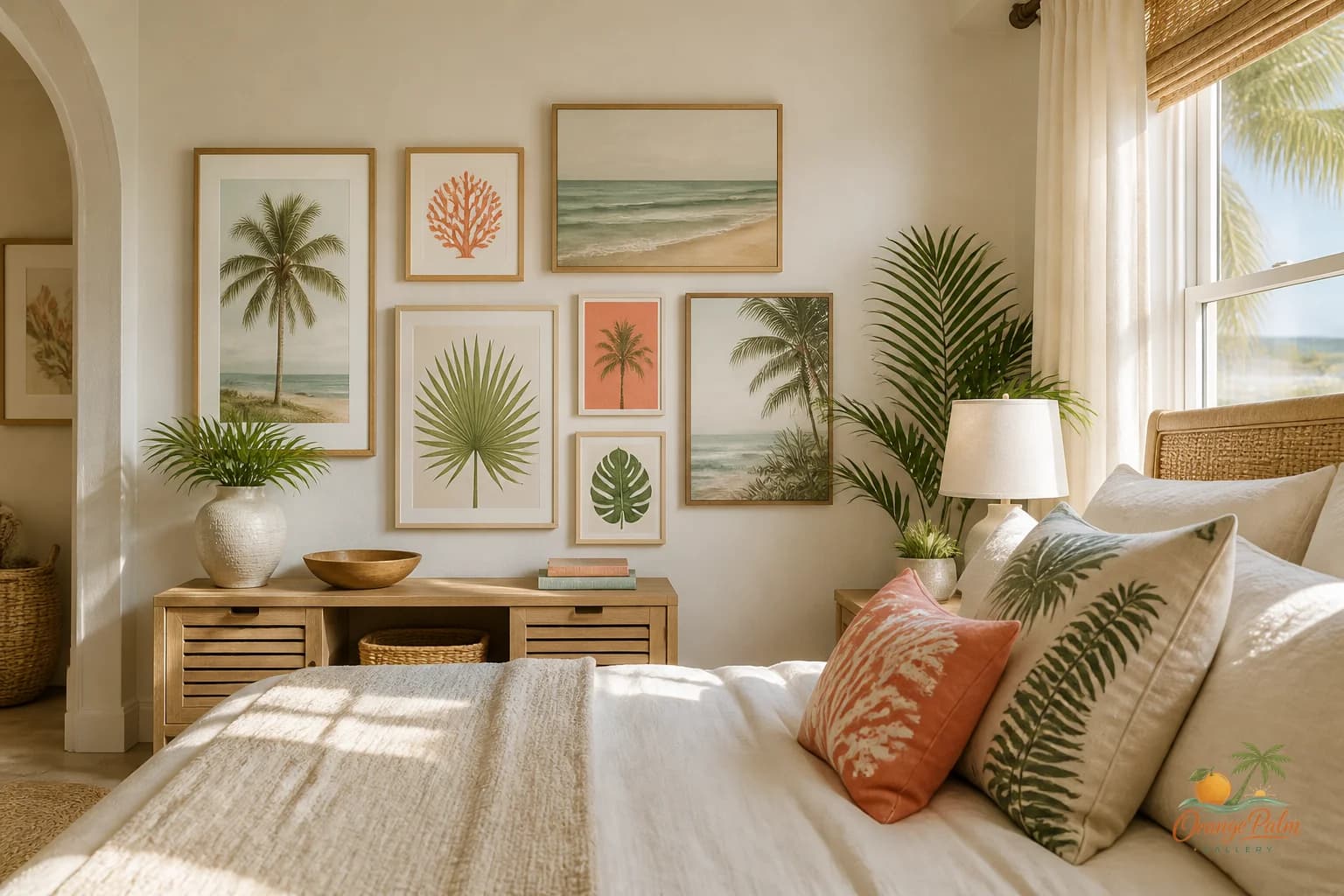
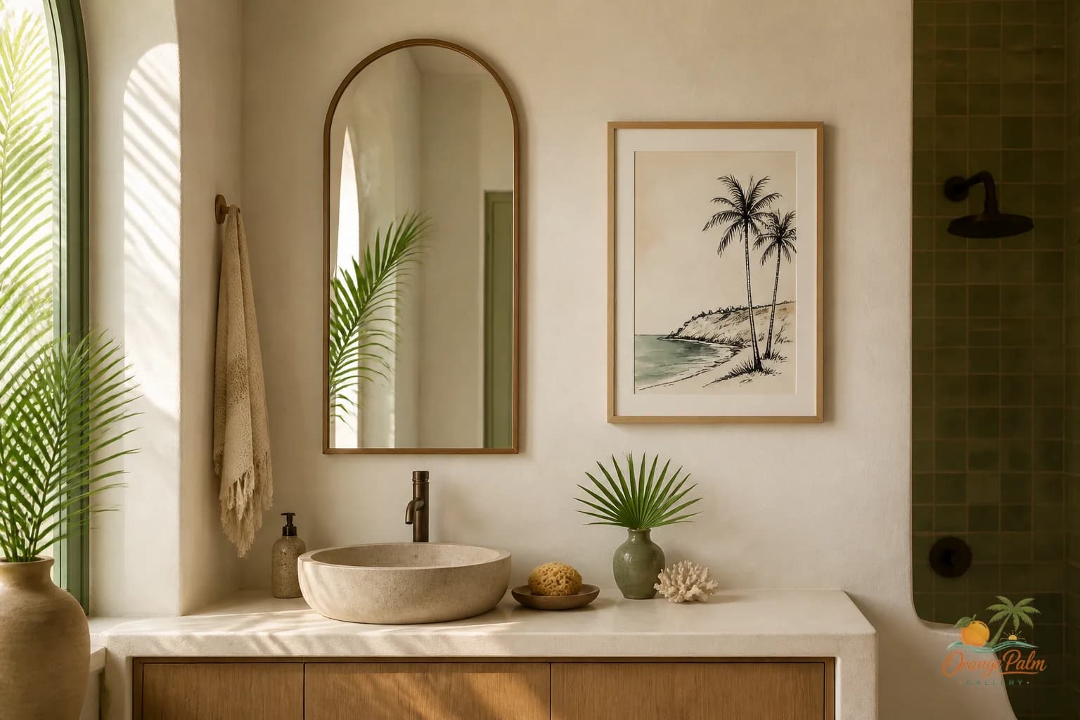
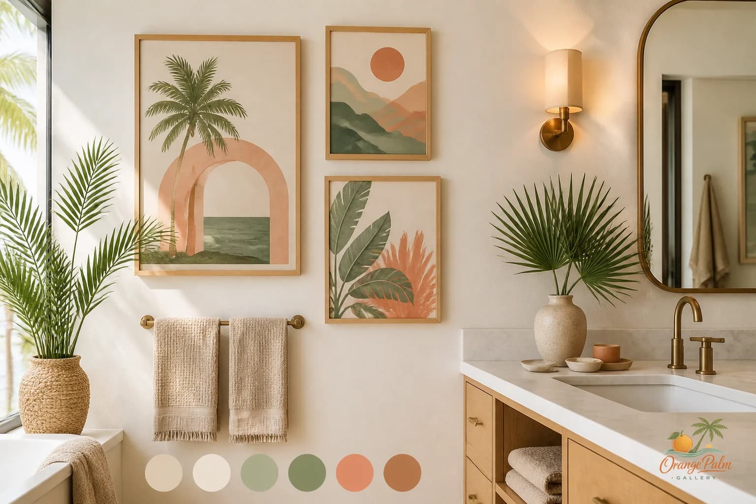
Warm white keeps the room from feeling sharp. Sand tones sit naturally with towels, woven baskets, stone counters, and wood vanities. Palm green brings life without shouting tropical. Coral can be beautiful in a small dose, especially if the bathroom has clean white tile or pale walls. Ink gives the composition a spine.
You do not need all five. Two or three are enough.
For a small bathroom, try warm white, sand, and ink. For a brighter bathroom with a window, try warm white, palm green, and a touch of coral. For a guest bath, sand and ink can feel polished without being fussy.
Give the art breathing room near the mirror
The mirror is usually the boss in a bathroom. It catches the most light and takes up the most visual space. Wall art near a mirror should not compete with it.
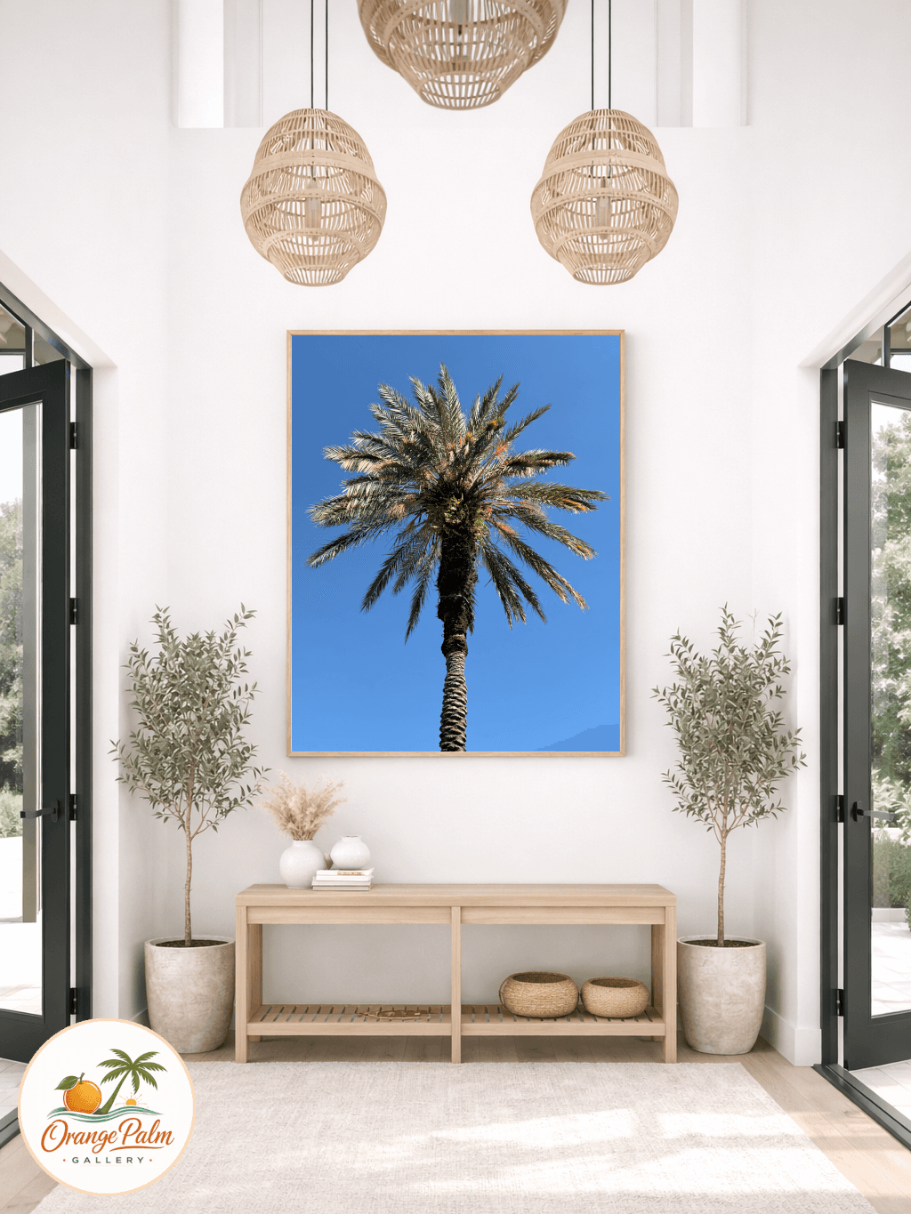
If you have a blank wall beside the vanity, choose one piece that is tall enough to feel intentional. A tiny print floating next to a large mirror looks nervous. A vertical piece can echo the mirror without copying it.
If the art is above the towel bar, leave enough air between the bar and the bottom of the piece. The towel has volume. It changes shape. It casts shadows. Treat it like part of the wall arrangement, not an interruption.
If the only open wall is above the toilet, restraint matters. This is not the place for a crowded gallery wall. One calm piece, centered with the tank and balanced against any shelf or cabinet, usually works better than three small things stacked because the wall looked empty.
Scale up sooner than you think
Bathrooms make people timid. The room is smaller, so the art gets smaller. Then the wall looks accidental.
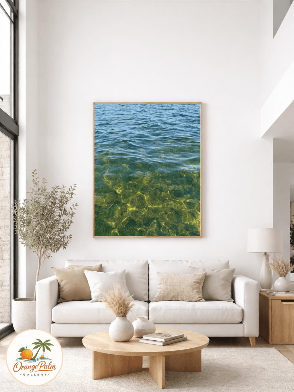
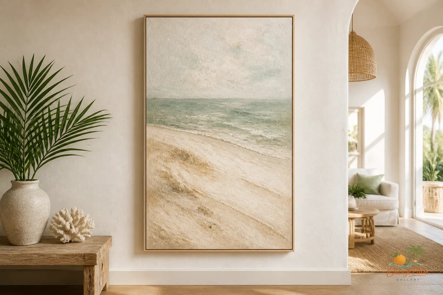
A small room can handle a generous piece if the palette is quiet and the composition is clean. In fact, one larger piece often makes the bathroom feel calmer than several little frames. The eye gets one place to land.
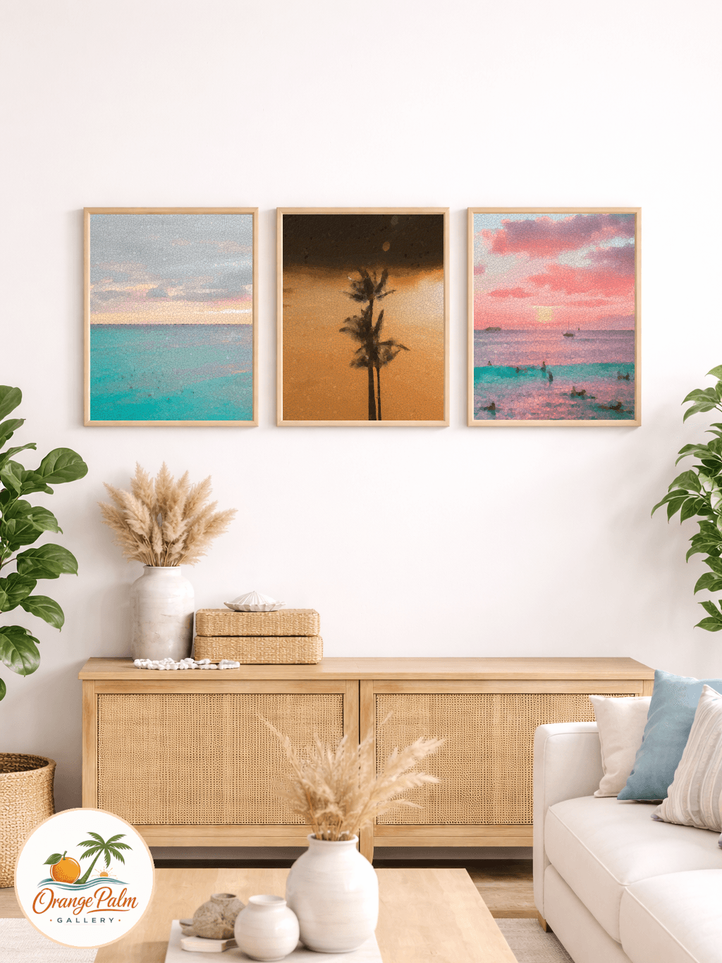
The safe move is not always the tasteful move. A postage stamp print on a blank bathroom wall makes the room feel unfinished. A larger, softer piece can make the same wall feel designed.
Keep the mood clean, but let it be human
A clean bathroom should still have a pulse. Handmade feeling matters here because the room is already full of manufactured surfaces. Tile is precise. Mirrors are perfect. Faucets are polished. Art can bring the slight softness those materials do not have.
Look for visual texture, organic shapes, imperfect edges, coastal color that feels sun faded rather than branded. The goal is not to decorate the bathroom harder. The goal is to make the hard room breathe.
That is usually where bathroom art succeeds: not as a theme, not as a joke, not as filler, but as the one warm note in a room built from cool surfaces.
Explore more calm, modern Florida inspired wall art and styling notes at Orange Palm Gallery.