Printable Wall Art
A Quiet Arch Print for Coastal Rooms That Need Structure
A journal note on using a Florida inspired arch printable to bring structure into a coastal room without leaning on obvious beach decor.
August 27, 2026 / 3 min read / Orange Palm Gallery Studio
Source note: this guide is written and maintained by Orange Palm Gallery Studio. Last updated August 27, 2026.
Coastal rooms can get very loud, very fast. One shell becomes twelve. A palm turns into a theme. Blue takes over the room and suddenly the whole wall is doing a vacation rental impression.
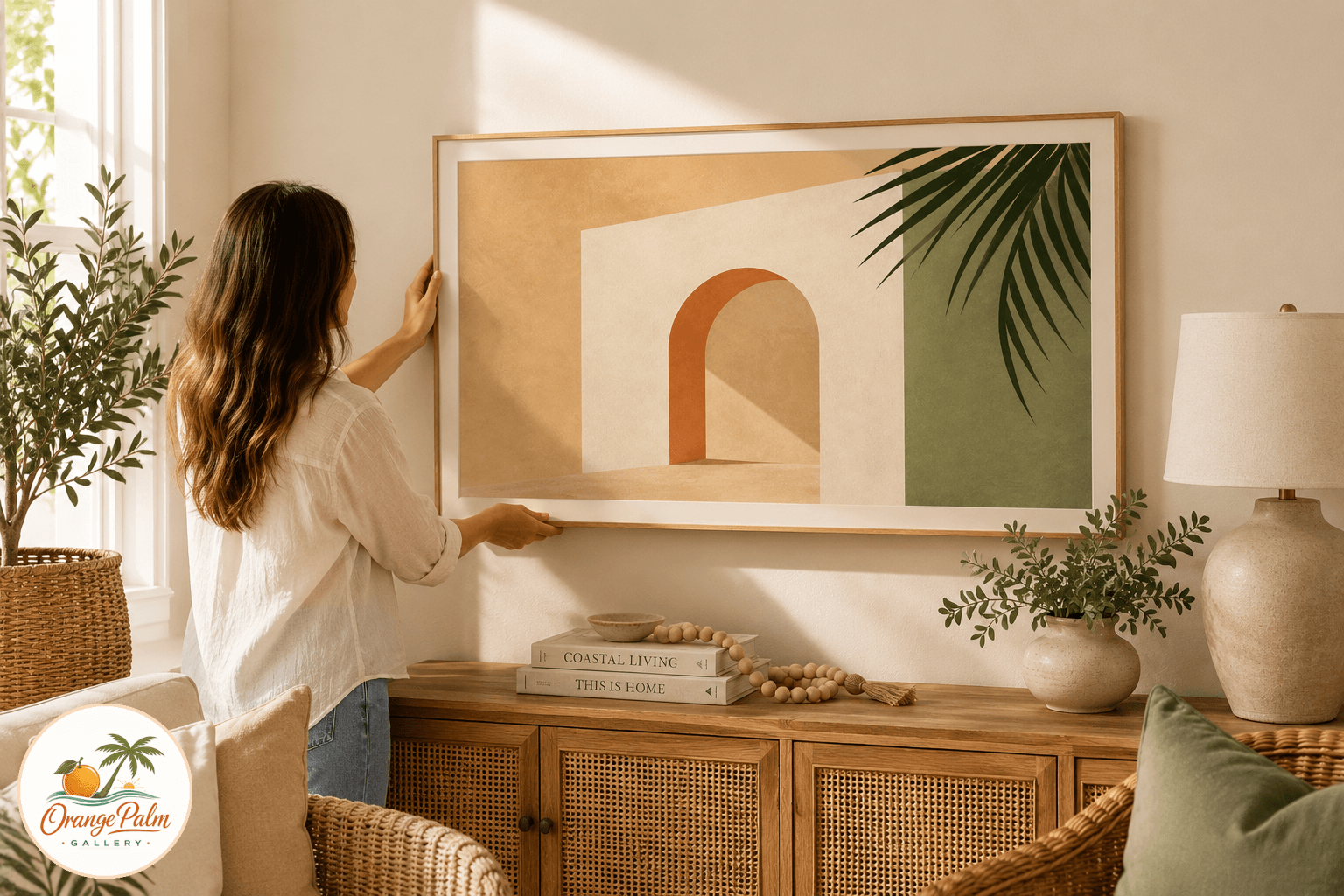
The better move is usually quieter: one clear shape, a warm ground, a little architectural tension. That was the starting point for this Florida arch study, a printable wall art piece built around the kind of soft stucco curve you notice in older Florida buildings, shaded walkways, garden walls, and sun washed entries.
It is coastal, but not because it announces itself. It holds the room like architecture.
Why an arch works in a coastal room
An arch gives a wall a center without making it feel formal. That is the useful tradeoff. A square print can feel crisp and modern, but sometimes too rigid. A loose botanical can feel relaxed, but sometimes too decorative. An arch sits between the two.
For this piece, the shape stays simple. The palette does the Florida work: warm sand, muted palm green, a coral shadow, and soft warm white space. Nothing needs to scream beach house. The color is enough.
This is what people often get wrong with coastal decor. They try to prove the place instead of suggesting the air. Florida light is not just turquoise water and bright umbrellas. It is also plaster, shade, faded clay, green leaves against white walls, and the peachy edge of late afternoon.
Where I would place it
This print belongs in the spots that need calm structure: a hallway, entry wall, small bedroom corner, powder room shelf, or the blank stretch beside a linen cabinet. It is especially useful where the furniture is simple and the wall needs one confident shape.
I would keep the frame plain if you print and frame it yourself. White, natural oak, or a thin black frame all make sense, depending on the room. The piece does not need a heavy mat, but a little breathing room helps. If the wall already has woven texture, rattan, seagrass, or linen nearby, the arch gives that softness a clean edge.
The point is not to match every color in the room. Matching is where rooms start to feel nervous. Let one color echo. Maybe the palm green catches a plant across the room. Maybe the coral shadow nods to a clay pot. That is plenty.
Printing notes from the studio side
For printable art, paper choice changes the mood more than people expect. Bright glossy paper will make this feel sharper and more commercial. A matte heavyweight paper keeps it closer to the studio sketch it came from.
If you want a softer look, use textured matte paper or a fine art style print service. If you want it cleaner, use smooth matte cardstock. Either way, avoid overly saturated settings. The charm is in the warm restraint, not in pushing the colors until they flatten out.
The quieter coastal choice
This piece is for rooms that want Florida without the costume. No anchor. No slogan. No staged beach scene. Just a shaped bit of warmth for a wall that needed something steady.
That is the kind of coastal decor I keep coming back to: less themed, more lived in, with enough handmade texture to feel human.
Explore Orange Palm Gallery pieces for calm, modern Florida inspired homes.