Printable Wall Art
A Canal Print for Coastal Rooms That Don’t Need Another Shell
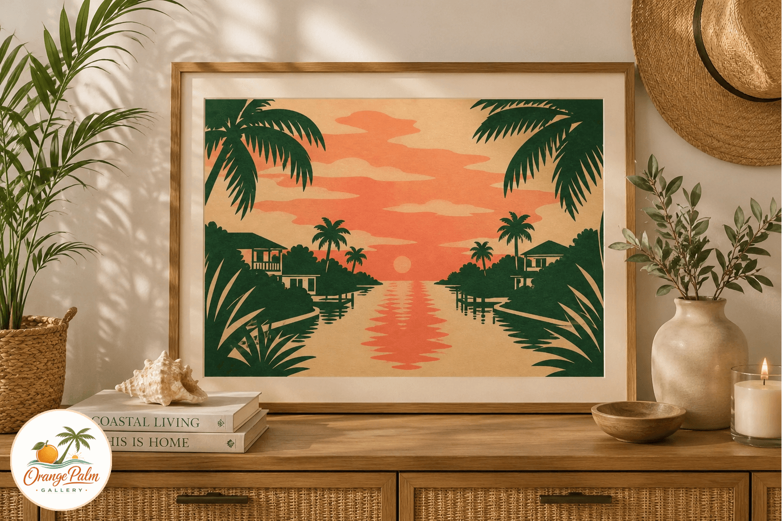
A studio note for Coral Canal Evening, a Florida inspired printable wall art piece with soft coral light, palm green edges, and a calm canal composition.
August 25, 2026 / 3 min read / Orange Palm Gallery Studio
Source note: this guide is written and maintained by Orange Palm Gallery Studio. Last updated August 25, 2026.
Coastal rooms get over-themed quickly. One shell print becomes five. The palette turns blue by default. Suddenly the room feels less like a place someone lives and more like a rental sign trying too hard.
Coral Canal Evening was sketched from a quieter Florida cue: the narrow band of color that sits over canal water when the day is almost done. Not dramatic sunset orange. Not postcard turquoise. More like coral light caught between stucco, palms, and a flat strip of water.
That mood is easier to live with.
Why a canal instead of the beach
The beach is the obvious subject, which is exactly the problem. It carries a lot of visual baggage: umbrellas, waves, shells, gulls, rope, signs with words on them. A canal is more restrained. It gives you Florida without shouting Florida.
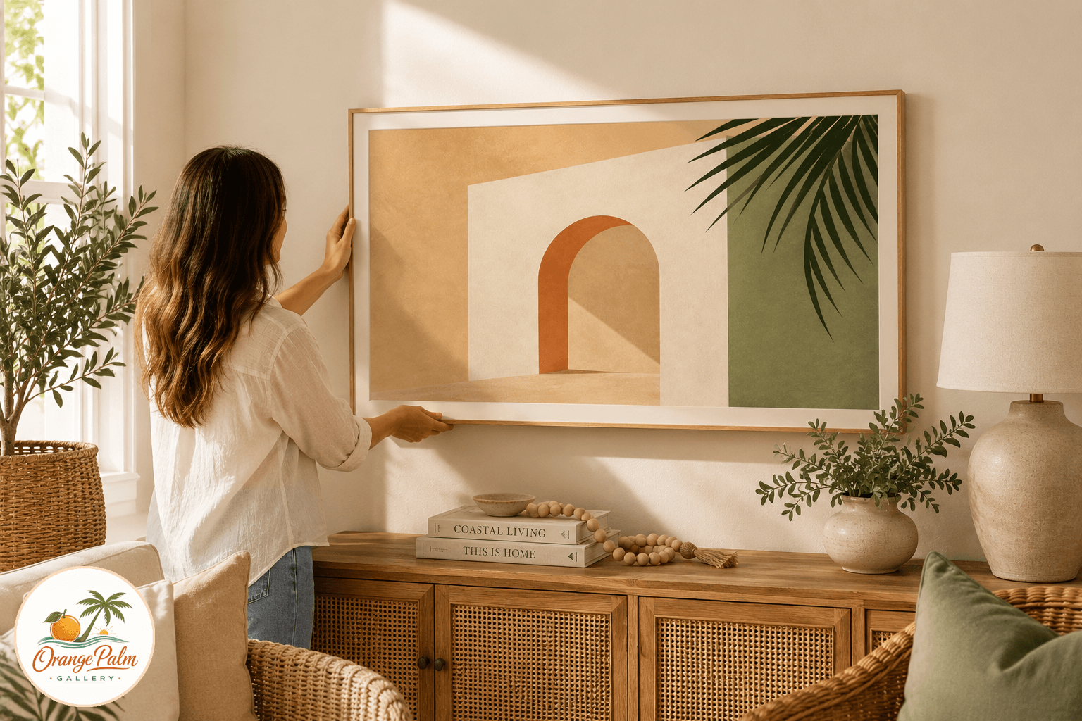
For this piece, the composition is built around a low horizon, a soft coral sky, a simple water reflection, and palm green shapes at the edge. The print keeps the scene abstract enough to work with modern furniture, vintage rattan, white walls, or a room full of warm wood.
The tradeoff is intentional. You lose some literal detail. You gain a calmer wall.
Where this print works best
This printable is meant for rooms that need warmth, not noise. I would put it over a small console, near a reading chair, above a nightstand, or as one piece in a relaxed coastal gallery wall.
It also works in transitional spaces, especially entries and hallways. Those spots often get leftover art because they are not the main room. That is a mistake. An entry sets the temperature for the whole home. A quiet coral and green piece can soften the first impression without making the wall feel decorated to death.
If your room already has blue coastal accents, this print pulls the palette warmer. If your room is mostly cream, tan, cane, oak, or linen, it adds color without pushing into bright tropical territory.
How to print it without making it look cheap
Printable art lives or dies by paper choice. Glossy paper is usually the wrong move here. It fights the handmade feeling and makes soft color look slick.
Choose a matte heavyweight paper, cotton rag, or lightly textured fine art paper if your printer offers it. The sand and coral tones will sit better, and the darker palm shapes will feel more inked than sprayed on.
For sizing, keep the frame simple. Natural wood, warm white, thin black, or muted brass all make sense. Avoid anything too beachy. No distressed teal frame. No rope detail. The artwork already carries the coastal note. The frame does not need to repeat it.
A quieter kind of Florida wall
The goal was not to make a souvenir. It was to make a printable that feels like a room after the heat has dropped a little, when the canal goes still and the colors flatten into simple shapes.
That is the Florida I keep coming back to in the studio: less spectacle, more atmosphere. Coral Canal Evening sits in that space. It is coastal, but not cute. Warm, but not loud. Familiar, but not literal.