Printable Wall Art
A1A Morning, without the souvenir shop
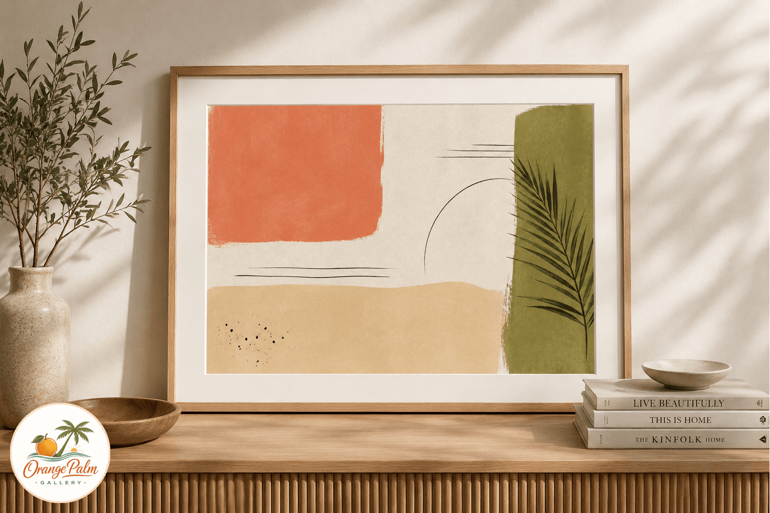
Studio notes for A1A Morning Color Block, a modern Florida printable wall art piece with sand, coral, palm green, and ink details.
August 11, 2026 / 3 min read / Orange Palm Gallery Studio
Source note: this guide is written and maintained by Orange Palm Gallery Studio. Last updated August 11, 2026.
Coastal art gets strange fast when it tries too hard. A shell, a wave, a palm, a rope font, then suddenly the room feels like a rental sign instead of a place someone actually lives.
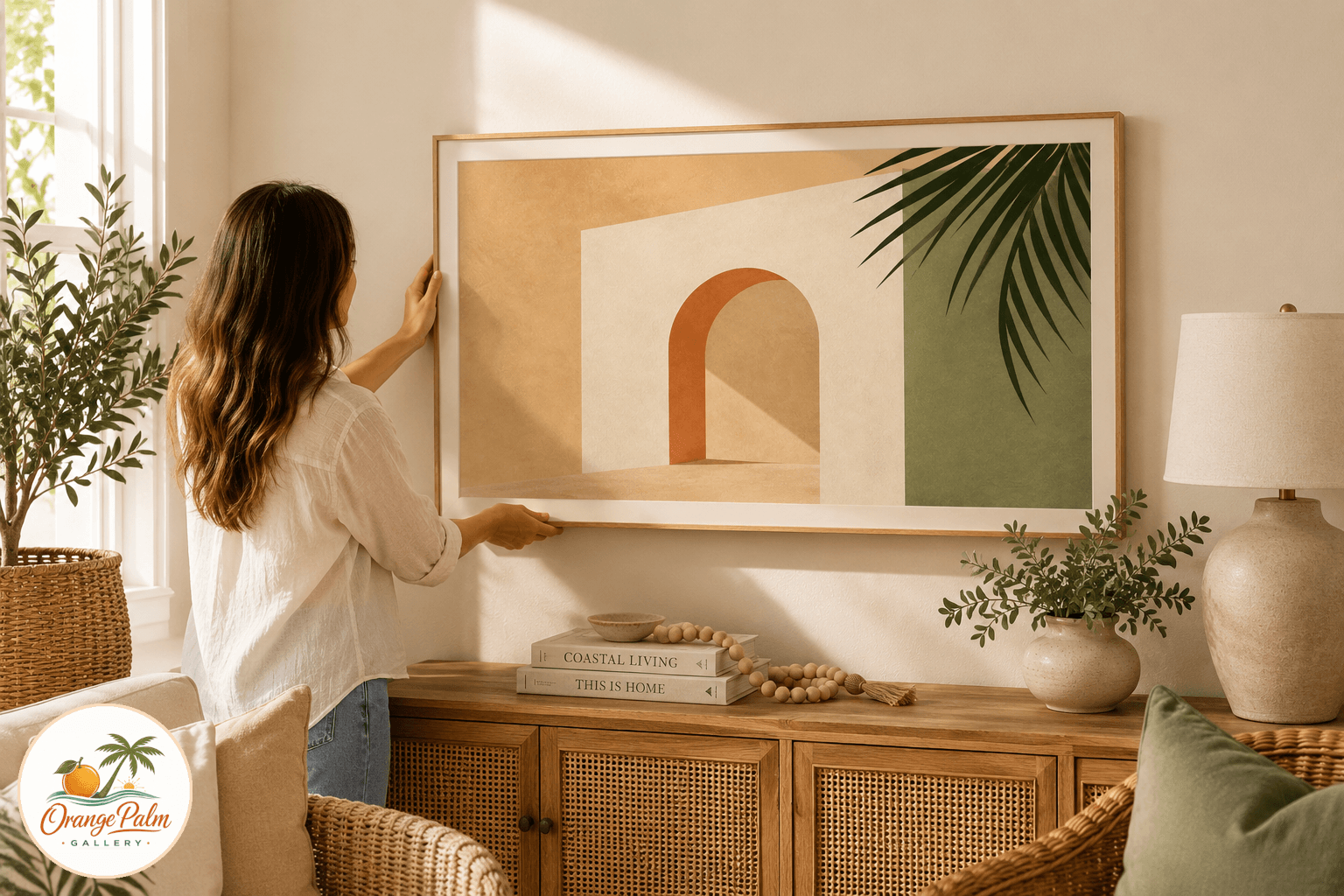
A1A Morning Color Block is meant to pull from Florida without shouting Florida. The idea is a flat printable composition with sand, coral, palm green, warm white, and a little ink. Not a beach scene. Not a map. More like the color memory of a slow drive near the water before the day gets bright and loud.
That tradeoff matters. Literal coastal decor can be charming, but it can also take over a wall. This piece is designed to sit back a little, especially in an entryway, hallway, office corner, or sunroom where the art needs to add warmth without becoming the whole personality of the room.
Why abstract coastal color works better in small rooms
Small rooms do not always need smaller art. They need calmer art. A busy wall print with tiny details asks people to step close, squint, and decode it. That can be lovely in the right spot, but in an entryway or pass through space, it often becomes visual noise.
Color block artwork does the opposite. It gives the wall a shape, a temperature, and a rhythm from across the room. Sand keeps it grounded. Palm green gives it a living edge. Coral brings the Florida heat without turning neon. Ink adds just enough structure so the whole thing does not float away.
That is the lane for this piece: warm, graphic, and easy to place.
The Florida reference is in the palette, not the punchline
A lot of coastal decor makes the reference too obvious. The room says beach three times before you have taken off your shoes. For Orange Palm Gallery, the more interesting question is quieter: what does Florida light do to color?
Morning on the coast has a softened contrast. Whites are not sterile. Greens are dusty and alive. Coral can feel sun faded instead of sugary. Even dark ink feels warmer against sand than it does against a bright white background.
A1A Morning uses that kind of restraint. The road reference is there in the title and in the composition, but the artwork does not need painted asphalt or a postcard horizon to make the point.
Where I would hang it
This printable is best for places that need a clean vertical lift: an entryway table, a narrow hallway, a small reading corner, or a sunroom wall with plants nearby. It would also work over a bench, beside a simple mirror, or as one piece in a loose coastal gallery wall.
The mistake is pairing it with too many other beach signals. If the room already has woven texture, pale wood, white walls, or linen, let the print be the color note. You do not need a shell bowl, a surfboard, and a sign that explains the vibe.
For printing, I would keep the paper matte. A soft textured fine art paper or heavyweight matte cardstock helps the color feel handmade instead of slick. Gloss can make coastal colors look commercial, especially with coral and green.
A note for printable art buyers
Printable wall art is practical, but it still deserves a little care. The file is only part of the object. The paper, trim, frame, and wall around it all change the result.
For this piece, I would avoid a heavy ornate frame. A thin natural wood frame, white frame, or simple black frame would keep the composition modern. If the room already has a lot of pale tones, black gives it a clean edge. If the room is small or sun washed, natural wood keeps it softer.
The goal is not to make the wall louder. It is to give it a little Florida morning before the day gets busy.
Explore Orange Palm Gallery pieces for calm, modern Florida-inspired homes.