Printable Wall Art
A Quiet Palm Print for the Wall That Gets Too Much Attention
Studio notes for Palm Screen Afternoon, a Florida-inspired printable wall art piece with soft palm shadow shapes, warm white space, and modern coastal restraint.
August 4, 2026 / 3 min read / Orange Palm Gallery Studio
Source note: this guide is written and maintained by Orange Palm Gallery Studio. Last updated August 4, 2026.
Some walls do not need a louder print. They need something with enough structure to hold the room, and enough air to let the rest of the space breathe.
Palm Screen Afternoon started as a small studio answer to that specific wall: the bedroom wall beside a woven shade, the narrow entry wall near a console, the little corner that looks unfinished when it is blank but overworked when it gets a busy poster.
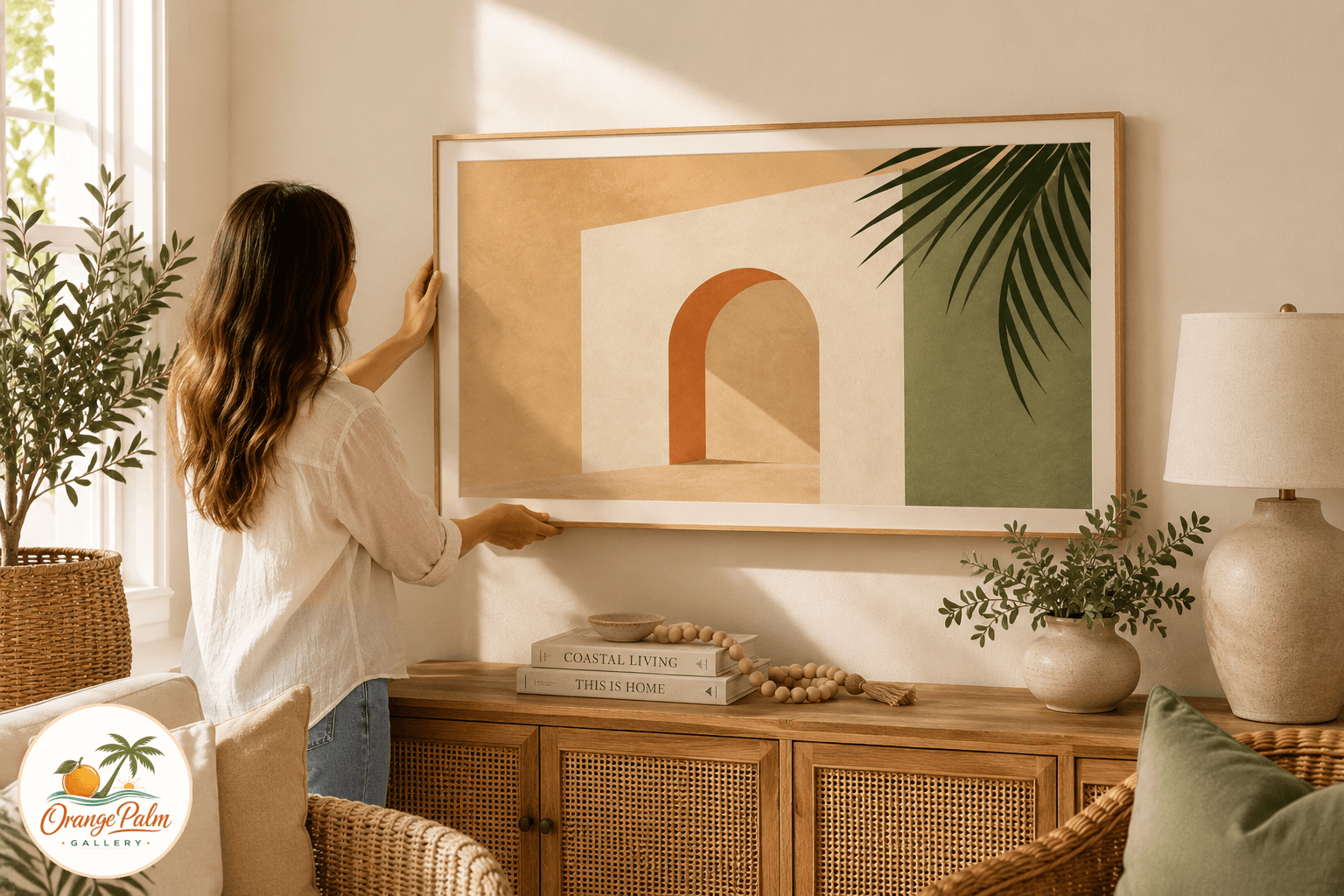
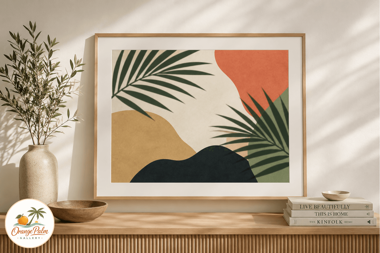
The piece is built around a Florida visual that is easy to miss because it is everywhere: palm shadows falling through a screen in late afternoon. Not the postcard palm. Not the neon vacation version. Just the soft, broken geometry of leaves, heat, and filtered light.
Why the palm shape stays quiet
Palm art can go wrong fast. Too literal, and the room starts to feel themed. Too decorative, and it fights the furniture. Too pale, and it disappears.
For this print, the palm reference is treated more like a shadow than a symbol. The shapes are loose and flattened, with enough movement to feel handmade but not so much that the piece becomes restless. The color stays close to the Orange Palm Gallery palette: warm white, sand, palm green, a little coral, and a grounding ink tone.
That restraint is the point. A printable can be useful without shouting that it is useful.
Where this print wants to live
Palm Screen Afternoon is meant for calm rooms with natural texture: linen bedding, pale wood, cane, rattan, ceramic lamps, simple shelves, or an entry table that needs one clean vertical note.
In a bedroom, it works best where you want visual softness rather than a focal wall. Over a nightstand, above a small dresser, or paired with a simple reading chair, the print adds shape without making the room feel busier.
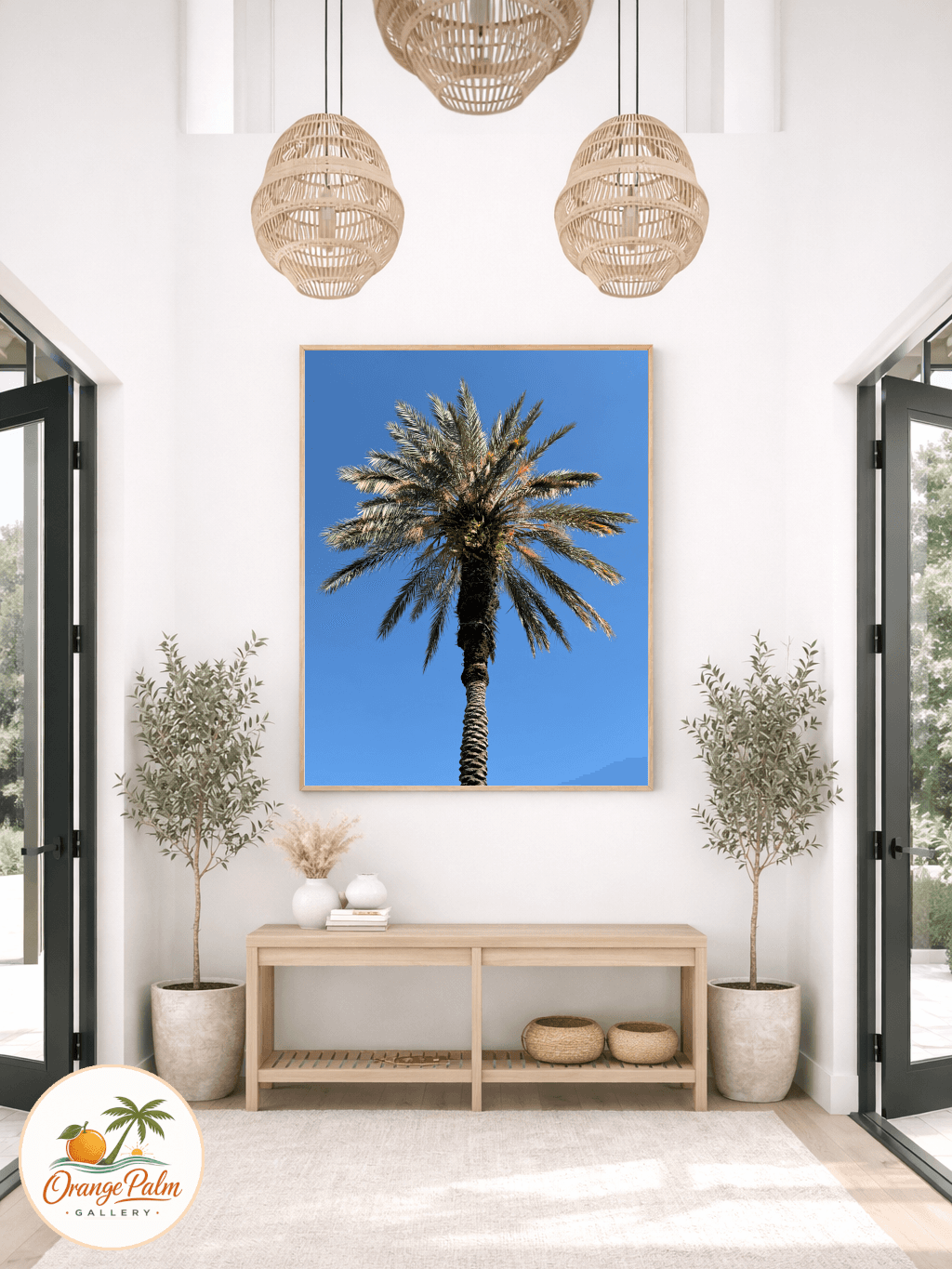
In an entryway, it can do something slightly different. It gives the first wall a little Florida atmosphere without turning the house into a beach rental lobby. That tradeoff matters. Coastal style is strongest when it remembers to leave some space.
How to print it without making it look flat
For a warmer result, skip glossy paper. Gloss tends to make quiet artwork feel slick. A matte heavyweight paper or lightly textured fine art paper keeps the palm shapes soft and lets the warm white background feel more natural.
If the room already has a lot of contrast, print smaller and give the artwork a wider mat. If the wall is pale and underdressed, go larger so the shadow shapes have room to stretch.
The goal is not to match every color in the room. That is where people overdo it. Let one color connect, maybe the palm green with a plant, the sand tone with a wood frame, or the coral with a tiny accent nearby. One connection is usually enough.
The studio note
This is the kind of printable that earns its place slowly. It is not trying to be the loudest object in the room. It is there to make a blank wall feel considered, to bring in a little Florida light, and to leave the rest of the room alone.
Explore Orange Palm Gallery pieces for calm, modern Florida-inspired homes.