Wall Art Styling
Sunroom Wall Art Should Not Fight the Window
How to style 2D wall art in a sunroom with bright Florida light, warm neutrals, and one calm focal wall.
July 20, 2026 / 4 min read / Orange Palm Gallery Studio
Source note: this guide is written and maintained by Orange Palm Gallery Studio. Last updated July 20, 2026.
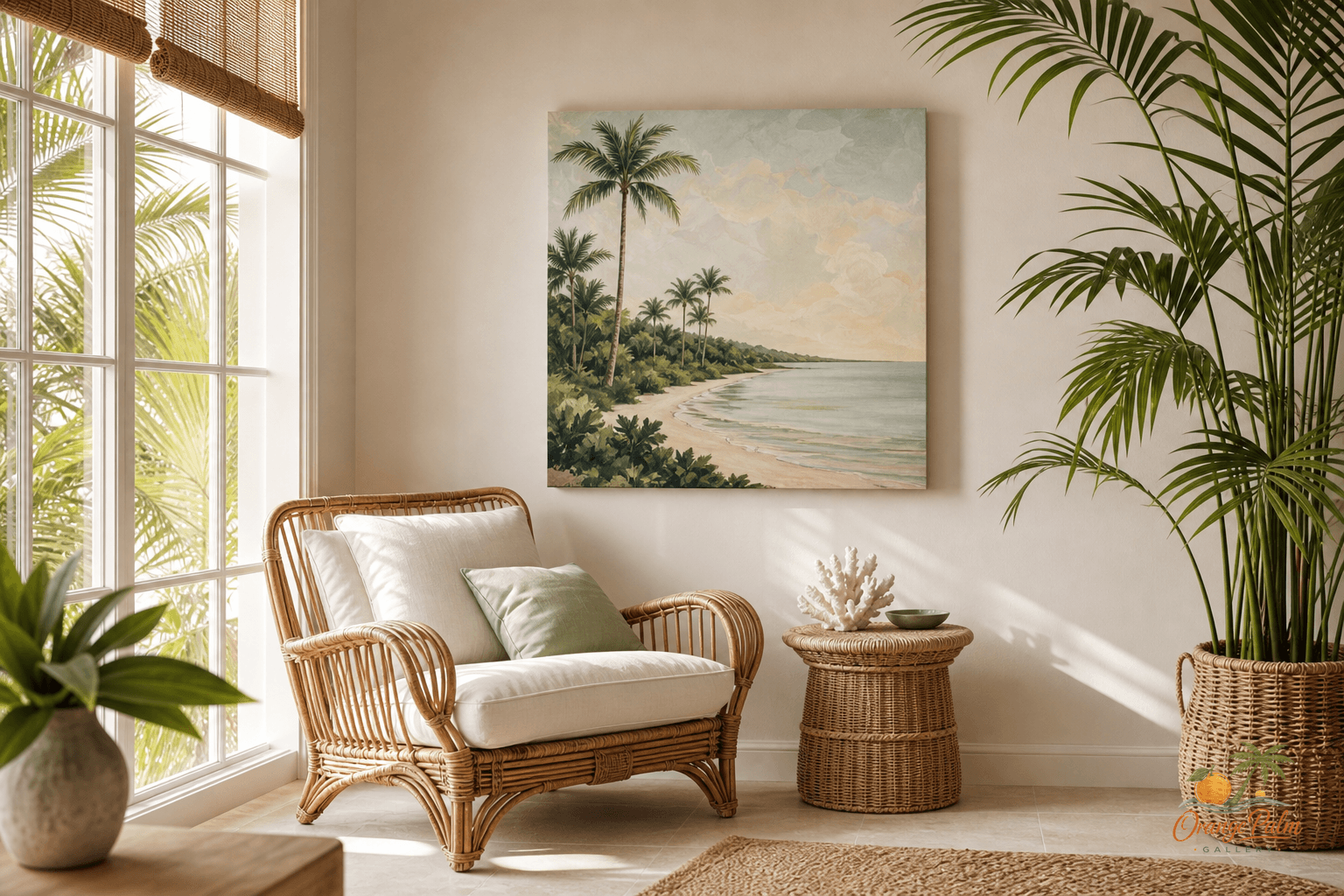
A sunroom already has the loudest feature in the house: light. Big windows, hot reflections, plant shadows, white walls that go almost blue at noon. If the wall art tries to compete with all of that, the room starts to feel twitchy.
The better move is quieter. Put the art where the light can graze it, not blast it.
That sounds fussy until you live with a bright room for a week. A print that looks perfect in soft morning shade can turn washed out by lunch if it is facing the strongest window. A piece with lovely warm sand, palm green, coral, or ink can lose its whole personality when glare sits on top of the surface. In a sunroom, placement is not decoration after the fact. It is part of the artwork.
Quick answer
The strongest sunroom wall art ideas respect the window first. Choose one calm piece, hang it on a wall with side light instead of direct glare, and let the artwork support the room’s brightness rather than compete with it.
Choose the wall that gets the side light
Most people hang art on the largest blank wall because it feels like the obvious answer. In a sunroom, that can be the wrong wall.
Look for the wall that gets angled light, not direct light. Side light gives a 2D piece a little presence without turning it into a mirror. It lets the color stay readable. It gives nearby textures, like cane, linen, old wood, or a ceramic planter, enough shadow to feel layered.
The wall does not have to be huge. A smaller shaded wall beside a chair can be better than a wide wall opposite a row of windows. The room will feel more intentional if the art belongs to a sitting spot instead of floating in the general brightness.
Do not center everything on the window
A window is not always the anchor. Sometimes it is the weather.
If the view is strong, palms, water, garden, sky, then the art should not pretend to be the main event. Let the window have its say. Hang the piece on a nearby wall where it can echo the room’s color without duplicating the view. A bit of palm green in the art can talk to the plants outside. A coral note can warm up all the white. A thin ink shape can keep the room from going too sweet.
The tradeoff is that the art may not be visible from every doorway. That is fine. Sunrooms are often better when they reveal themselves slowly. You sit down, turn your head, and notice the piece. Not every wall needs to announce itself from across the house.
Scale it to the furniture, not the sunlight
Bright rooms make small art look even smaller. The light eats edges. White space expands. A tiny print above a full-size rattan sofa can feel like a postage stamp taped to a cloud.
Use the furniture as the measuring tool. Above a bench or loveseat, choose a piece wide enough to hold its own against the seat below it. Near a single lounge chair, a smaller piece can work if it relates to the chair, side table, and lamp as one little zone.
What people get wrong is treating sunroom art like an accessory. A pillow can be small and still do its job. Wall art has to claim enough visual weight to register across all that brightness.
Keep the palette warm, or the room can go sterile
Florida light is beautiful, but it can bleach a room flat. If the walls are warm white and the floor is pale tile or light wood, the art can do a lot of quiet work.
A good sunroom palette does not need five loud colors. Try warm white, sand, palm green, and a small hit of coral or ink. The restraint is the point. The art should make the room feel cooler in spirit, not colder in temperature.
This is where Florida-inspired wall art works best to me: not as a beach sign, not as a souvenir, but as a warm visual rhythm. A curved palm shape. A washed coastal tone. A bit of sun-baked color that feels like it has been in the room all afternoon.
Give the art breathing room
Plants are the usual sunroom mistake. Not having them. Having them crowd every surface until the wall art becomes background noise.
Leave space around the piece. Let a tall plant sit low and off to one side rather than climbing directly into the frame. Keep hanging baskets away from the artwork unless the whole point is a layered, greenhouse look. Even then, give the art one clean edge.
A calm room needs contrast. Leaf against wall. Shadow against white. Art against empty space.
If you are building a sunroom mood slowly, start with the wall that catches the gentlest light and make that your art wall. One well-placed piece can do more than a busy cluster, especially in a room where the sun is already moving all day.
You can explore more of the Orange Palm Gallery studio direction here: Orange Palm Gallery.