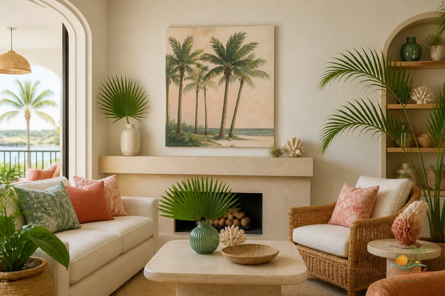
Wall Art Styling
The Sofa Wall Is Where Tiny Art Gets Exposed
Orange Palm Gallery journal on sofa wall art scale, warm Florida color, and how to make a living room wall feel calm, anchored, and intentional.
August 3, 2026 / 4 min read / Orange Palm Gallery Studio
Source note: this guide is written and maintained by Orange Palm Gallery Studio. Last updated August 3, 2026.
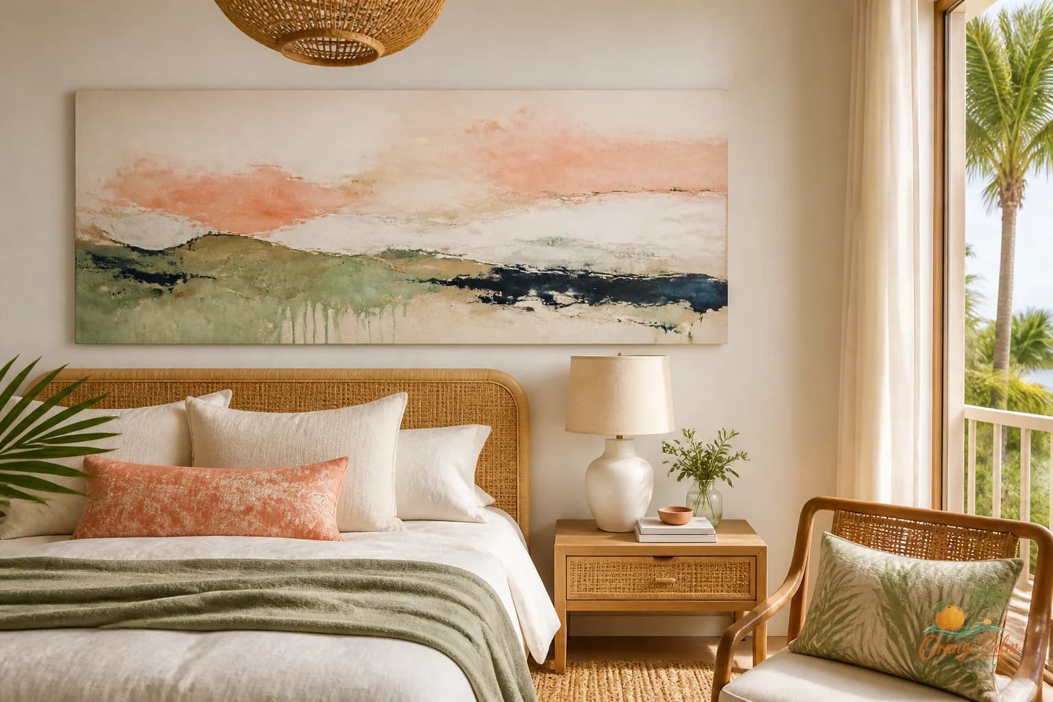
A sofa wall is not complicated, but it is unforgiving.
Put a small print above a sofa and the room tells on you immediately. The art may be beautiful up close, but from across the room it turns into a postage stamp with upholstery beneath it. The wall still feels empty. The sofa still feels heavy. The art looks like it is apologizing for being there.
Today’s Orange Palm Gallery snapshot is quiet: 2 visitors, 4 pageviews, and no newsletter signups. That kind of day is useful because it pulls the studio back to the basic questions people actually live with. Not what to launch. Not what to hype. Just how to make a room feel better with one smart visual decision.
For a living room, the sofa wall is one of those decisions.
Quick answer
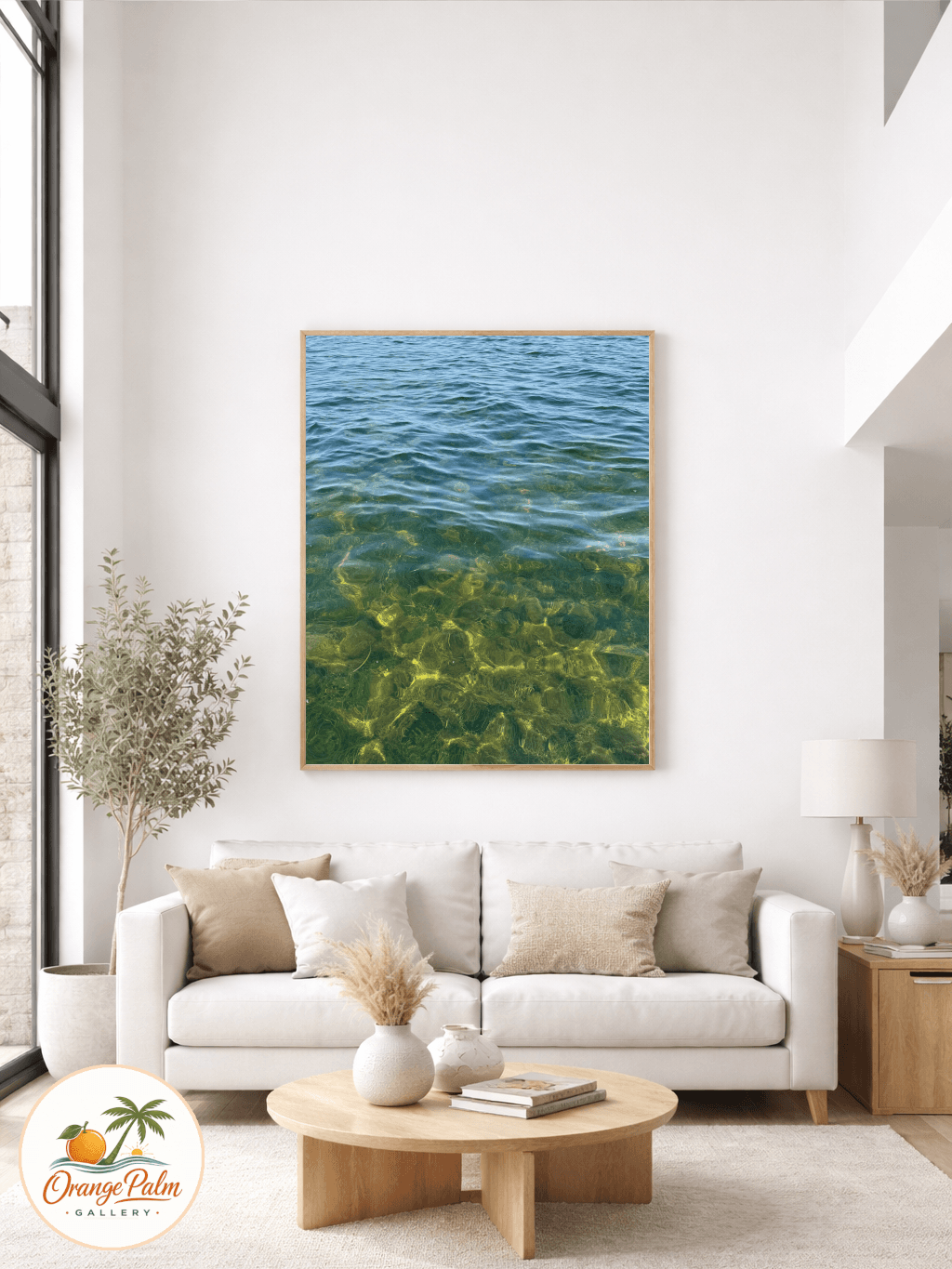
To style wall art above a sofa, choose one piece with enough width to anchor the seating area, hang it low enough to relate to the furniture, and let the color answer what the living room is missing. A calm sofa wall art style usually comes from proportion first, then palette, then subject.
Start with the sofa, not the wall
The common mistake is measuring the blank wall first. That sounds logical, but it usually leads to art that floats too high or feels disconnected from the furniture.
Start with the sofa instead. The artwork should relate to the width, weight, and color of the piece below it. A good rule is that the art should feel like it belongs to the sofa, not like it wandered onto the wall by accident.
For one large 2D piece, aim for a width that feels generous against the sofa. Not edge to edge. Not timid. Somewhere around two thirds of the sofa width often feels balanced, but the real test is simpler: when you step back, does the art visually hold the seating area together?
If the answer is no, the piece is probably too small or hung too high.
Hang it lower than your nervous system wants
Most wall art above a sofa is hung too high. People leave a big gap because they are afraid the room will feel crowded. The result is worse: the sofa sits down here, the art floats up there, and the eye has to do too much work to connect them.
A calmer placement usually leaves a modest band of wall between the sofa back and the bottom of the art. Enough breathing room so the piece does not feel jammed into the furniture. Not so much that it looks stranded.
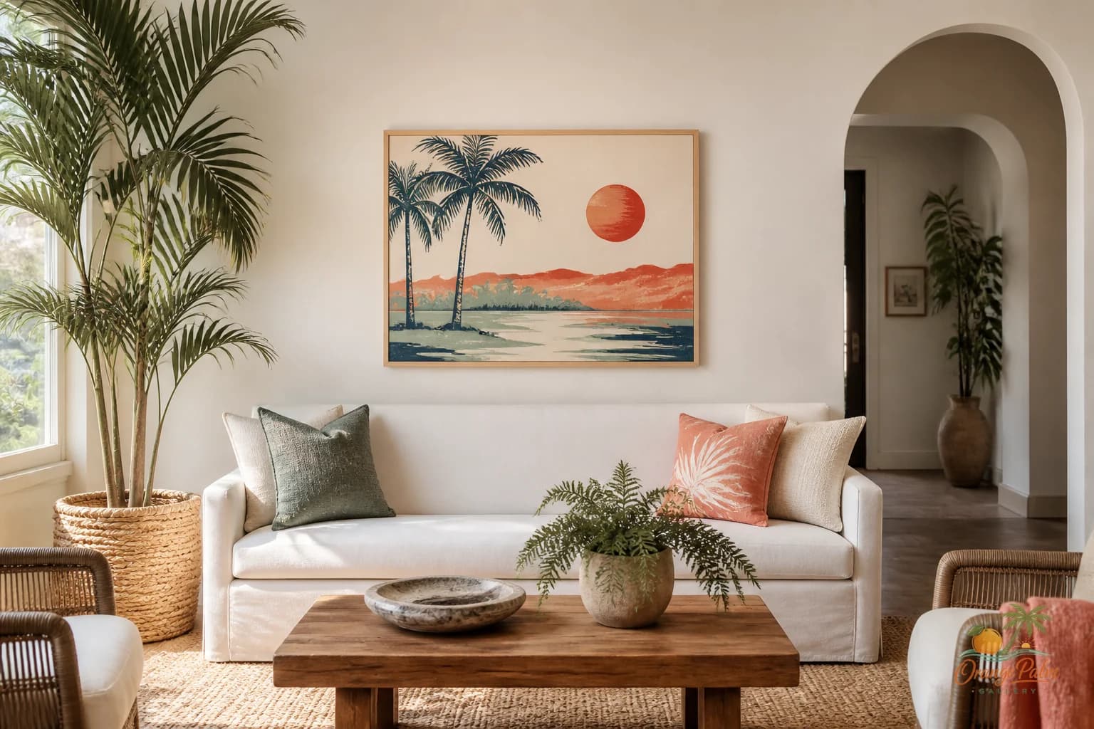
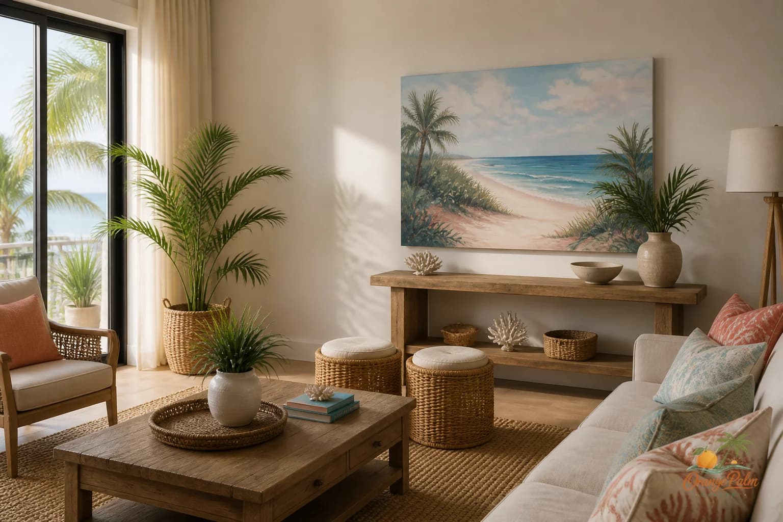
This is especially true in Florida inspired rooms, where light already does a lot of lifting. Warm white walls, linen upholstery, rattan, pale wood, and palm greens can make a space feel airy. The art does not need to climb toward the ceiling to create space. It can sit lower and still feel relaxed.
Let color do one clear job
A sofa wall is not the place to use every coastal color at once. Coral, palm green, sand, ink, and warm white can all belong in the same room, but not every piece needs to shout all five.
Pick one dominant mood.
If the room already has a lot of texture, like woven shades, caned furniture, or a nubby rug, a quieter artwork with broad shapes and softer contrast may work better. If the sofa and walls are very neutral, a stronger coral or green moment can bring the room out of beige without making it loud.
The tradeoff is simple. More color gives the wall energy. Less color gives the seating area ease. Neither is automatically better. The question is what the room is missing.
A warm modern Florida room usually needs a little sun baked color, not a beach theme pasted onto the wall.
One piece can be stronger than a gallery wall
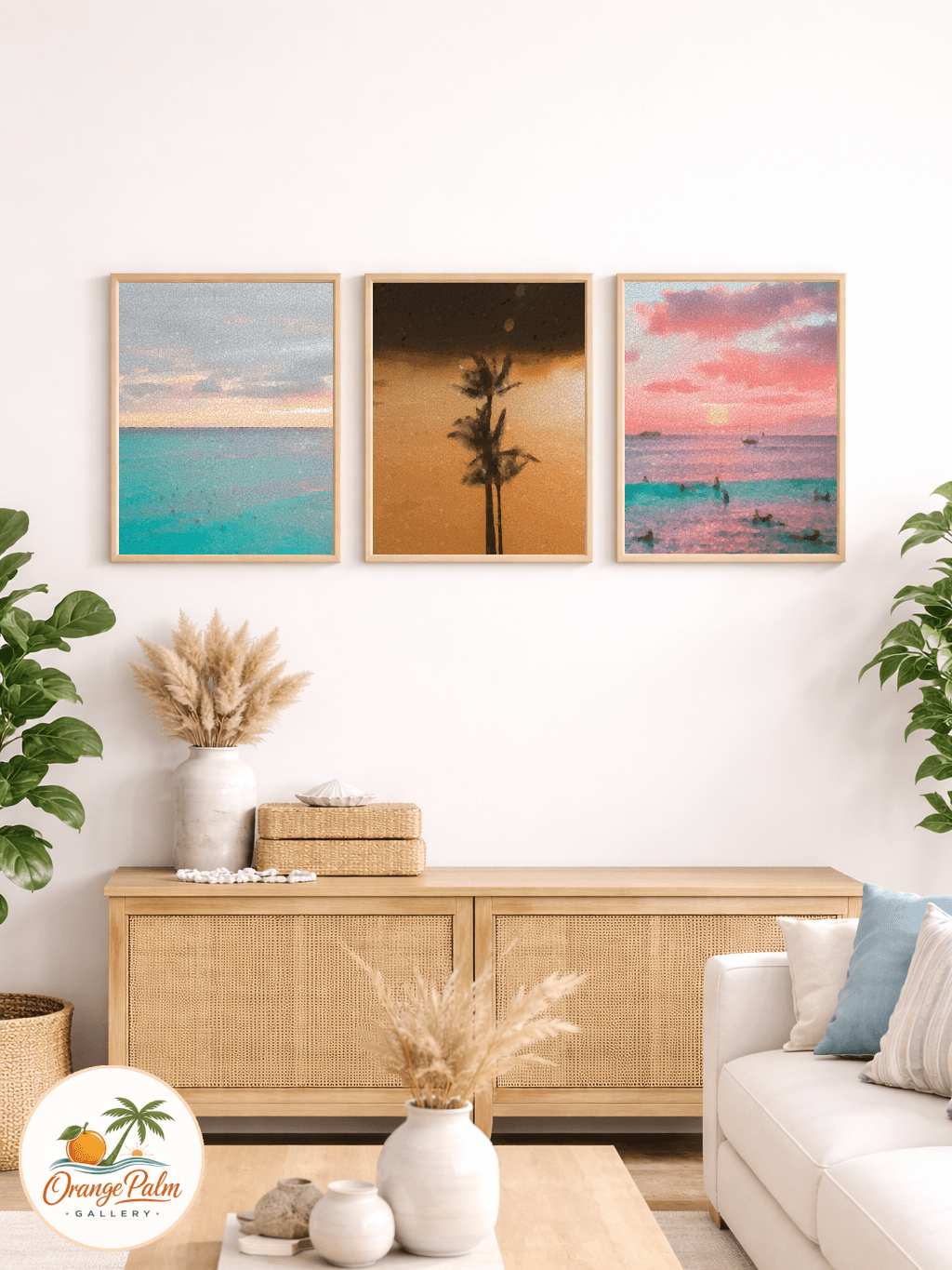
Gallery walls are not wrong. They just ask for more decisions: spacing, rhythm, frame finishes, paper tones, visual hierarchy. If those decisions are not handled carefully, the wall starts to feel busy instead of collected.
Above a sofa, one confident 2D piece often does the job better. It gives the room a clear focal point. It keeps the seating area calm. It leaves enough negative space for the wall to breathe.
This is where people get the sofa wall wrong. They think a single piece is the safe choice, so they choose a small one. But one small piece is not calm. It is underpowered. One larger piece with quiet composition is calm.
Scale is not the same as noise.
Check the room from the doorway
The best test is not standing directly in front of the sofa. Stand where you enter the room.
From that angle, the art should help explain the space. It should tell the eye where the seating area begins. It should make the sofa feel placed, not parked. If the piece disappears from the doorway, it may not have enough presence. If it dominates everything before you even notice the seating, it may be too aggressive for the room.
A good sofa wall has a little restraint and a little confidence. It does not need a slogan. It does not need a matching set of coastal objects. It needs proportion, good color, and a sense that someone cared where the visual weight landed.
That is the studio note for today: do not decorate the blank wall. Anchor the sofa.
For more warm modern Florida inspired wall art and styling notes, visit Orange Palm Gallery.