Printable Wall Art
A Quiet Sawgrass Print for the Room That Needs Less Noise
A journal note introducing a modern Florida sawgrass printable wall art piece for quiet rooms, entryways, bedrooms, and work corners.
July 23, 2026 / 3 min read / Orange Palm Gallery Studio
Source note: this guide is written and maintained by Orange Palm Gallery Studio. Last updated August 4, 2026.
Coastal decorating gets loud fast. Too many blues, too many shells, too many signs telling you to relax. A room can start to feel like it is performing beach house instead of simply being comfortable.
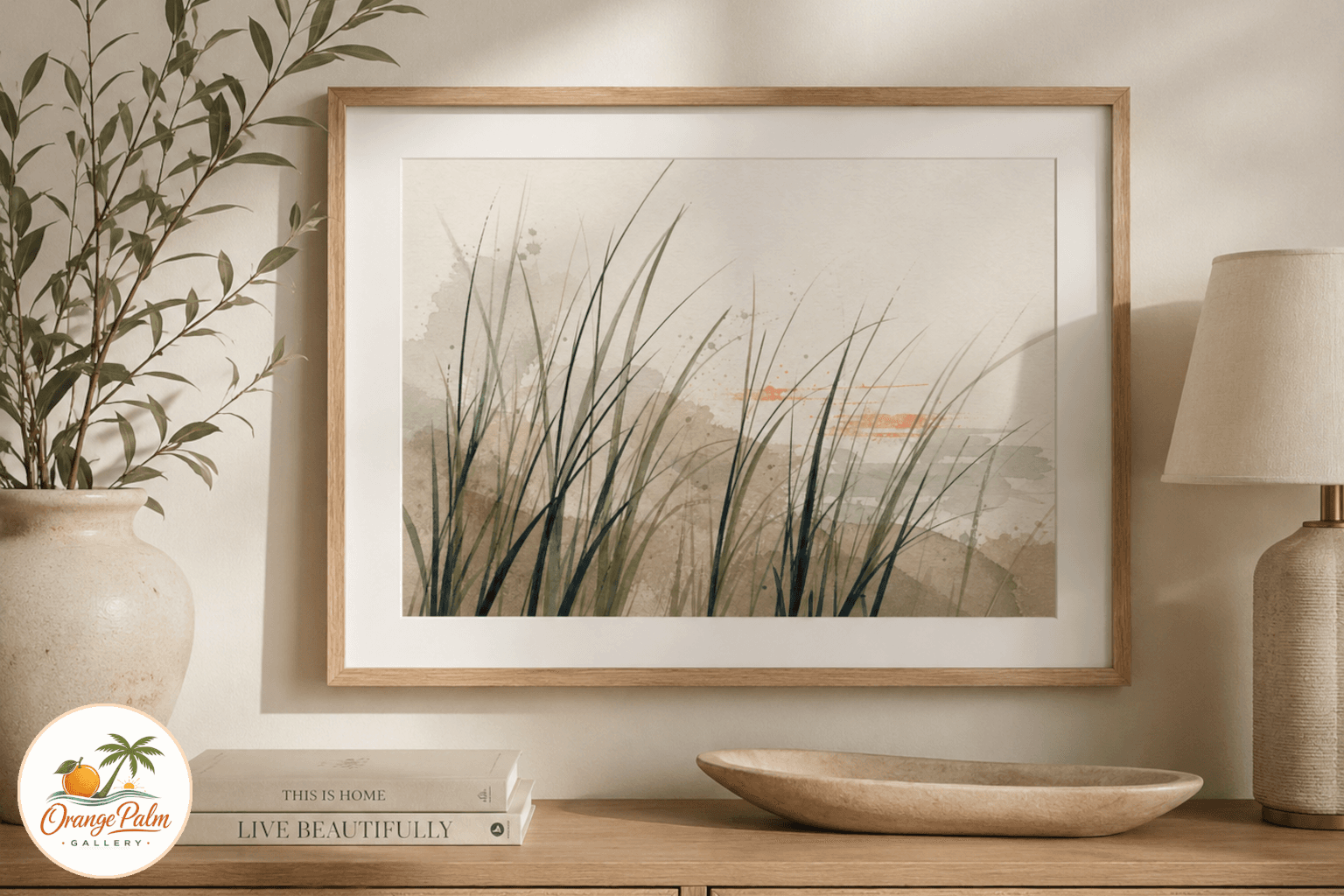
This printable started somewhere quieter: sawgrass after rain. Not the postcard version of Florida. The roadside version. The edge of a marsh. The green that looks darker when the afternoon storm has just passed. The sandy neutral that shows up in sidewalks, shell paths, and old stucco. A small coral note because Florida light almost always warms the edges of things.
Quick answer
Sawgrass After Rain is a Florida-inspired printable wall art piece for rooms that need calm texture more than obvious beach decor. It works best in entryways, bedrooms, offices, and quiet corners with warm white, wood, sand, palm green, or linen nearby.
Use this print when the room already has useful everyday objects and needs one quieter focal point. Matte paper, a simple frame, and a little open wall around the piece will preserve the sawgrass texture without turning the room into a beach theme.
Why sawgrass instead of another palm
Palms are beautiful, but they are also the obvious choice. Sawgrass has a different rhythm. It is thinner, sharper, more architectural. It gives a print movement without turning it into a scene.
For this piece, the idea is not to illustrate a landscape. It is to borrow the structure of one. Layered blades, soft rain washed color, enough open space for the wall to breathe. The tradeoff is intentional: less instant beach signal, more staying power.
That works especially well in rooms that already have texture. A woven shade, a wood console, a linen lampshade, a ceramic bowl by the door. The print does not need to explain the whole room. It can just pull the greens and sandy tones into one calm place.
Where this printable fits best
I would use this in an entryway first. Entryways collect visual clutter almost immediately: keys, bags, shoes, mail, sunglasses, the things people actually live with. A quieter print gives that mess a little visual anchor without adding more noise.
It also works in a bedroom, especially if the room already leans warm white, natural wood, clay, or muted green. In a home office, it gives the wall something organic without turning the space into a vacation rental mood board.
What people often get wrong with coastal art is scale of personality. Every piece does not need to be the main character. Sometimes the better print is the one that lowers the temperature of the room.
Printing notes from the studio side
For the cleanest result, I would print this on matte paper rather than glossy. Gloss can make soft greens look slick, and this piece is meant to feel dry, tactile, and calm even though the inspiration is rain.
A heavier matte paper, around 200 gsm or higher, will keep the ink areas feeling substantial. If you print at home, use the highest quality setting and let the page dry flat before trimming or framing. If you send it to a local print shop, ask for a matte art paper or heavyweight smooth cardstock.
The palette is built around warm white, palm green, sand, ink, and a small coral accent. That means it can sit with Florida rooms without shouting about Florida. That is the point.
The room does not need more decoration
This is a small piece with a specific job: bring in Florida texture, keep the wall quiet, and avoid the usual coastal shorthand.
A print like this is not trying to solve the whole room. It is a finishing layer. The kind of thing that looks better next to a real plant, a bowl of keys, a stack of books, or the daily evidence of a home being used.
For another quiet Florida printable with a daily-use purpose, see Lanai Light Daily Notes.