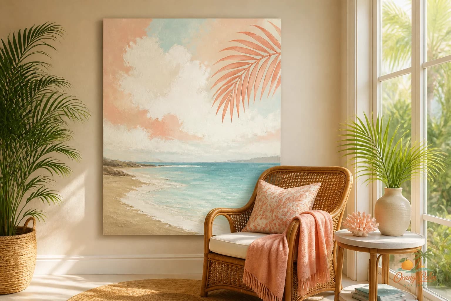
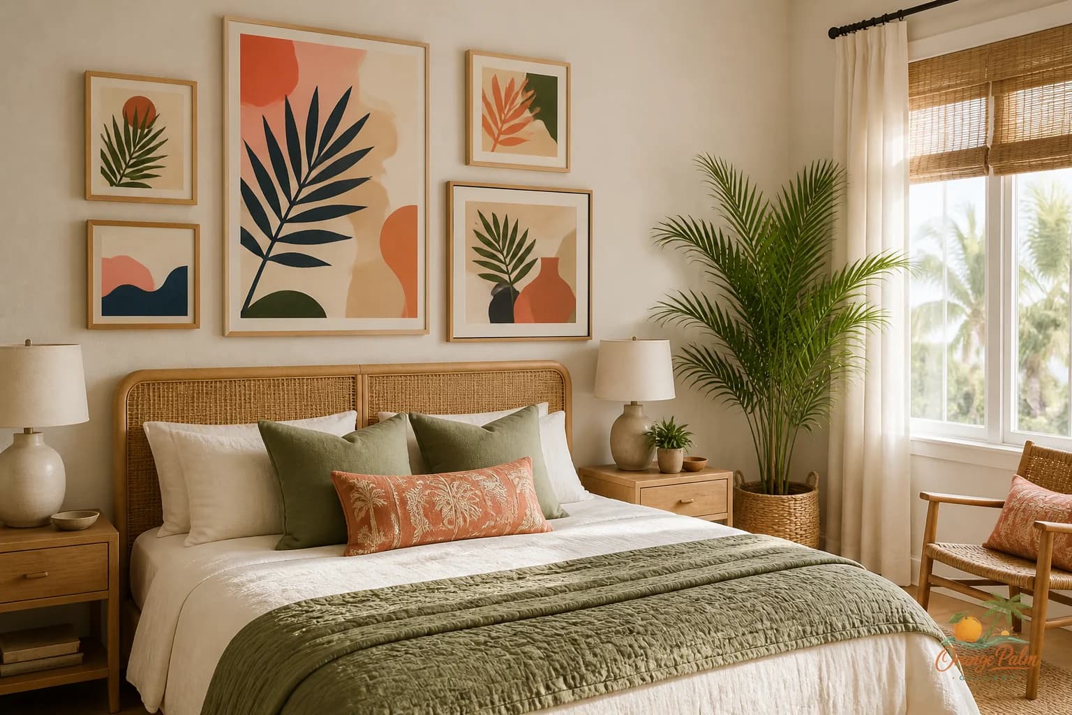
Wall Art Styling
The Reading Chair Wall Should Leave Some Air
Wall art styling advice for a quiet reading chair corner, with notes on scale, color, spacing, and warm Florida inspired restraint.
October 14, 2026 / 4 min read / Orange Palm Gallery Studio
Source note: this guide is written and maintained by Orange Palm Gallery Studio. Last updated October 14, 2026.
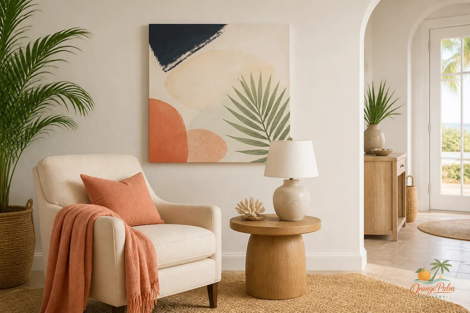
The reading chair wall is easy to overdecorate because the furniture footprint is so small. One chair, maybe a lamp, maybe a side table. The blank wall starts looking guilty. So people pile on art, shelves, a plant hanger, a tiny gallery wall, a quote, and then wonder why the corner no longer feels like a place to sit.
A reading corner should not feel like a showroom sample. It should feel like a place where the room lowers its voice.
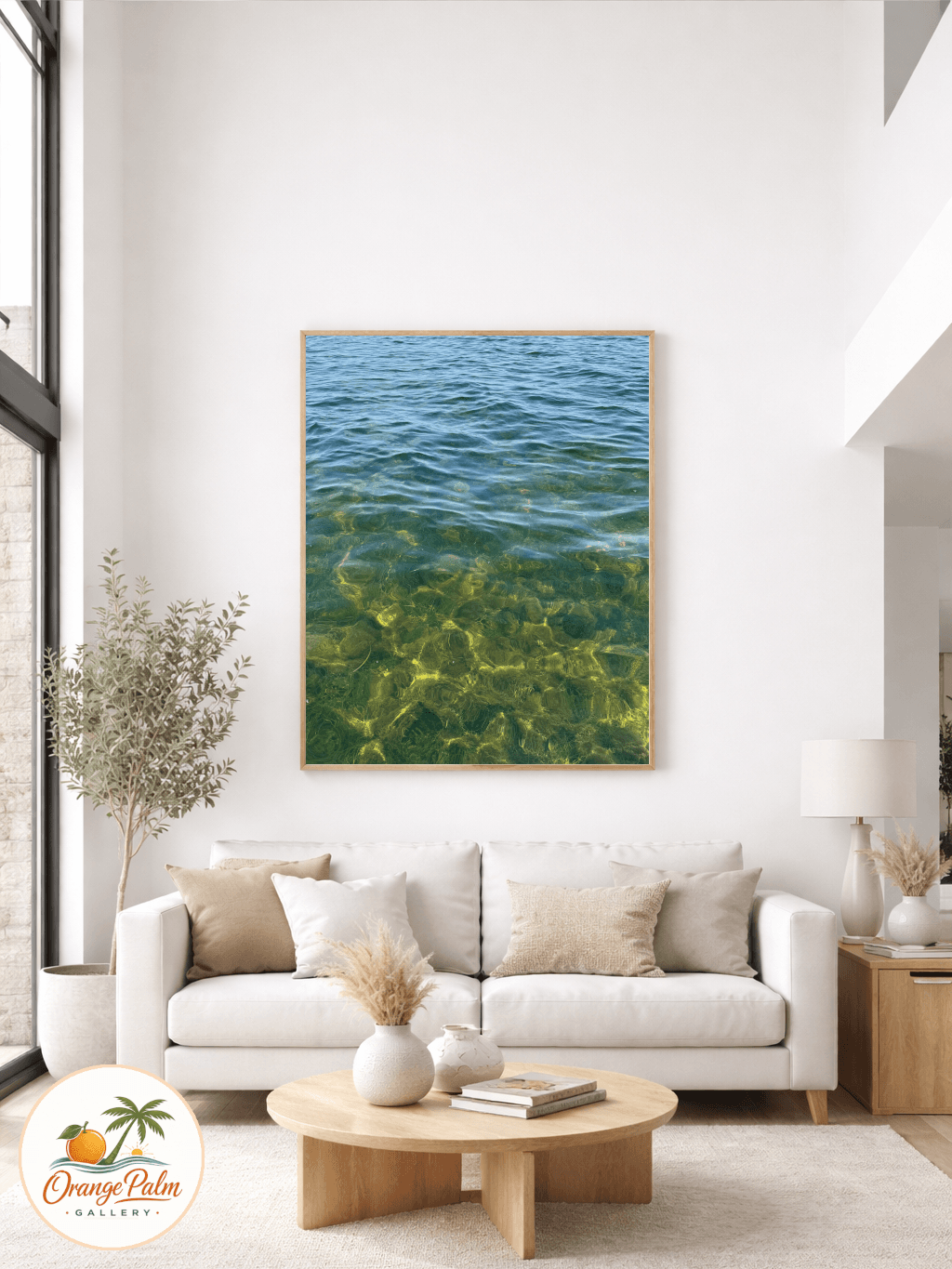
That does not mean the wall has to be empty. Empty can be beautiful, but it can also make a chair look stranded. The better move is usually one calm piece, or a very small pair, placed with enough air around it that the chair still feels like the main invitation.
Start with the chair, not the wall
The mistake is measuring the wall first. A reading corner is not a full feature wall unless the chair is part of a larger built in moment. Most of the time, the art should answer the chair width, not the whole wall width.
If the chair is compact, choose art that is roughly half to two thirds the width of the chair. If the chair is oversized or has wide arms, the art can stretch a little larger, but it still does not need to dominate. The goal is to give the eye a resting point above the chair, not a command center.
Hang the art low enough to belong to the chair. Too high and it floats away. Too low and it crowds the sitter. A good visual check is whether the bottom edge of the piece feels connected to the top line of the chair without sitting on it. Leave breathing room, but not a gap so large that the art feels unrelated.
Let the color do less
Reading corners are sensitive to color because you experience them at close range. A bright piece that looks fun across the room can feel loud when it is just above your shoulder.
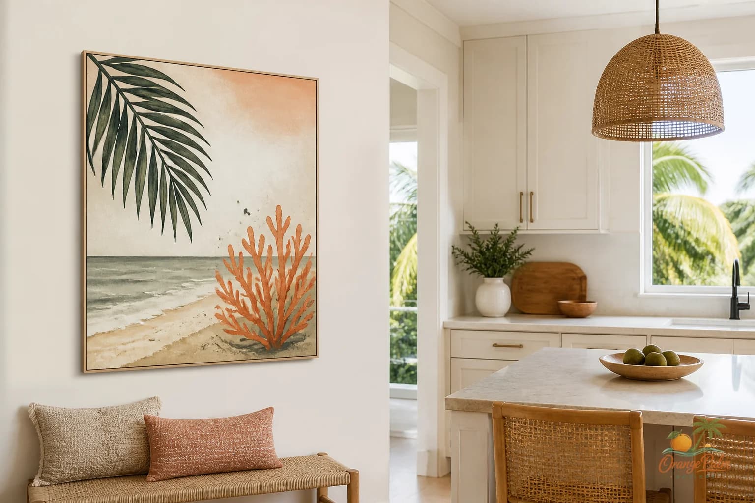
For a Florida inspired corner, I like color that feels sun faded rather than sugary. Sand, warm white, palm green, muted coral, soft ink, a little shell beige, a little old stucco. Those colors can still have character. They just do not shout while you are trying to read two pages without checking your phone.
If the chair already has texture, like linen, cane, boucle, worn leather, or a woven cushion, choose art with a cleaner composition. If the chair is visually plain, the artwork can carry more movement. One strong palm curve, one abstract coastal shape, one block of warm color. Not five competing gestures.
Avoid the tiny art apology
A small piece can work beautifully, but it has to look intentional. Tiny art hung too high over a chair often reads like an apology. It says, I knew this wall needed something, so I found something.
If you love a smaller piece, bring it lower and closer to the chair. Let a lamp, side table, or stack of books help complete the composition. The art does not have to solve the entire corner alone. In fact, it usually looks better when it is part of a quiet triangle: chair, light, artwork.
That triangle is what makes the corner feel designed without feeling decorated to death.
Give the art one job
The best reading chair wall art usually does one of three things.
It can soften the corner with organic shape.
It can add a little color to a neutral room.
It can create a horizon line that steadies the space.
Trouble starts when the piece tries to do all three at once, plus tell a story, plus match every pillow. A reading corner is not asking for a thesis. It is asking for a mood.
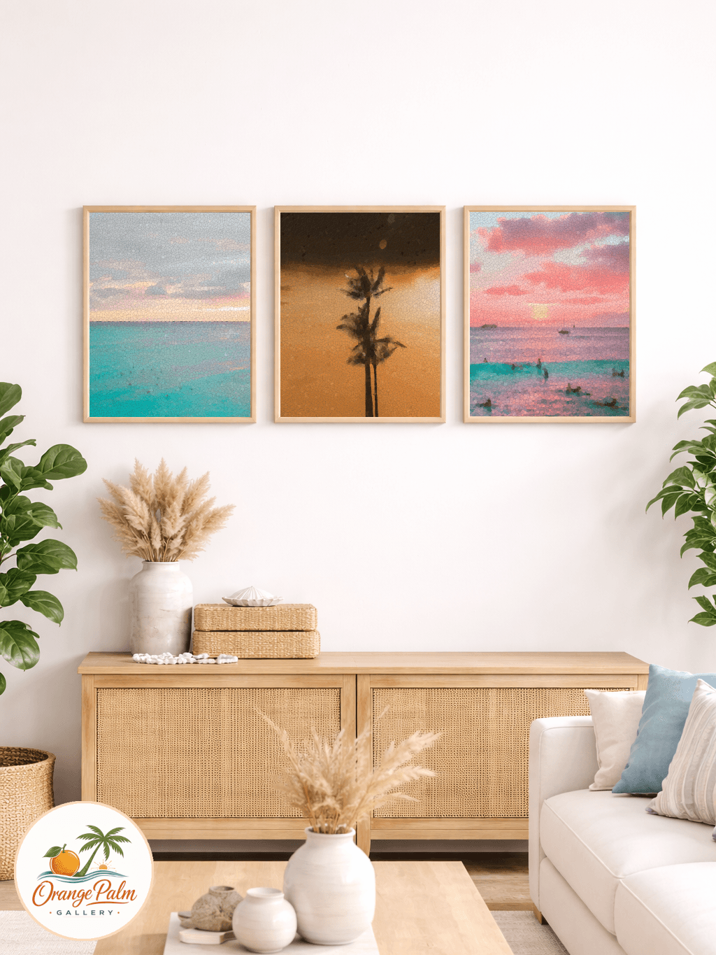
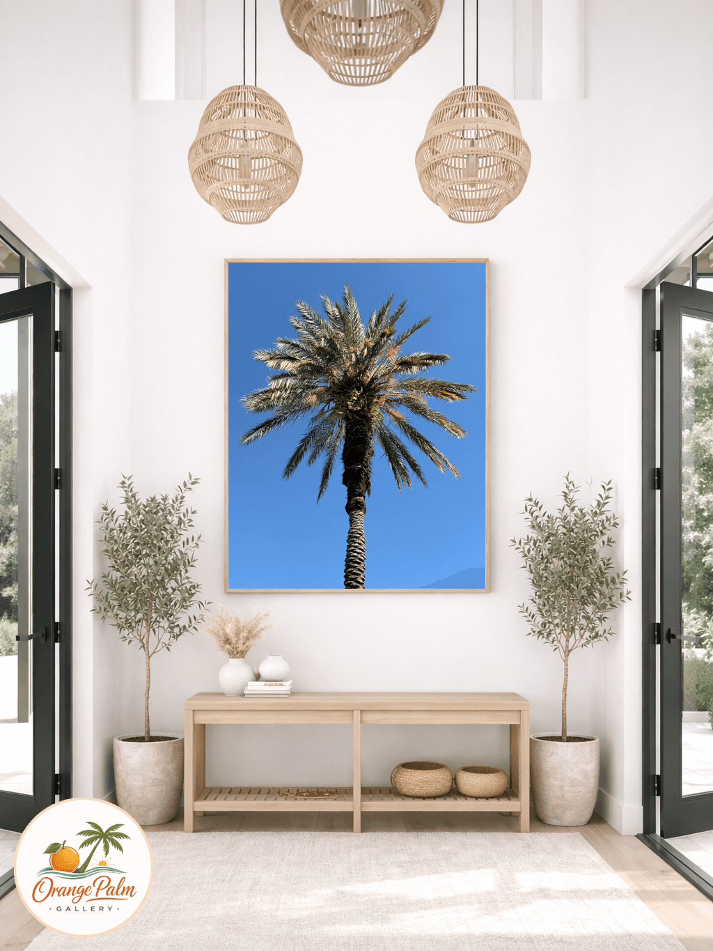
If the room already has coastal references, avoid making the art too literal. You do not need a beach sign, a shell cluster, and a blue wave just because the house gets good light. A restrained coastal piece can feel more Florida than a full souvenir wall. Think warm air, palm shadow, limestone, sunset afterglow, not a themed corner.
Leave some wall showing
This is the part people resist. The blank space around the art is not wasted. It is what lets the piece feel calm.
A reading nook benefits from negative space because the whole point of the area is attention. You are building a small pause inside the room. If every inch is styled, the pause disappears.
So leave the side wall alone if the main wall has art. Leave the space above the lamp alone if the chair already has a piece above it. Let the corner breathe.
A good reading chair wall should feel like it was edited by someone who knew when to stop.
For more quiet wall art and modern Florida inspired styling notes, explore Orange Palm Gallery at https://orangepalmgallery.com/?utm_source=mdx.