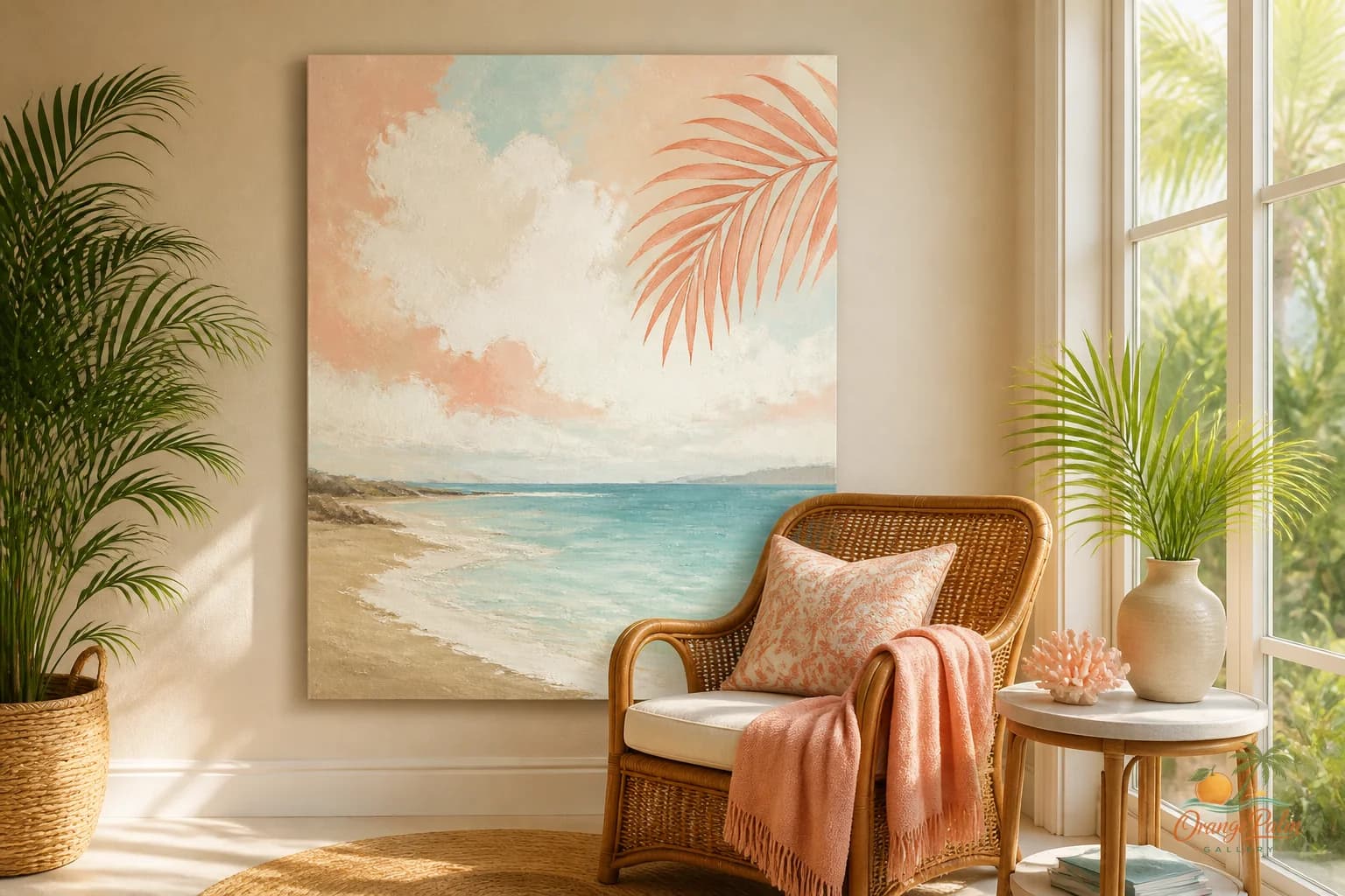
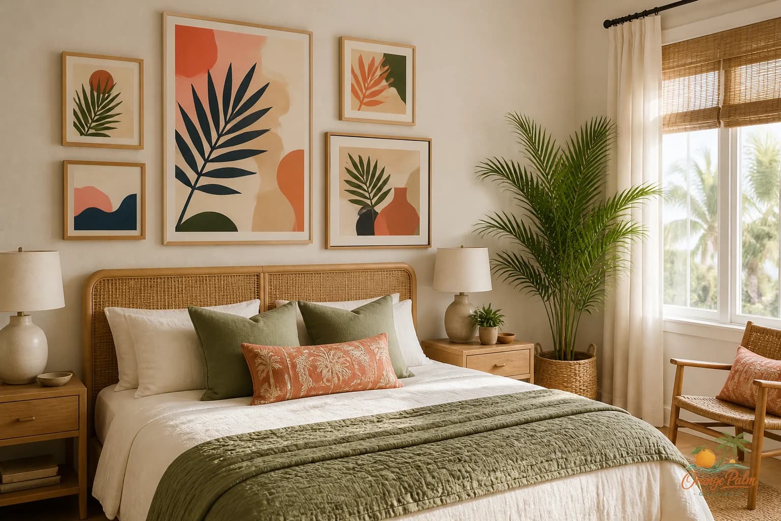
Wall Art Styling
A Quiet Corner Can Hold the Room Together
How to style a quiet corner wall with calm Florida inspired art, soft color, and enough negative space to make the whole room feel more settled.
October 28, 2026 / 5 min read / Orange Palm Gallery Studio
Source note: this guide is written and maintained by Orange Palm Gallery Studio. Last updated October 28, 2026.
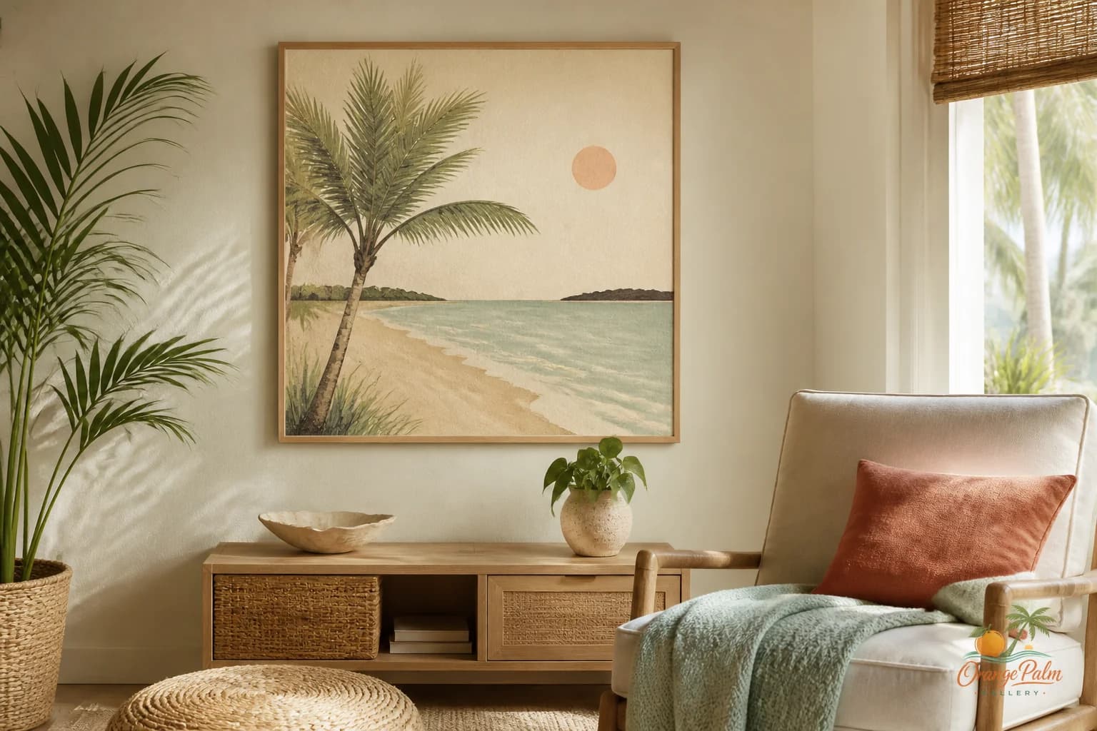
The corner wall is easy to ignore because it rarely causes a crisis. It is not the sofa wall, not the bed wall, not the entry wall trying to shake your hand before you have set down your keys.
But a quiet corner can do a lot of work. It can soften a room that has too many straight lines. It can pull color across the space. It can make a chair feel like it belongs there instead of looking like it was parked after vacuuming.
The mistake is treating the corner like leftover wall. Leftover wall gets leftover art, and leftover art almost always looks like it knows.
Give the corner one job
Before choosing art, decide what the corner is supposed to do.
If it is next to a reading chair, the job is probably pause. The art should make the chair feel settled, not shout over the book. If it is near a plant, side table, or floor lamp, the job may be balance. The art can add structure so the corner does not become a loose pile of vertical objects.
If the corner is visible from the next room, the job is often continuity. That is where color matters more than subject. A soft palm green, sand tone, coral note, or inky dark line can quietly connect two spaces without matching everything like a furniture catalog.
A corner does not need a theme. It needs a reason.
Use art to make a vertical anchor
Most corners already have height. Floor lamps, palms, windows, curtains, door trim, and bookcases all pull the eye upward. Wall art works best when it gives that height a clear stopping point.
For a small corner, one medium piece usually feels better than a scatter of tiny frames. Tiny pieces can look nervous in a corner because the eye has to hop around too much. One calm piece gives the wall a place to land.
For a wider corner, two pieces can work if they are related by color or spacing. Think of them as a pair, not a mini gallery wall. Keep the gap modest and clean. The point is rhythm, not inventory.
A good rule: the art should feel connected to the furniture or object below it. If there is a chair, keep the piece close enough that they read as one moment. If there is a slim console or plant stand, let the art sit slightly above it rather than floating halfway to the ceiling.
Floating art is one of the fastest ways to make a room feel unfinished.
Let the corner stay quiet
Not every wall needs a clever punchline. In a Florida inspired room, the nicest corners often borrow from the landscape without making a costume out of it: warm white walls, washed sand, palm green, sun faded coral, a dark botanical line, a little coastal blue if the room can handle it.
That restraint matters. A corner is usually seen at an angle. Overly busy art can turn into visual static from across the room. Softer shapes, simple compositions, and generous margins tend to age better there.
This is where negative space earns its keep. Blank wall around art is not empty. It is the thing that lets the art breathe and lets the corner feel deliberate.
If the room already has patterned pillows, woven texture, books, plants, and a lamp, the corner art can be quieter than you think. It does not have to compete with the objects nearby. It can be the calm surface that makes those objects look chosen.
Match the temperature, not the exact color
People often try to match wall art to one object in the room. The coral pillow. The green vase. The tan rug. That can work, but it can also look too literal.
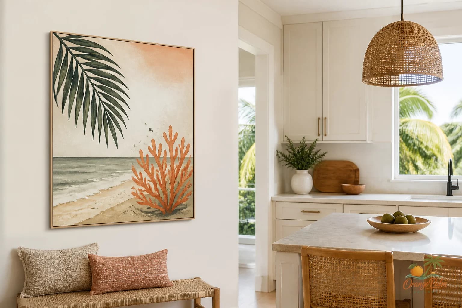
A better move is matching temperature. If the room is warm, choose art with warm whites, sandy neutrals, olive greens, clay, peach, or muted coral. If the room is cooler, keep the palette softer and less sun baked.
Florida light has a way of making color feel louder by afternoon. A print that looks gentle online can feel much brighter on a wall that gets direct sun. For corner walls, I like color that feels slightly softened, as if it has already lived through a few hot afternoons.
That is part of the Orange Palm Gallery point of view: modern coastal, but not brittle. Handmade feeling, but clean. Florida inspired, but still livable on a Tuesday.
Leave room for real life
A corner wall has to live with cords, lamp shades, plant leaves, dog beds, baskets, side tables, and the odd stack of books. Do not style it as if nothing will ever move.
Hang the art where it can survive the room being used. Leave enough space around a floor lamp shade. Do not let a plant cover the main gesture of the piece unless that overlap feels intentional. Avoid placing art so low that a chair back visually chops it in half.
The goal is not a perfect corner. It is a corner that makes the whole room exhale.
A quiet corner can hold a surprising amount of mood: the late day light, the soft green from a palm outside, the sandy warmth of a rug, the dark line of a simple frame or printed edge. When the art is scaled well and the palette belongs to the room, the corner stops feeling forgotten.
It becomes part of the architecture of calm.
Explore more calm, modern Florida inspired wall art and styling notes at Orange Palm Gallery.