Florida Living
A Guest WiFi Card That Does Not Look Like Office Paper
A studio note on making a practical guest WiFi card feel like part of the room instead of a loose instruction sheet.
August 6, 2026 / 3 min read / Orange Palm Gallery Studio
Source note: this guide is written and maintained by Orange Palm Gallery Studio. Last updated August 6, 2026.
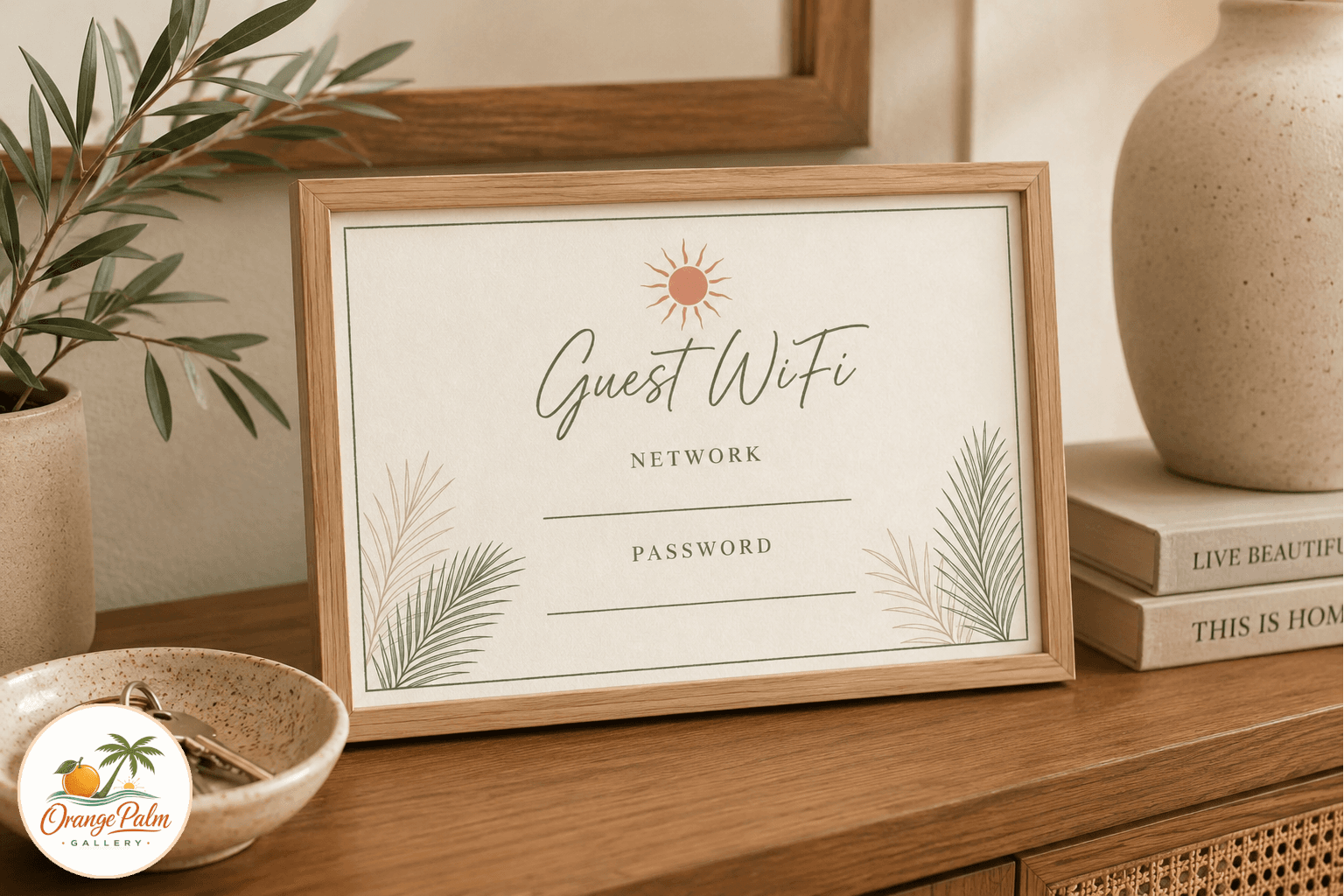
A WiFi card is one of those tiny home details that can go wrong fast. Too cute and it starts to feel like a rental binder. Too bare and it looks like office paper that never made it into a drawer.
The Palm Line Guest WiFi Printable Card sits in the middle. It is practical, but it still behaves like part of the room. Warm white ground, palm green structure, a little coral lift, and enough blank space for the network name and password to be easy to read.
Why a small sign deserves design attention
Guest spaces collect the oddest objects: spare towels, phone chargers, a water glass, a lamp that is never quite bright enough. A WiFi sign usually lands there too, often as an afterthought.
But that is exactly why it needs restraint. The card should not compete with the art, bedding, books, or tray on the nightstand. It should answer one question cleanly, then disappear back into the room.
What people get wrong is treating every printable as decoration first. Some printables are tools. The better version is a tool with a little visual manners.
The Florida reference is quiet on purpose
This piece uses palm linework, not a full beach scene. No shells piled into the corners. No forced vacation mood. Just a slim green border, soft coastal color, and a drawn edge that feels closer to a studio page than a sign shop template.
That restraint matters in Florida inspired decor. A room can already have rattan, sunlight, tile, plants, woven shades, or sandy neutrals. The printable does not need to shout the same idea again. It only needs to belong.
The palette stays close to Orange Palm Gallery’s usual studio lane: palm green, warm white, sand, ink, and a small coral accent. It is calm enough for a guest room, but not so minimal that it feels sterile.
Where to use it
The most obvious spot is a guest room nightstand. Print it as a small card, fill in the network and password by hand, and tuck it into a simple holder or lean it against a small object on a tray.
It can also work near an entry table, in a home office used by visitors, or in a vacation stay where the goal is to make the practical details feel considered. The tradeoff is simple: if the text is too small, it becomes pretty but annoying. Keep the printed size generous enough that someone can read it without picking it up.
Printing notes from the studio side
For the cleanest result, print on matte white or warm white cardstock. Glossy paper tends to make soft coastal color feel harder than it needs to be. If the card will sit near a sink, coffee setup, or luggage area, a heavier paper will hold up better.
Trim with a sharp blade or paper cutter if you want the border to stay crisp. A slightly imperfect hand cut can still look good, but a ragged edge will make the whole thing feel less intentional.
This is a small piece, which means the details carry more weight. Good paper, clean trimming, and one calm place to set it down are enough.
Explore Orange Palm Gallery pieces for calm, modern Florida-inspired homes.