Florida Living
A Small Printable for Choosing Where Art Actually Works
A Florida-inspired printable decor planner for choosing calmer, smarter wall art placement in bright rooms.
August 18, 2026 / 3 min read / Orange Palm Gallery Studio
Source note: this guide is written and maintained by Orange Palm Gallery Studio. Last updated August 18, 2026.
A bare wall can look like a design problem, but a bright Florida room usually has a different issue: the light is bossy.
Morning light can make a pale print disappear. Afternoon glare can flatten the prettiest texture. A piece hung too high over a console can feel like it is floating away from the room. None of that means the art is wrong. It means the wall has not been asked enough questions yet.
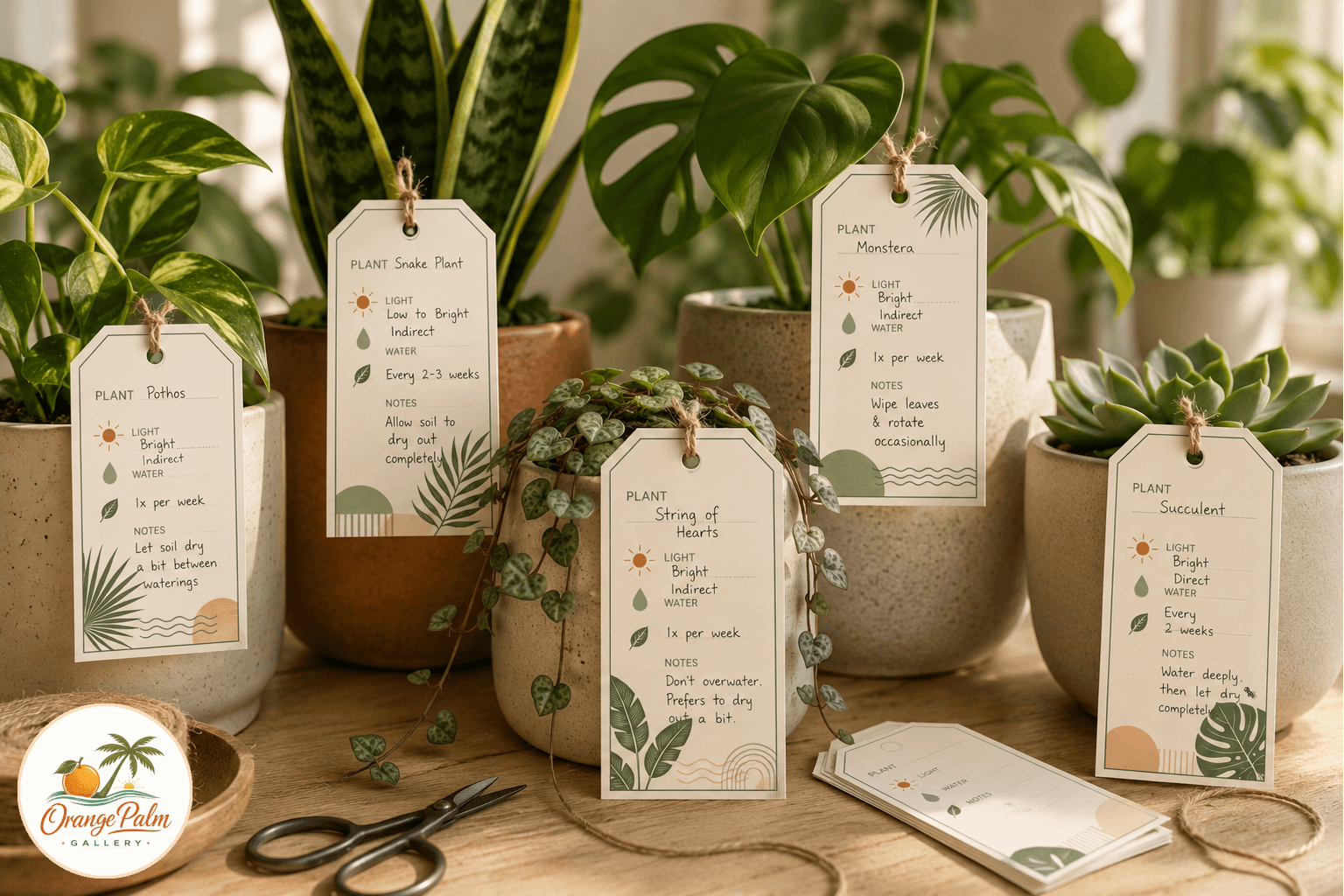
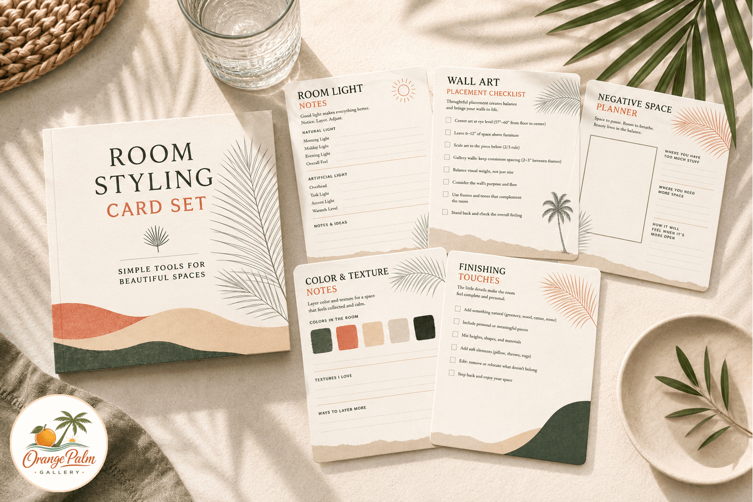
That is the idea behind the Florida Light Room Styling Cards, a printable side product designed for slower, more practical decorating. It is not a mood board pretending to solve your house in one page. It is a small set of cards for checking the things people skip when they are eager to fill a blank wall.
Start with the light, not the frame
People often choose art by color first. That makes sense online, where everything is cropped, clean, and evenly lit. Real rooms are less polite.
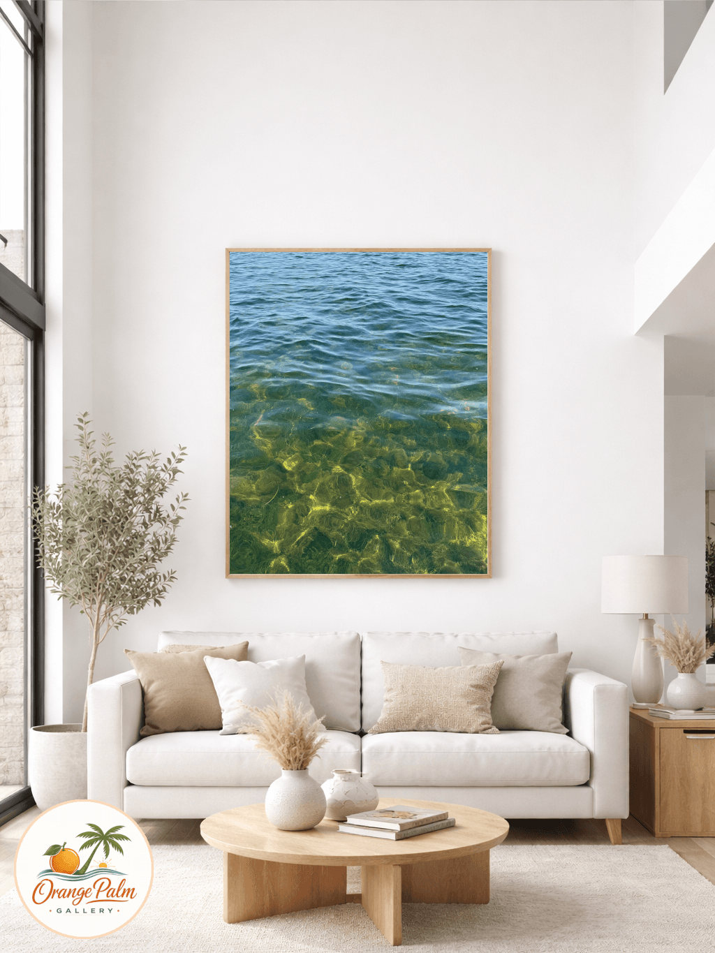
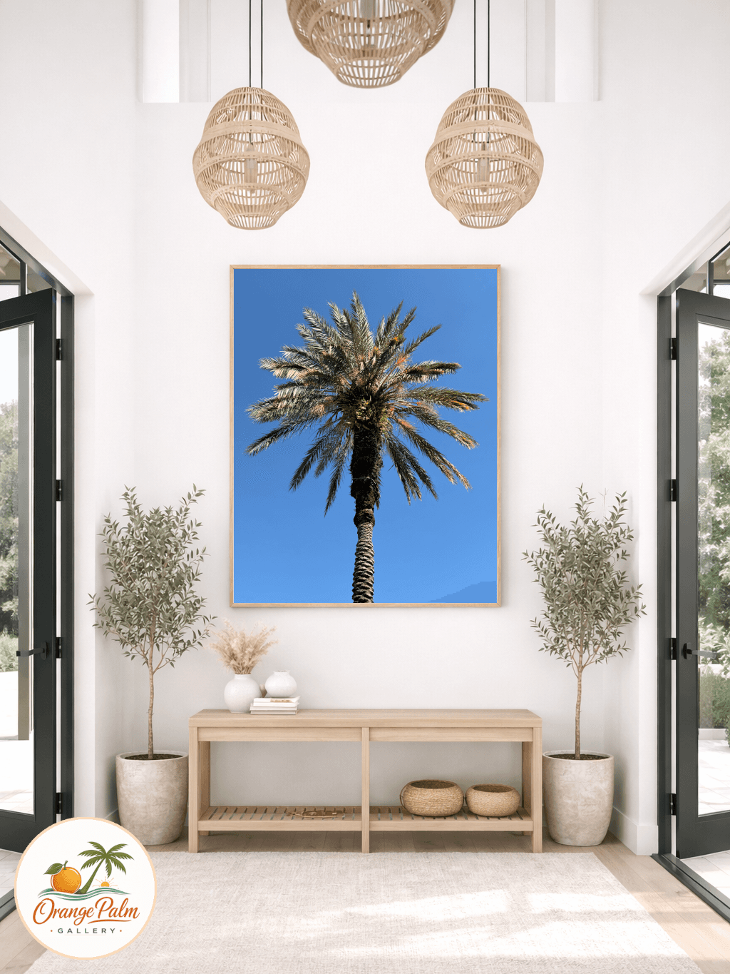
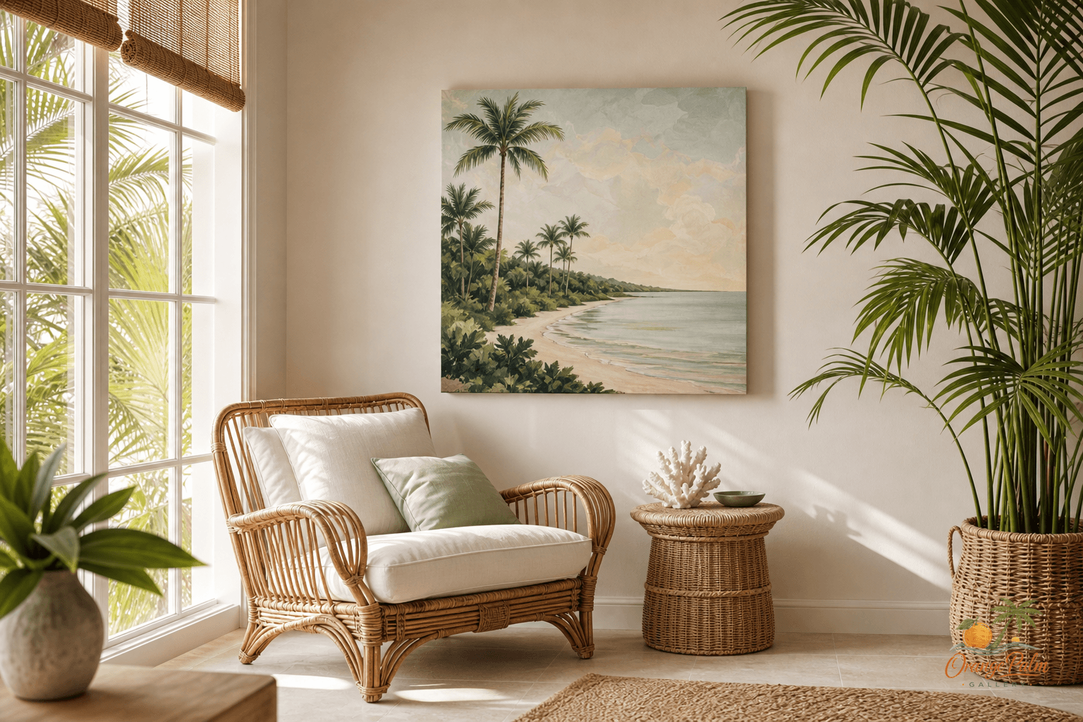
A sunroom with palm shadows across the wall asks for a different kind of print than a dim hallway. An entryway that gets hard late day light may need stronger contrast. A bedroom wall might want softer shapes because the room is already doing enough work with bedding, lamps, and furniture.
The printable cards are built around that tradeoff. Before deciding where a piece belongs, you can mark the room, the wall, the time of day, and the kind of light hitting the surface. It is a small pause, but it keeps the decision from turning into guesswork.
Height is where good art goes wrong
The most common mistake is hanging art like it is trying to escape. Too high, too far from the furniture, too disconnected from the room below it.
A print over a console, bench, crib, bed, or small dining nook needs a relationship with the object underneath it. That does not mean every wall needs a strict formula. It means the art should feel intentionally placed, not dropped onto drywall because there was a nail nearby.
The cards include simple notes for furniture relationship, wall width, and breathing room. The goal is not perfection. The goal is avoiding that strange almost right feeling, where the piece is beautiful but the placement keeps nagging at you.
Florida rooms need negative space
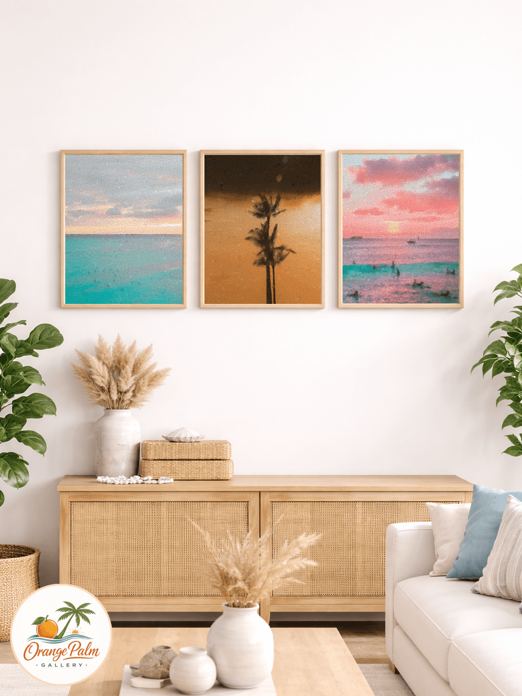
Coastal decorating gets cluttered fast when every surface tries to announce the theme. Palms, shells, blue glass, rattan, stripes, woven trays, beach books, citrus, linen. Individually lovely. Together, sometimes loud.
Negative space is what keeps a Florida-inspired room modern instead of souvenir-shop busy. A quiet wall can make a palm print feel stronger. A simple entryway can make one warm coral accent land better than five small decorations competing for attention.
These styling cards leave room for that decision. They ask what should stay empty. That may be the most useful part.
A printable for slower decorating
This is a practical studio object, not a grand design system. Print the pages, keep them in a home folder, or use one card per room before moving art around. The palette stays close to Orange Palm Gallery’s visual language: warm white, sand, palm green, coral, and ink.
The point is simple. Buy or print the art you love, but give it a fair wall. A bright room can be generous, but it is rarely neutral. Light changes the work. Furniture changes the scale. Empty space changes the mood.
A small card on paper can catch all of that before the hammer comes out.
Explore Orange Palm Gallery pieces for calm, modern Florida-inspired homes.