Florida Living
Sunroom Wall Art Has to Survive the Glare
How to style sunroom wall art in a bright Florida inspired space without adding glare, clutter, or too much visual noise.
September 2, 2026 / 4 min read / Orange Palm Gallery Studio
Source note: this guide is written and maintained by Orange Palm Gallery Studio. Last updated September 2, 2026.
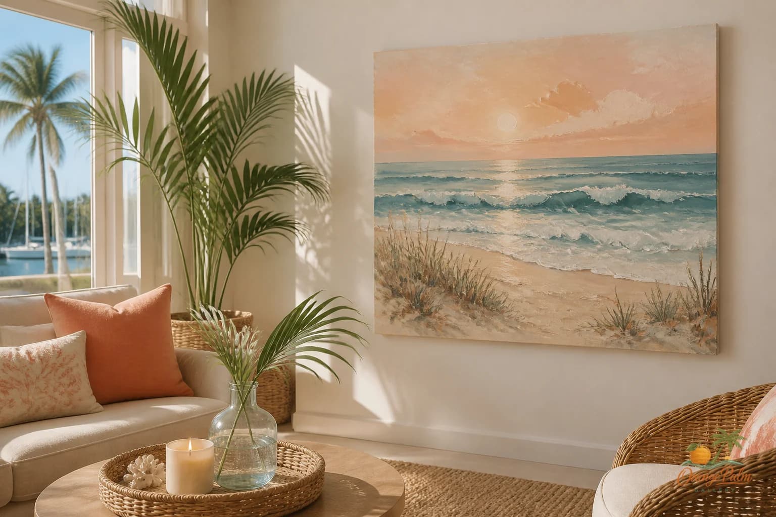
A sunroom is one of the easiest rooms to overdecorate because it already feels like it came with a mood board attached. Glass, plants, wicker, tile, afternoon shadows, maybe a ceiling fan doing too much. Then someone adds a busy print wall and suddenly the room feels less like a porch with better manners and more like a garden center checkout lane.
Sunroom wall art has a different job than living room wall art. It does not need to create all the atmosphere. The room already has atmosphere. The art needs to steady it.
Quick answer
The best sunroom wall art ideas for bright Florida homes start with glare control, not theme. Choose a wall with gentler side light, use one calm piece with enough scale, and let the art support the plants, glass, and view instead of competing with them.
Start with the light, not the blank wall
The tempting move is to hang art on whichever wall is empty. In a sunroom, that can be a trap. The best wall is not always the barest one. It is the wall that does not turn the art into a reflective rectangle at 3 p.m.
If the room has big windows, look for a wall that sits perpendicular to the strongest light instead of directly opposite it. Art across from glass can catch glare, especially if the surface is glossy or the palette has a lot of pale contrast. A quiet piece can look harsh when the sun hits it flat.
The better sunroom wall often feels slightly secondary at first: the short wall beside the door, the small wall near a reading chair, the solid strip between windows if it has enough breathing room. That is where art can anchor the room without competing with the view.
Use scale to calm the room down
Sunrooms collect small things. Plant pots, side tables, woven baskets, stacked books, outdoor cushions that wandered inside. The wall art should not copy that smallness.
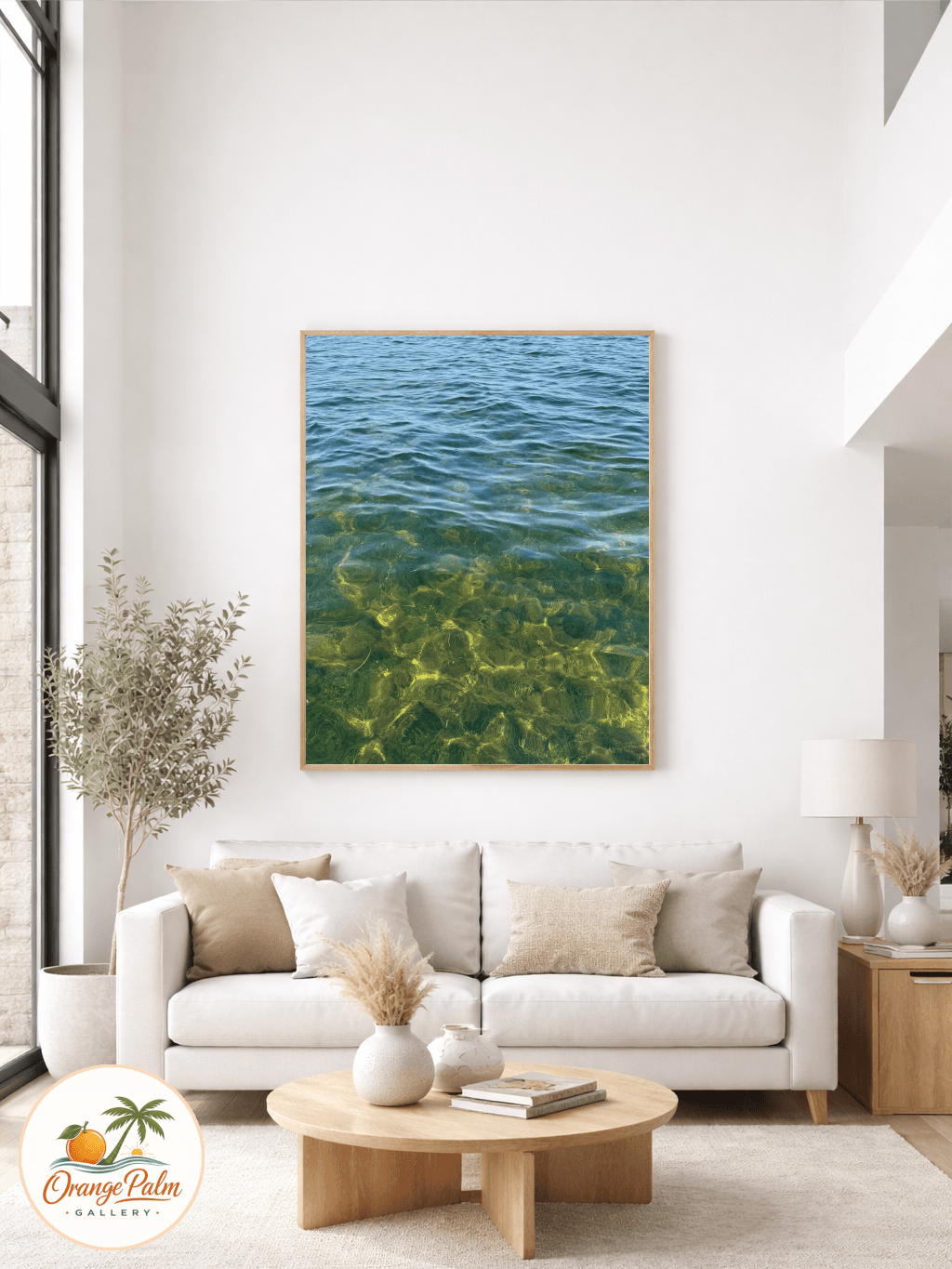
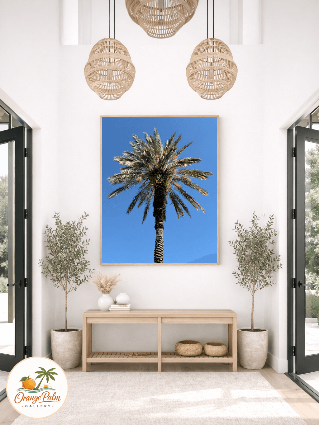
One medium to large piece usually works better than five tiny pieces. A tight pair can work too, especially over a bench or console, but the spacing has to be disciplined. The goal is not to fill every inch. The goal is to give the eye one stable place to land after all that leaf movement and window light.
What people get wrong is treating a sunroom like a casual leftover room. They hang the extra print, the extra shelf, the extra souvenir. The room may be relaxed, but relaxed is not the same as random.
Keep the palette sun washed, not sugary
Florida inspired does not have to mean turquoise on everything. In a bright sunroom, color gets louder. Coral gets hotter. Blue gets sharper. Green multiplies because the plants are already doing green for free.
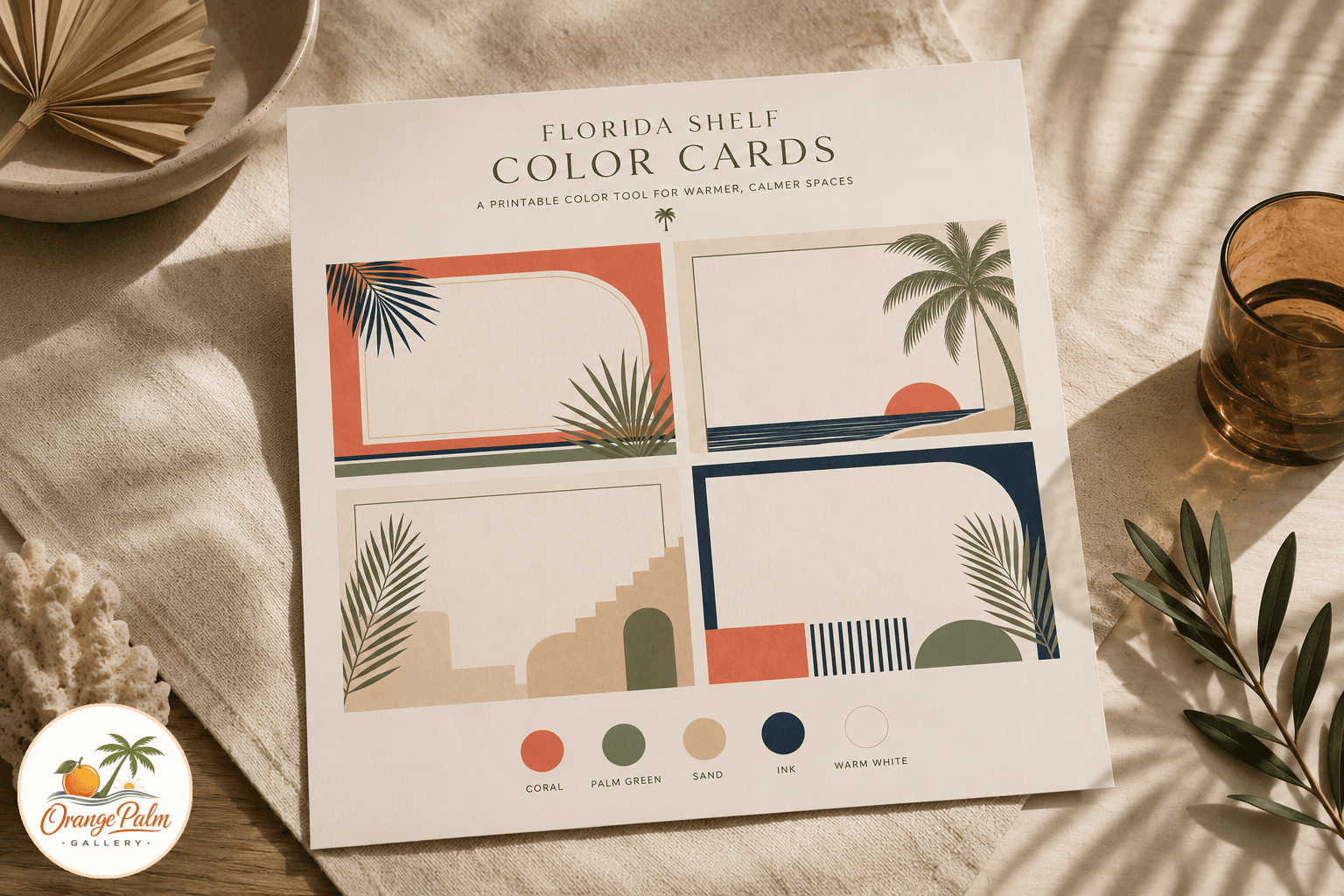
A better palette is warm white, sand, palm green, a little ink, and maybe one coral note if the room can handle it. The wall art can pick up the room without mimicking every material in it. If the furniture is rattan, the rug is jute, and the plants are glossy, the print can stay flatter and cleaner. That contrast is what keeps the room modern.
I like art in a sunroom that feels sun faded in the best way: softened edges, simple forms, coastal restraint, a little handmade texture. Not washed out. Not bland. Just aware that the room is already bright.
Be careful with gallery walls
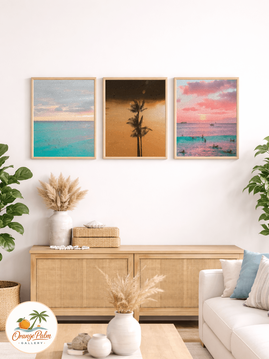
A gallery wall can work in a sunroom, but it needs rules. A loose cluster often looks jumpy in a space where shadows are already changing all day. If you want multiple pieces, use a grid, a vertical pair, or a narrow row with consistent spacing.
The messier the light, the cleaner the composition should be.
That is the tradeoff. A sunroom can take warmth, texture, and personality, but it usually cannot take visual clutter on every surface. If the plants are wild, keep the art calm. If the furniture is patterned, keep the art simpler. If the windows dominate, let the wall art act like punctuation instead of another paragraph.
A simple sunroom art test
Before hanging anything, stand at the room entrance and ask three questions.
Does the art give the eye a place to rest?
Does it still look good when the light shifts?
Does it make the room feel more intentional, or just more decorated?
That last one is the whole game. Sunroom art should make the space feel chosen. Not staged. Not stuffed. Chosen.
For Orange Palm Gallery, this is the kind of room note that fits the studio best: calm Florida color, modern coastal restraint, and wall art that respects the actual conditions of a home. The latest RC9 snapshot is small and honest, with Orange Palm Gallery showing 4 visitors, 6 pageviews, and no newsletter signups. So today is not a launch note or a sales story. It is one useful decorating decision, written from the wall outward.
Explore more quiet Florida inspired wall art and room styling notes at Orange Palm Gallery.