Florida Living
A Coastal Pantry Label Set for Kitchens That Don’t Want Farmhouse Cosplay
A companion journal post for the Salt Air Pantry Labels Printable Set, with notes on coastal kitchen organization, paper choice, and a quieter approach to pantry styling.
July 28, 2026 / 3 min read / Orange Palm Gallery Studio
Source note: this guide is written and maintained by Orange Palm Gallery Studio. Last updated August 4, 2026.
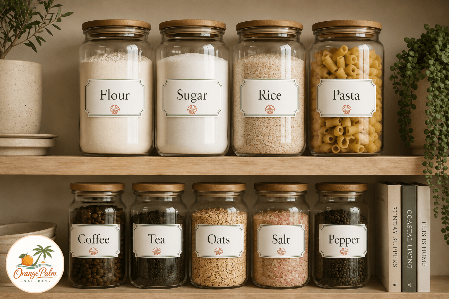
A pretty pantry can go wrong fast. Too many matching bins, too much chalkboard script, too much pretend general store energy. The goal is not to make your kitchen look like it sells pickles by the barrel. The goal is to make the daily stuff easier to find and nicer to look at.
The Salt Air Pantry Labels Printable Set was designed for that middle place: organized, but not precious. Coastal, but not covered in anchors. Florida inspired, but still clean enough for a modern kitchen.
Quick answer
Printable coastal pantry labels are most useful when they make common staples easier to find without adding shelf noise. For a modern Florida kitchen, use matte white or cream sticker paper, keep the palette restrained, print at 100 percent scale, and place labels on visible jars, coffee stations, baking drawers, or open pantry shelves.
The tradeoff with pantry labels
Labels are useful because they remove small decisions. Rice, oats, flour, coffee, pasta, sugar. You should not have to open three jars to make breakfast.
The tradeoff is visual noise. A label can help the room or it can become one more thing yelling from the shelf. That is why this set keeps the marks small: palm green rules, warm white space, ink lettering, and a small coral shell accent that feels more like a studio stamp than a beach souvenir.
The labels are meant for glass jars, ceramic canisters, spice containers, and the awkward pantry shelf that never looks calm no matter how many baskets you buy.
A Florida kitchen without the theme park version
Florida light has a way of making color feel different. White goes warmer. Green gets deeper. Coral can either sing or shout. For this set, the palette stays close to Orange Palm Gallery’s studio language: warm white, palm green, ink, sand, and a small coral note.
That mix gives the labels a coastal feeling without making the kitchen feel staged. They work best in rooms with natural wood, white shelves, woven baskets, stone counters, glass jars, or simple everyday ceramics. Nothing has to match perfectly. In fact, it is better when it does not.
The point is rhythm, not perfection. A row of labeled jars can bring order to a shelf, but the handmade feeling keeps it from looking like a supply closet.
How I would print them
For everyday pantry jars, matte white sticker paper is the cleanest option. It keeps glare down and gives the linework a softer finish. If you want a slightly more elevated look, try cream label paper instead of bright white. Bright white can feel too office supply, especially next to warm cabinets or wood shelves.
For rental kitchens or jars you like to reuse, print the labels on heavyweight matte paper, trim them carefully, and attach them with removable adhesive or a small strip of double sided tape. It is less permanent and easier to change when your pantry habits change.
Use the highest quality print setting your home printer allows. If you send the file to a local print shop, ask for matte sticker stock and make sure the sheet is printed at 100 percent scale, not fit to page.
Where the set works best
This set is made for visible storage: open shelving, glass front cabinets, counter canisters, coffee stations, baking drawers, and small pantry closets that need a little discipline.
It is not trying to make your kitchen perfect. It is trying to make the most repeated parts of the day feel less scrambled. Coffee should be easy to find. Pasta should not live in a half torn box forever. A pantry can be practical and still have a point of view.
Salt air, clean type, and a small shell mark. That is enough.