Wall Art Styling
Laundry Room Wall Art Deserves Better Than a Joke Sign
Laundry room wall art styling advice for warm modern coastal homes, with scale, placement, palette, and humidity-aware tips.
July 17, 2026 / 4 min read / Orange Palm Gallery Studio
Source note: this guide is written and maintained by Orange Palm Gallery Studio. Last updated July 17, 2026.
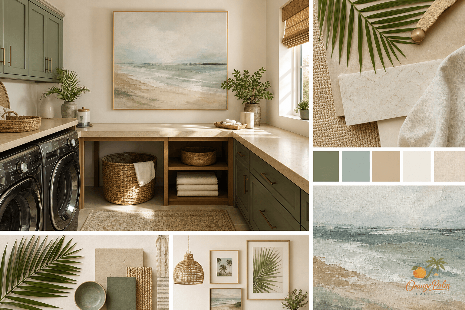
The laundry room does not need a punchline on the wall.
That may be a small hill, but I will stand on it. So many laundry rooms get treated like the place where leftover decor goes to die: a tiny sign, a loud quote, a basket that says exactly what the basket is already doing. The room is already full of labels, machines, bottles, buttons, cords, lint, tile lines, cabinet seams, and whatever is waiting to be folded.
Adding more noise is not the same as making it feel finished.
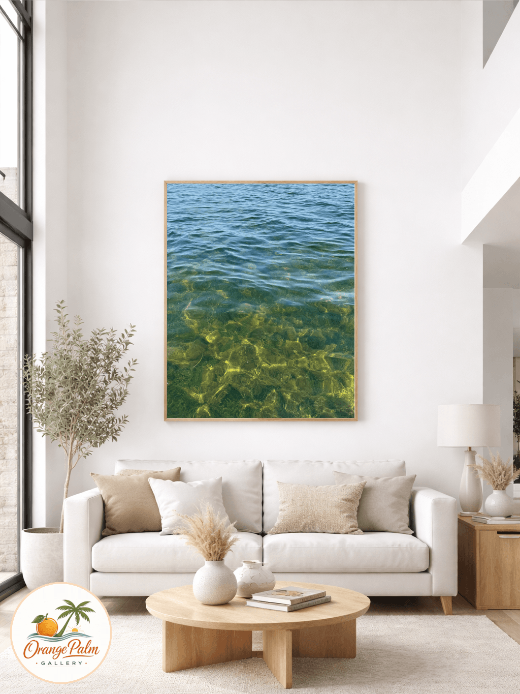
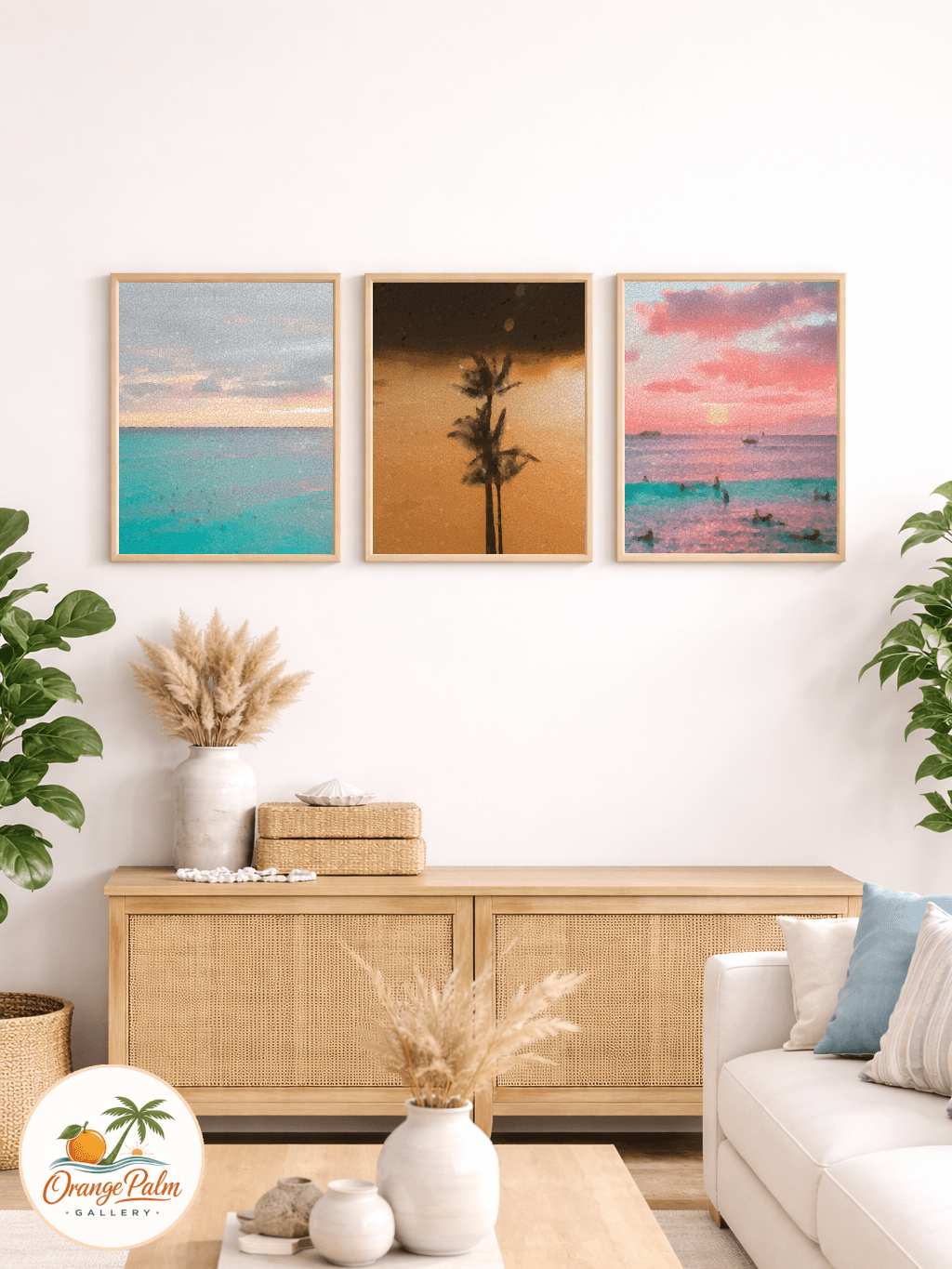
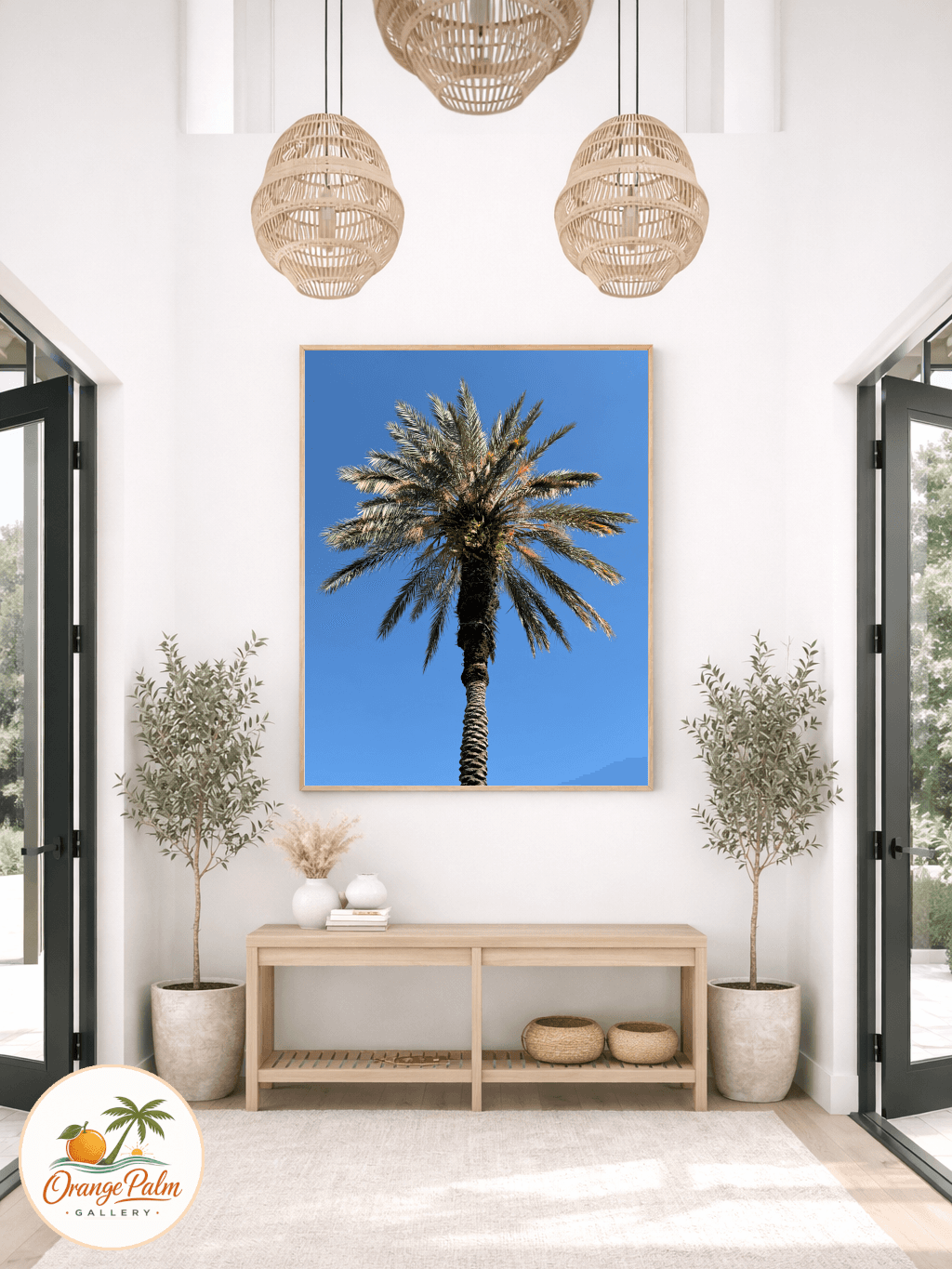
A better move is one calm piece of wall art that gives the room a visual center. Not a gallery wall. Not a theme. Just one good rectangle, placed with intention, in a palette that can survive the practical mess of the space.
Quick answer
Laundry room wall art works best as one calm focal piece above a folding counter, open wall, or first-view spot. Choose art with enough scale to balance appliances, leave breathing room around the frame, and avoid joke signs or busy coastal themes that add visual noise.
Start with the wall that gets seen first
Laundry rooms are usually viewed in quick glances. You walk past the doorway. You lean in to switch a load. You stand at the counter for three minutes folding towels. That means the best wall is often not the largest wall. It is the wall your eye meets first.
If there is a folding counter, the space above it is usually the strongest spot. If the room has upper cabinets, look for the gap between cabinet runs or the open wall beside them. If the washer and dryer sit under open shelving, avoid forcing art into the busiest zone. Shelves already have enough little edges and shadows.
The tradeoff is simple: the most obvious blank wall may not be the calmest wall. Pick the wall that gives the art enough breathing room to be read quickly.
Keep the scale confident, not precious
Small art can look especially timid in a utility room because the appliances are so visually heavy. A washer and dryer have mass. Cabinet doors have repetition. Tile has pattern. A tiny print floating above all of that can feel like an apology.
For a wall above a folding counter, I would rather see one medium piece than three small ones. If the counter is wide, let the art take up enough width to feel connected to the surface below it. It does not need to match the counter exactly. It just needs to look like it belongs to the same composition.
A good rule: leave breathing room around the piece, but not so much that it feels stranded. If the wall art looks like it was hung because there happened to be a nail there, lower it or size up.
Use a palette that can handle white machines
Laundry rooms often lean hard on white: white machines, white trim, white tile, white shelves, white detergent bottles. That can look clean, but it can also feel sterile.
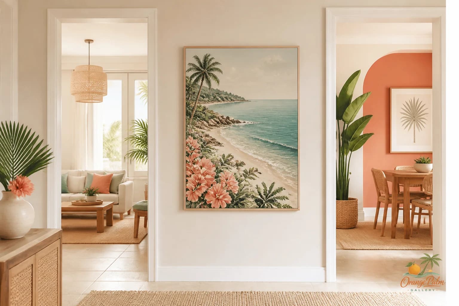
This is where a Florida-inspired palette works well if it stays restrained. Warm white keeps the room soft. Sand brings in a practical, sun-washed neutral. Palm green gives the space a grounded note. Coral can work as a small accent, not the whole personality. Ink gives the composition a little structure so everything does not dissolve into beige.
The mistake is going too beachy too fast. A laundry room does not need anchors, shells, rope, and turquoise all at once. One coastal cue is enough. A palm-like shape, a warm horizon line, a soft botanical rhythm, or a sun-faded abstract form can do more than a literal theme.
Respect the room’s moisture and movement
This is still a working room. Steam, detergent splashes, damp towels, swinging doors, and baskets all matter.
Do not hang art where it will be bumped every time someone opens a cabinet or pulls out a hamper. Avoid the splash zone near utility sinks. If the room gets humid, framing and material choices matter. The styling idea can be beautiful, but the placement still has to respect the job of the room.
There is no romance in art that gets knocked crooked twice a week.
Let the art soften the chore, not disguise it
The best laundry room art does not pretend laundry is glamorous. It simply gives the eye somewhere better to land.
That is the quiet advantage of one 2D piece in a utility space. It can warm up the hard surfaces without adding more objects to manage. It can make the room feel designed without making it delicate. It can hold a little Florida light, a little palm green, a little sand tone, and still let the baskets, machines, and towels do what they need to do.
For Orange Palm Gallery, that is usually the sweet spot: modern coastal art that feels calm enough for real rooms, not just styled corners. If you are thinking through a small wall at home, you can explore the studio direction here: Orange Palm Gallery.
The laundry room may never be the room people gather in. Fine. It still deserves one honest visual decision.